
Born To The Game
A loud sports brand in a hot pink-to-orange gradient, with a logo system, lock-ups, apparel and a 24-page guideline book.
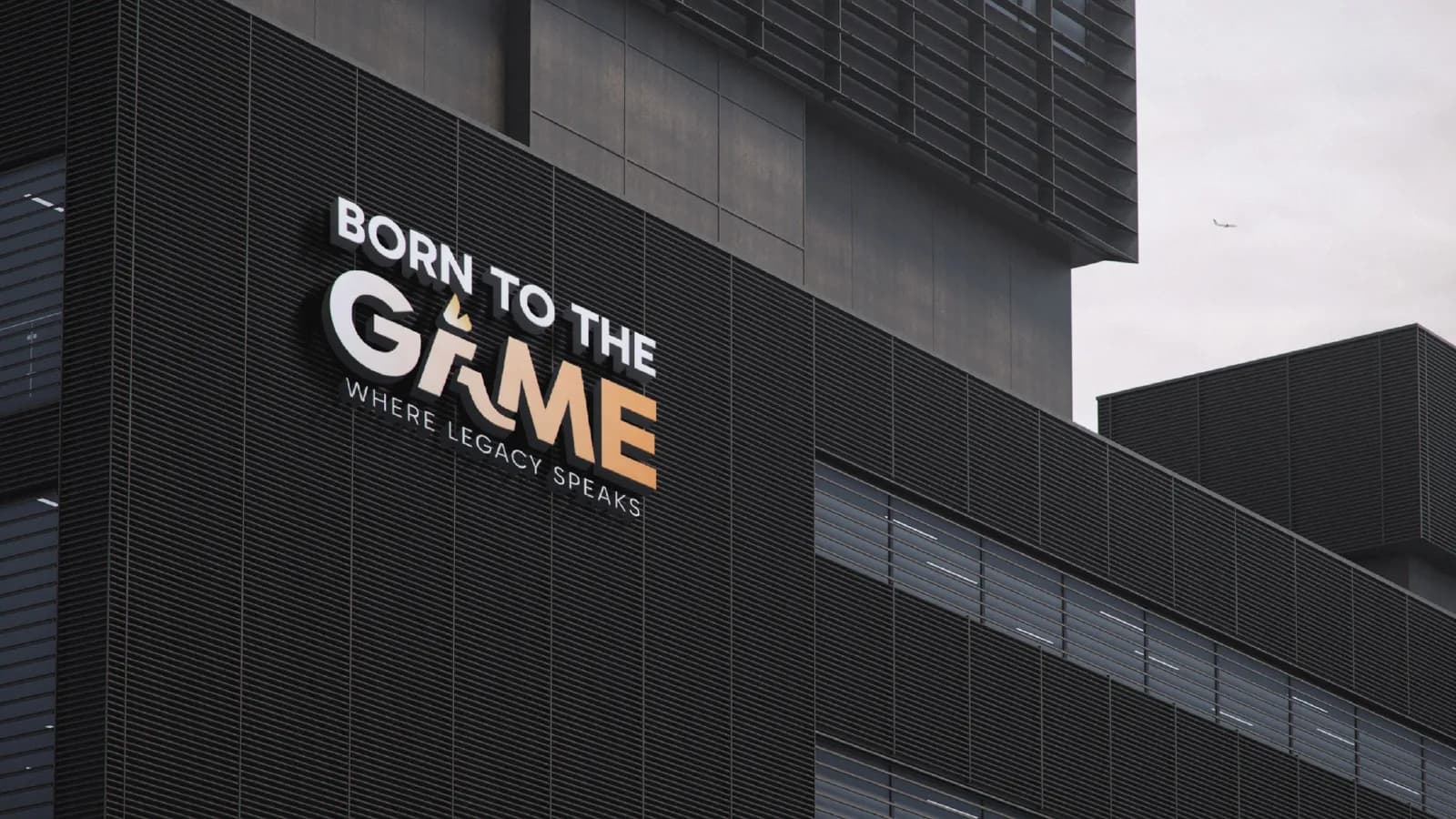
What the brand needed
Sports brands compete in some of the noisiest places there are: feeds, stadiums, kit. Born To The Game needed enough energy to stand out, and enough discipline to look the same on a watch face as on a hoodie.
How I approached it
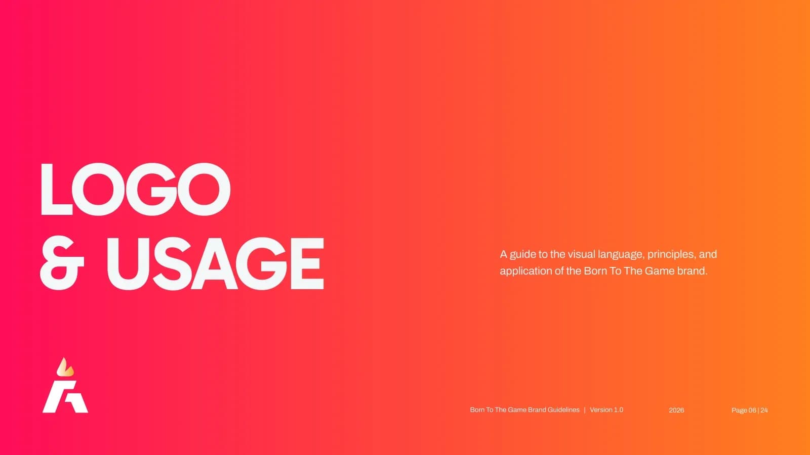
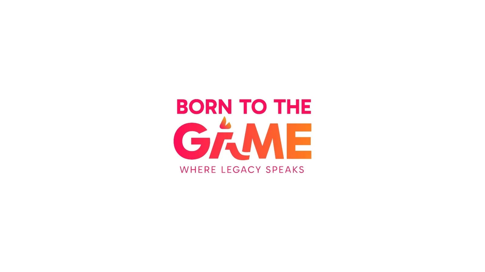
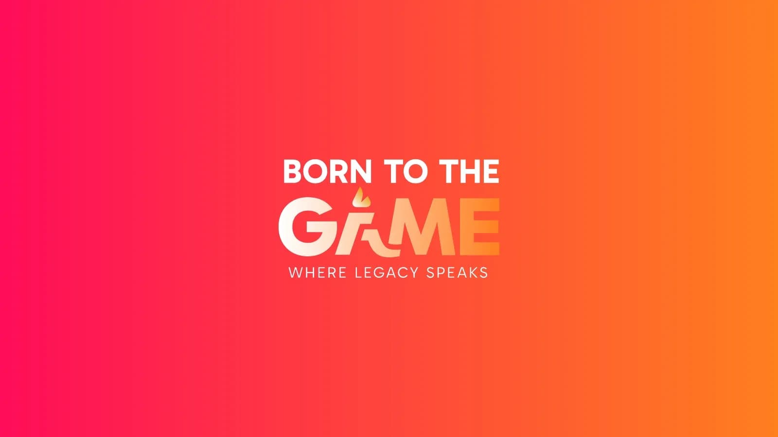
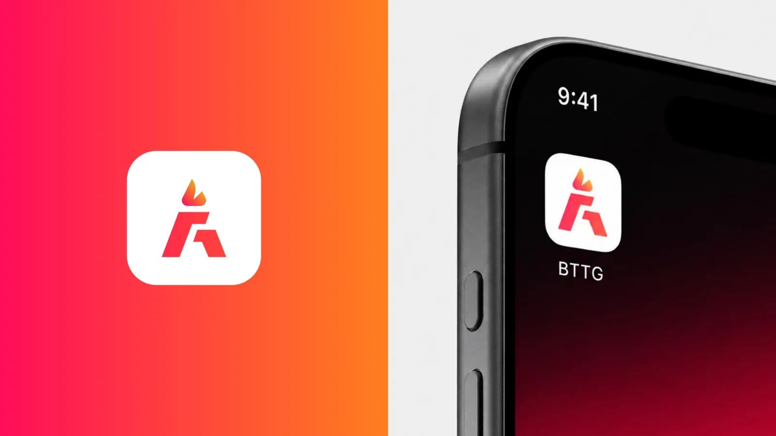
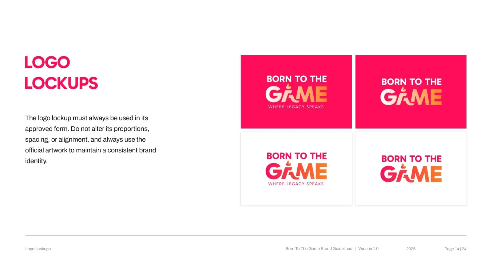
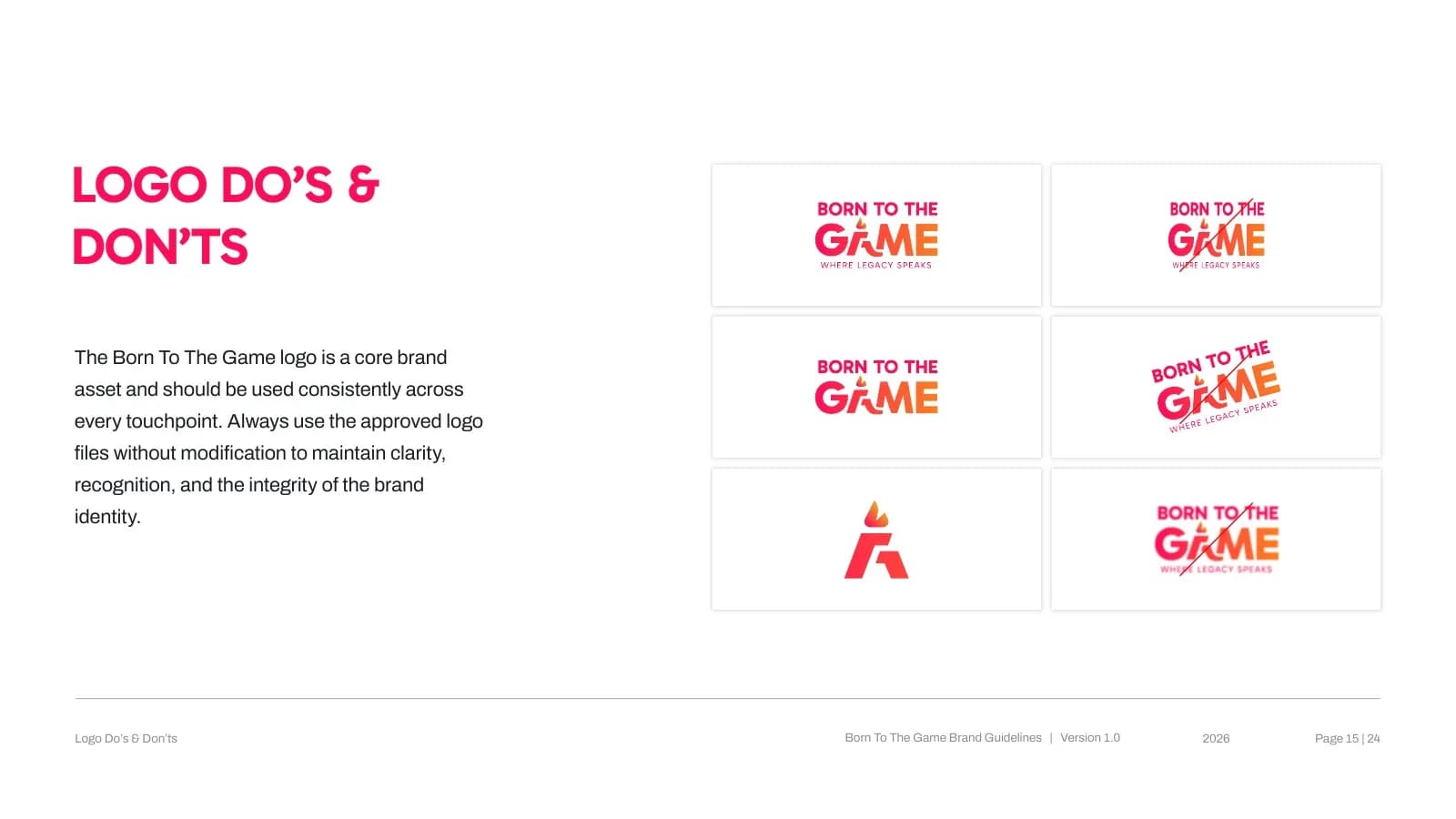
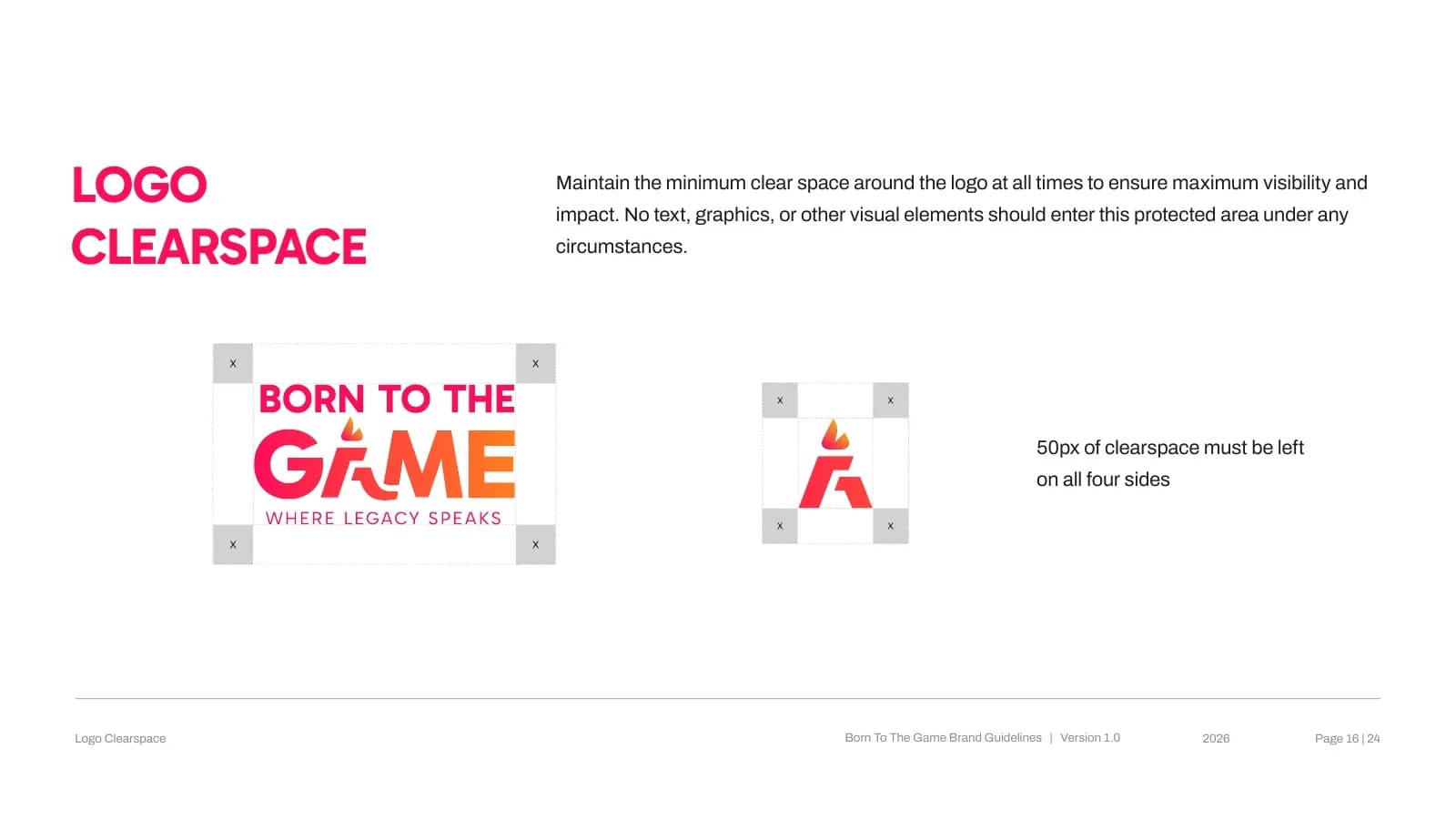
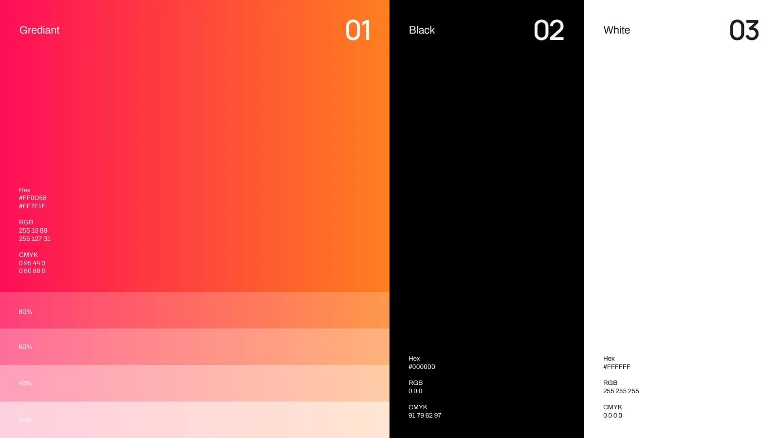
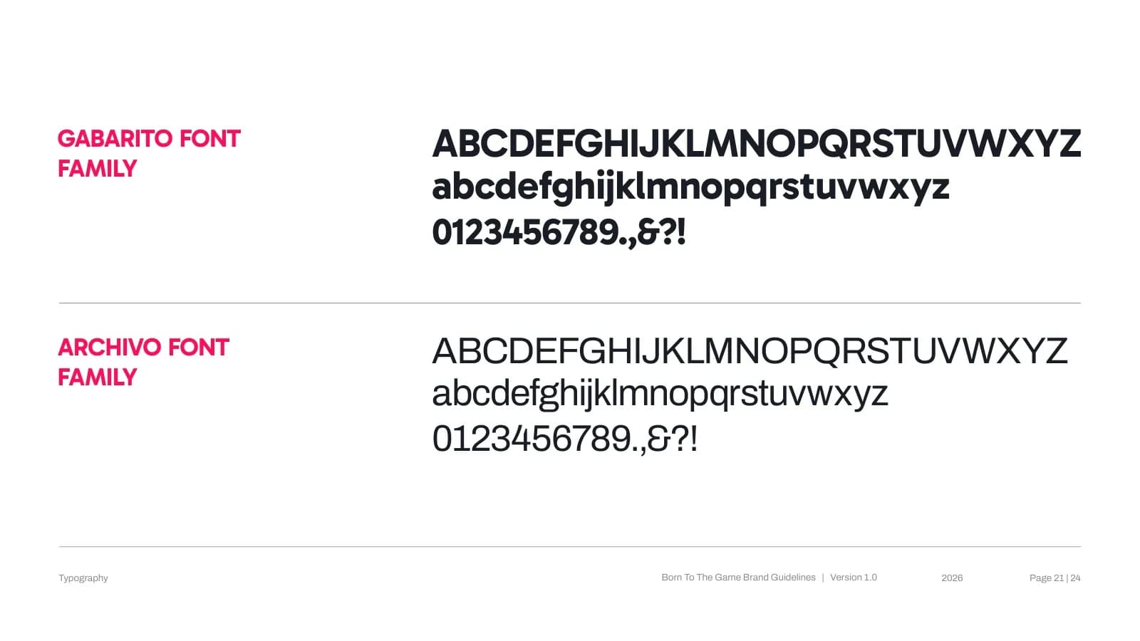
A bold A-mark and a stacked wordmark hold up at any size, backed by the pink-to-orange gradient against black and white. Gabarito keeps headlines punchy and Archivo keeps body copy clean. Lock-up, clear-space and do's-and-don'ts rules keep partners on brand.
What I delivered
- Primary logo, A-mark and stacked lock-ups
- Clear space and do's and don'ts
- Gradient color system
- Typography (Gabarito / Archivo)
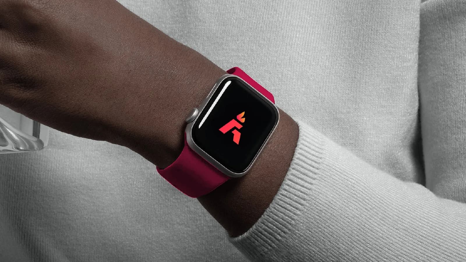
- App icon and smartwatch applications
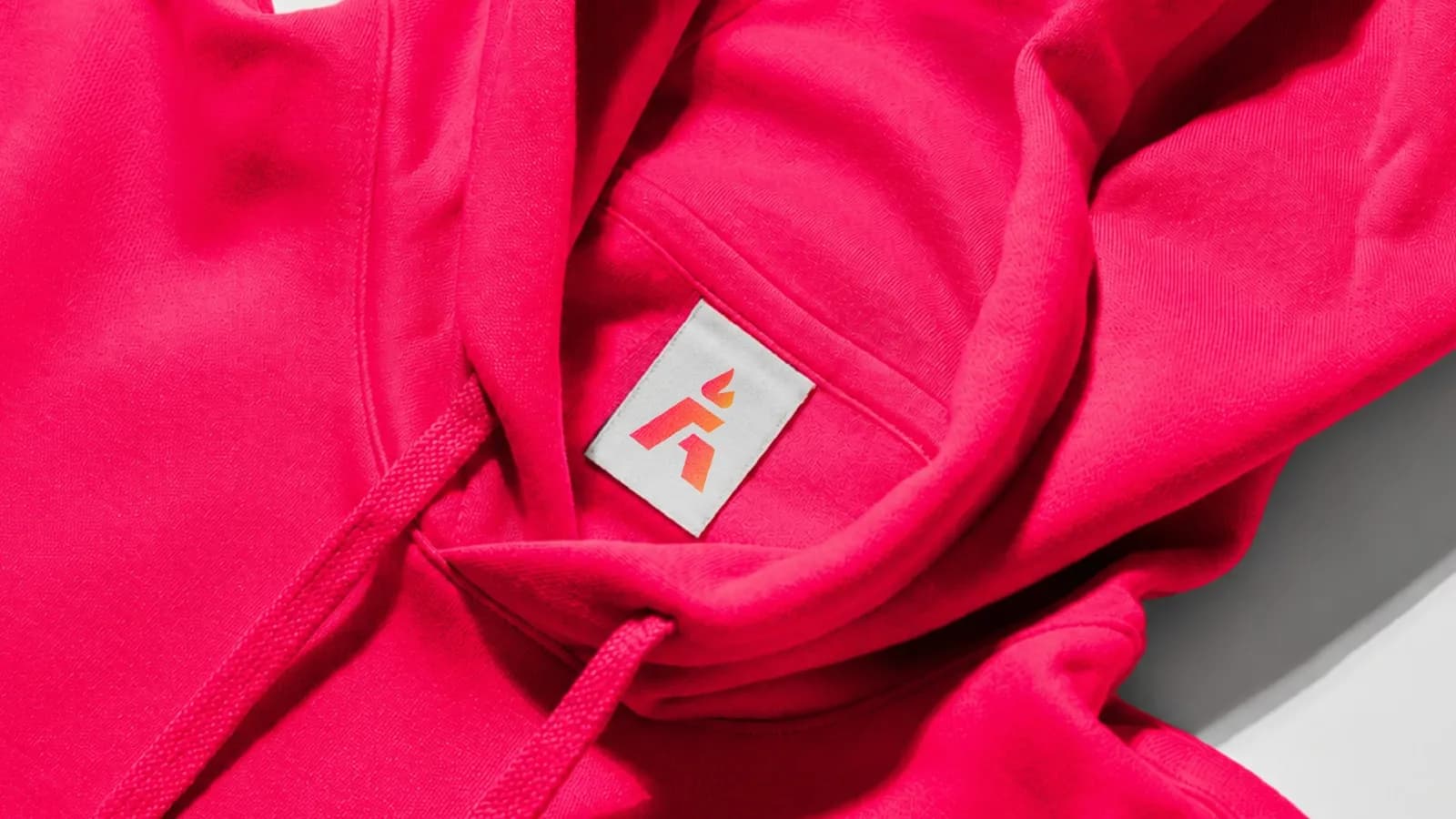
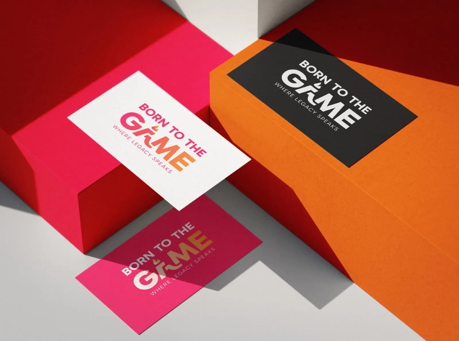
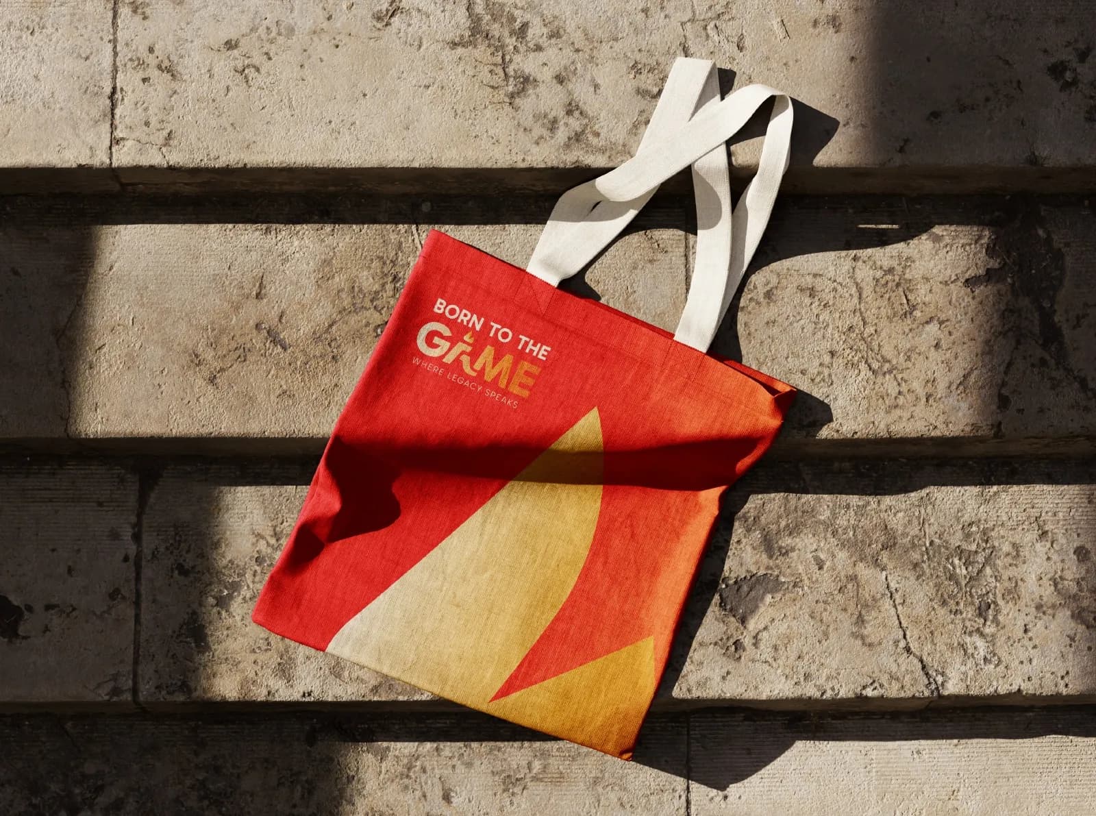
- Apparel, tote bags and business cards
- Building signage
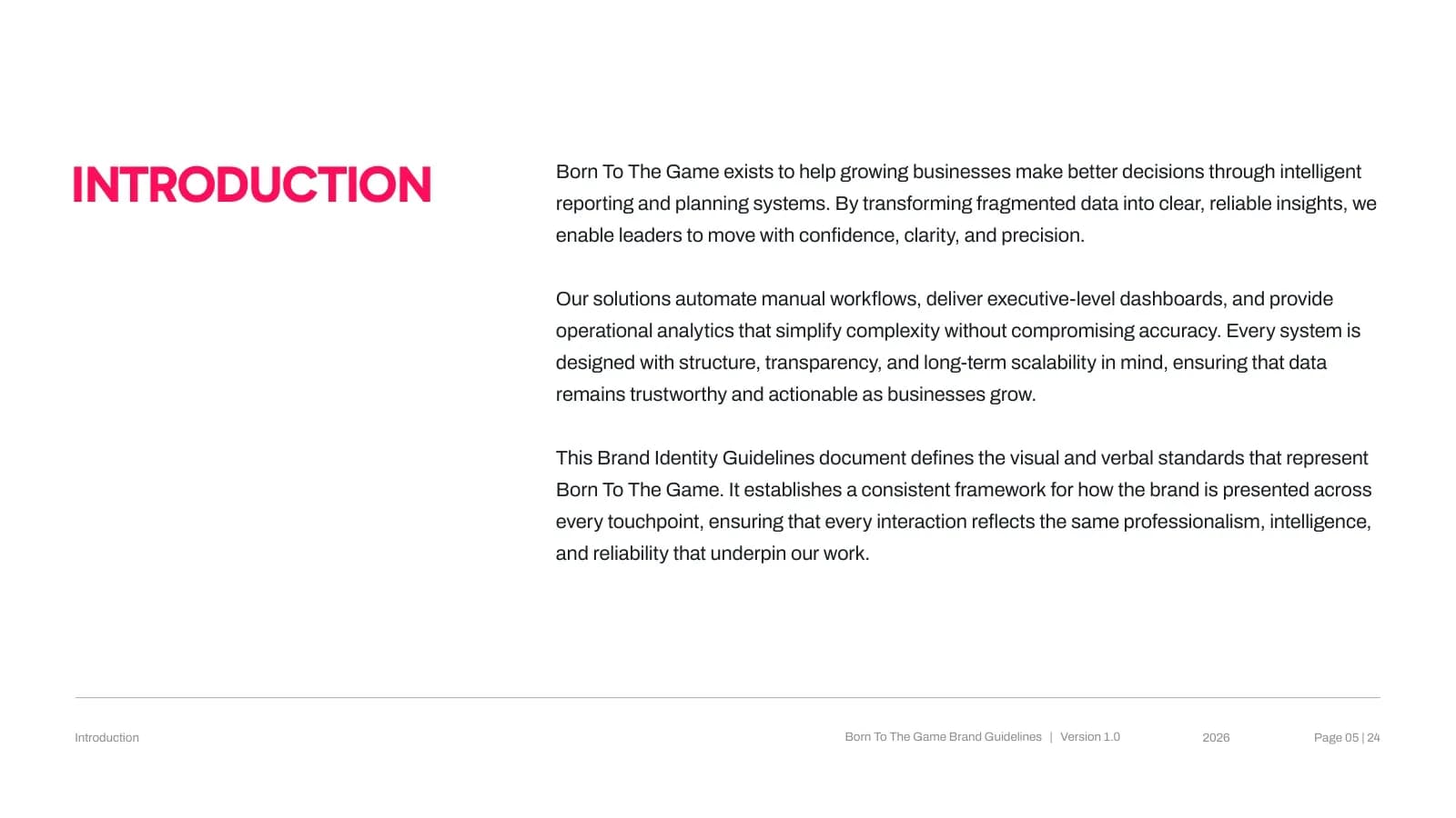
- 24-page brand guideline document
Where it landed
A 24-page guideline book, so every drop, post and partnership looks like it came from the same team.
[RESULT: add a result you can share, like a launch date, a sales or engagement lift, or a client quote]
Need the same for your brand? See what’s included in brand identity systems and how pricing works.
The full project24 images


Next project
PuppyDock
Brand Identity · Pet Care