
KAE Hair Care
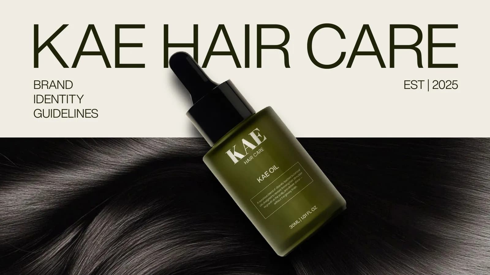
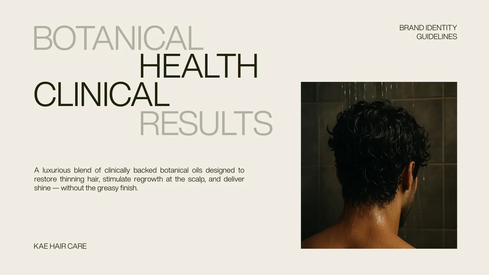
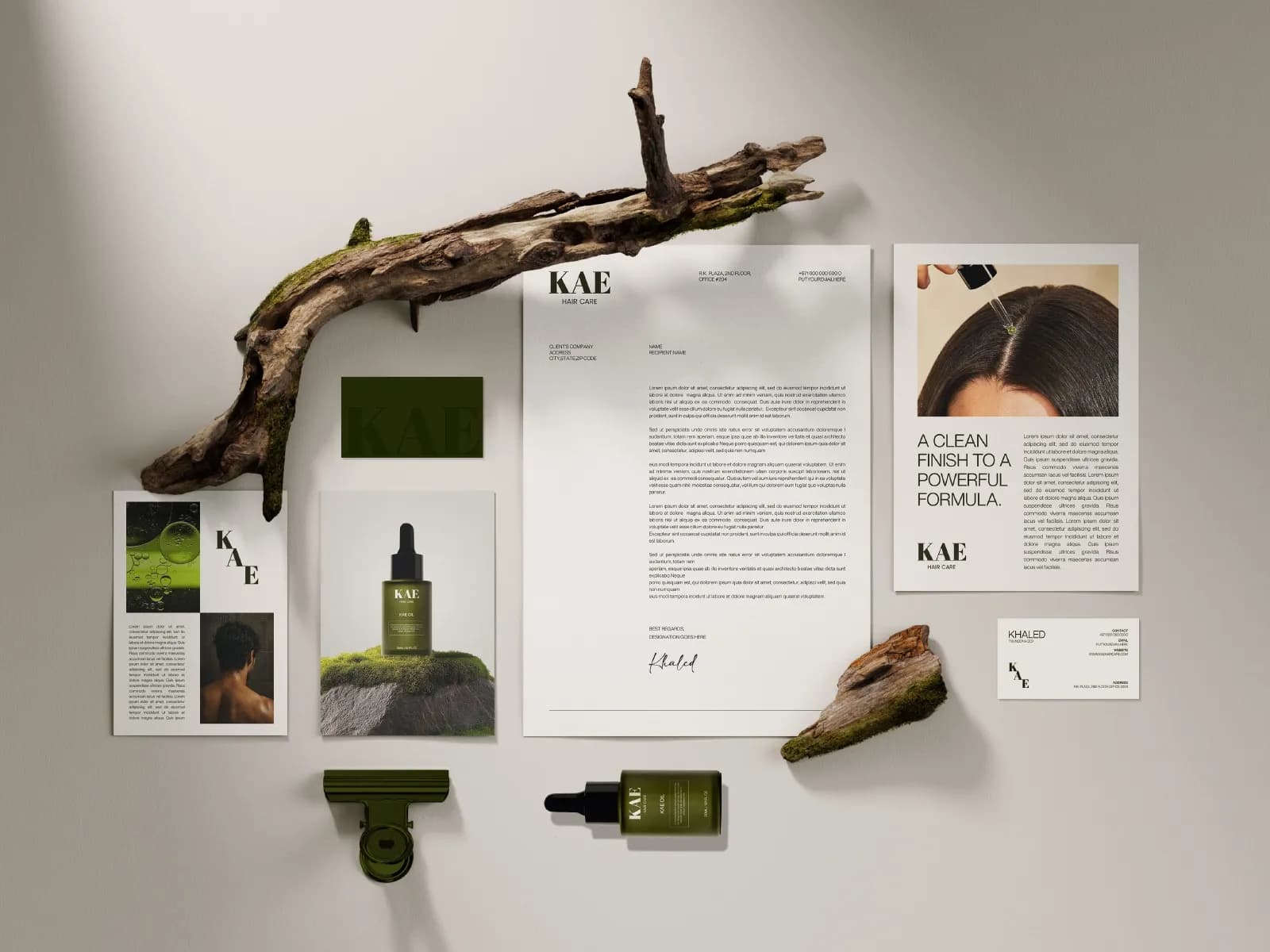
Hair care that's part botanical, part clinical: a serif monogram, olive-green packaging and a 17-page identity guide.
What the brand needed
Hair oil brands tend to look either cold and clinical or homemade. KAE needed to sit in between. Gentle enough to feel kind to your scalp, clinical enough to promise results.
How I approached it
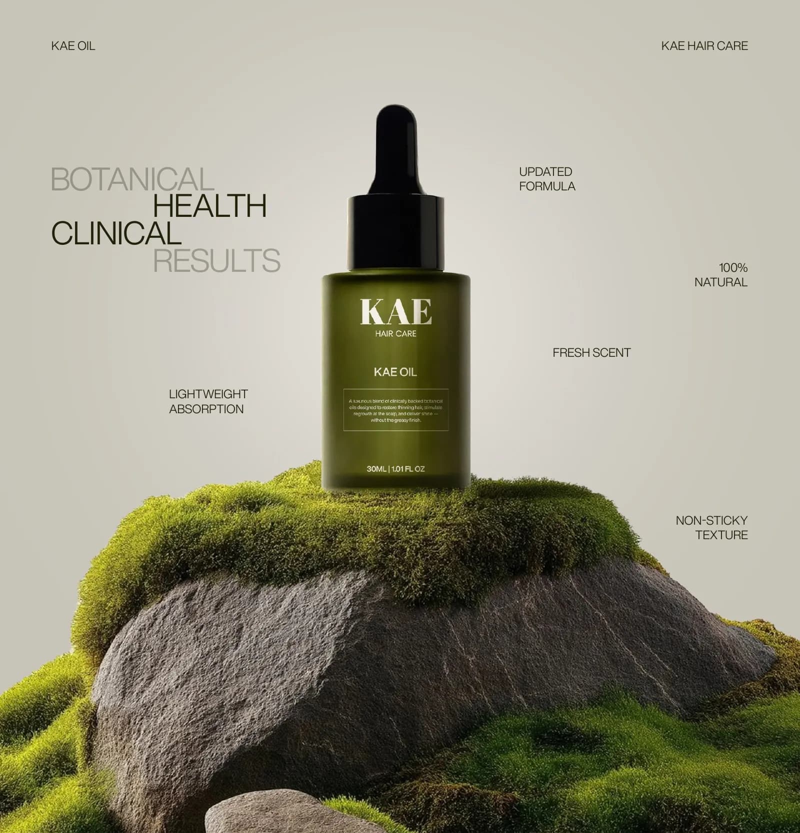
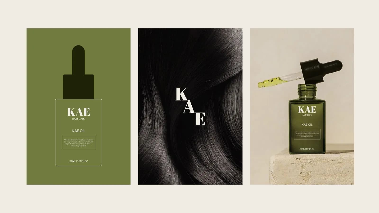
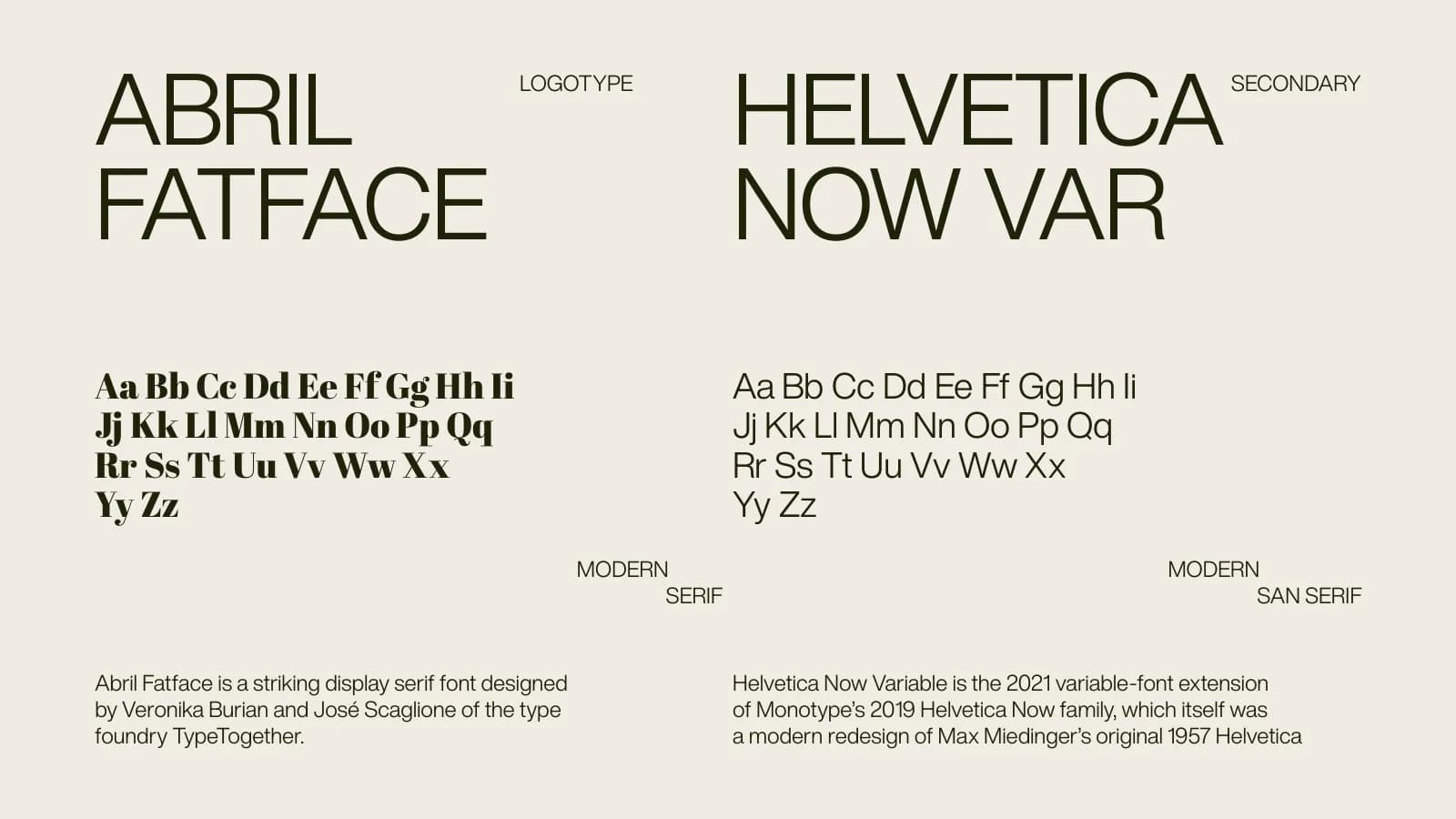
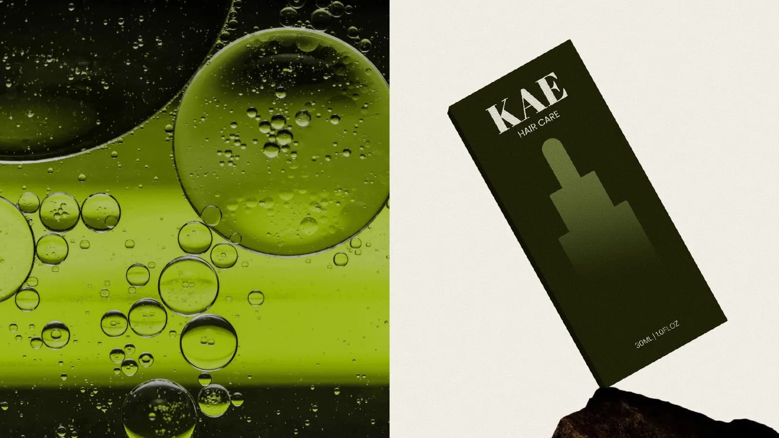
Abril Fatface gives the wordmark the weight of an old apothecary label. A deep olive palette and moss-and-stone photography soften it. The bottle stays dark and the type stays minimal, so the product reads as a treatment, not a cosmetic.
What I delivered
- Logotype, monogram and icon
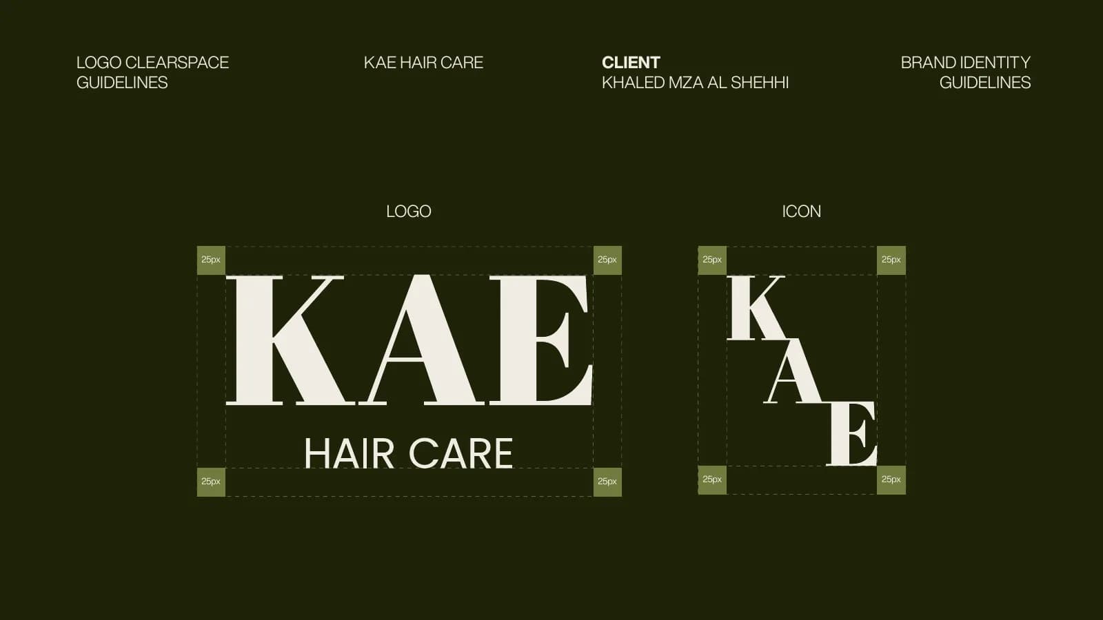
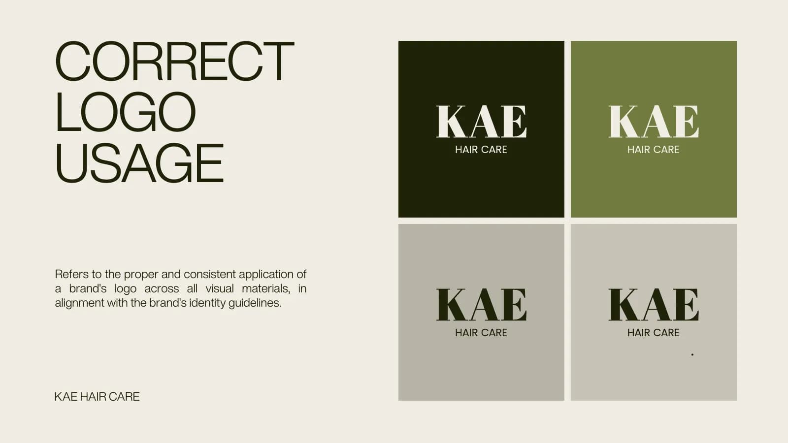
- Correct logo usage and clear-space rules
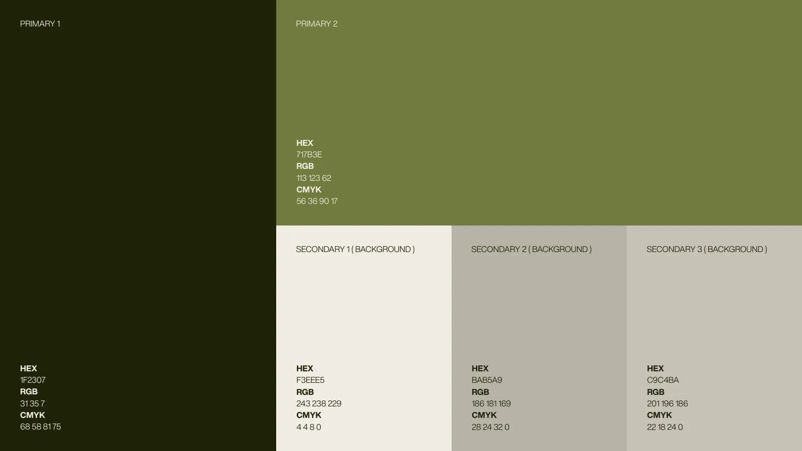
- Olive and stone color palette
- Typography (Abril Fatface / Helvetica Now Var)
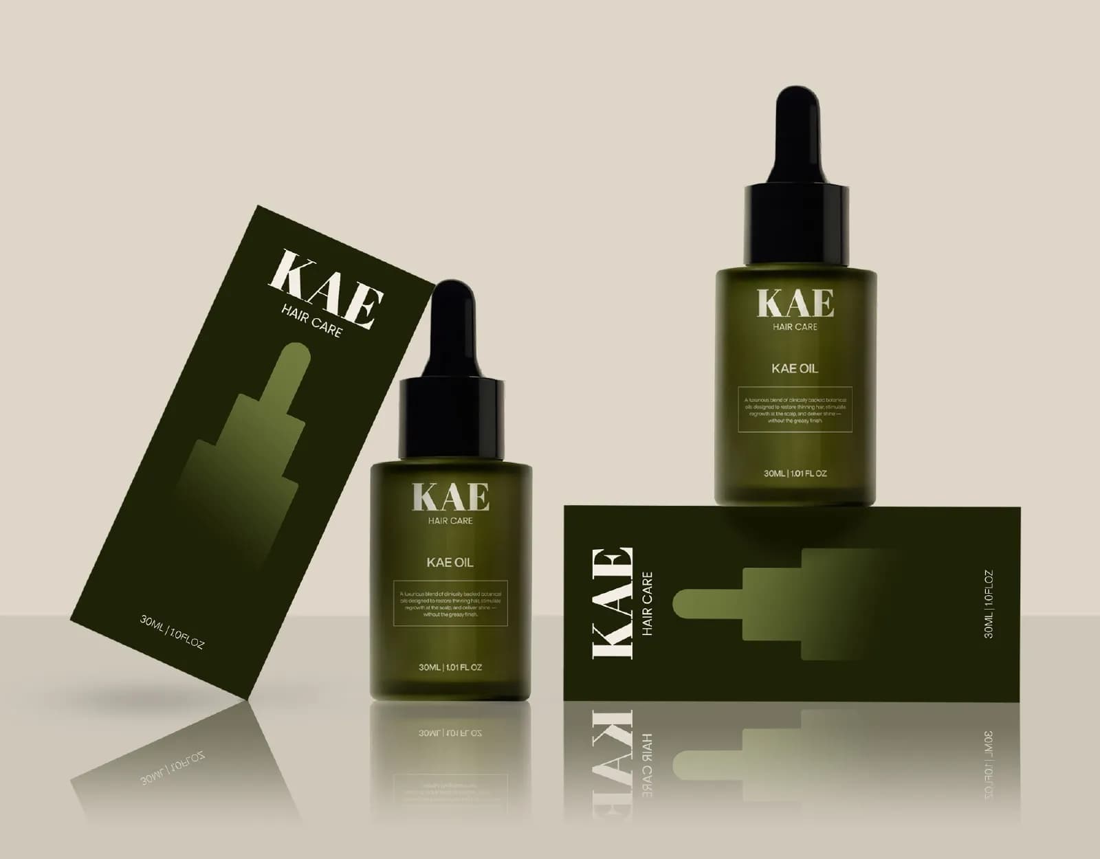
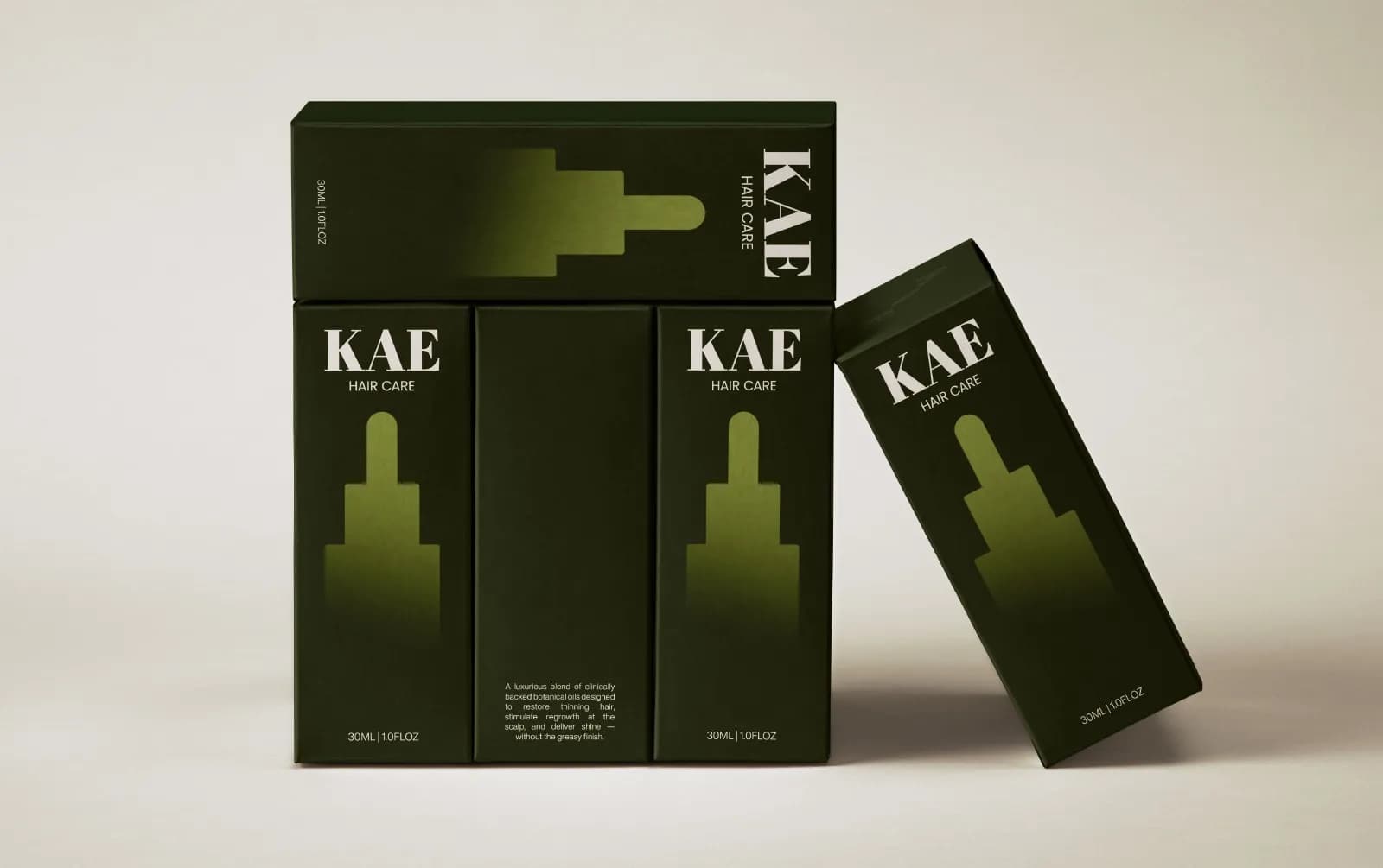
- Serum bottle and outer carton
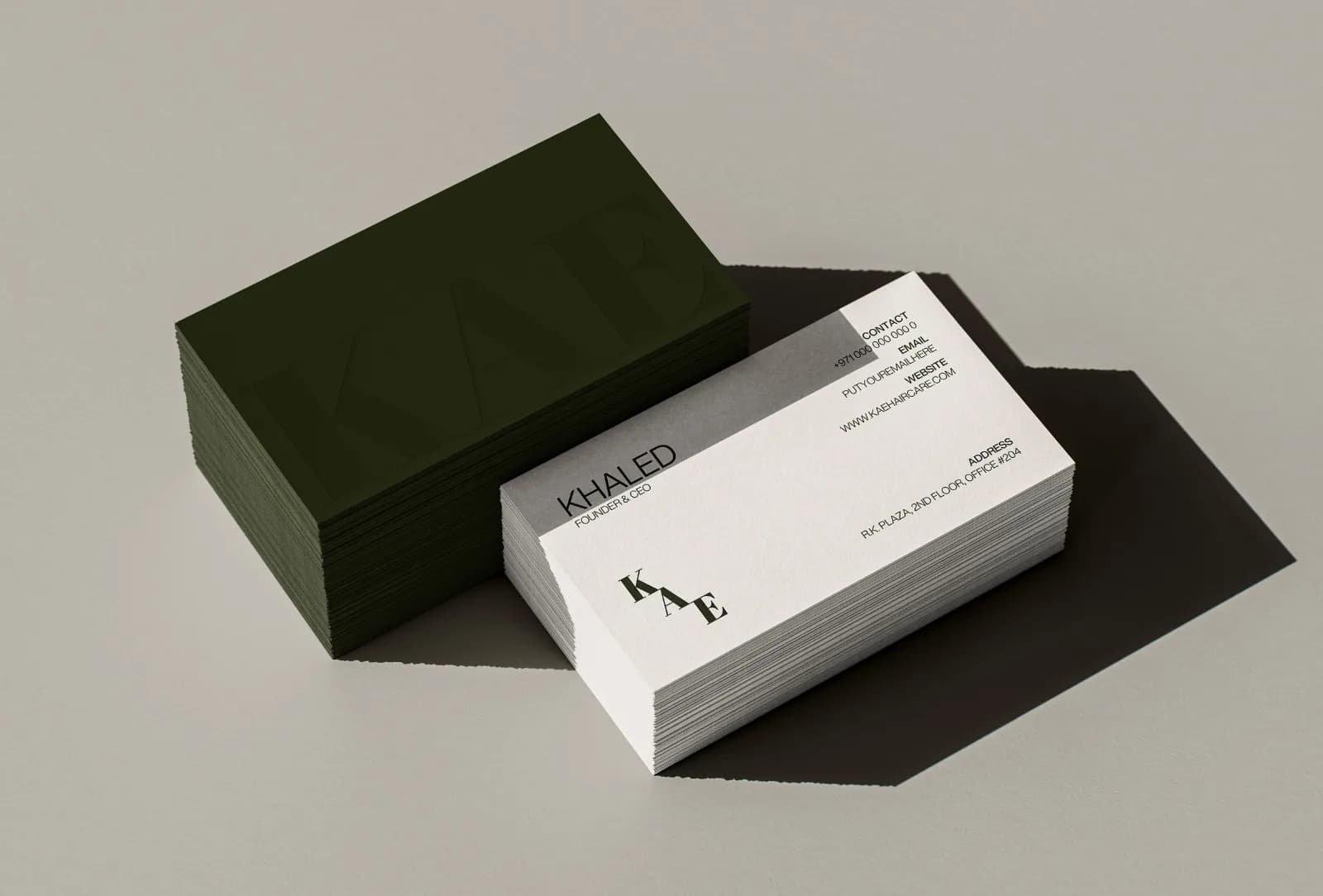
- Business cards and stationery suite
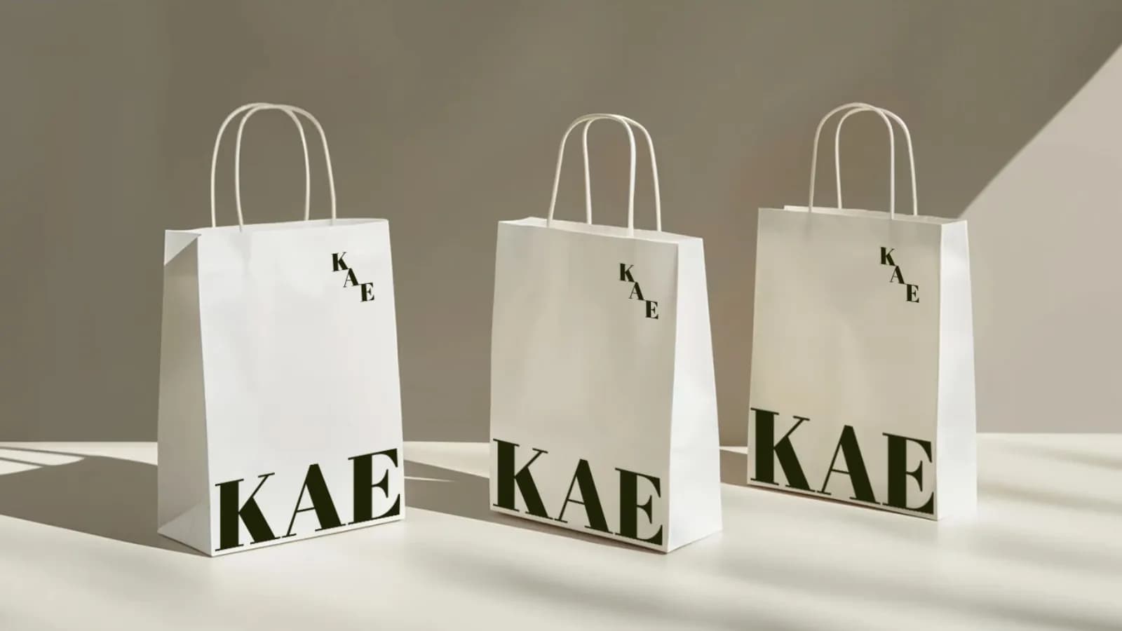
- Retail bags and boxes
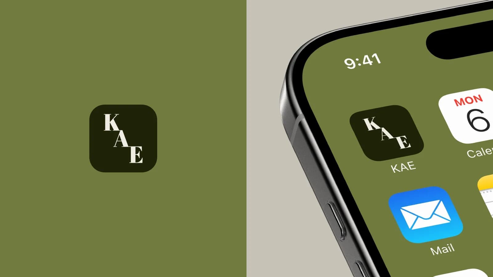
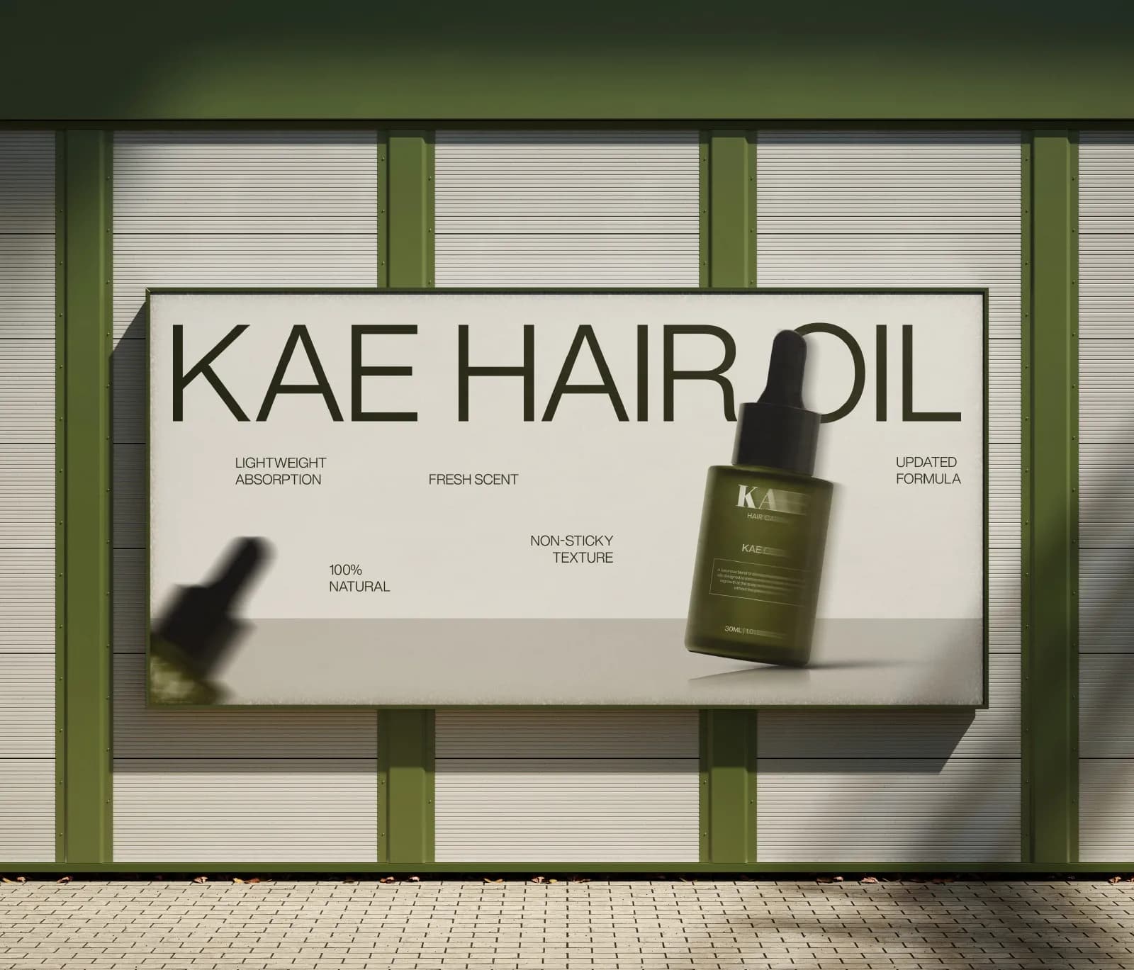
- Billboard and app icon applications
Where it landed
A 17-page identity guide and print-ready packaging artwork for the whole launch range.
[RESULT: add a result you can share, like a launch date, a sales or engagement lift, or a client quote]
Need the same for your brand? See what’s included in brand identity systems and how pricing works.
The full project17 images
Next project
Born To The Game
Brand Identity · Fitness & Sports