
Cerevion Cognitive Supplement
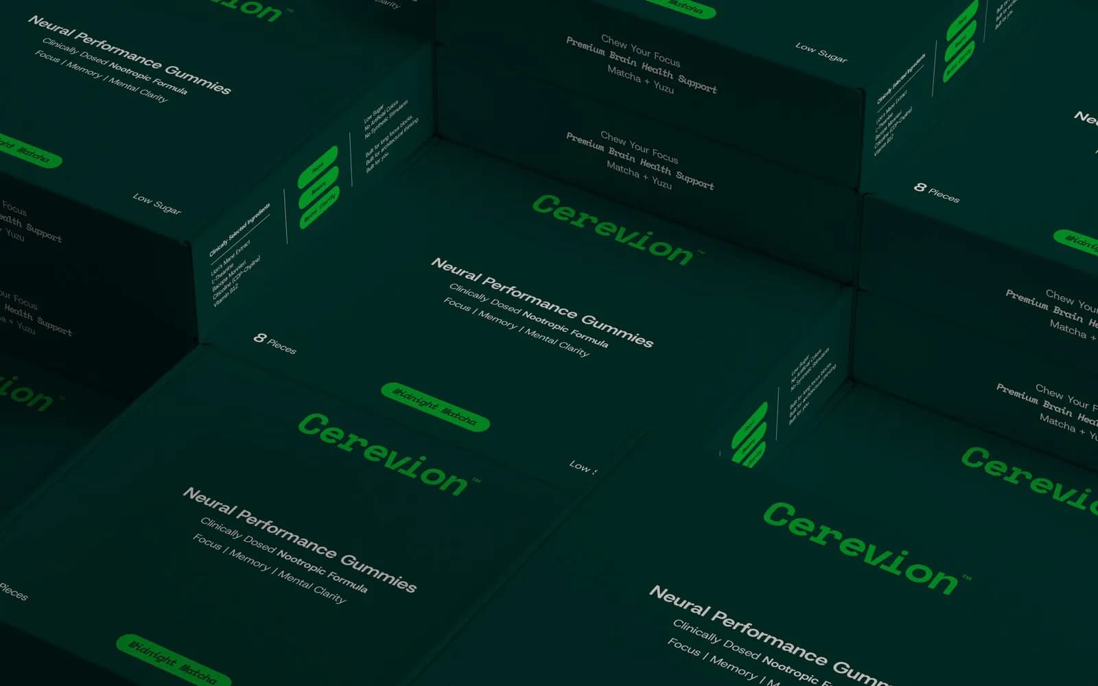
A nootropic supplement brand in signal green and deep forest, covering the logotype, color system and the full box and tub range.
What the brand needed
Nootropics have to look like serious science, not a wellness fad. Cerevion's packaging needed to hold its own on a pharmacy shelf and still feel modern to people buying online.
How I approached it
Bright green against near-black keeps everything crisp and clinical. Host Grotesk and Space Mono set dosage information like data, not marketing. Every SKU shares one layout and changes a single accent color, so the range stays easy to read as it grows.
What I delivered
- Logotype and brand mark
- Color system across four SKUs
- Typography (Host Grotesk / Space Mono)
- Box and tub packaging artwork
- Dosage and supplement-facts layout
- Retail display and stacking system
- Brand pattern and stationery
Where it landed
A 16-page packaging and identity system, with artwork ready for both carton and tub production.
[RESULT: add a result you can share, like a launch date, a sales or engagement lift, or a client quote]
Need the same for your brand? See what’s included in brand identity systems and how pricing works.
Next project
Jayy Studio
Brand Identity · Creative & Design