
PuppyDock
A playful pet-safety brand with a dog-eared wordmark, sky blue and sunshine yellow colors, app icons and a 12-page brand guide.
What the brand needed
Pet safety is an emotional purchase. Owners need to trust the product straight away, but a clinical look would lose the fun of having a dog. PuppyDock had to feel reassuring and playful at once.
How I approached it
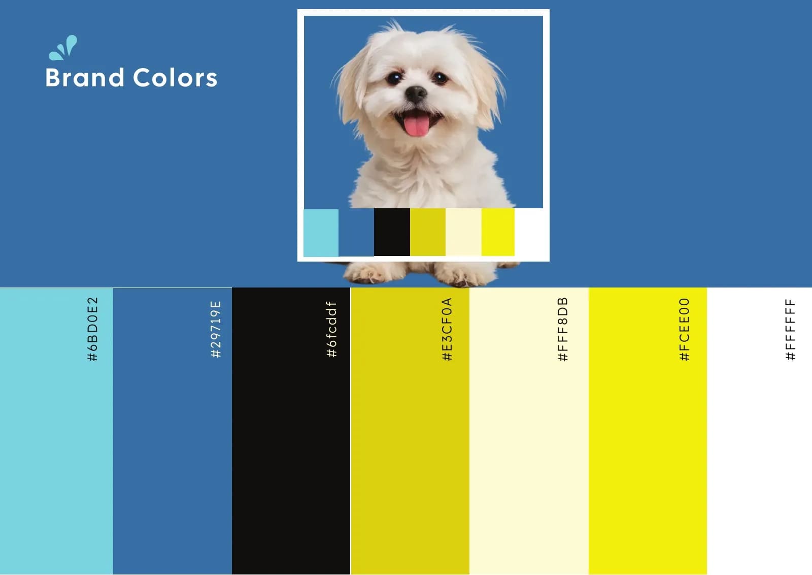
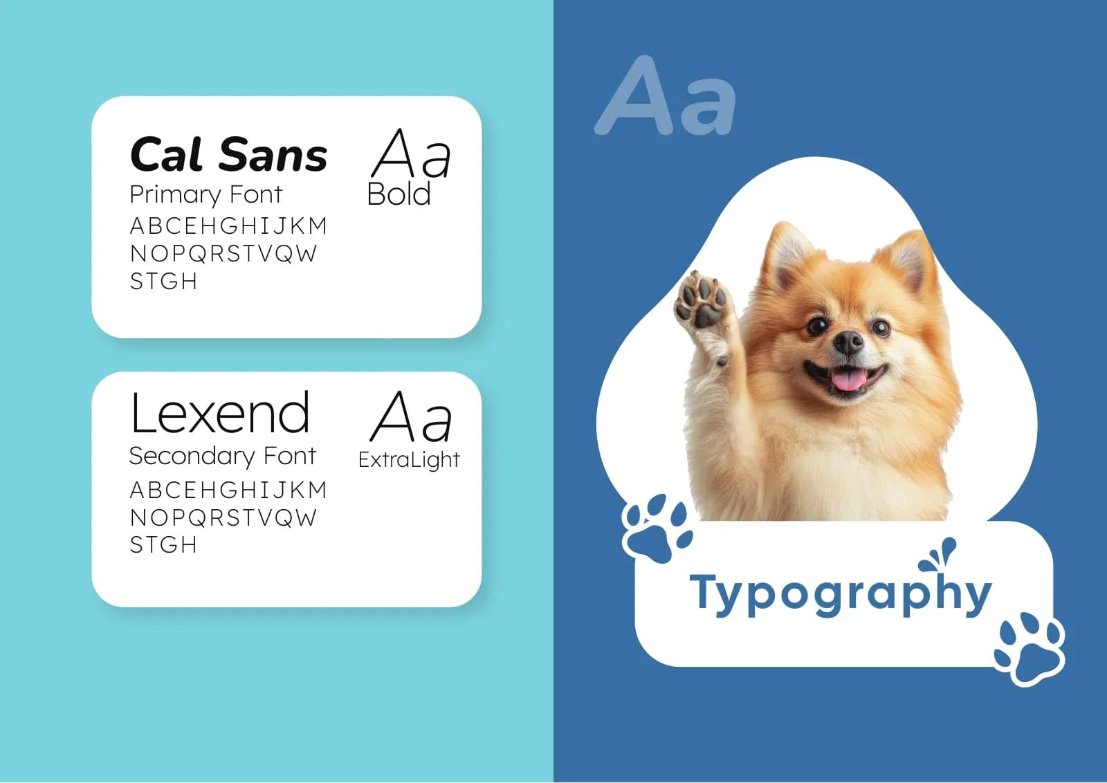
A friendly wordmark sits at the center, with bright sky blue, sunshine yellow and real dog photography around it. Cal Sans and Lexend keep the type rounded and easy to read. Dog silhouettes and app icons carry the brand onto screens and social.
What I delivered
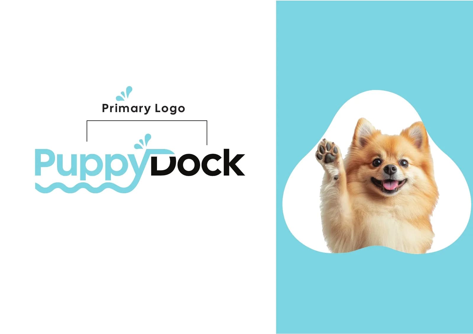
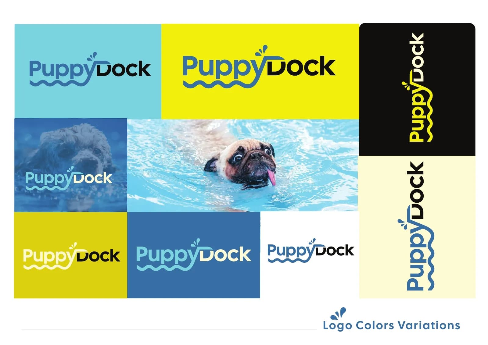
- Primary logo and color variations
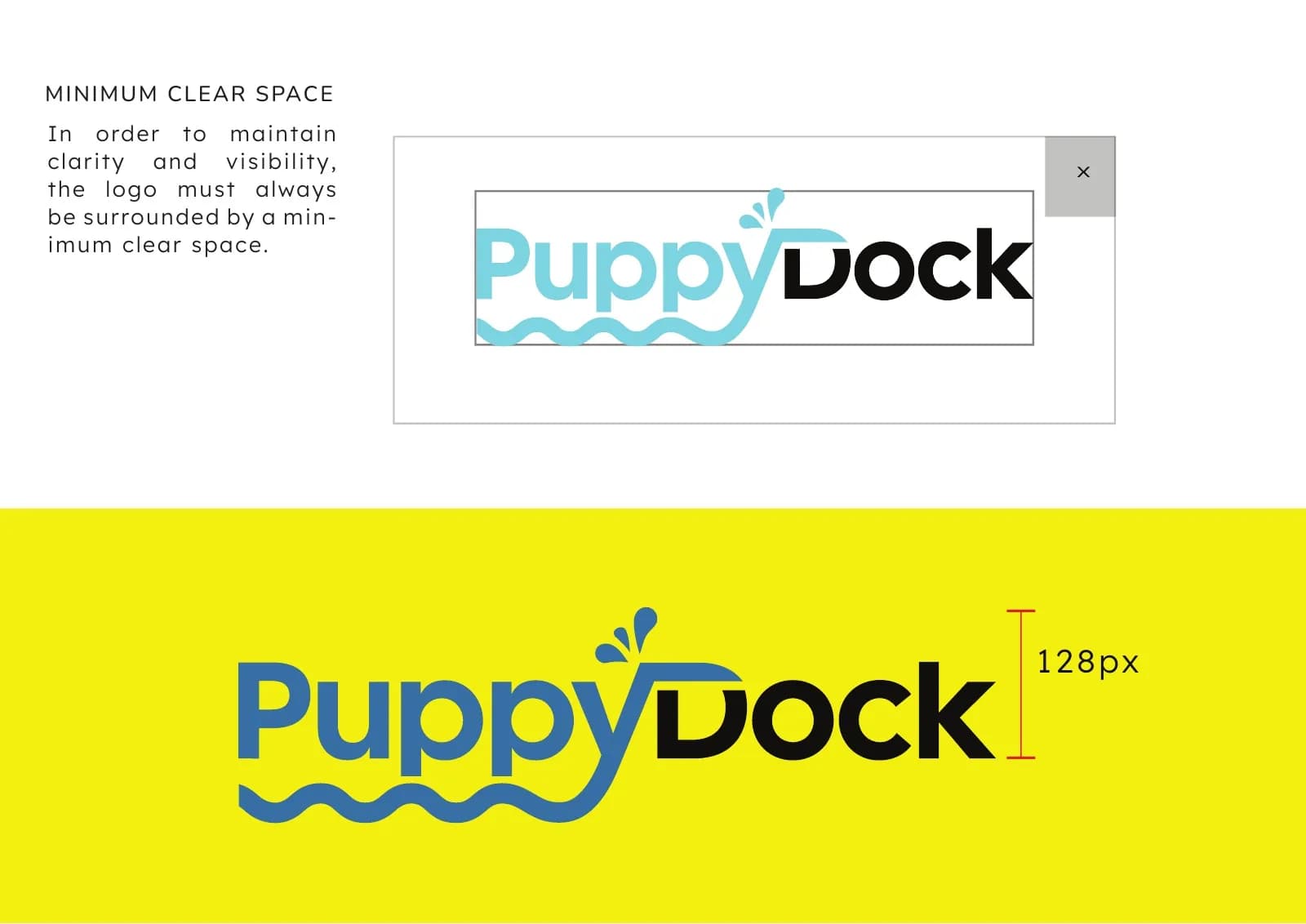
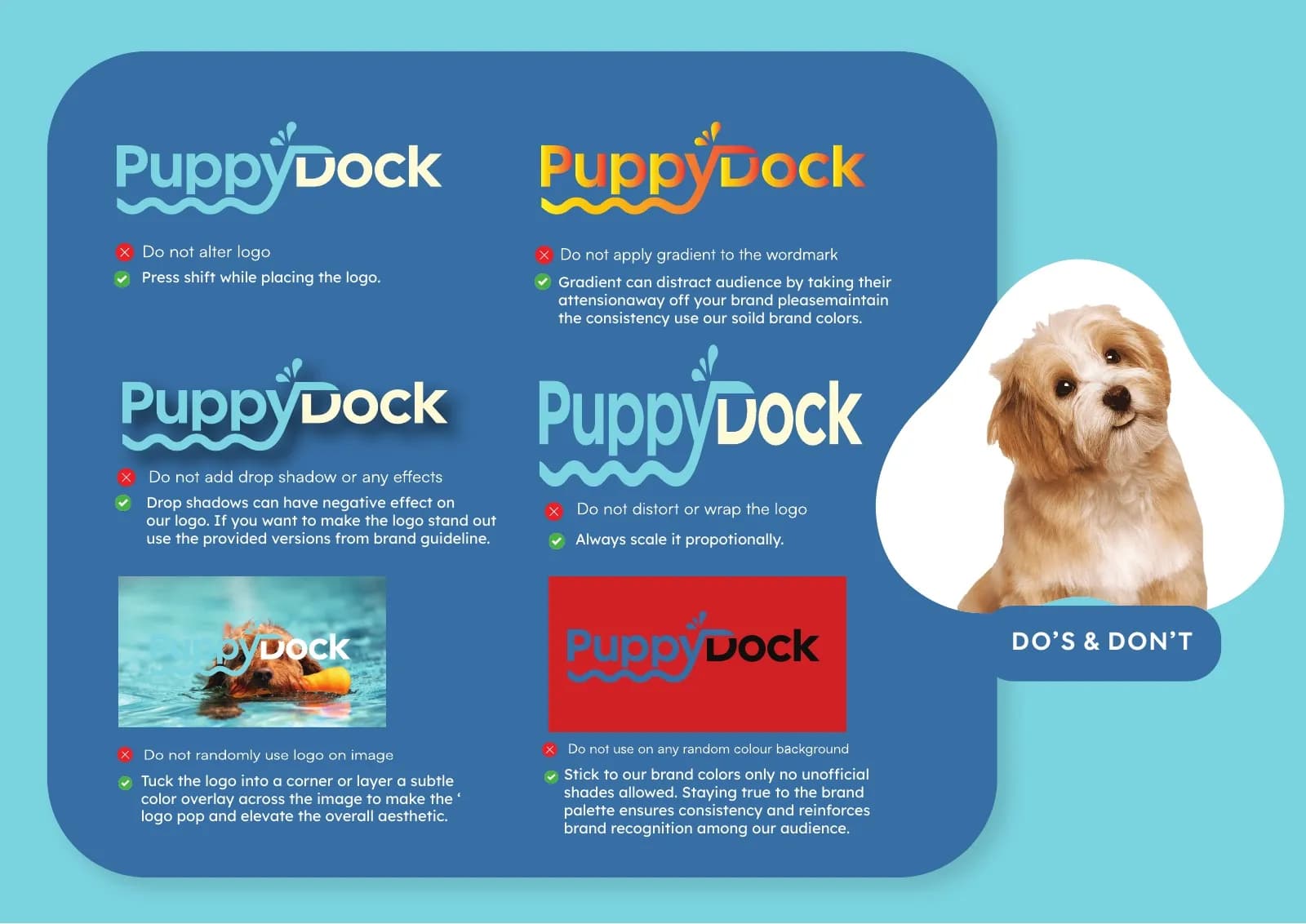
- Clear-space and do's-and-don'ts rules
- Brand color palette
- Typography (Cal Sans / Lexend)
- Brand story and tone
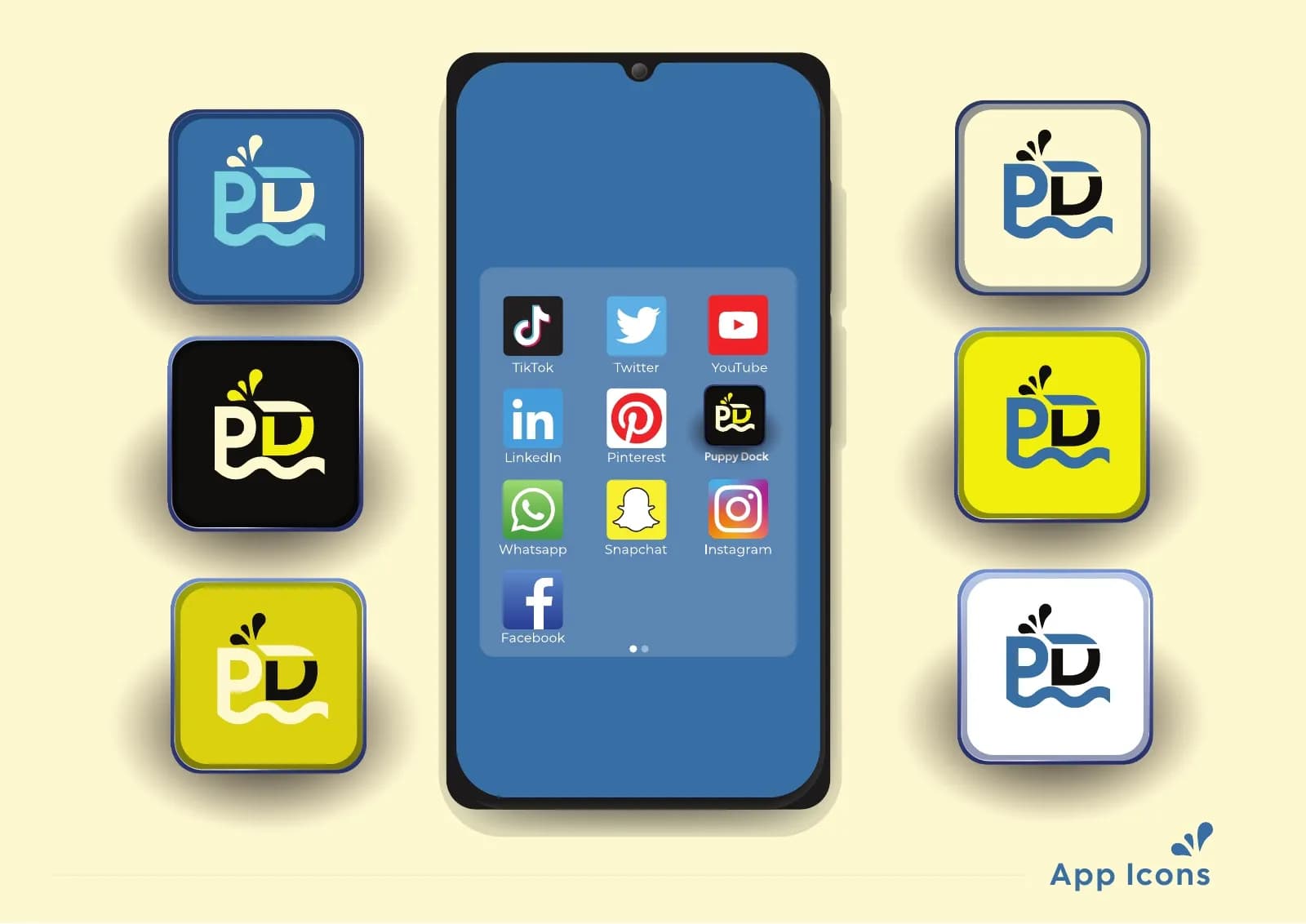
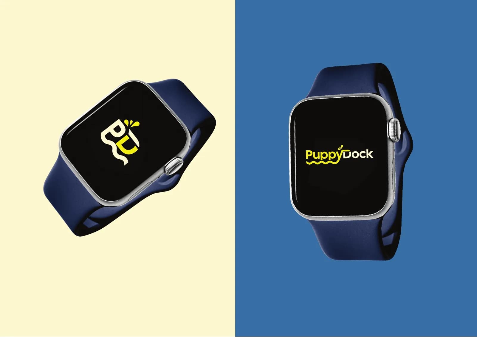
- App icons and smartwatch application
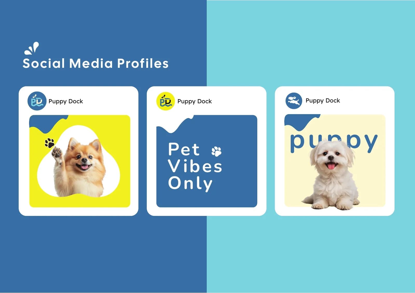
- Social media profile templates
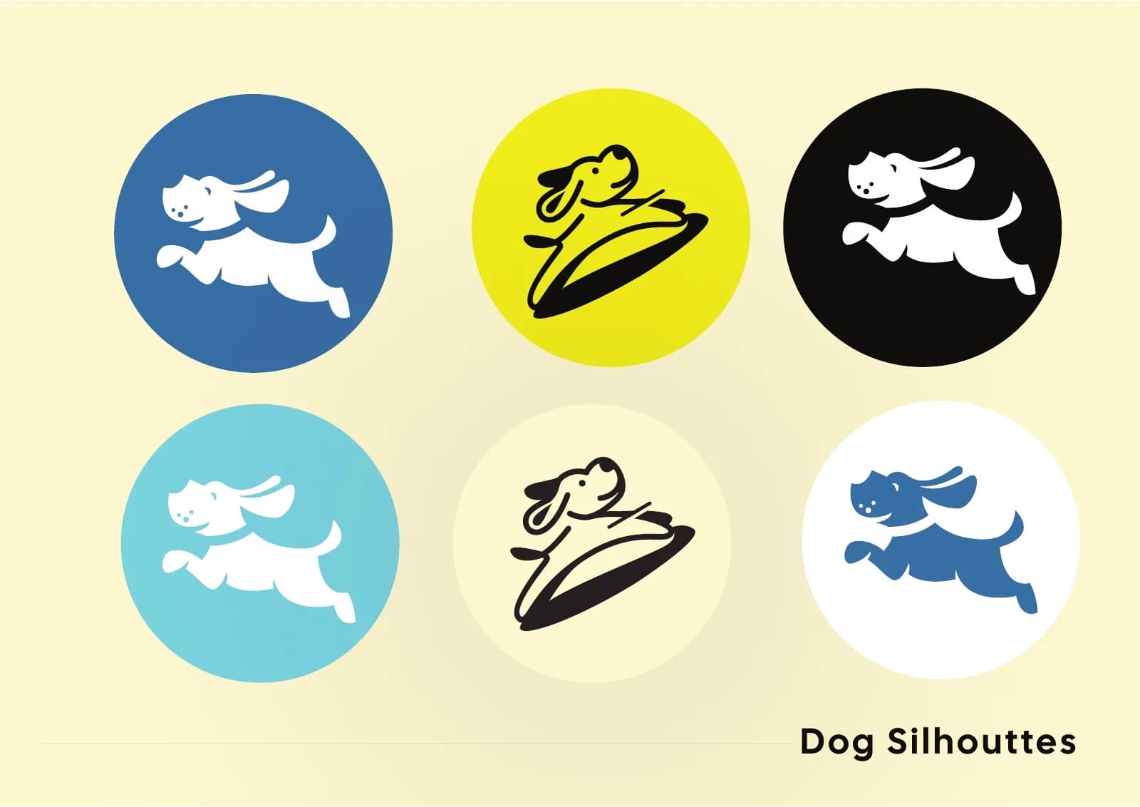
- Dog silhouette illustration set
Where it landed
A 12-page brand guide with everything PuppyDock needs to launch consistently on packaging, web and social.
[RESULT: add a result you can share, like a launch date, a sales or engagement lift, or a client quote]
Need the same for your brand? See what’s included in brand identity systems and how pricing works.
The full project12 images



Next project
Cerevion Cognitive Supplement
Brand Identity · Health & Wellness