
Arista Living
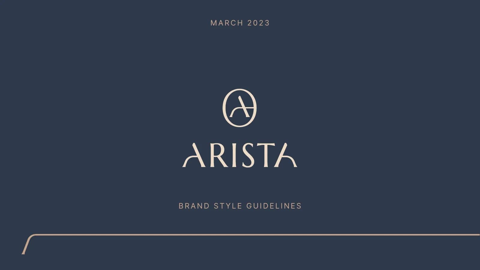
Identity for a luxury real estate brand: a circular A monogram, an Estate sub-brand, navy and sand colors, and a 45-page style guide.
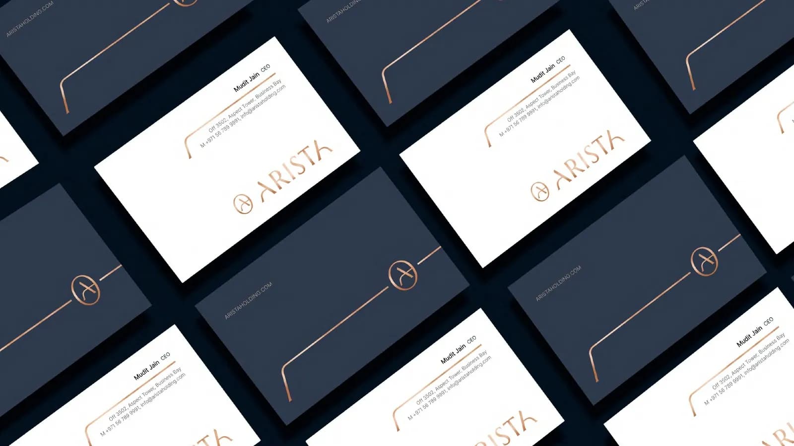
What the brand needed
People buy luxury property on feeling long before they look at floor plans. Arista wanted a brand as considered as its homes, one that stays calm and high-end in print, online and on site.
How I approached it
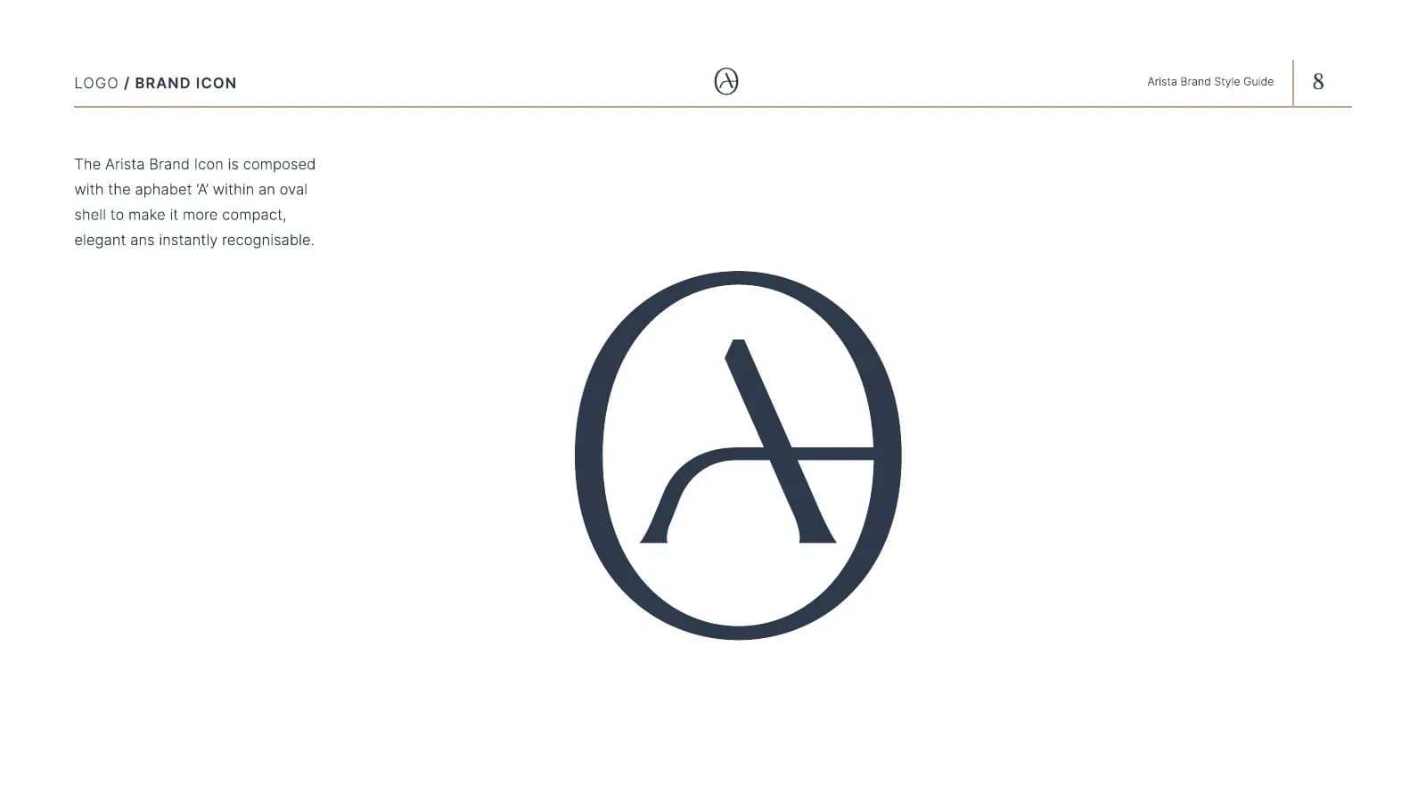
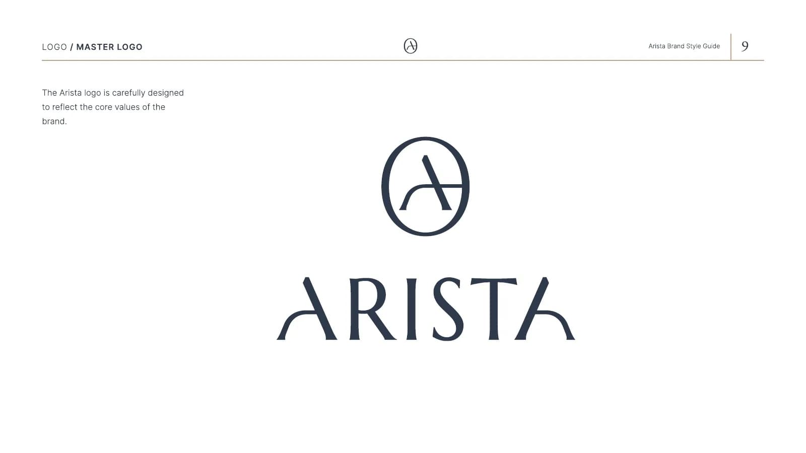
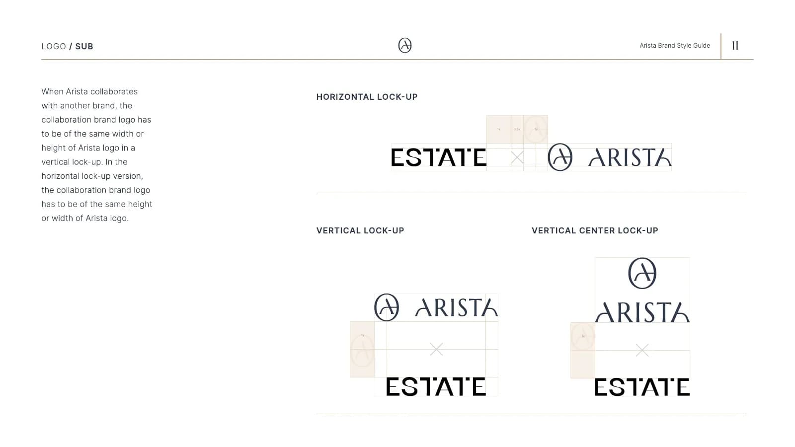
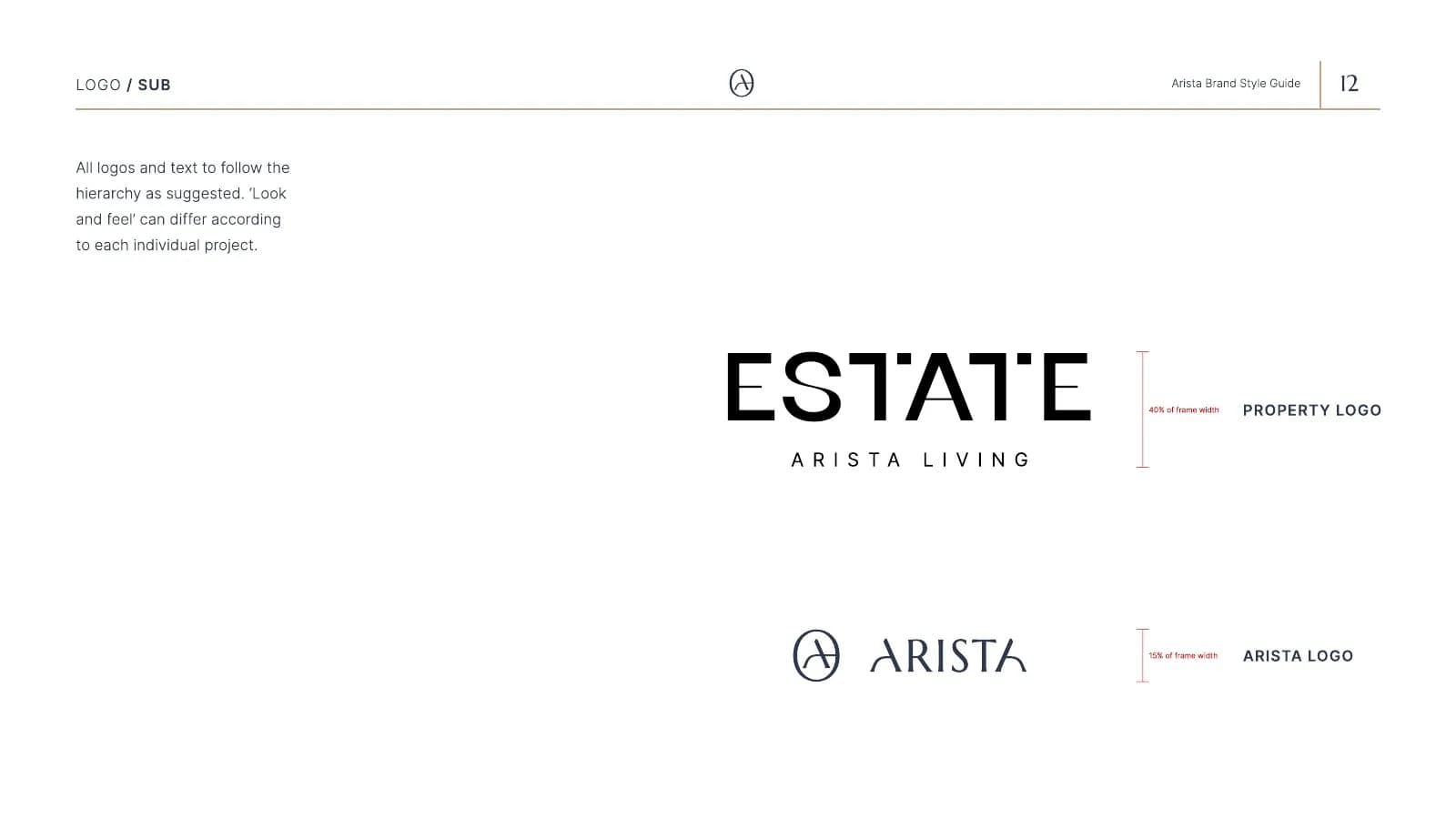
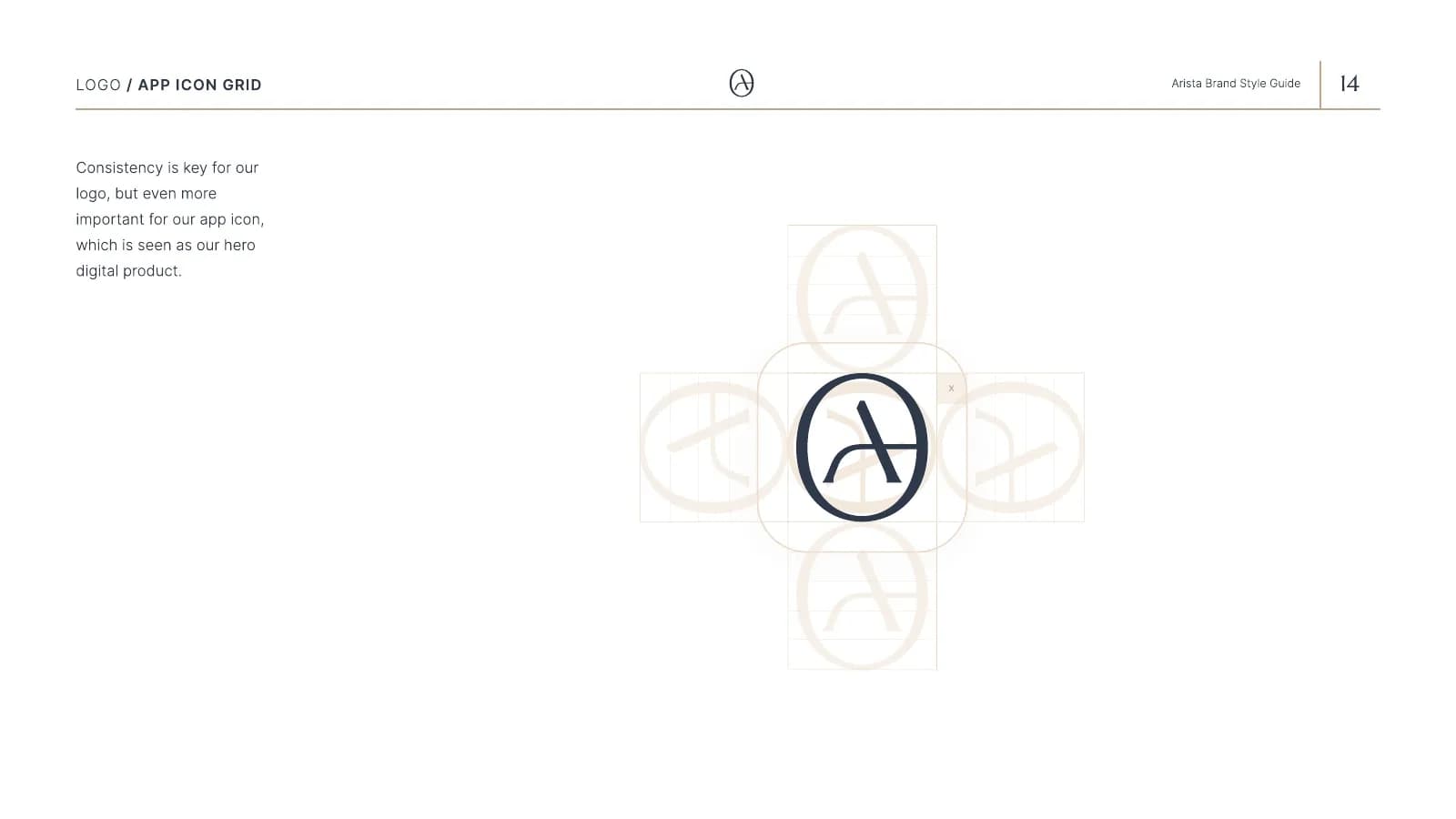
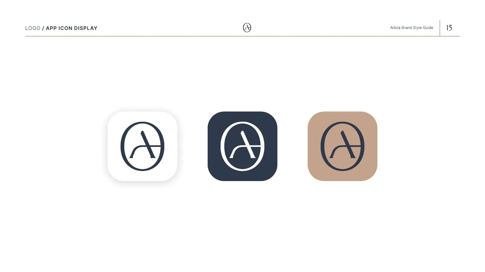
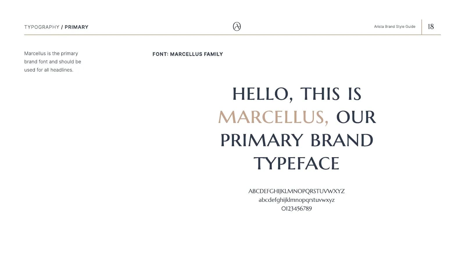
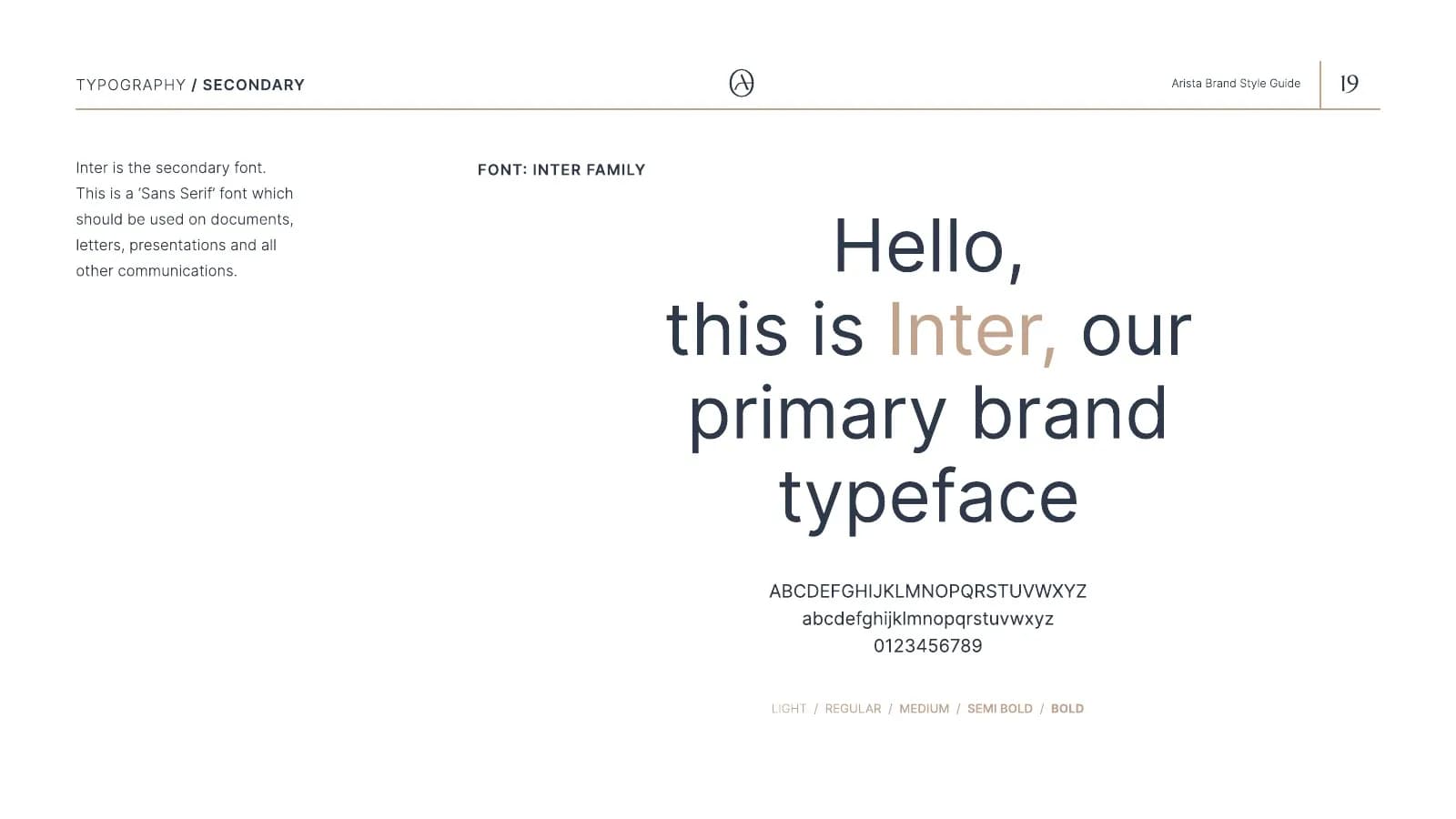
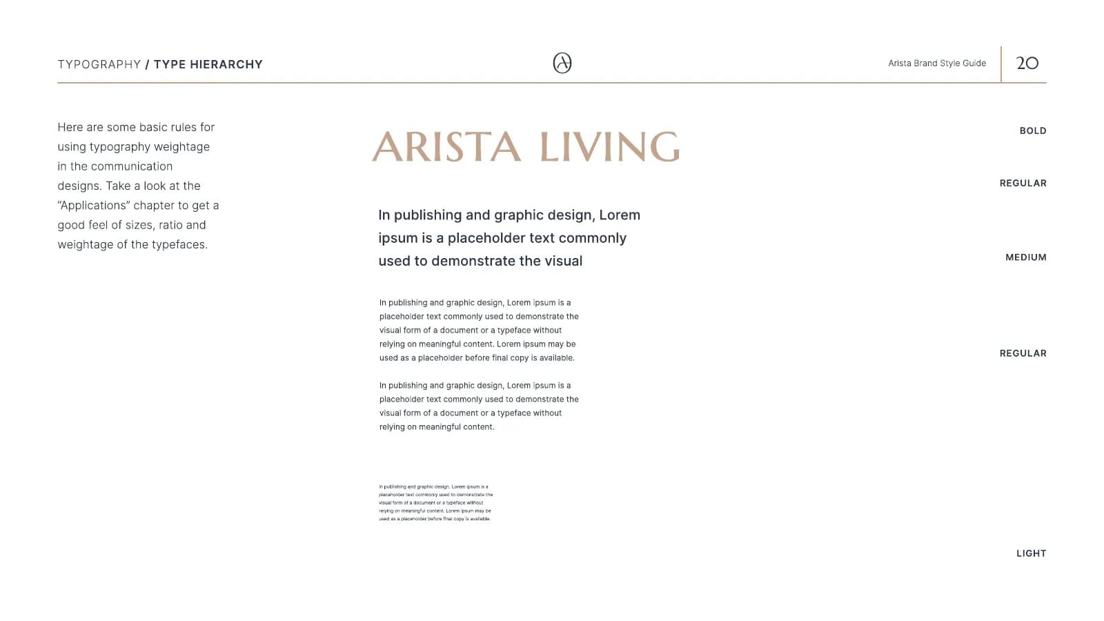
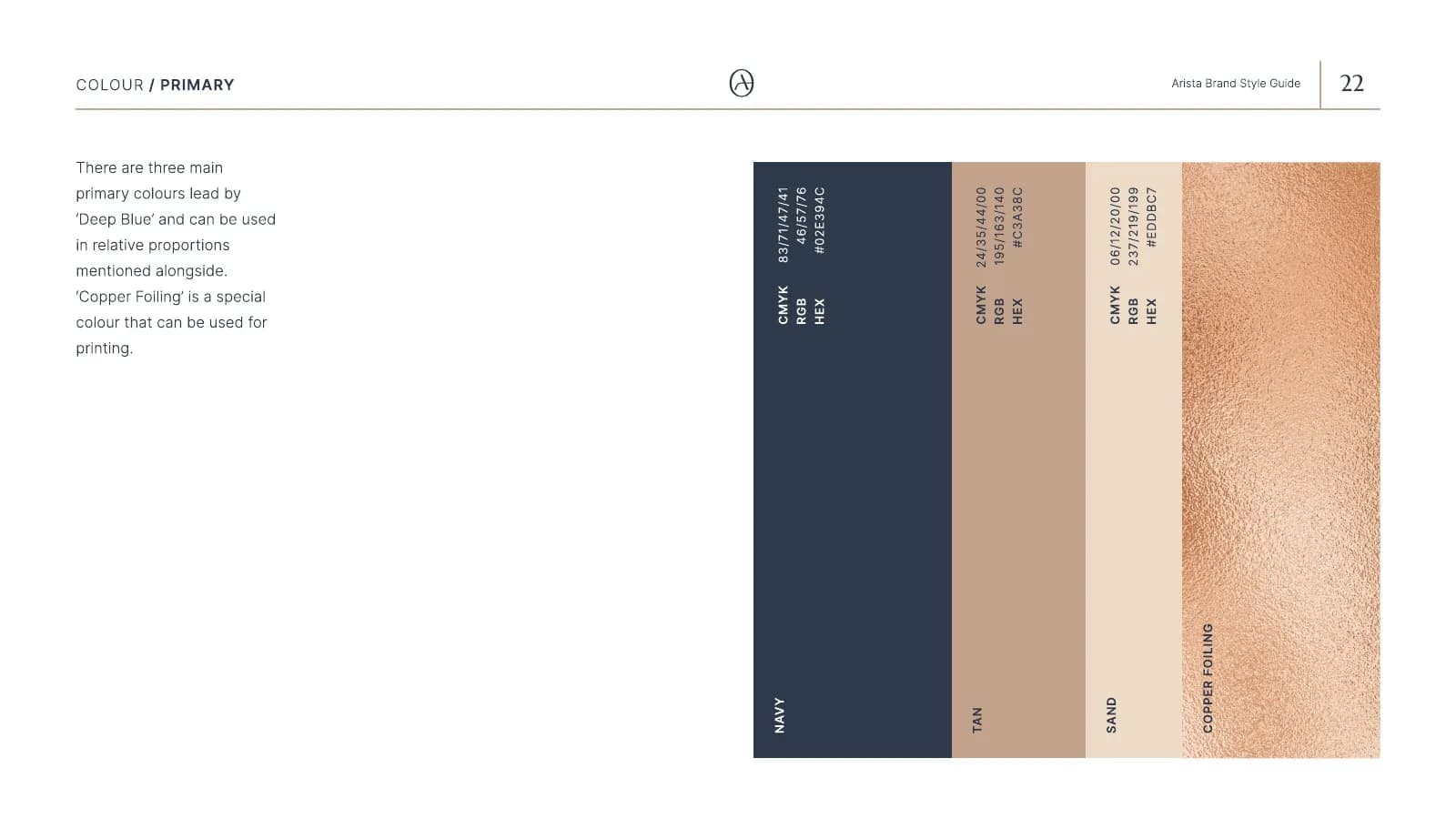
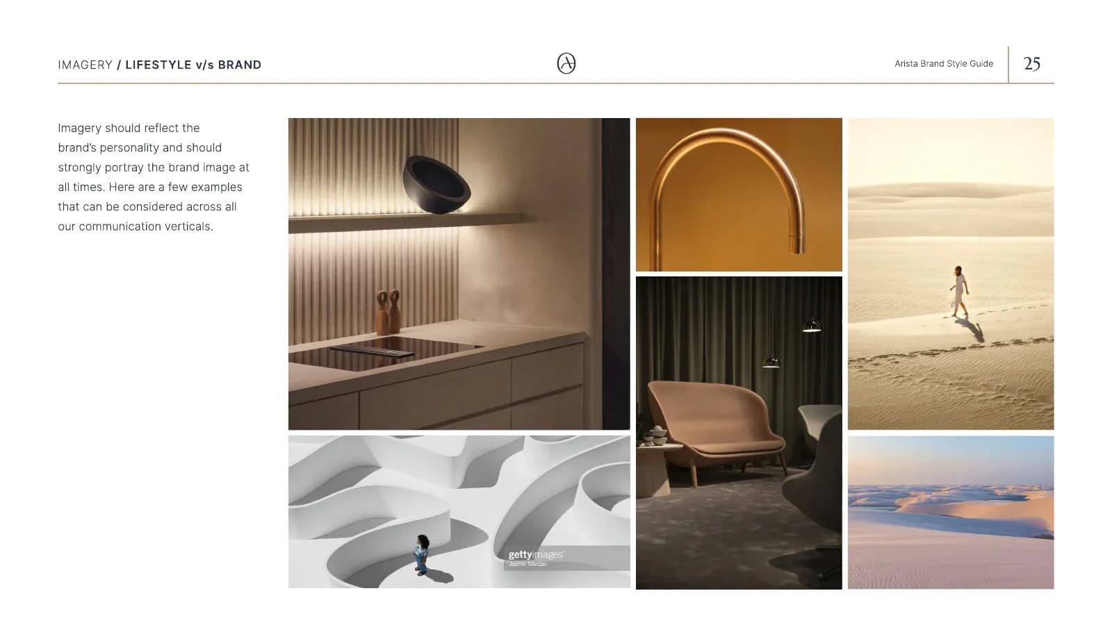
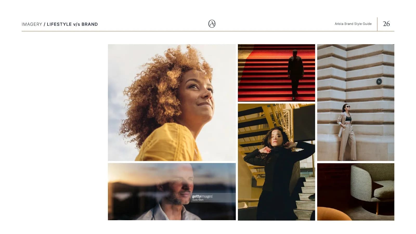
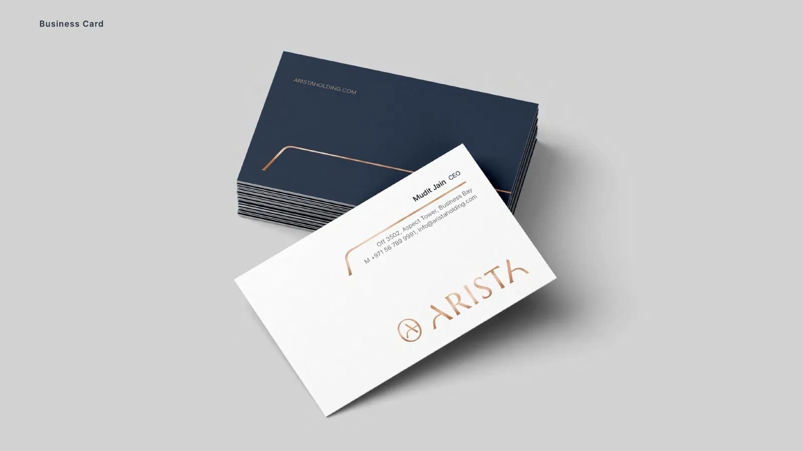
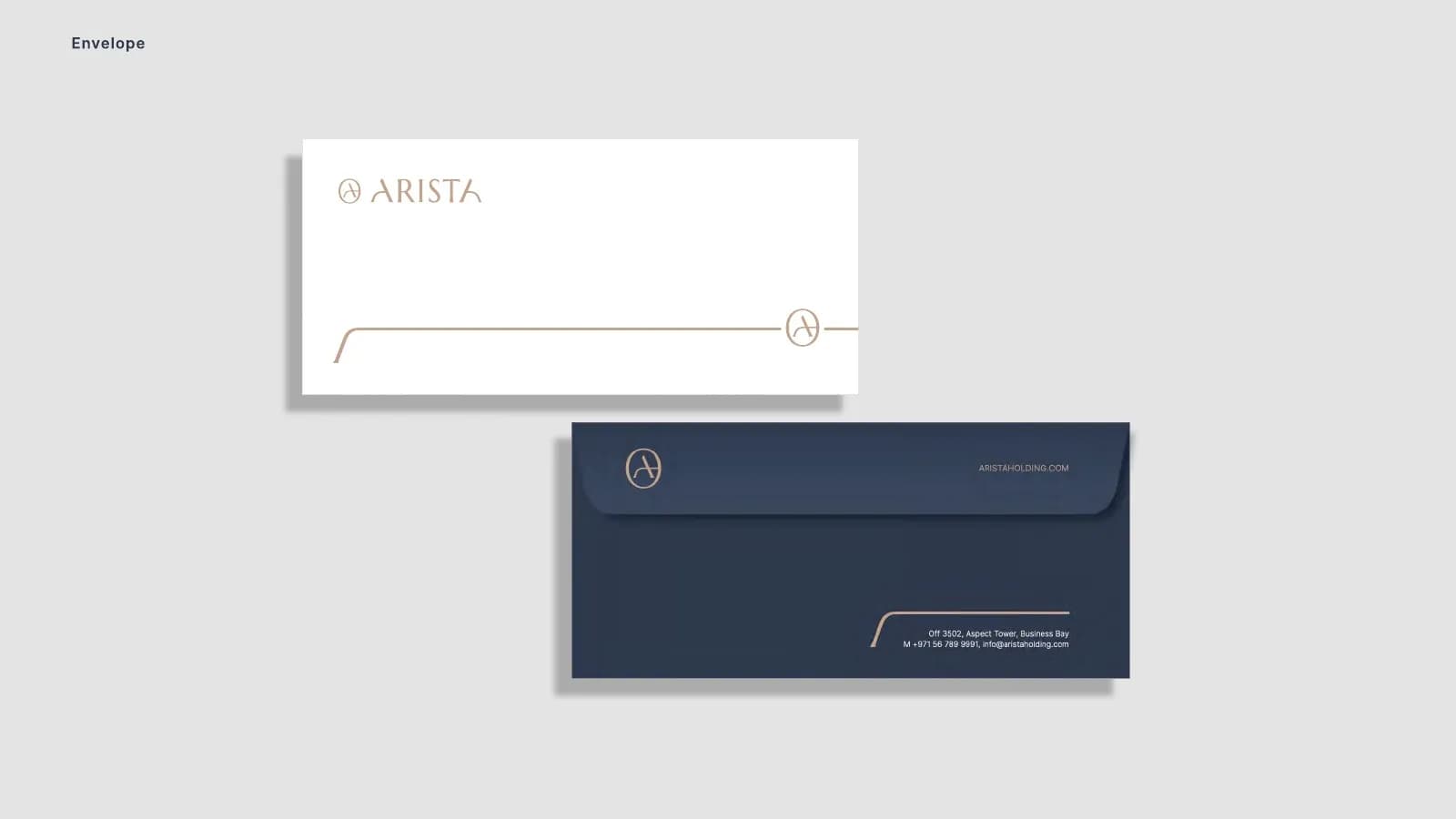
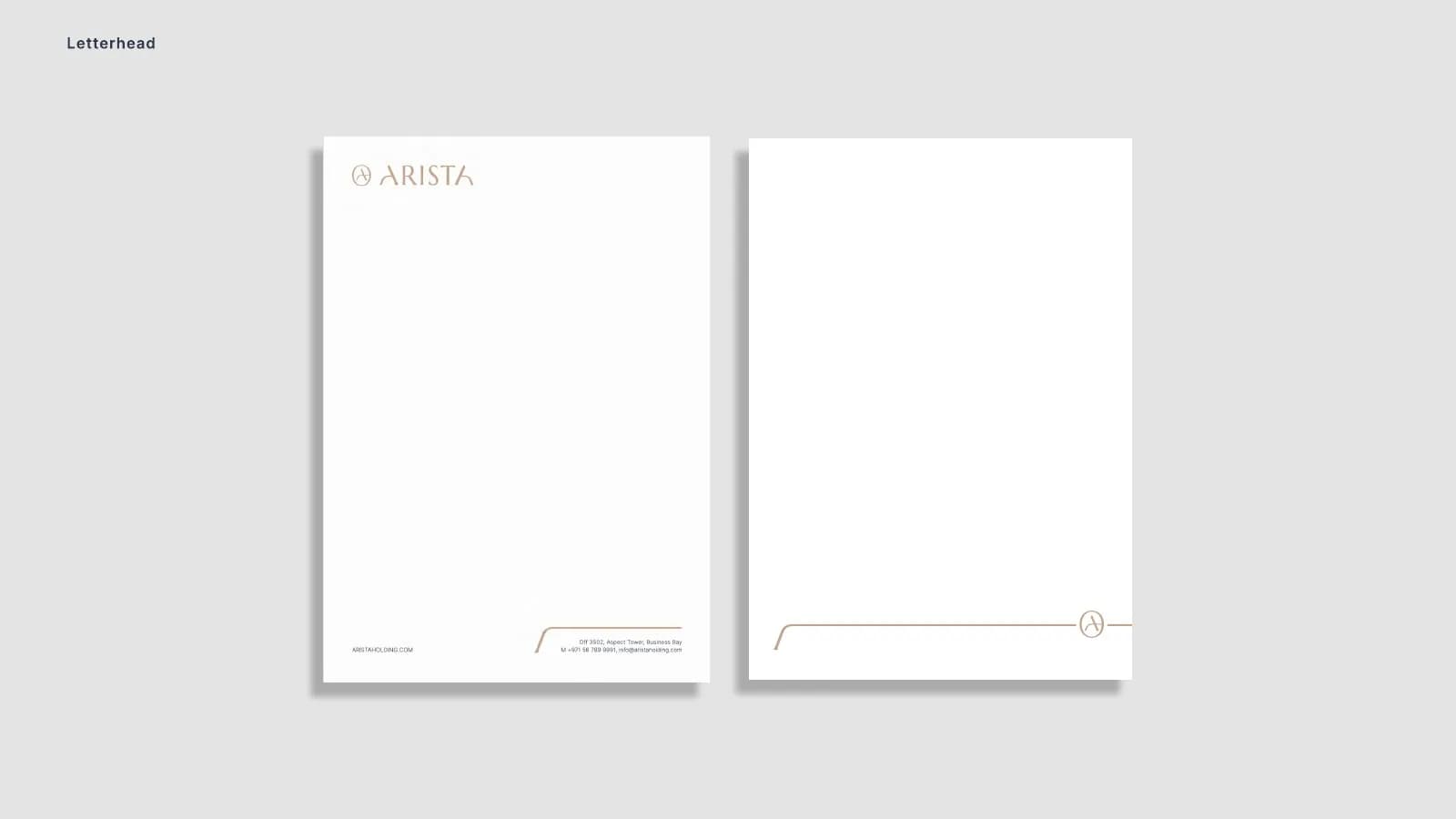
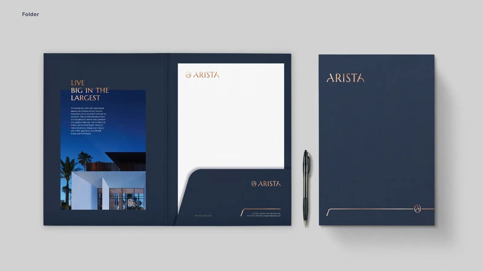
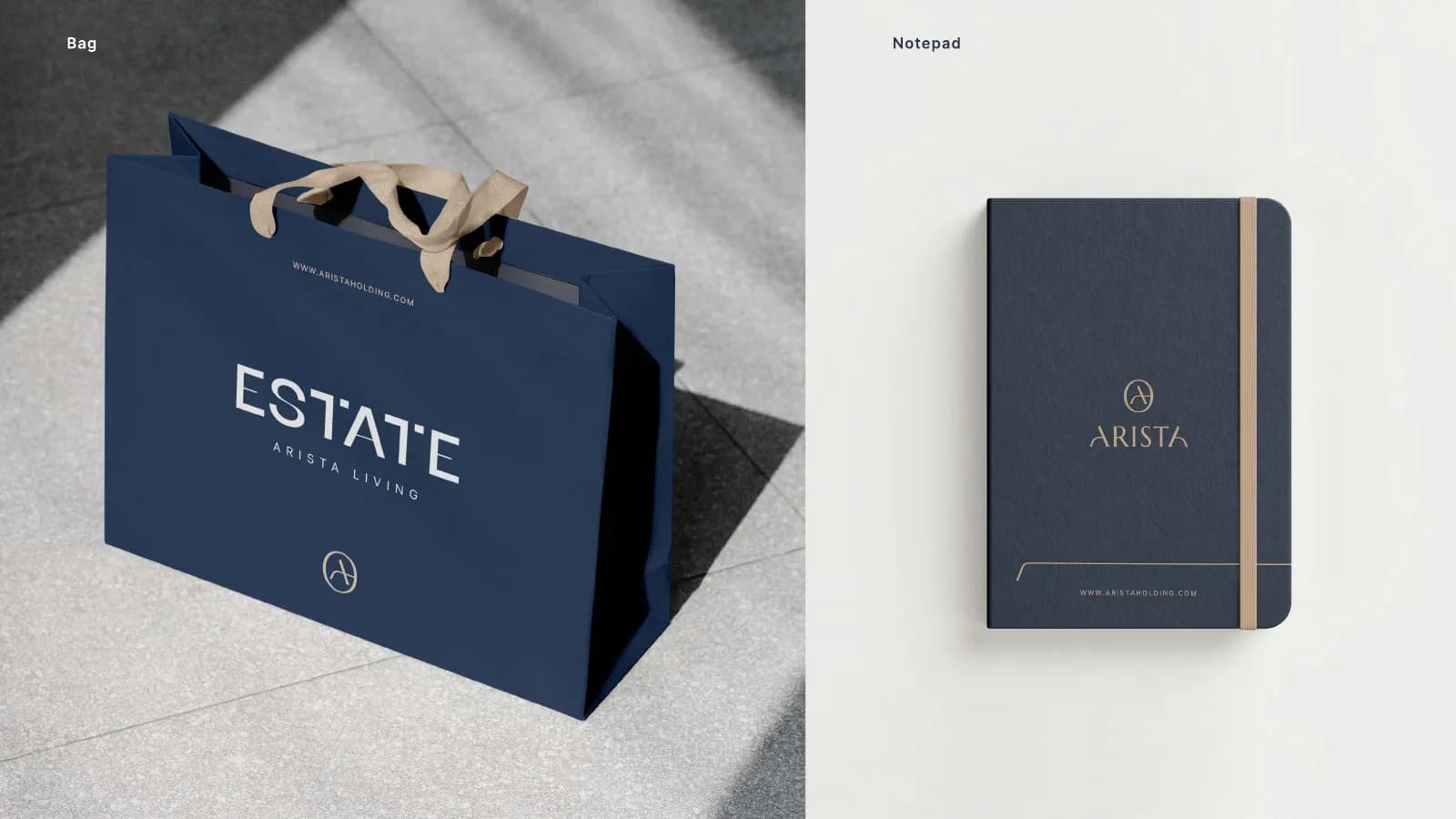
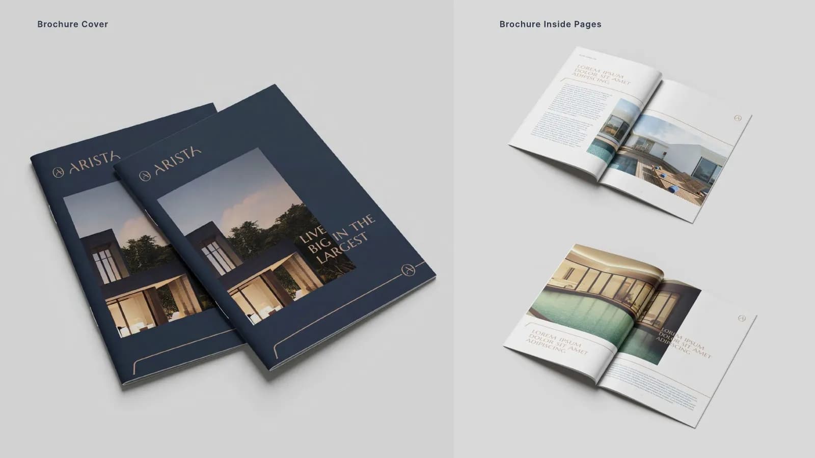
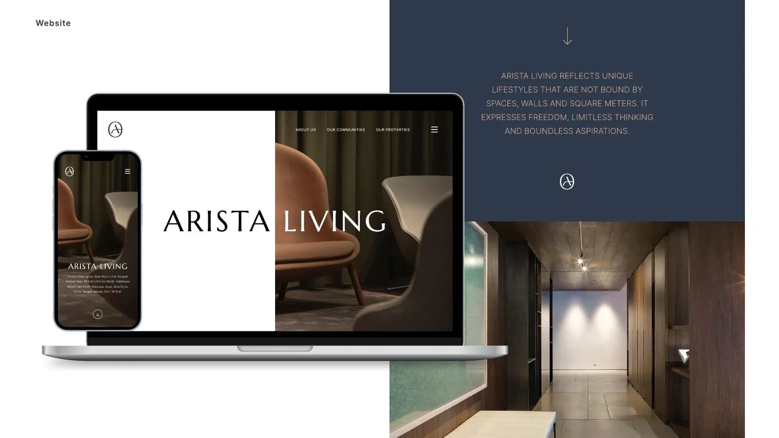
A circular A monogram and a wide, airy wordmark set the tone, with an Estate sub-brand for developments. Deep navy and warm sand run through everything. Marcellus handles headlines, Inter handles reading, and the photography sticks to soft light and natural materials.
What I delivered
- Primary logo, monogram and Estate sub-brand
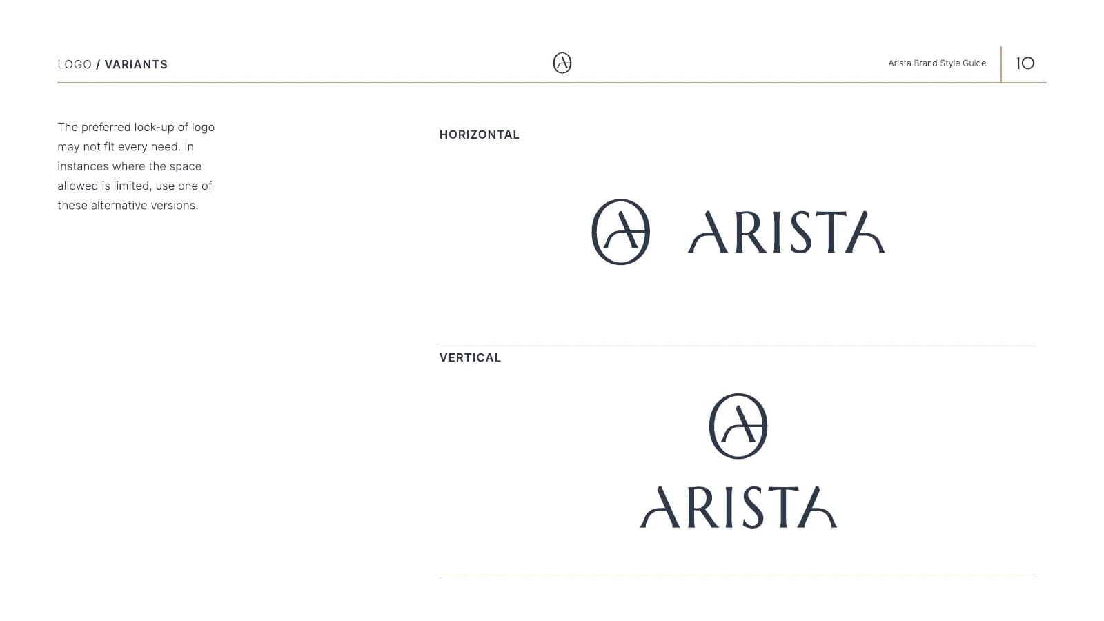
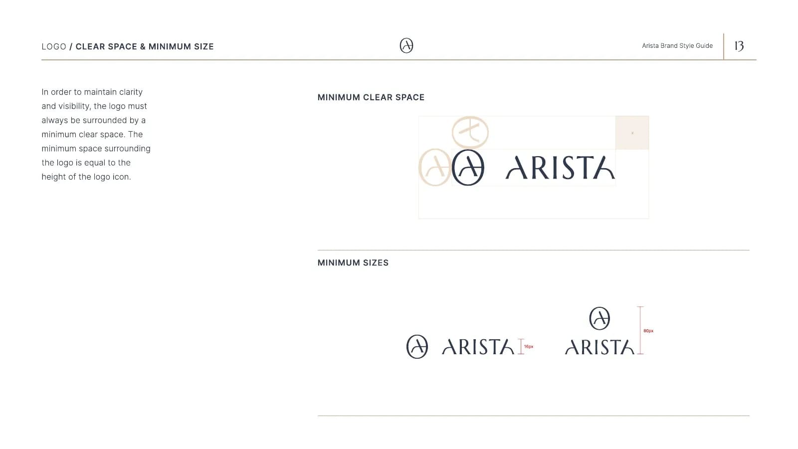
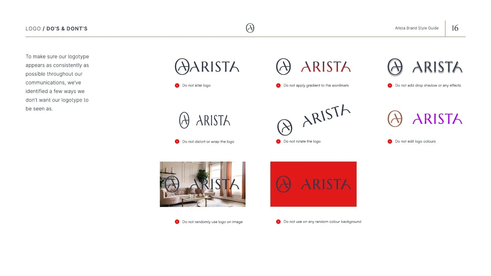
- Lock-ups, clear space and misuse rules
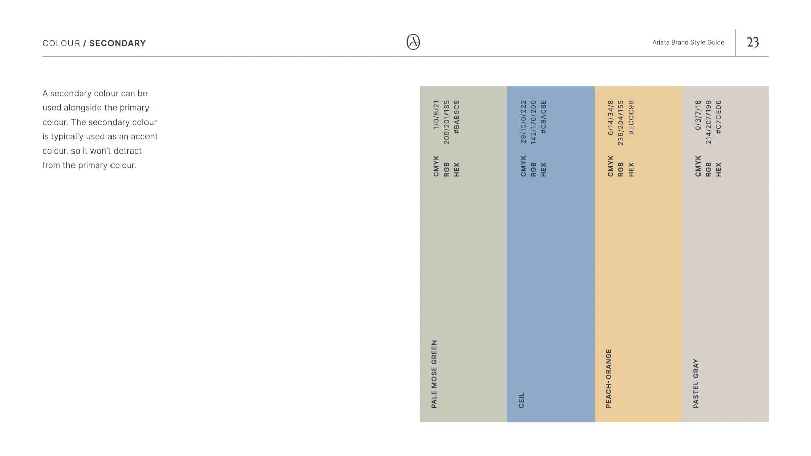
- Navy and sand color system
- Typography (Marcellus / Inter)
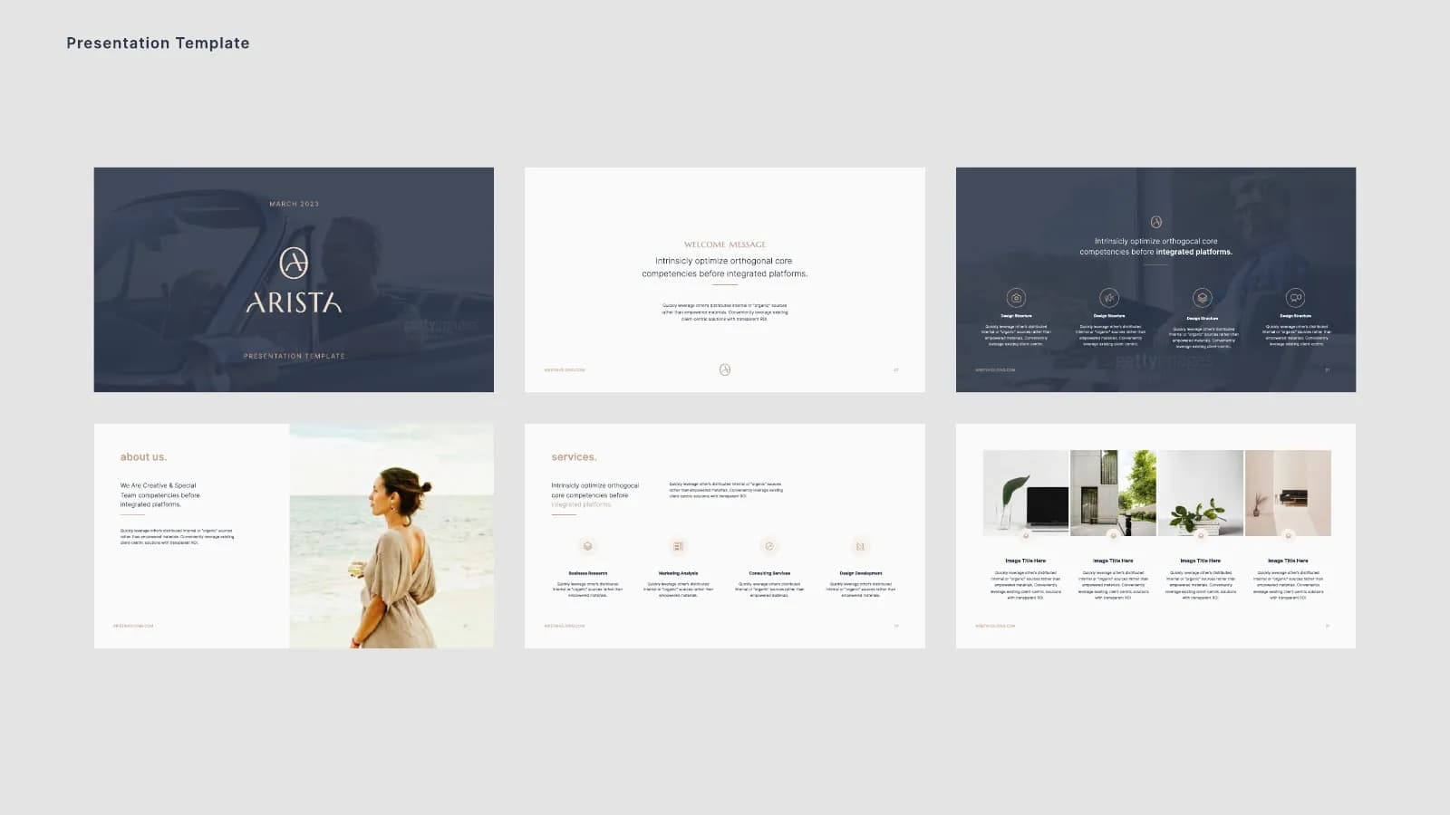
- Imagery and art direction guidelines
- Business cards, letterhead, envelopes and folders
- Shopping bags, notebooks and brochures
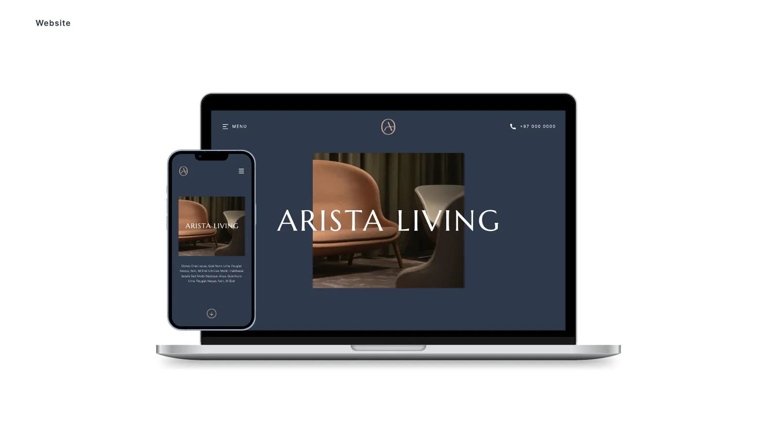
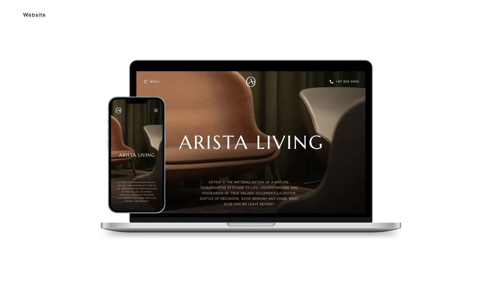
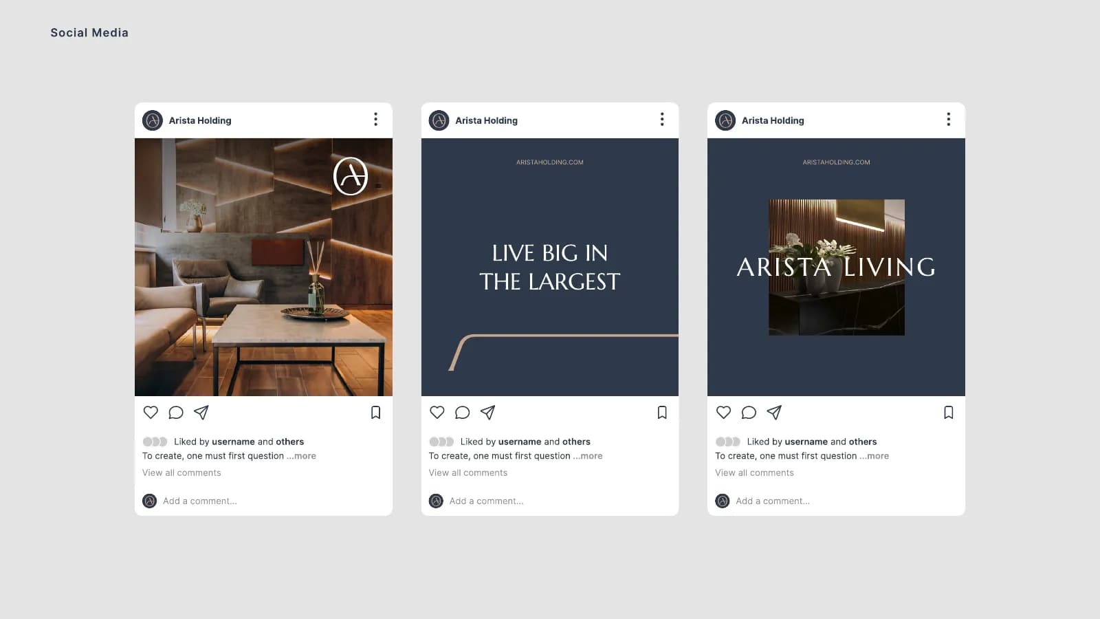
- Website and social media templates
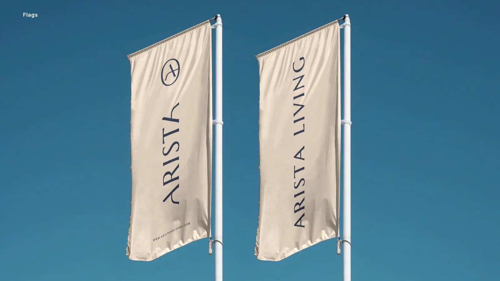
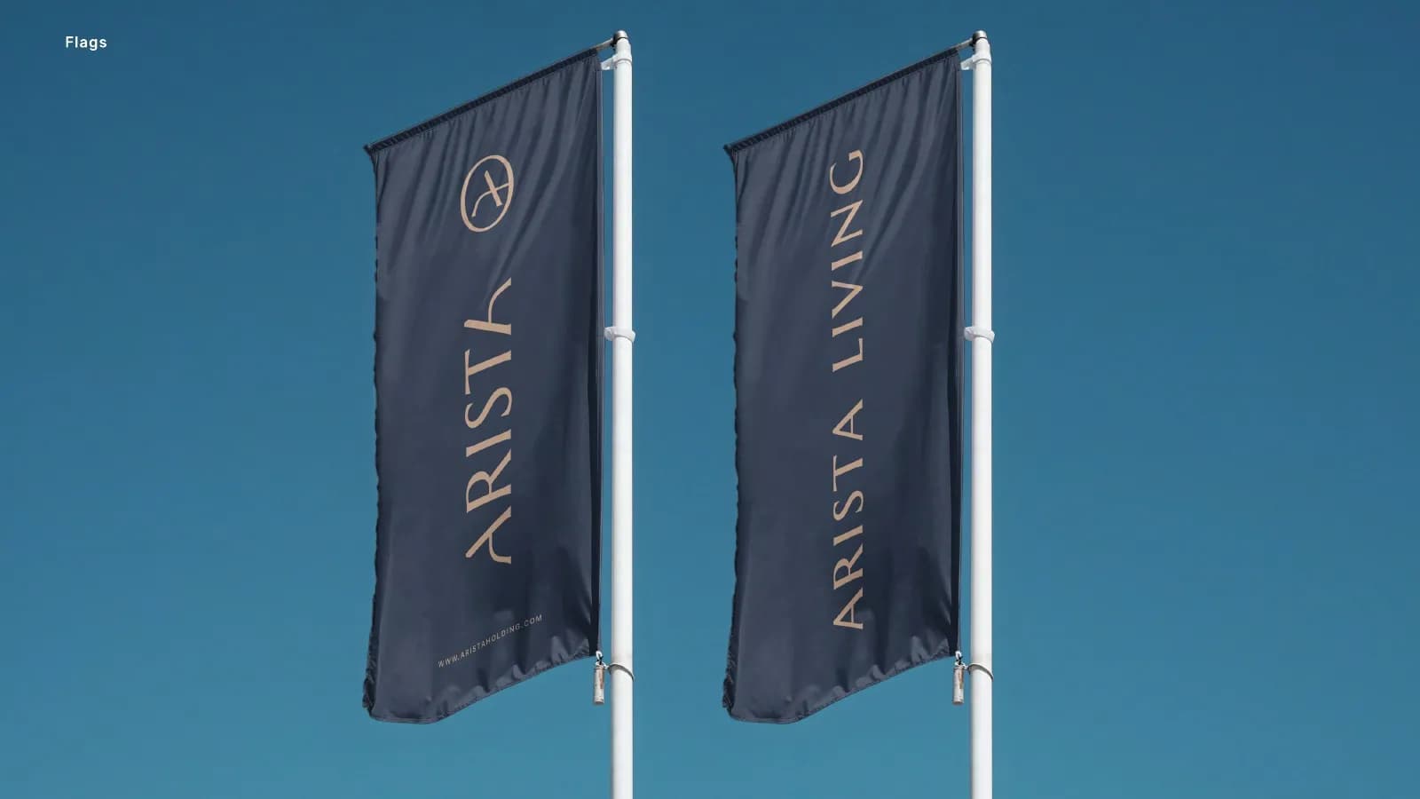
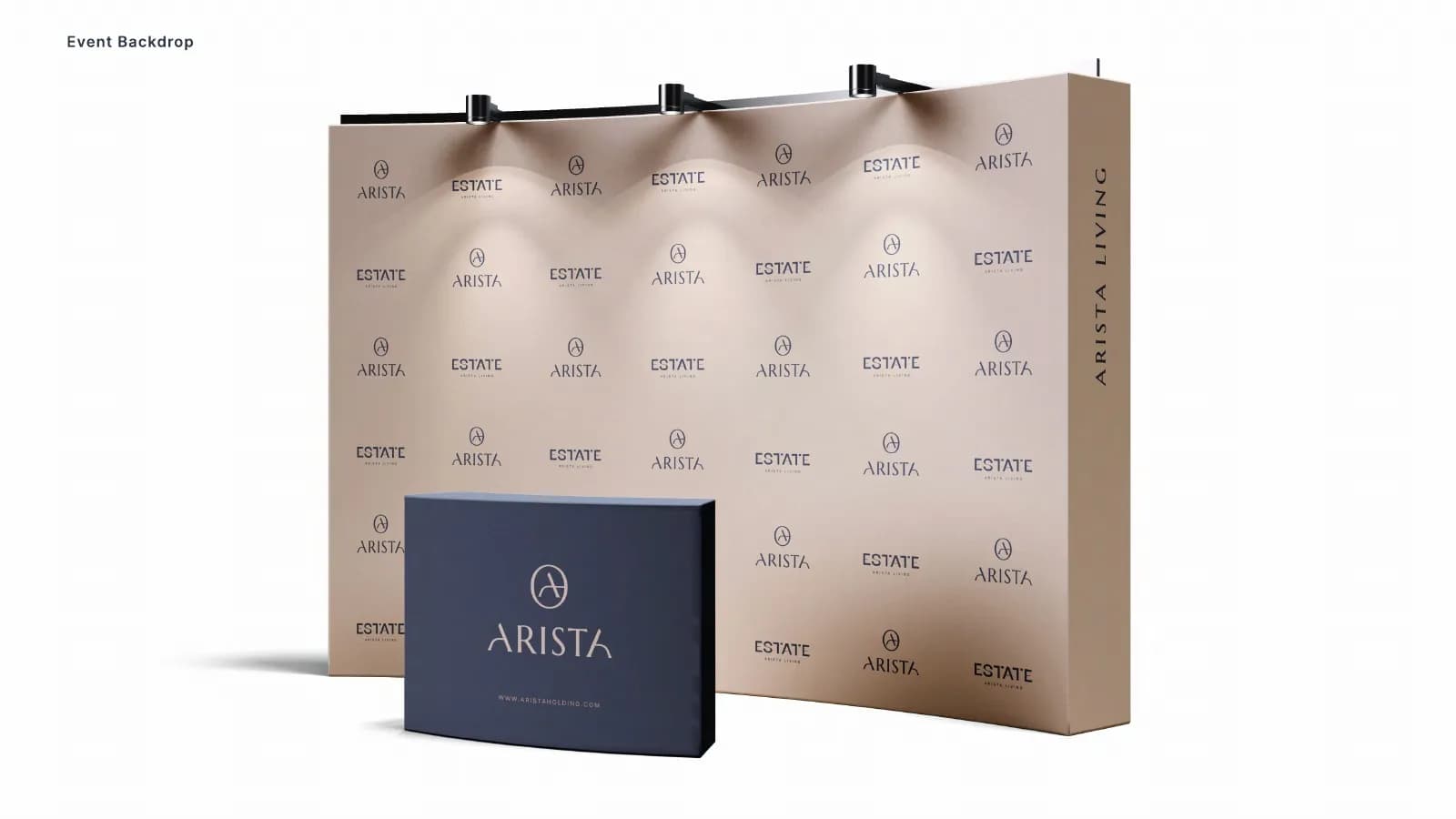
- Vehicle livery, flags and event backdrop
Where it landed
A 45-page style guide the Arista team, agents and suppliers can follow, so everything from the first viewing to the handover looks like one brand.
[RESULT: add a result you can share, like a launch date, a sales or engagement lift, or a client quote]
Need the same for your brand? See what’s included in brand identity systems and how pricing works.
The full project45 images




Next project
Aurexon Construction
Brand Identity · Construction & Real Estate