
Verdia Organic Skincare
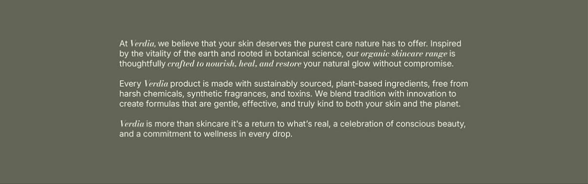
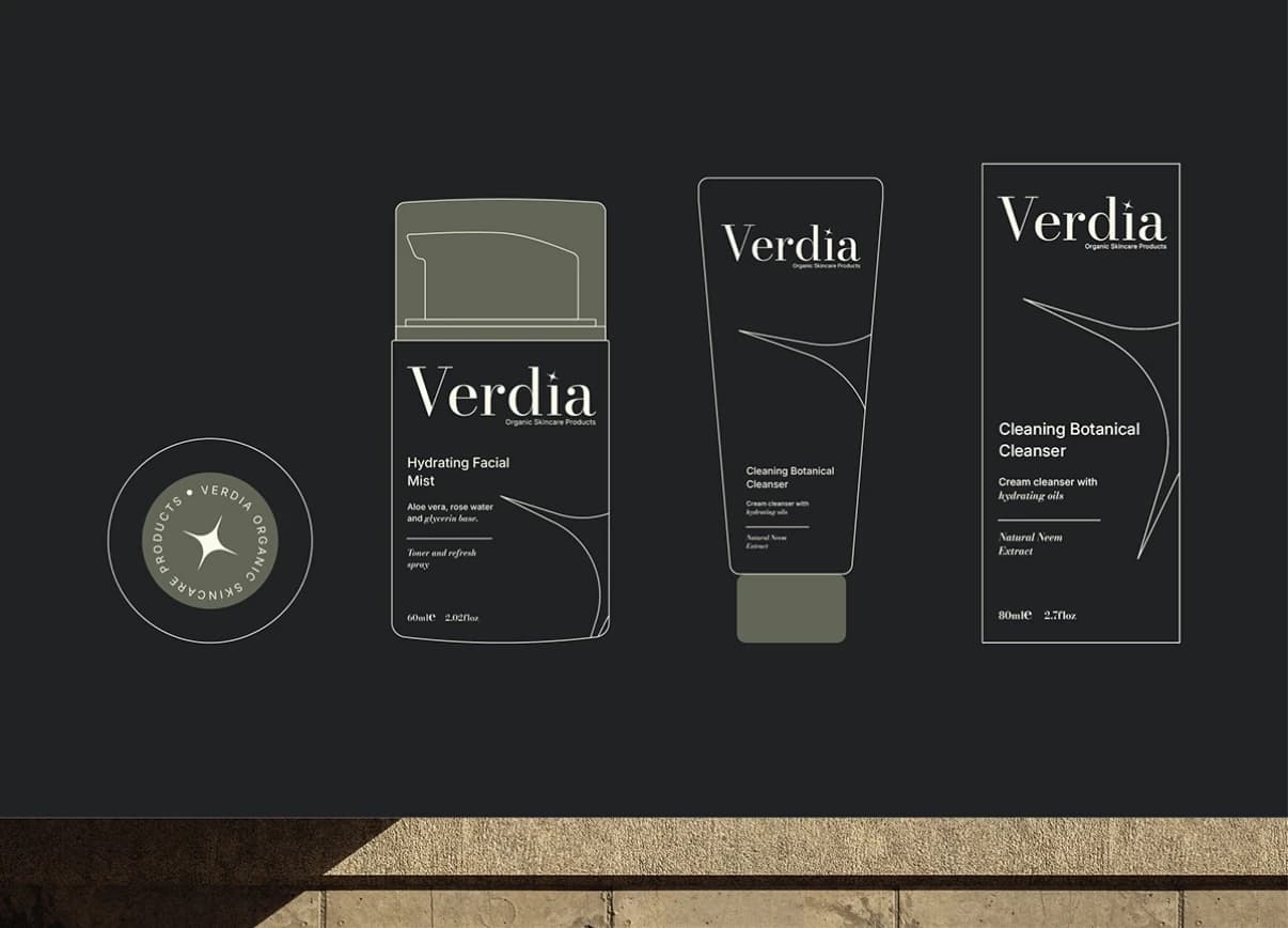
An organic skincare identity built on a serif wordmark, a four-point spark mark, cream, near-black and sage colors, and packaging across cleanser, serum and mist.
What the brand needed
Organic skincare tends to split into two camps: crunchy and homemade, or so clinical it forgets to feel good. Verdia needed a brand that reads as premium and botanical at once, credible enough for a pharmacy shelf and warm enough for a bathroom counter.
How I approached it
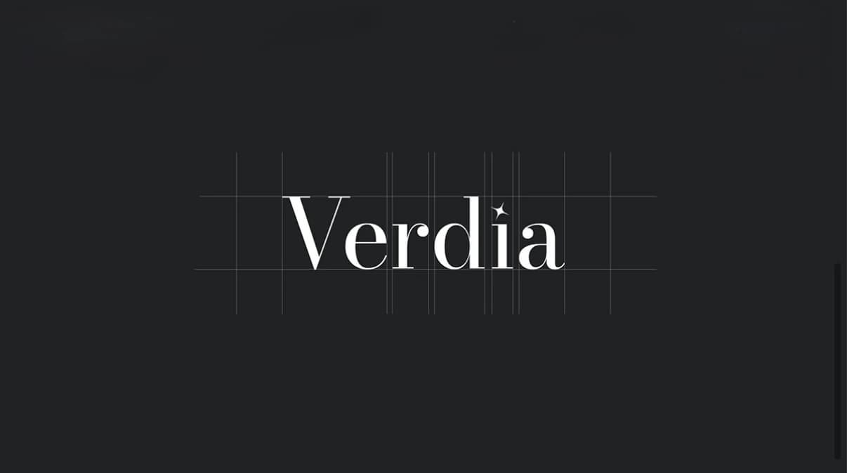
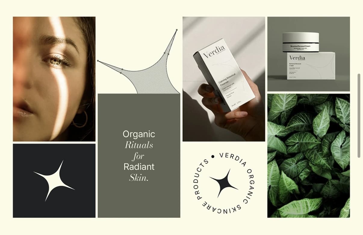
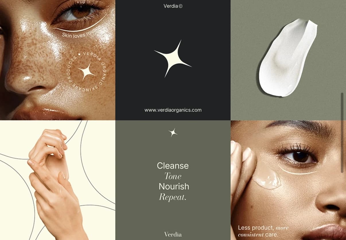
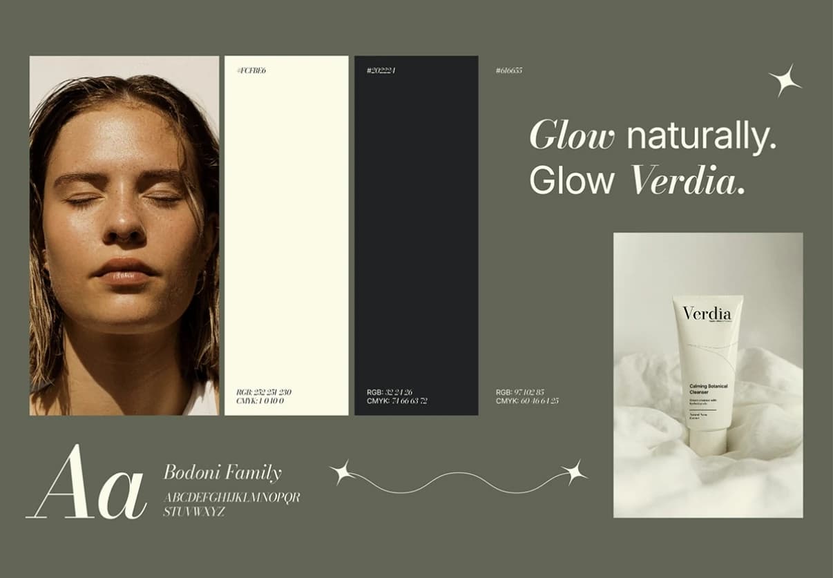
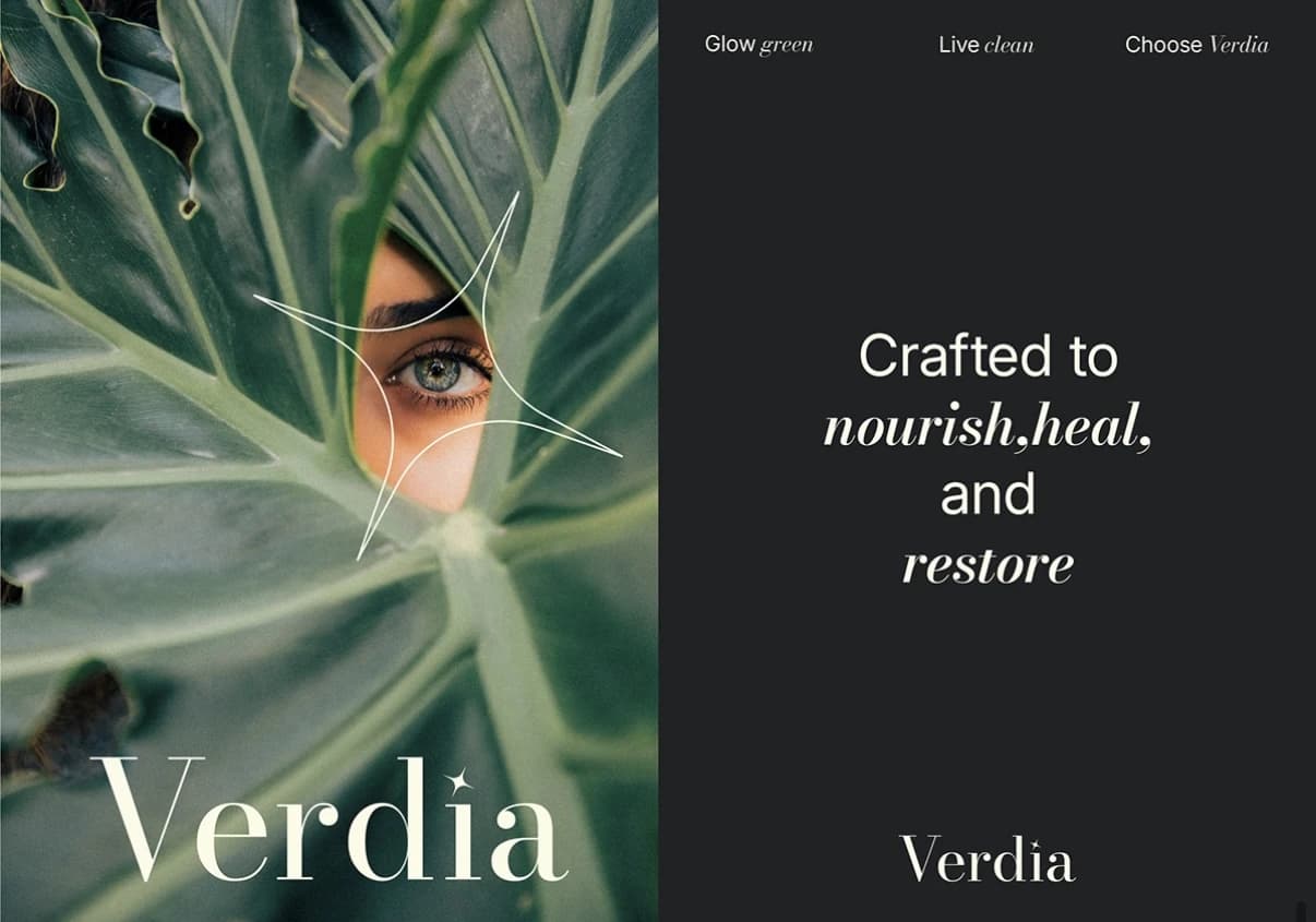
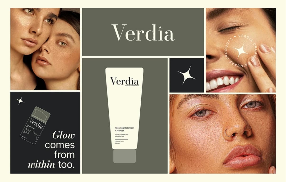
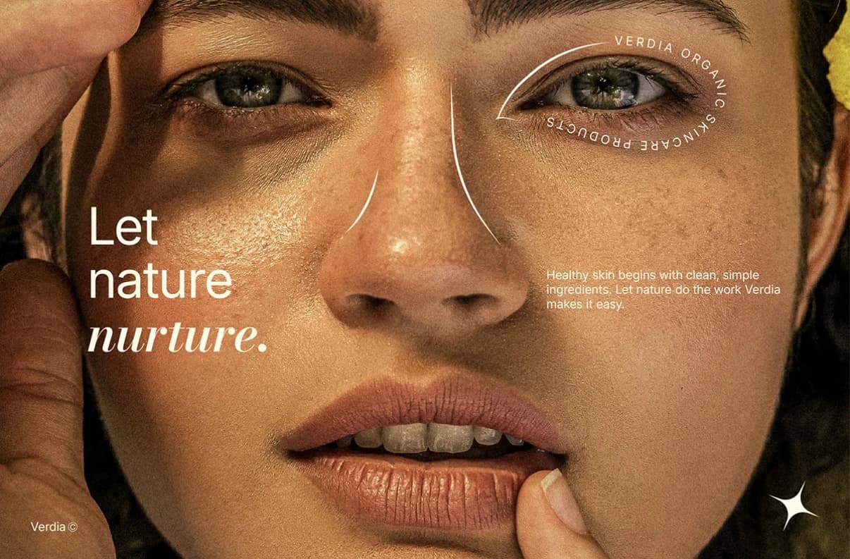
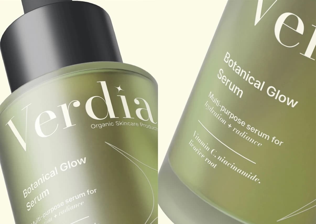
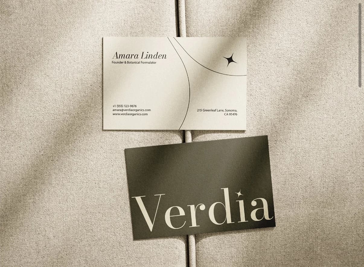
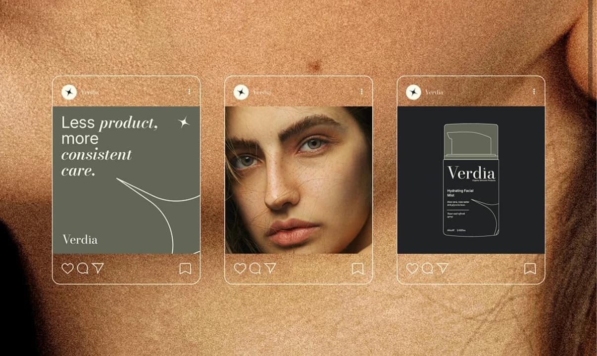
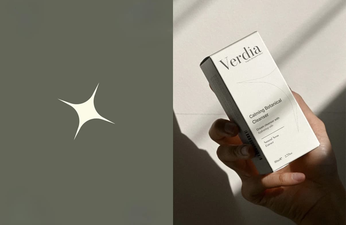
A Bodoni-based wordmark carries the weight of an apothecary label, with a four-point spark standing in for the small moment of glow the products promise. Cream, near-black and a muted sage rotate across packaging, campaign and social so the range reads as one family from a shelf away. Editorial photography of skin, leaves and hands keeps the science-forward color palette from feeling cold.
What I delivered
- Logotype, spark mark and monogram seal
- Color palette (cream / near-black / sage) with RGB and CMYK specs
- Typography (Bodoni family)
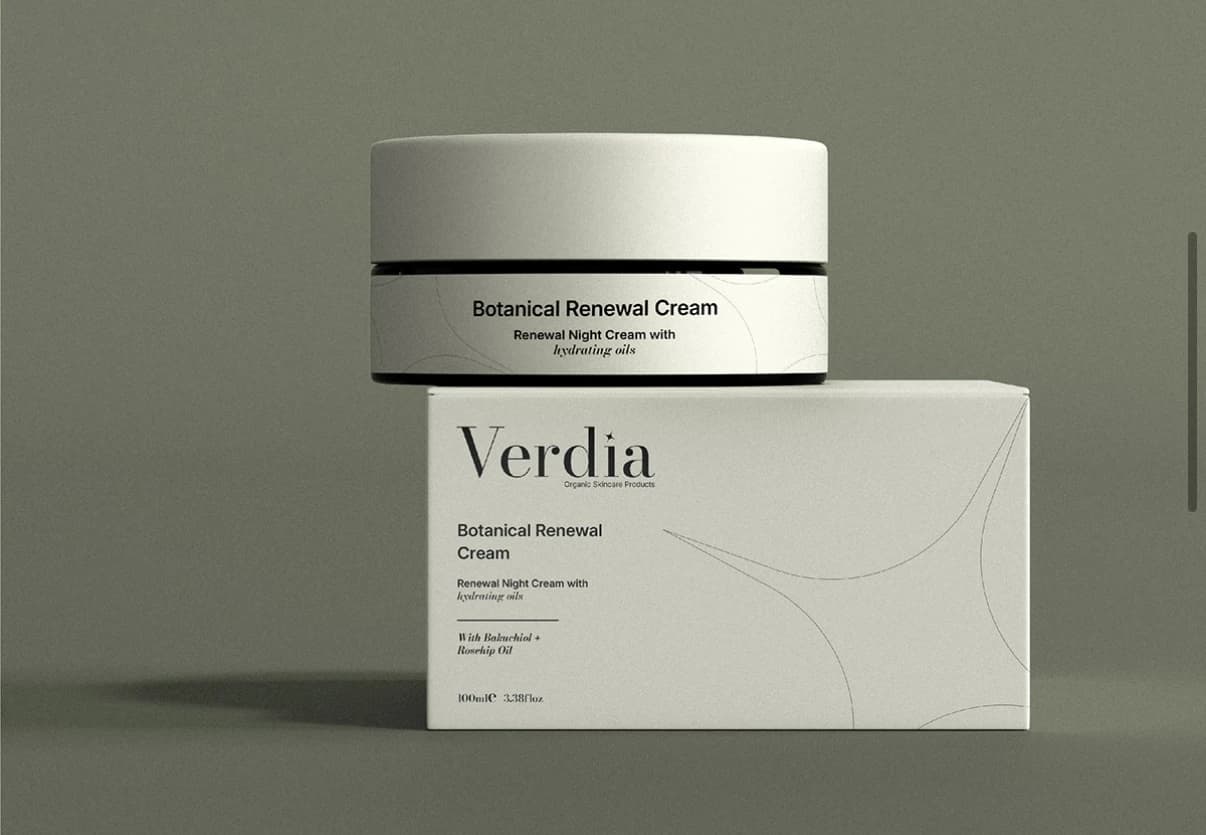
- Cleanser tube and carton, serum bottle, facial mist packaging
- Business cards and stationery suite
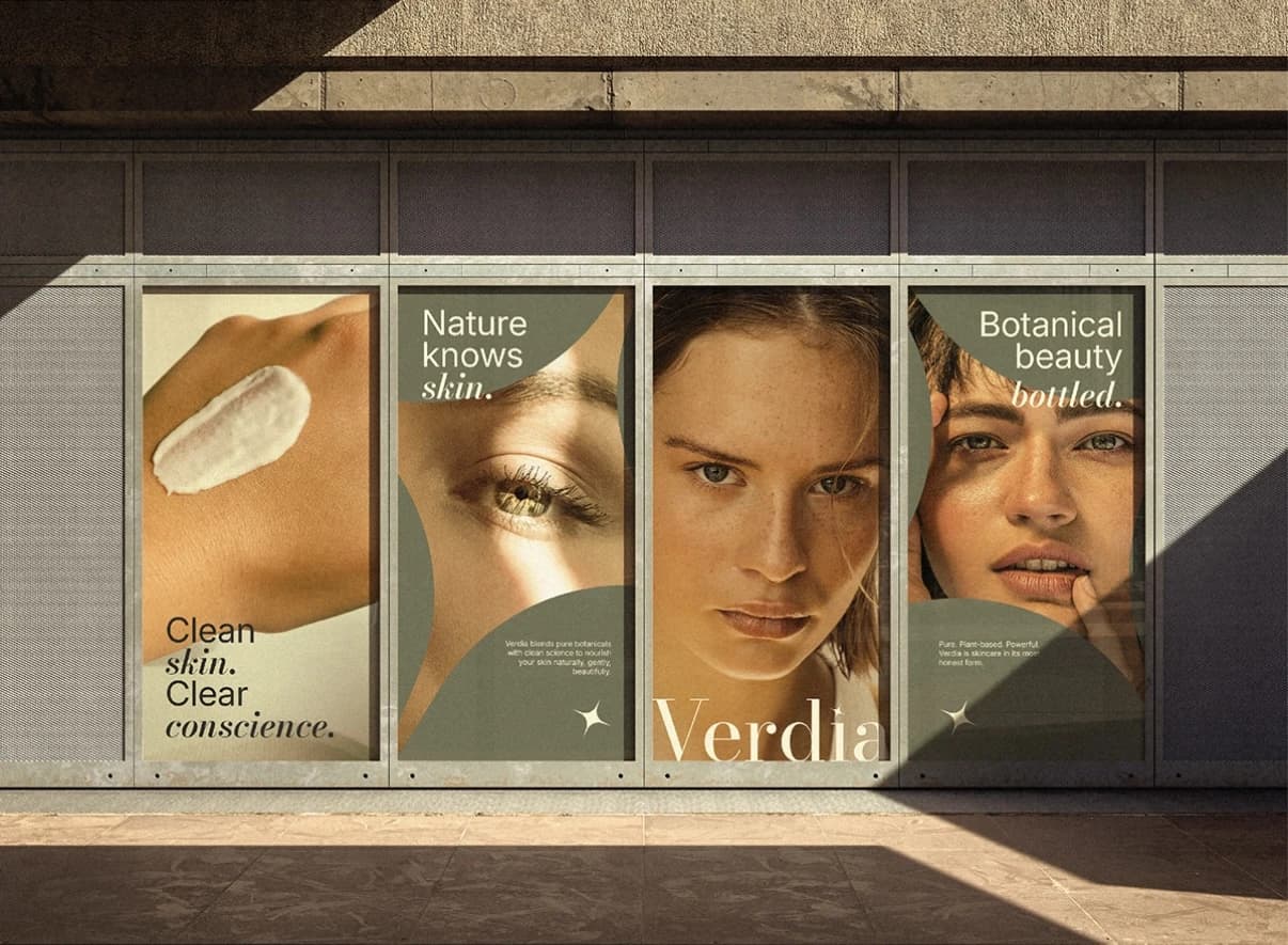
- Campaign posters and storefront signage
- Social media templates
Where it landed
A full guideline set covering packaging, print and digital, so every Verdia touchpoint shares the same restrained, botanical look.
Need the same for your brand? See what’s included in brand identity systems and how pricing works.
The full project15 images


Next project
Arista Living
Brand Identity · Construction & Real Estate