
Aurexon Construction
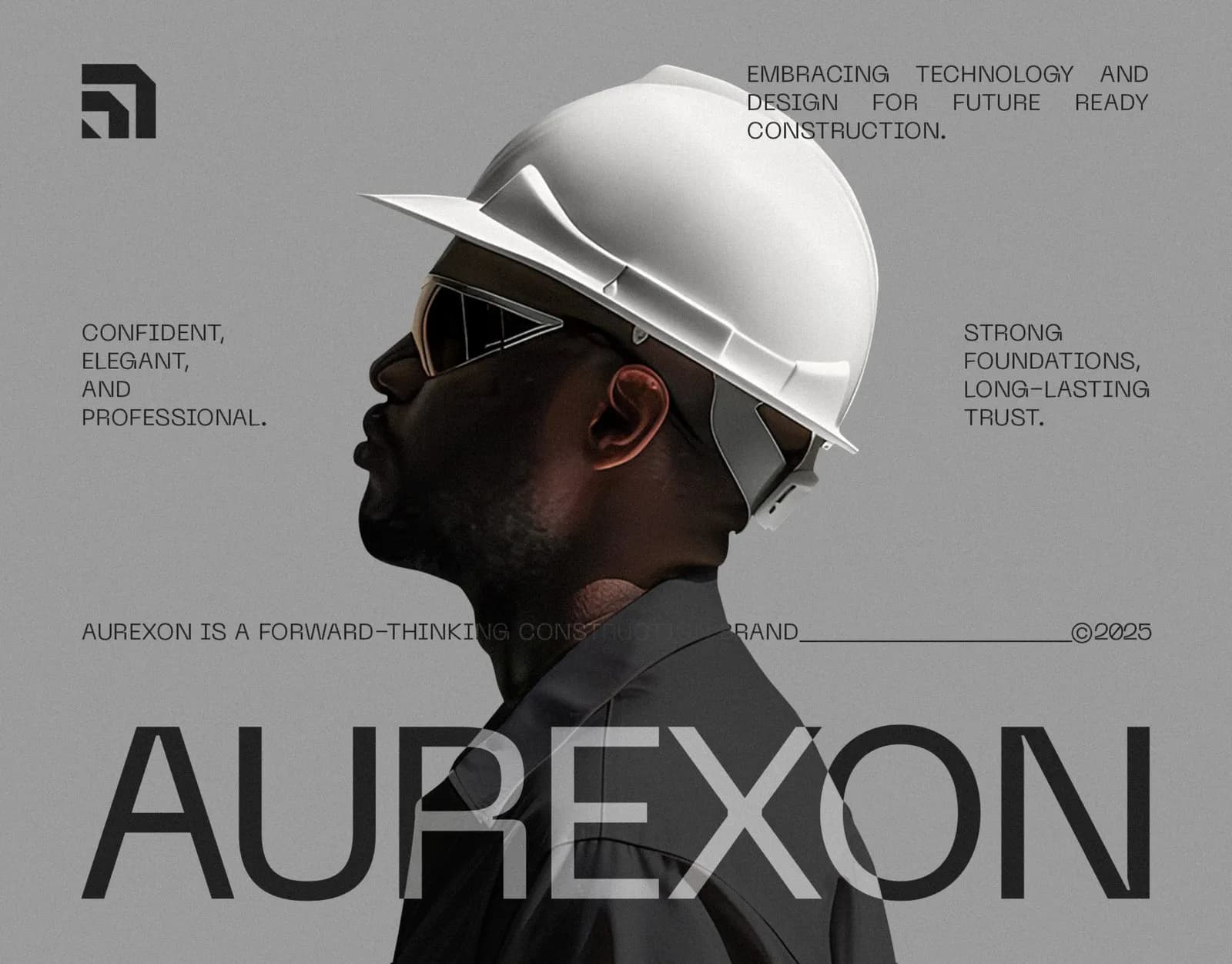
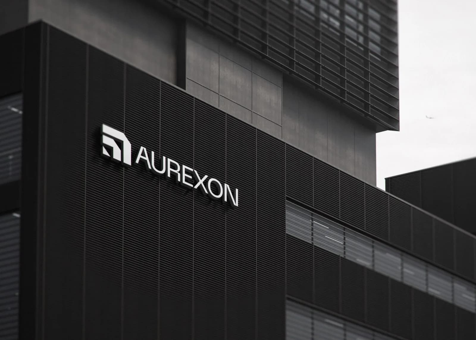
A black-and-white identity for a construction firm, from the logo grid to building signage, site workwear and a full guideline book.
What the brand needed
Construction runs on trust, and most construction brands still look like a clip-art hard hat. Aurexon wanted to come across as a modern engineering company that big developers take seriously, not a local contractor.
How I approached it
The mark comes from architectural geometry on a strict grid, so it works cast in metal on a facade or shrunk to an app icon. Neue Machina and Neue Haas Display sit inside an all-monochrome system. Photography is the only thing that adds warmth.
What I delivered
- Primary logo, monogram and construction grid
- Monochrome color system
- Typography scale (Neue Machina / Neue Haas Display)
- Business cards, letterhead and ID badges
- Building signage and site hoarding
- Workwear, hard hats and lanyards
- Social templates and billboards
- App icon and website direction
Where it landed
21 pages of guidelines, so sign makers, printers and developers all work from the same reference.
[RESULT: add a result you can share, like a launch date, a sales or engagement lift, or a client quote]
Need the same for your brand? See what’s included in brand identity systems and how pricing works.
The full project2 images

Next project
KAE Hair Care
Brand Identity · Beauty & Personal Care