Brand guidelines7 min read
The 7 things every brand guidelines document must include
Your social media designer, your VA and your developer are all guessing. Here’s the rulebook that stops the guessing, section by section.
Javeria Hareem
Logo & Brand Designer, founder of Jayy Studio
In this article
Every time someone new touches your brand without a guidelines document, they’re making it up.
That sounds harsh, so let me be specific. Think about who works on a growing brand in an ordinary month. The freelancer who designs your Instagram posts. The VA putting together a pitch deck the night before a meeting. The developer you asked to “just refresh the homepage”. A new team member building a sales presentation from an old one they found in a shared drive.
Every one of them makes dozens of small decisions about your logo, your colours and your fonts. None of them has anything to check those decisions against. So they guess, and every guess is a little different from the last.
Small inconsistencies add up faster than you’d think
One off-brand post won’t sink a business. The trouble is how they accumulate. The logo gets squashed to fit a banner. Your green drifts towards teal because someone picked it by eye from a screenshot. A deck uses a font that’s close to yours but not quite. On their own, nobody would notice any of these. Together, they make a brand feel slightly unsure of itself.
Premium clients pick up on that feeling even when they couldn’t tell you what’s causing it. When your proposal, your website and your LinkedIn banner look like they came from three different companies, it plants a small doubt about how carefully you’ll handle their project. That doubt is hard to win back on a sales call.
None of this is your team’s fault, by the way. It’s a system problem. Or more accurately, it’s what happens when there isn’t a system at all.
What a guidelines document actually does
A brand guidelines document is the rulebook that keeps your brand looking exactly the same, whoever is holding the pen. Whether you designed the thing or someone else did. Whether it’s going on Instagram or into a boardroom deck. Whether it’s being made this week or three years from now by someone you haven’t hired yet.
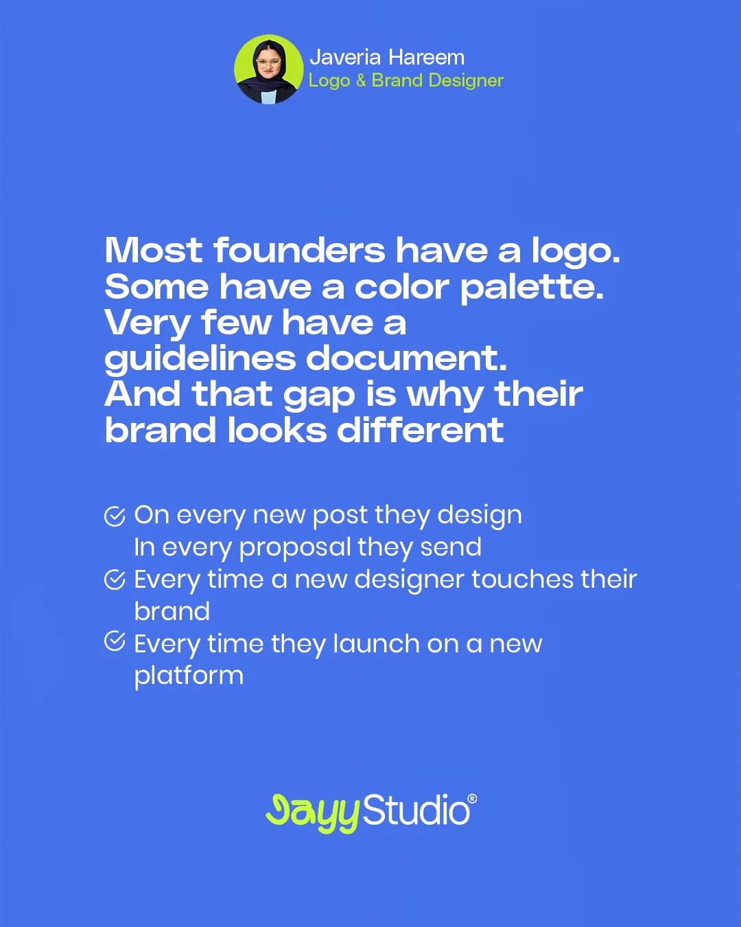
Most founders I talk to have a logo. Some have a colour palette saved somewhere. Very few have a proper guidelines document, and that gap is exactly why their brand looks different on every new post, in every proposal they send, every time a new designer touches it, and every time they launch on a new platform.
Here are the seven sections a proper one needs. If you only have two or three of them, that’s normal, and it’s also where the drift is coming from.
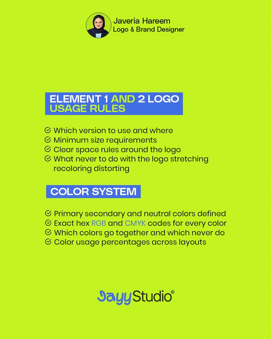
1. Logo usage rules
Your logo almost certainly exists in more than one version: the full lockup, a stacked version, the symbol on its own, maybe a single-colour version for print or embroidery. The guidelines need to say which version goes where, so nobody puts the wide lockup into a tiny square profile picture.
Then come the practical limits. What’s the minimum size before the logo stops being readable? How much clear space does it need around it, so it isn’t crammed against a headline or the edge of a page? And, just as important, what should never happen to it: no stretching, no recolouring, no drop shadows, no putting it on a busy photo where it disappears. For Aurexon Construction we built the mark on a strict construction grid, which is what lets the same logo work cast in metal on a building and shrunk down to an app icon.
2. Colour system
“Our brand colour is green” isn’t a colour system. You need the exact codes for every colour: HEX for screens, RGB for digital work, CMYK for anything printed. Define which colours are primary, which are secondary and which are neutrals.
Then write down which colours go together and which never do, and roughly how much of each to use. A layout that’s mostly neutral with a small hit of your accent colour looks deliberate. The same accent splashed across the whole page looks loud. A simple usage split takes the guesswork out. The Cerevion supplement brand runs on seven colours with RGB, CMYK and HEX values written down, and each flavour gets exactly one accent. That’s why four different products still read as one family on a shelf.
3. Typography system
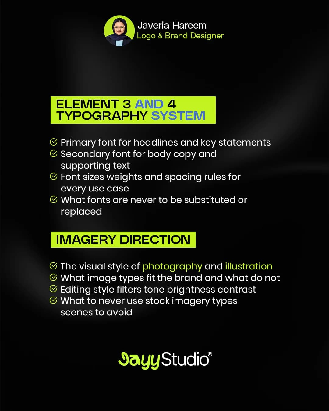
Name the primary font for headlines and key statements, and the secondary font for body copy and supporting text. Then go further than most guides do: set the sizes, weights and spacing for each job. A headline, a subheading, a paragraph, a caption and a button label shouldn’t be improvised every time.
The part people forget is substitution. Your brand font probably isn’t installed in Google Slides, Canva or your email client. If the guidelines don’t say which fallback to use, somebody will pick one, and it’ll be a different one every time. Say which fonts must never be swapped, and what to use when the real one isn’t available.
4. Imagery direction
Photos and illustrations say as much about your brand as your logo does, and they’re usually chosen in a hurry. Describe the visual style you want, which kinds of images fit and which don’t, and how they should be edited: the filters, the tone, how bright or contrasty they are.
It helps just as much to say what to avoid. If you never want the classic stock photo of people in suits shaking hands, write that down. It sounds obvious to you. It won’t be obvious to someone searching a stock library at 11pm.
5. Brand voice
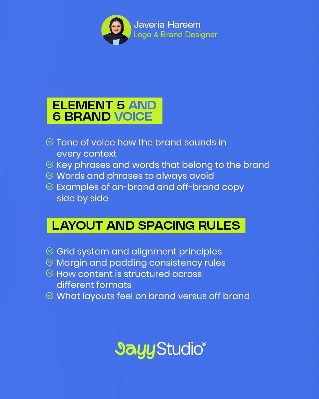
This is how the brand sounds, in every context: a caption, a proposal, an error message, a reply to an unhappy customer. Write down the phrases and words that belong to the brand, and the ones it should never use.
The most useful thing you can include here is examples side by side. “Friendly but professional” means almost nothing to a new writer. Two versions of the same sentence, one on-brand and one off-brand, explain it in five seconds.
6. Layout and spacing rules
Consistent spacing is one of those things nobody consciously notices, yet everyone feels. Set out the grid and how things align to it, the margins and padding, and how content is structured across the formats you actually use: a square post, a story, an A4 page, a slide.
Show what an on-brand layout looks like next to one that’s off. Once people see the difference, they tend to get it right without being told twice.
7. Brand don’ts
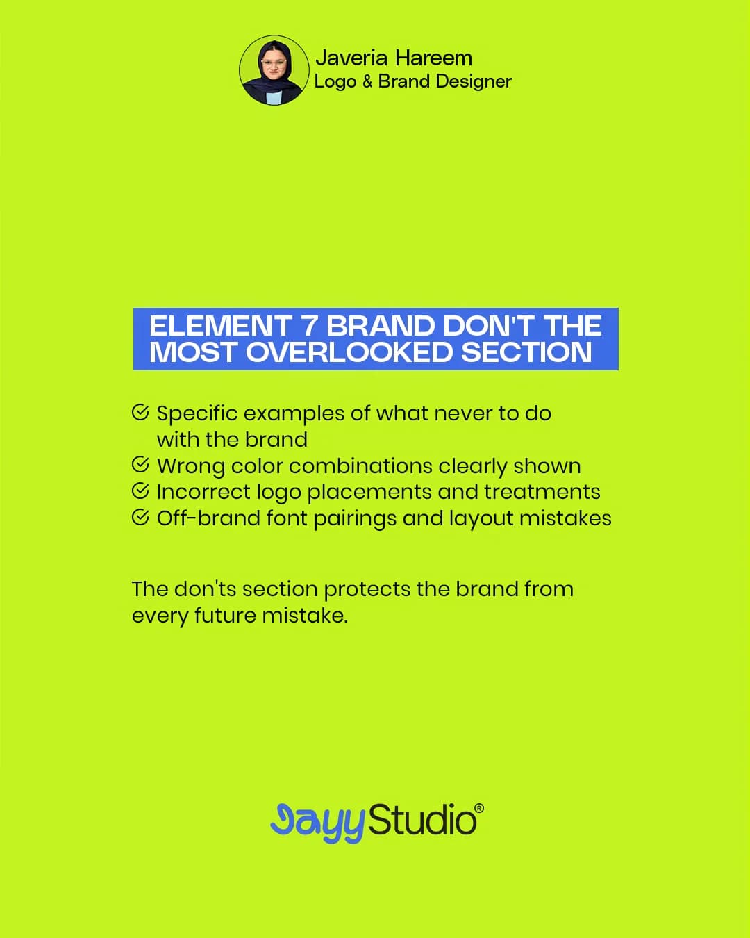
This is the most overlooked section, and in my experience the one that does the most work. It shows specific examples of what never to do with the brand: the wrong colour combinations, actually shown. Logos placed or treated incorrectly. Font pairings and layouts that don’t belong.
People learn faster from a picture of the wrong thing than from a paragraph about the right thing. The don’ts section protects your brand from every future mistake, including the ones made by people who haven’t joined yet.
Save this checklist
The brand guidelines checklist
Tick off what your guidelines already cover. Your ticks are saved in this browser, so you can come back to it.
0/7
Without all 7 of these, your brand has no protection.
A brand without guidelines has no protection
If you’re missing any of these seven, your brand is relying on everyone who touches it to guess well, every time, forever. That’s a lot to ask of a busy team and a rotating cast of freelancers.
Save this checklist, and share it with any founder who thinks they have a brand but doesn’t have a guidelines document yet. If you want to see what a finished one looks like, the Aurexon brand book runs to 21 pages and the Arista Living style guide to 45.
And if you’d like me to show you what your own guidelines should include, message me the word SYSTEM on WhatsApp or LinkedIn. I’m happy to take a look, no strings attached. You can also read what’s included in a brand guidelines project.