
CedarLand Bousfier Jam
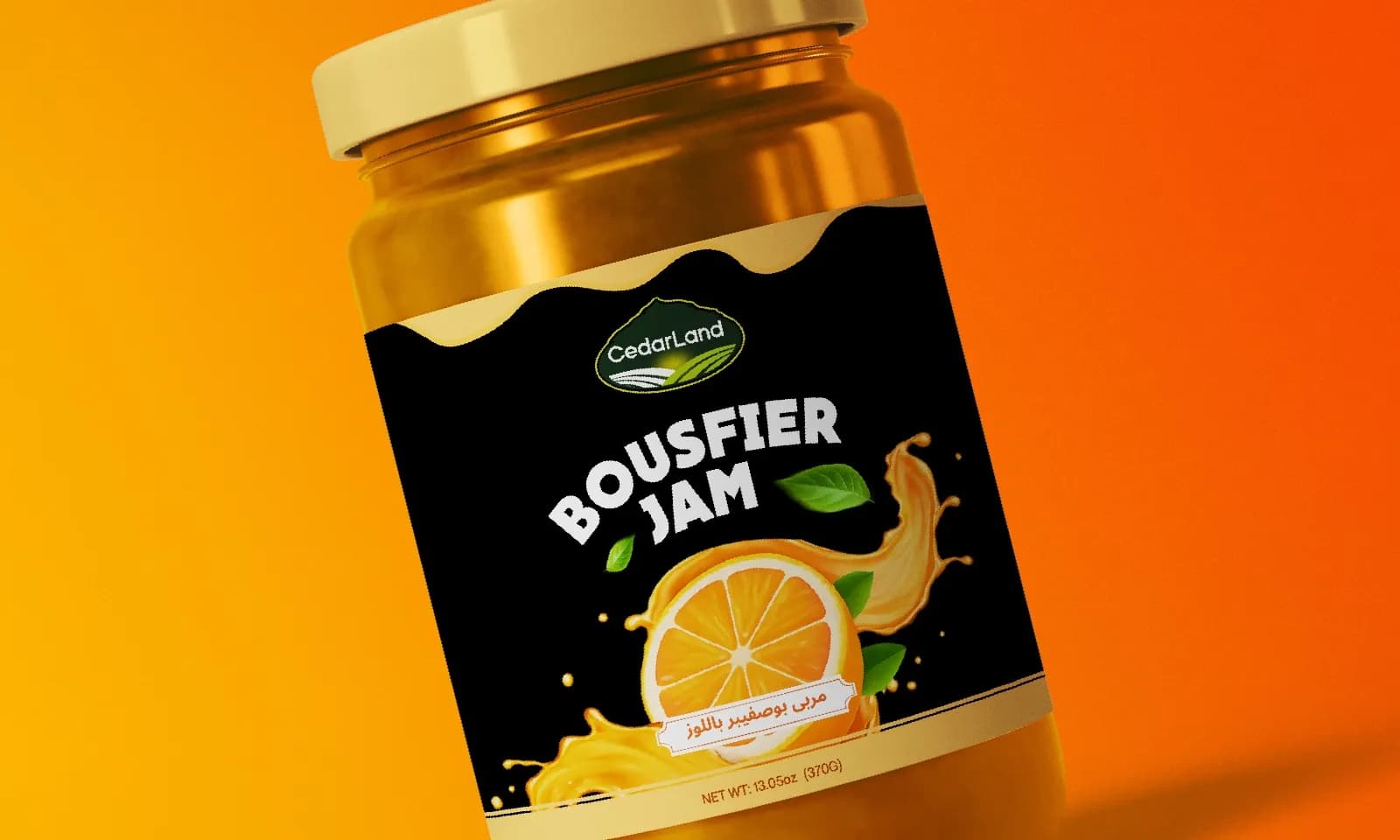
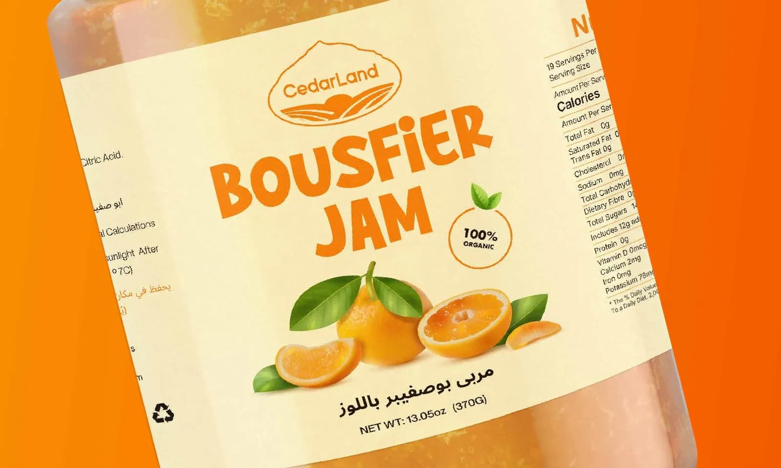
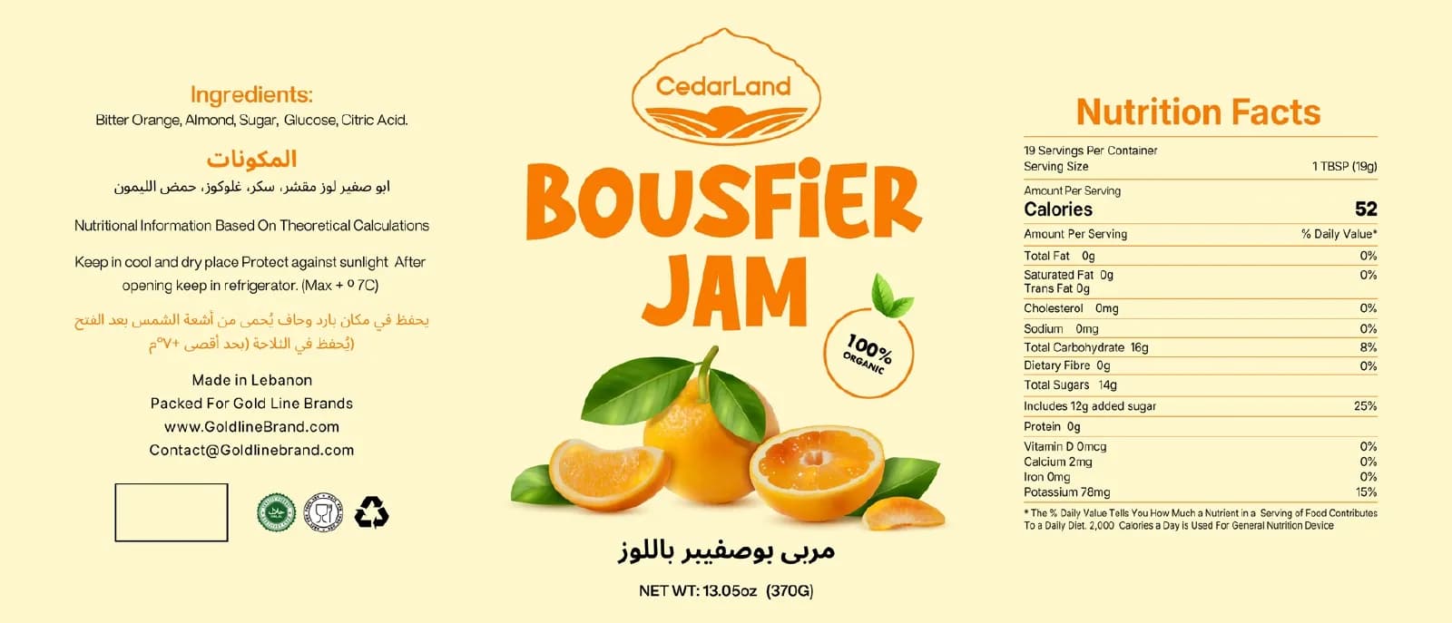
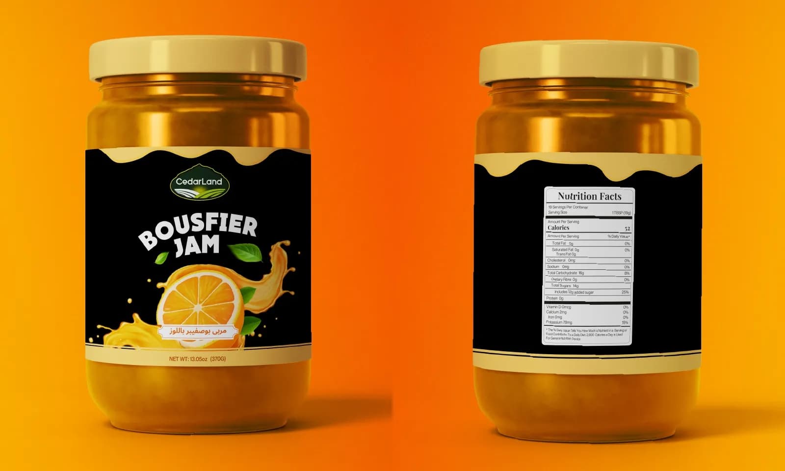
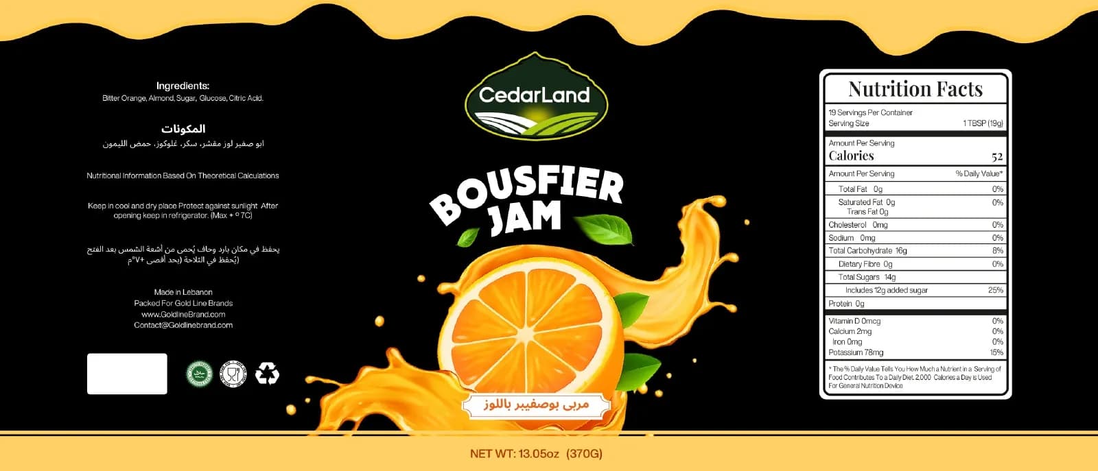
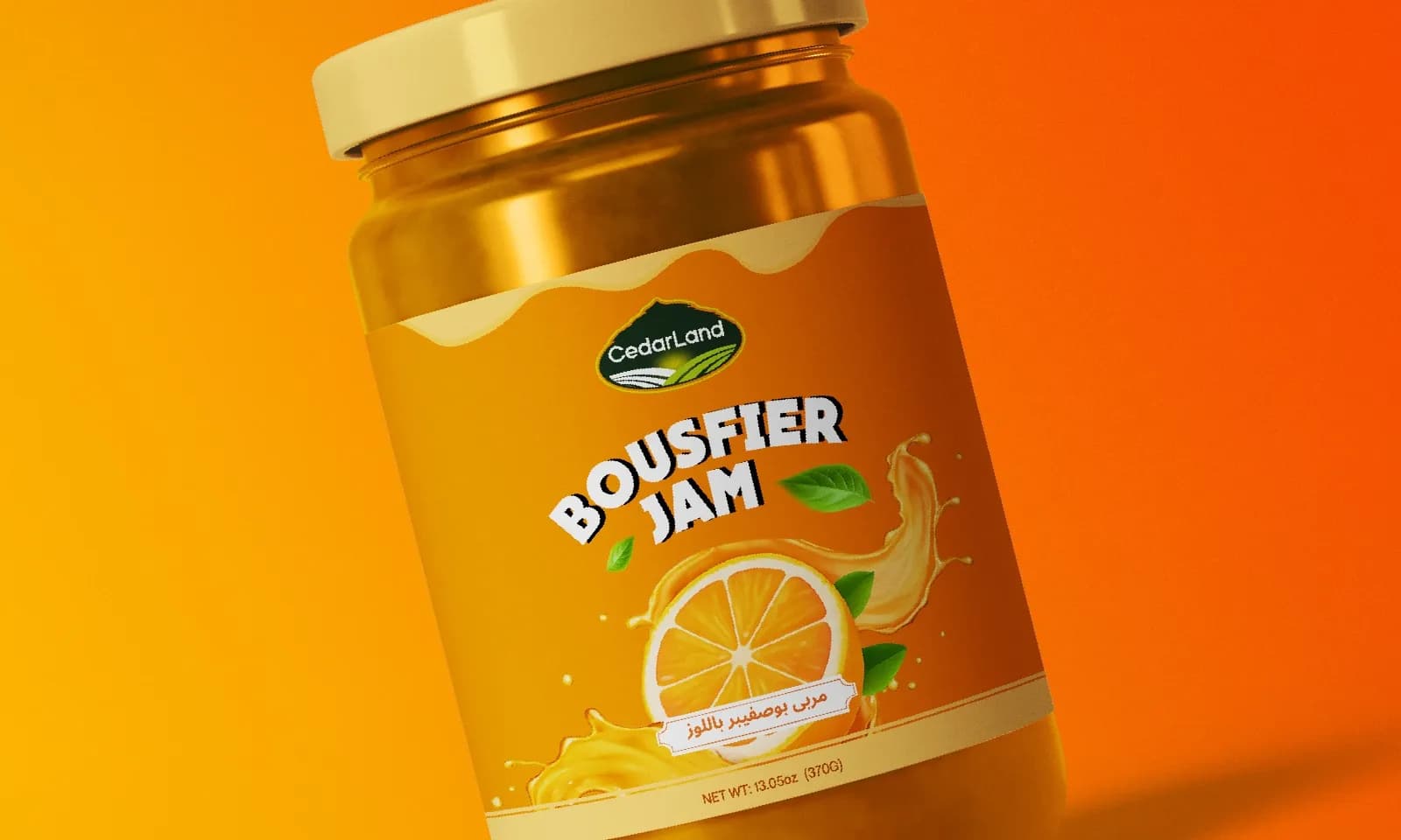
Three label options for a bitter-orange jam (soft cream, black and bold orange), each shown on the jar with print-ready bilingual artwork.
What the brand needed
Bousfier, or bitter orange, jam is a traditional product up against heritage brands and newer premium spreads. CedarLand wanted to see how far the label could stretch before picking a direction.
How I approached it
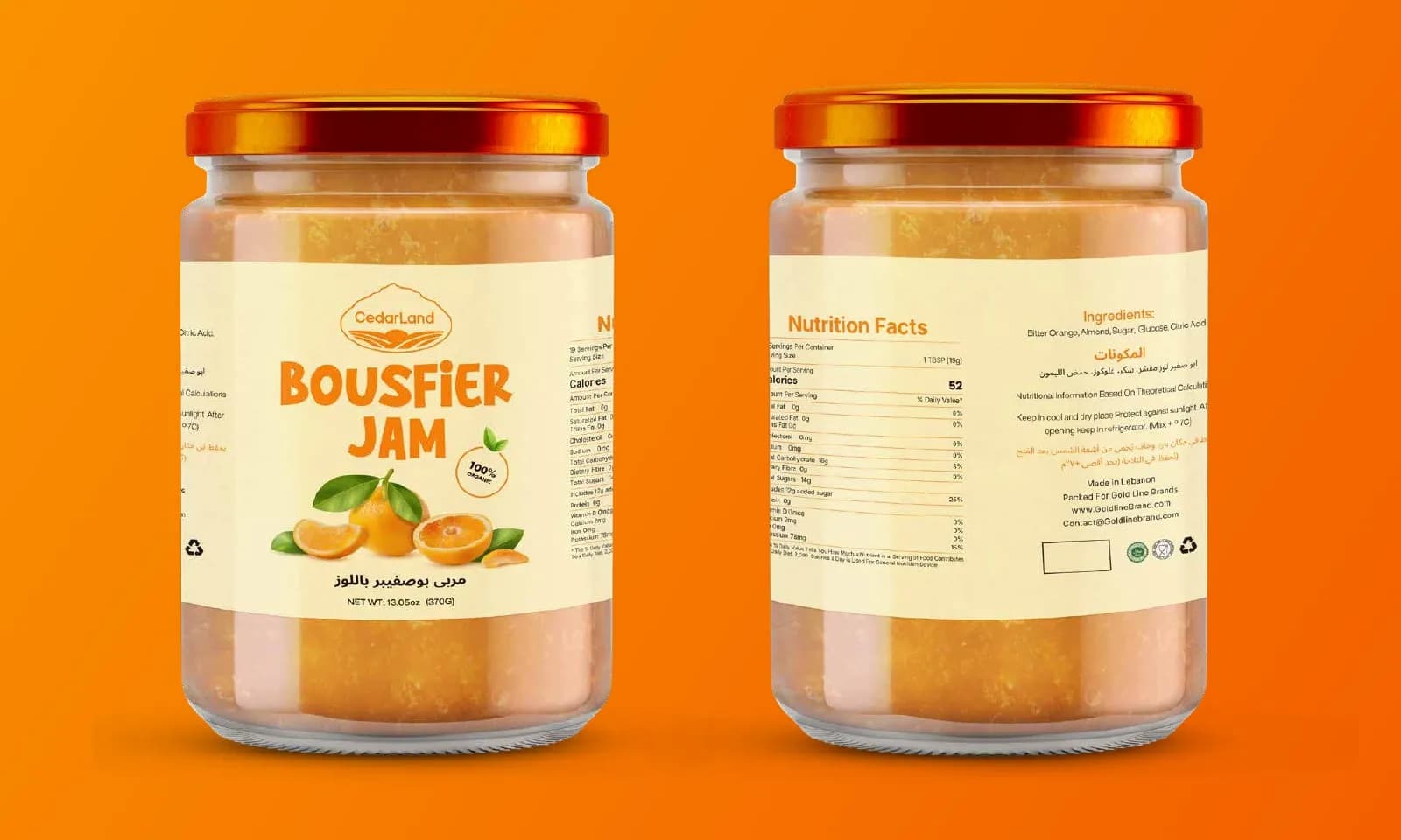
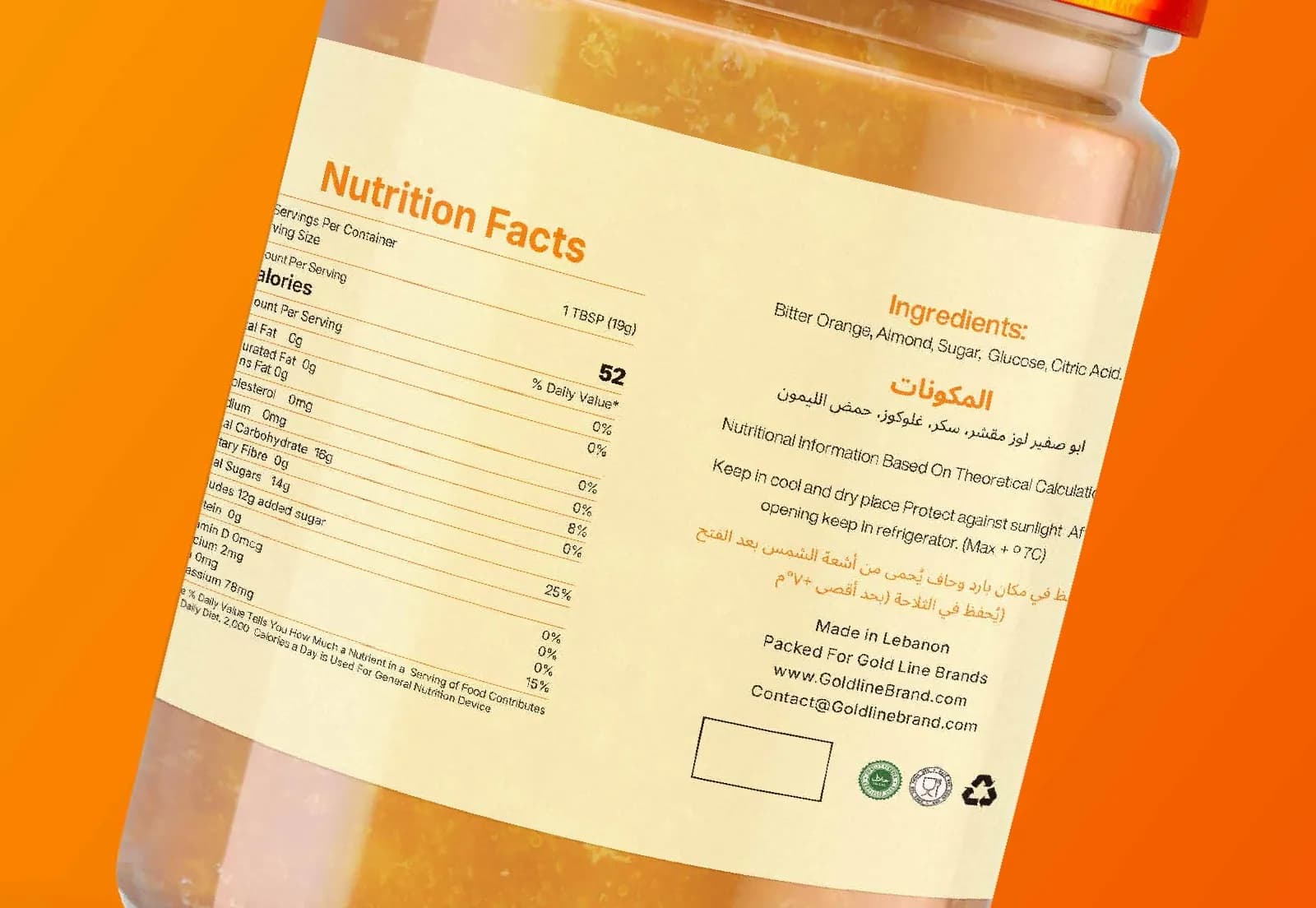
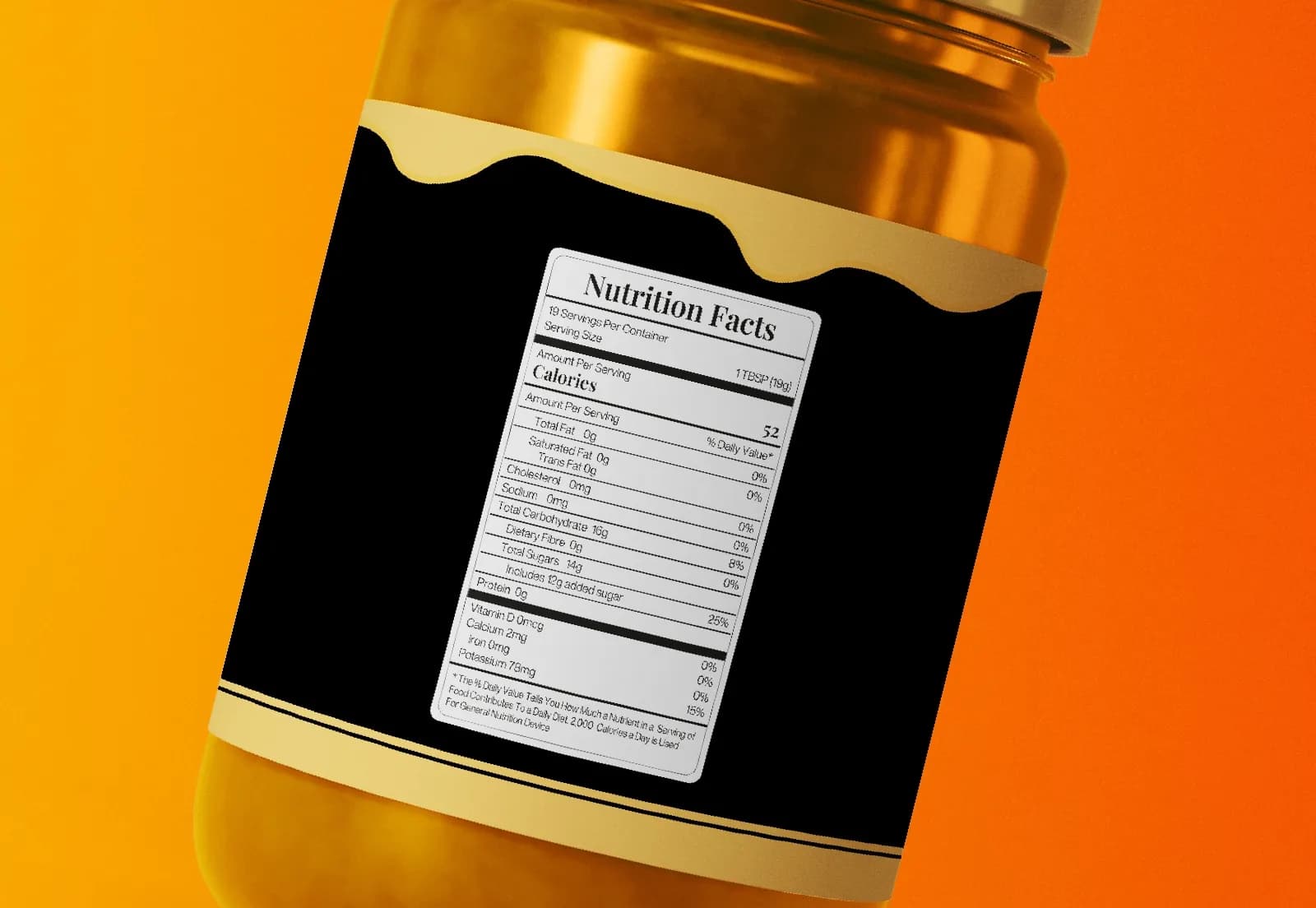
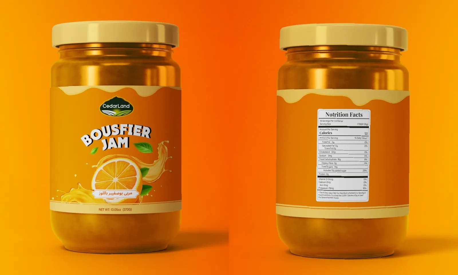
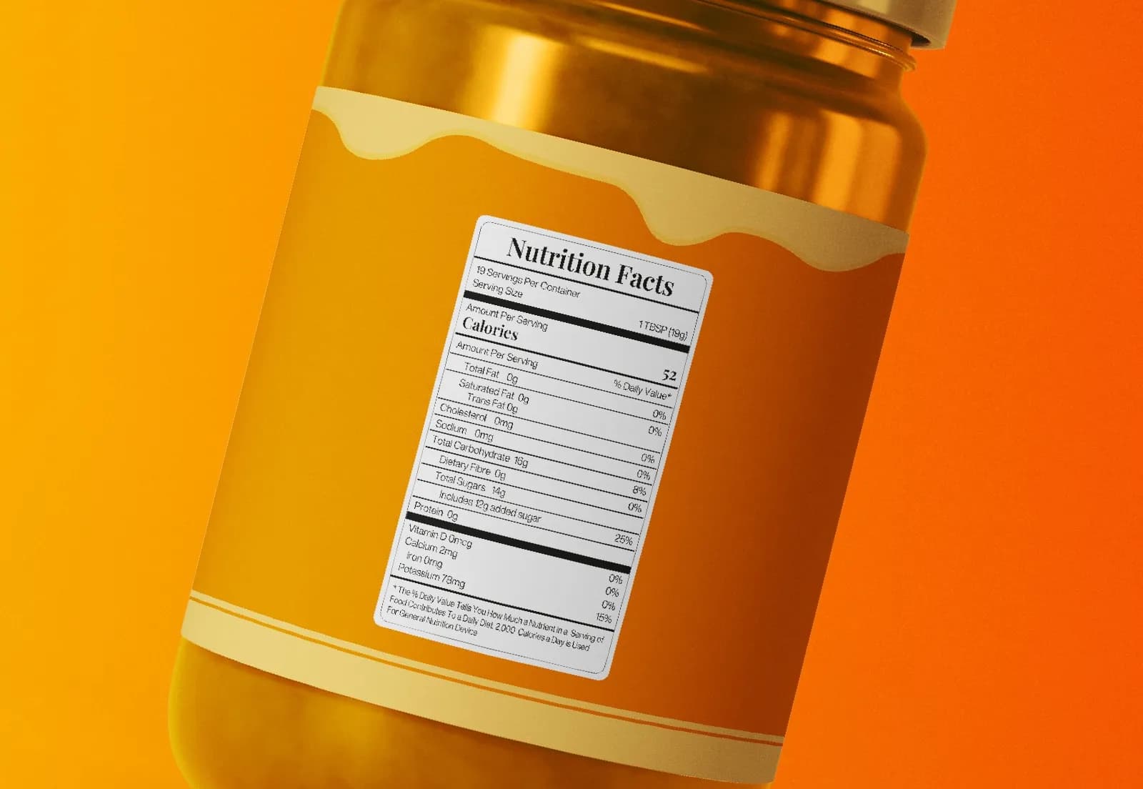
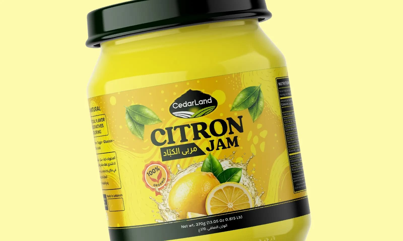
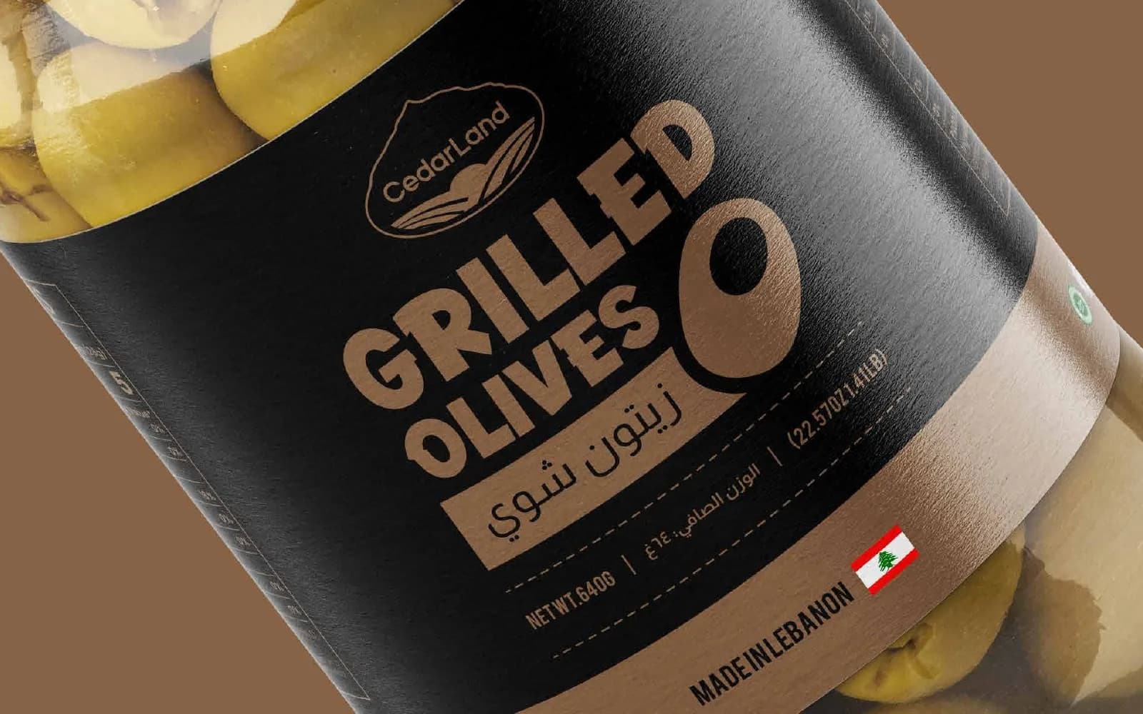
All three options share one bilingual layout, and each one feels completely different. The cream label feels homemade, the black one looks premium on a shelf, and the orange one is made for impulse buys. Every label is shown on the jar from several angles, with the nutrition panel set to print spec.
What I delivered
- Three label design directions
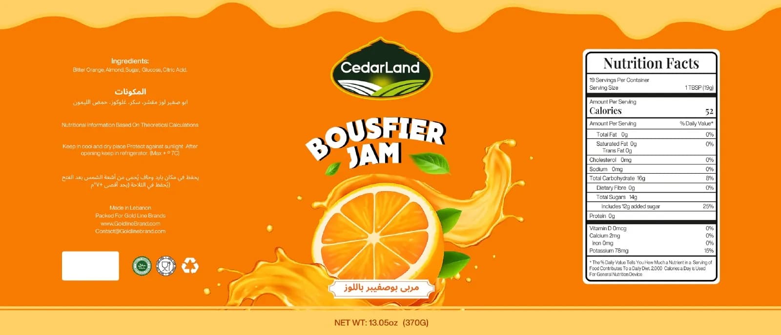
- Bilingual (Arabic / English) layout
- Nutrition facts and ingredient panels
- Print-ready flat label artwork
- Jar mockups: front, back and pair views
Where it landed
Three production-ready labels, so the client could pick from realistic shelf renders instead of sketches.
[RESULT: add a result you can share, like a launch date, a sales or engagement lift, or a client quote]
Need the same for your brand? See what’s included in packaging & label design and how pricing works.
The full project12 images
Next project
Roast Canned Coffee
Packaging · Food & Beverage