
CedarLand Grilled Olives
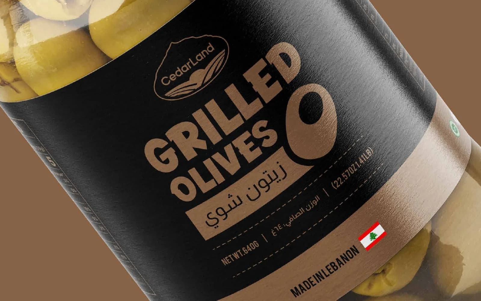
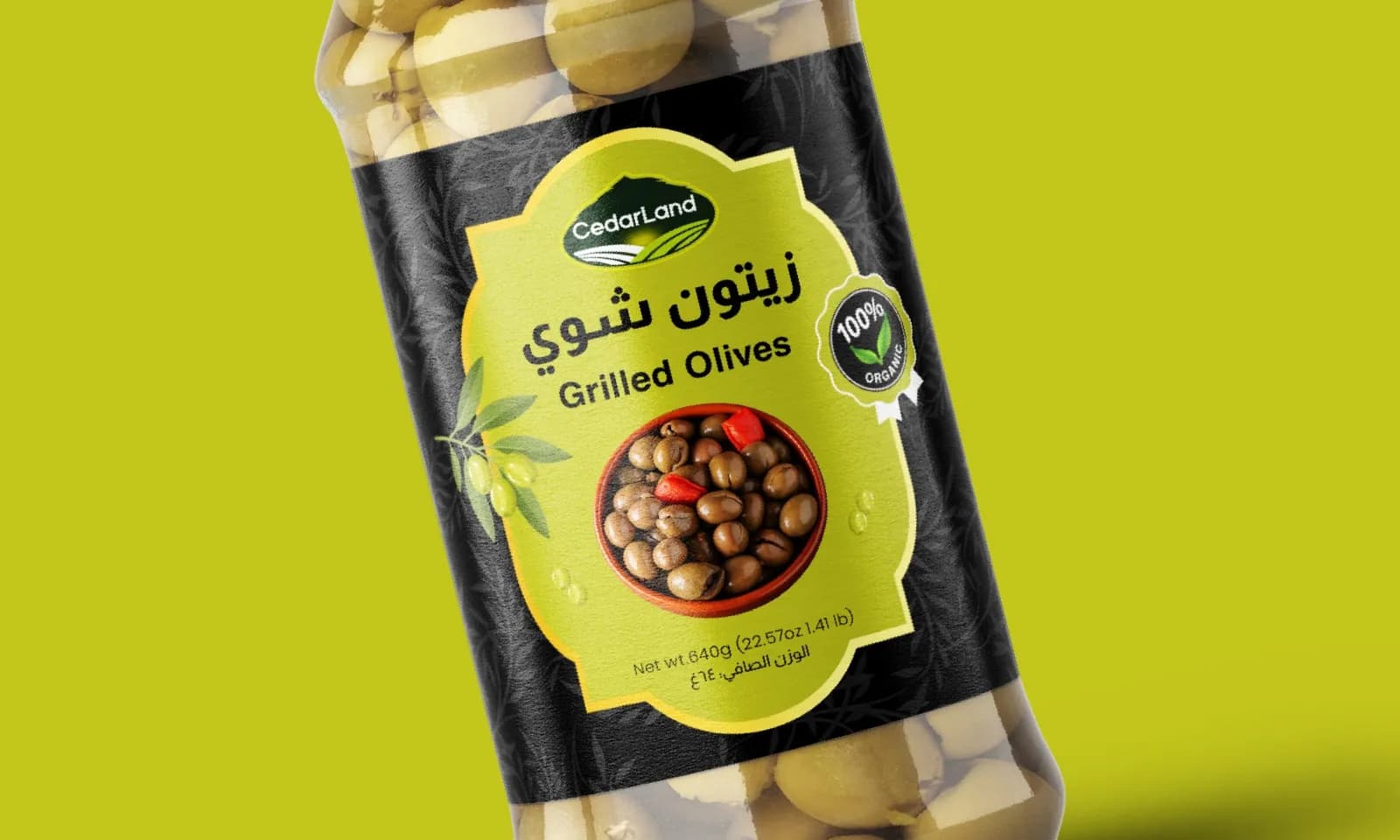
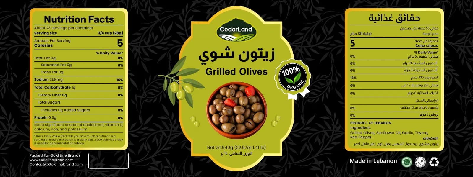
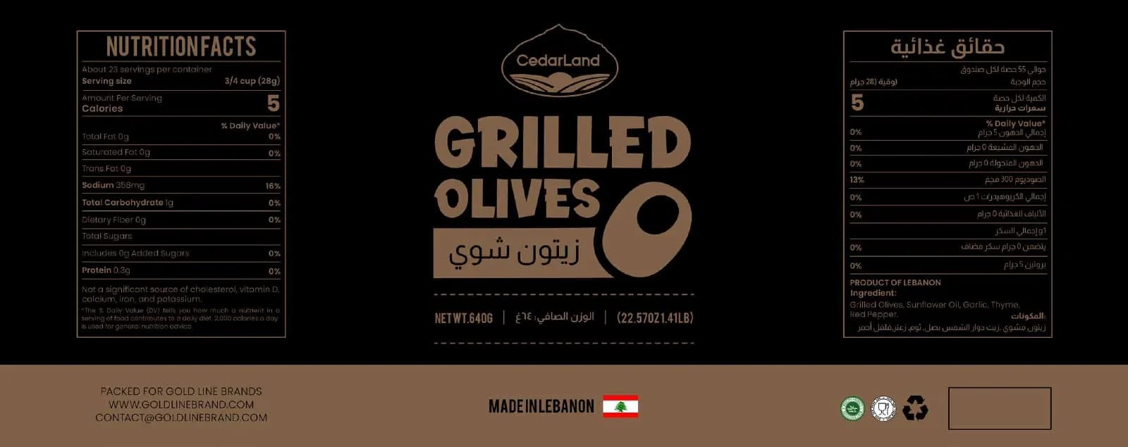
Two jar labels for grilled olives, one vibrant lime and one black and copper, with bilingual, print-ready artwork.
What the brand needed
Jarred olives are a crowded, price-driven category. CedarLand wanted its grilled olives to look more premium, and more flavorful, than the plain labels next to them.
How I approached it
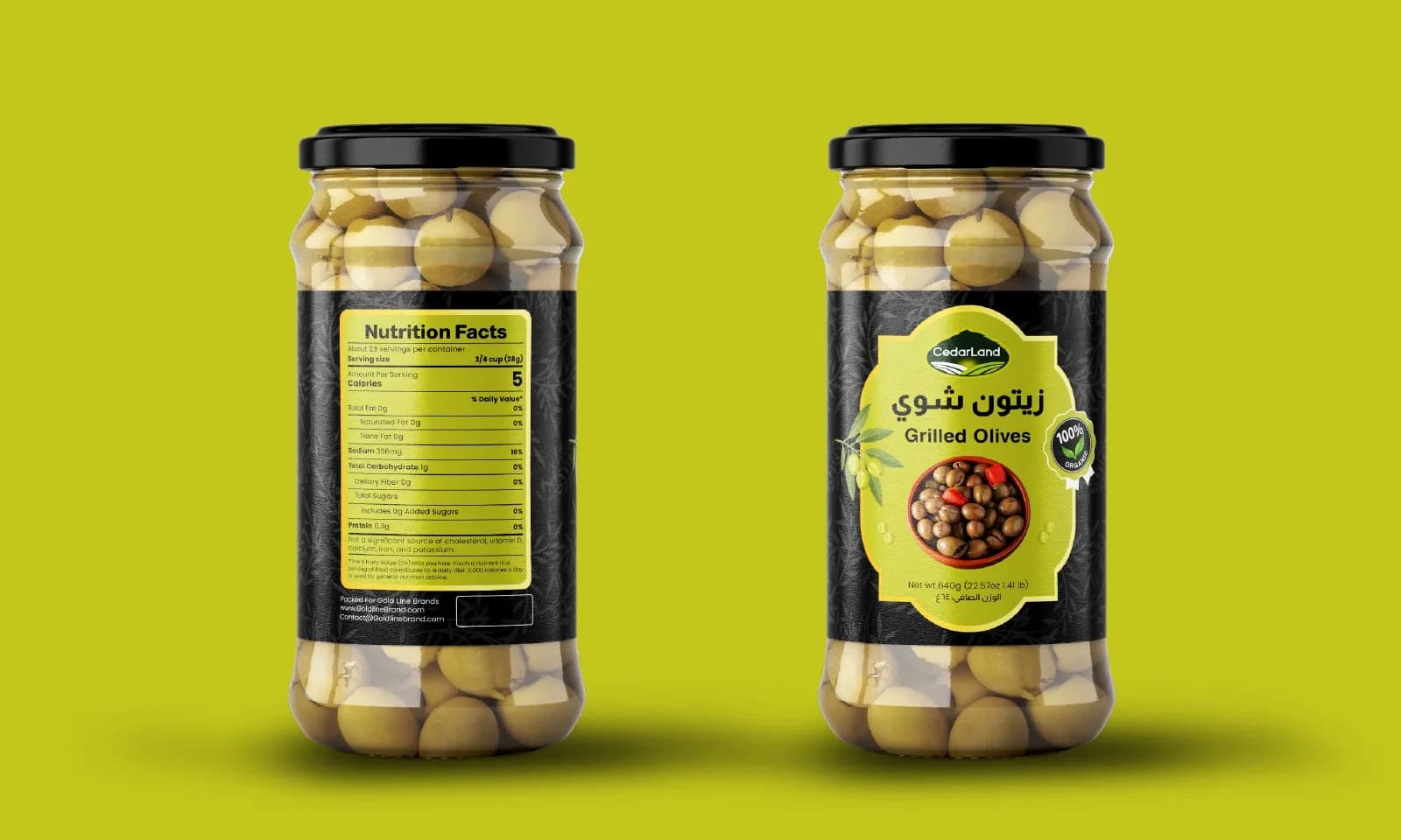
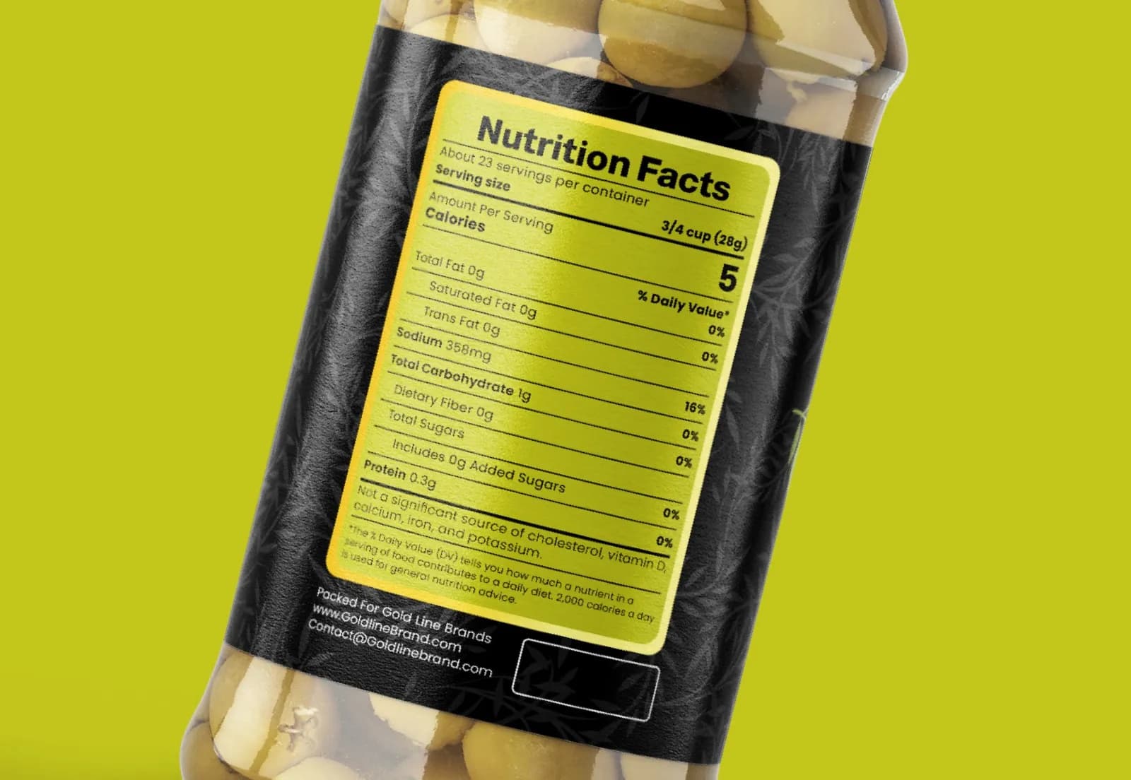
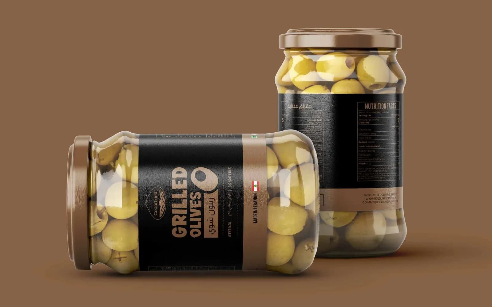
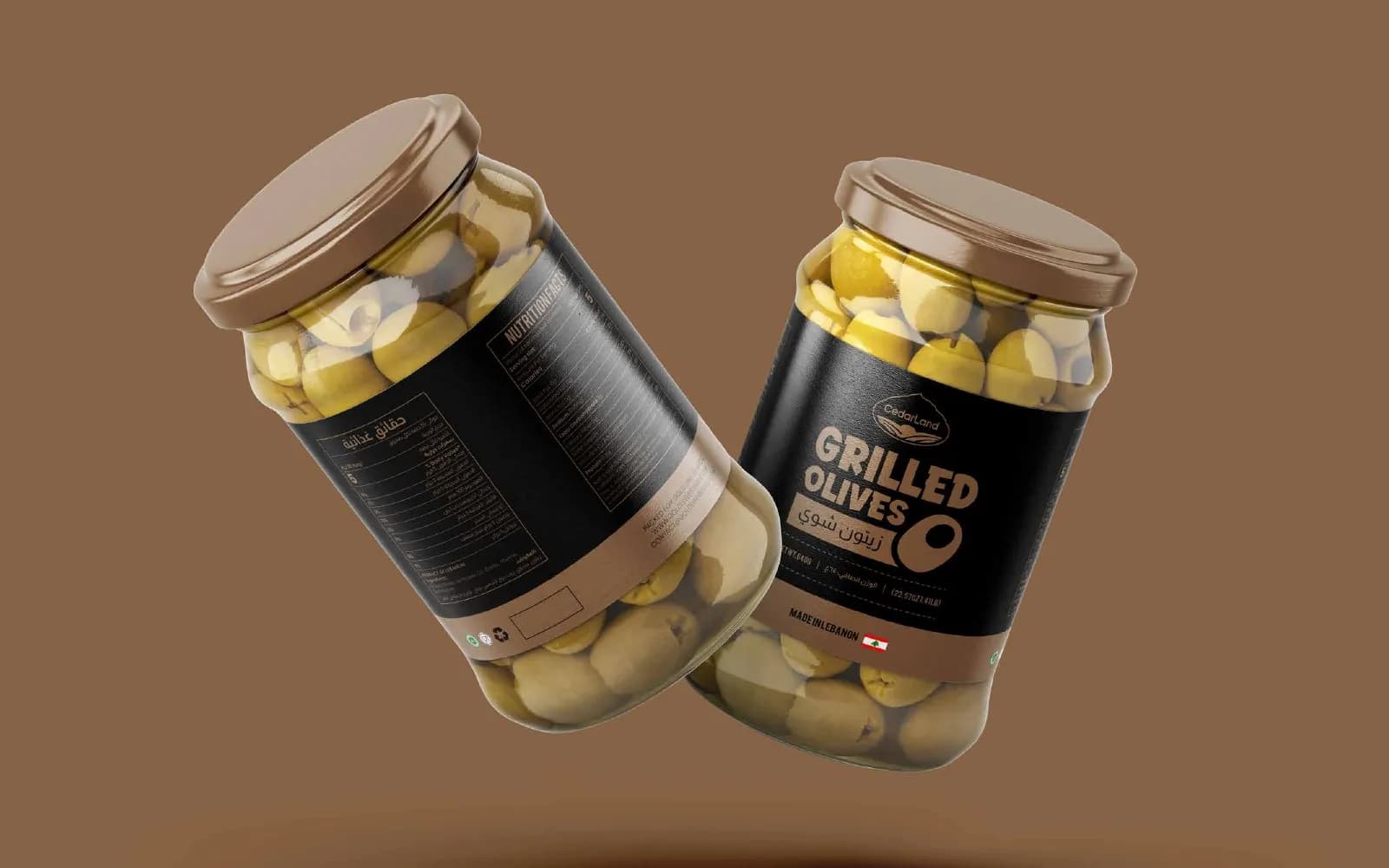
The lime option puts an ornate olive badge on a punchy background for maximum contrast on the shelf. The black option uses bold copper type for a deli feel. Both share the same bilingual layout and a full nutrition panel.
What I delivered
- Two label design directions
- Bilingual (Arabic / English) layout
- Nutrition facts panel
- Print-ready flat label artwork
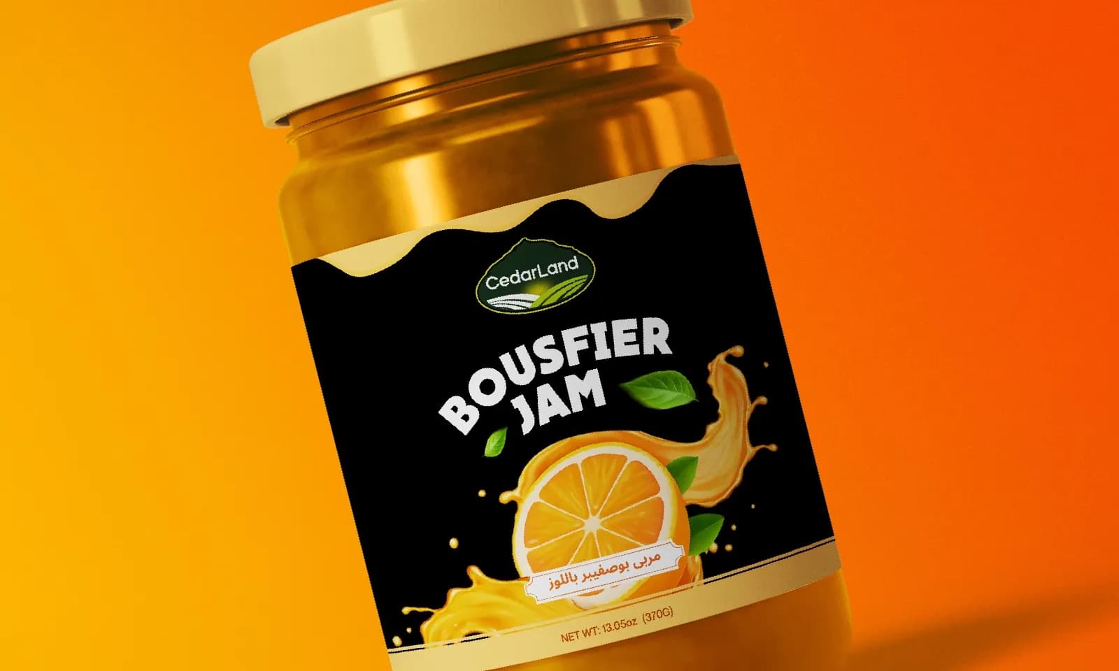
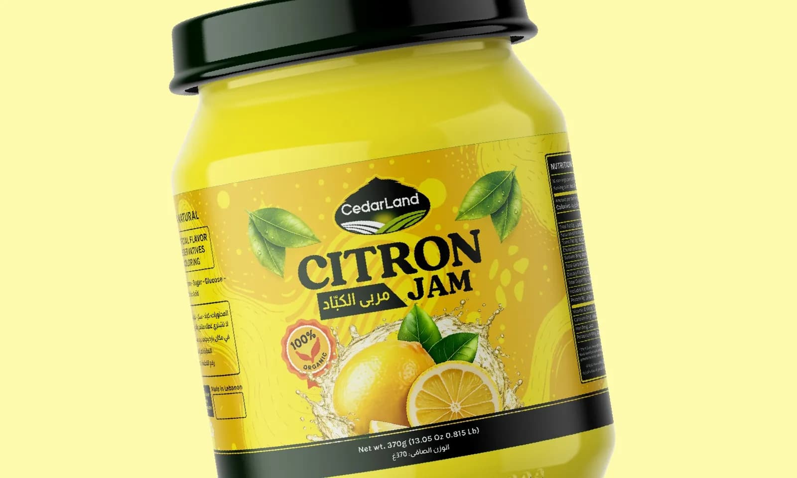
- Jar mockups and pair views
Where it landed
Two print-ready labels shown in context, giving the client a clear choice between a mass-market look and a premium one.
[RESULT: add a result you can share, like a launch date, a sales or engagement lift, or a client quote]
Need the same for your brand? See what’s included in packaging & label design and how pricing works.
The full project8 images
Next project
Arista Living
Brand Identity · Construction & Real Estate