
CedarLand Citron Jam
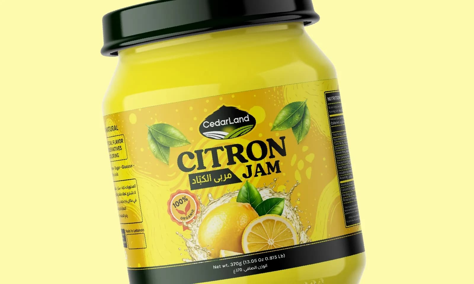
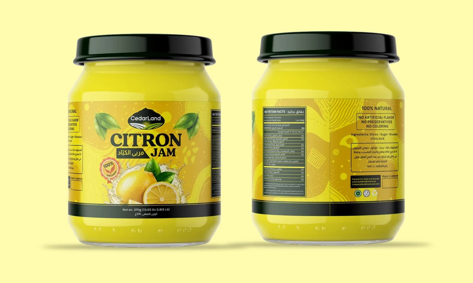
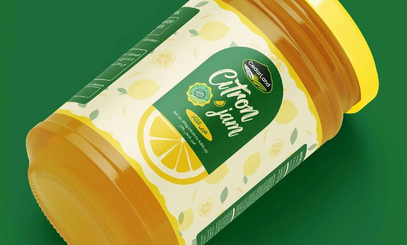
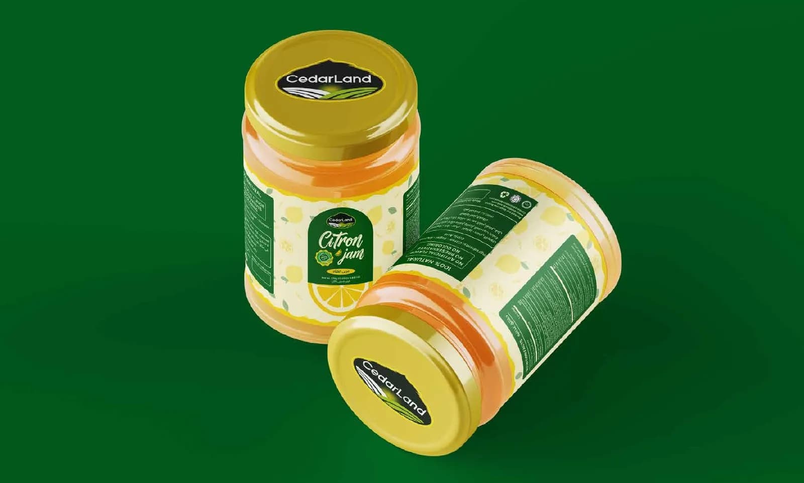
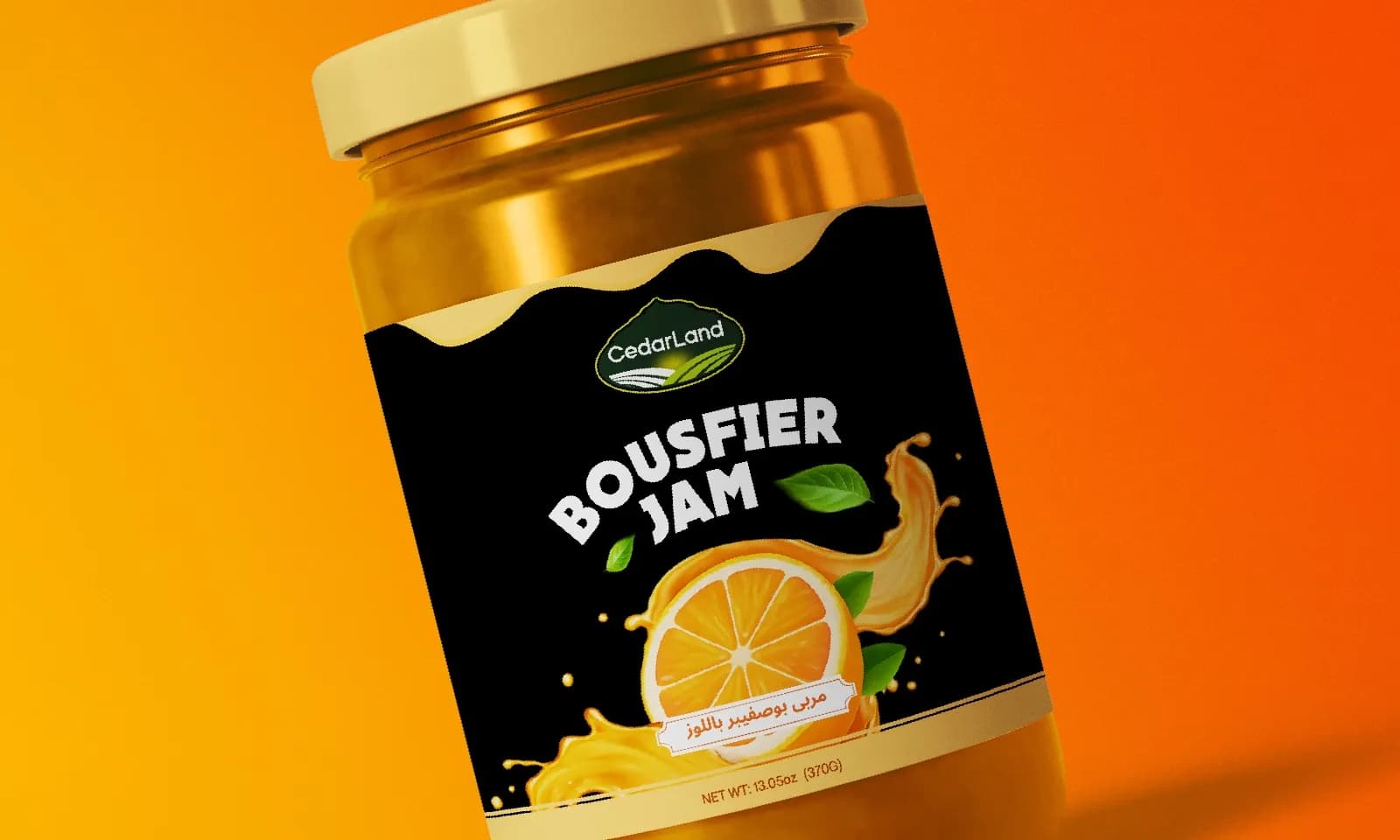
Two label options for a lemon jam, one sunny yellow and one fresh green, with bilingual, print-ready artwork.
What the brand needed
Citrus jam sells on how fresh it looks. CedarLand needed a label that reads bright and natural in a second, in Arabic and English.
How I approached it
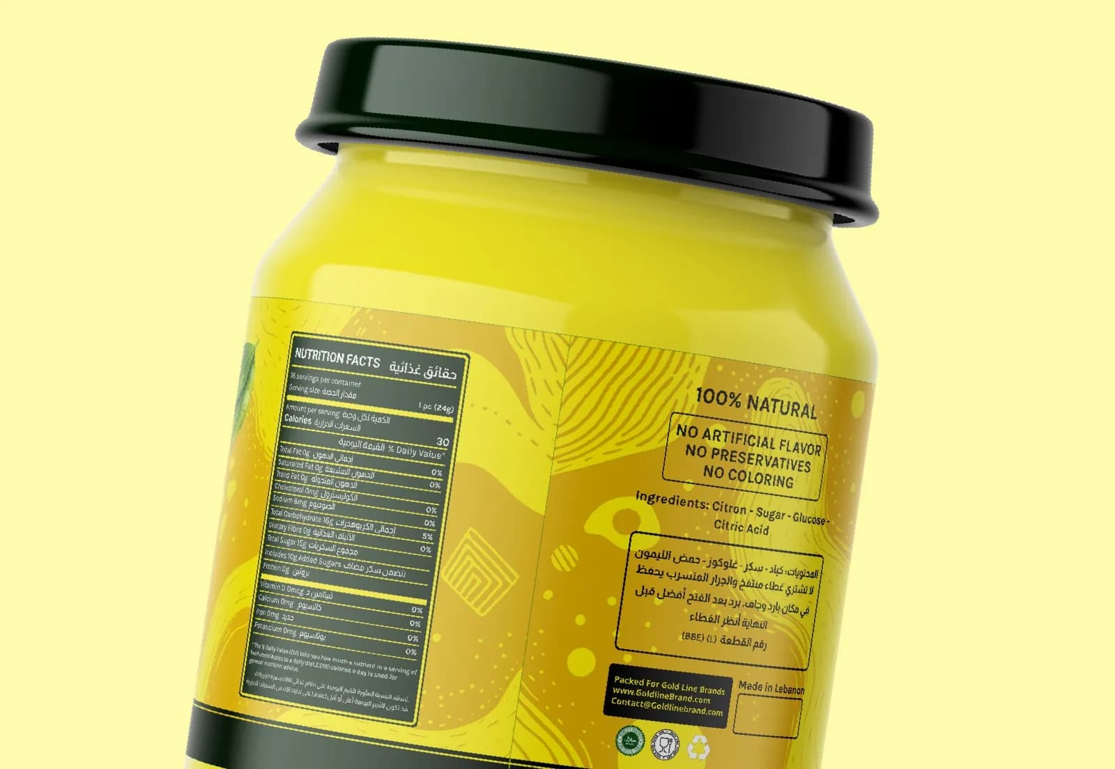
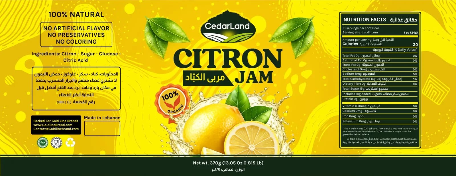
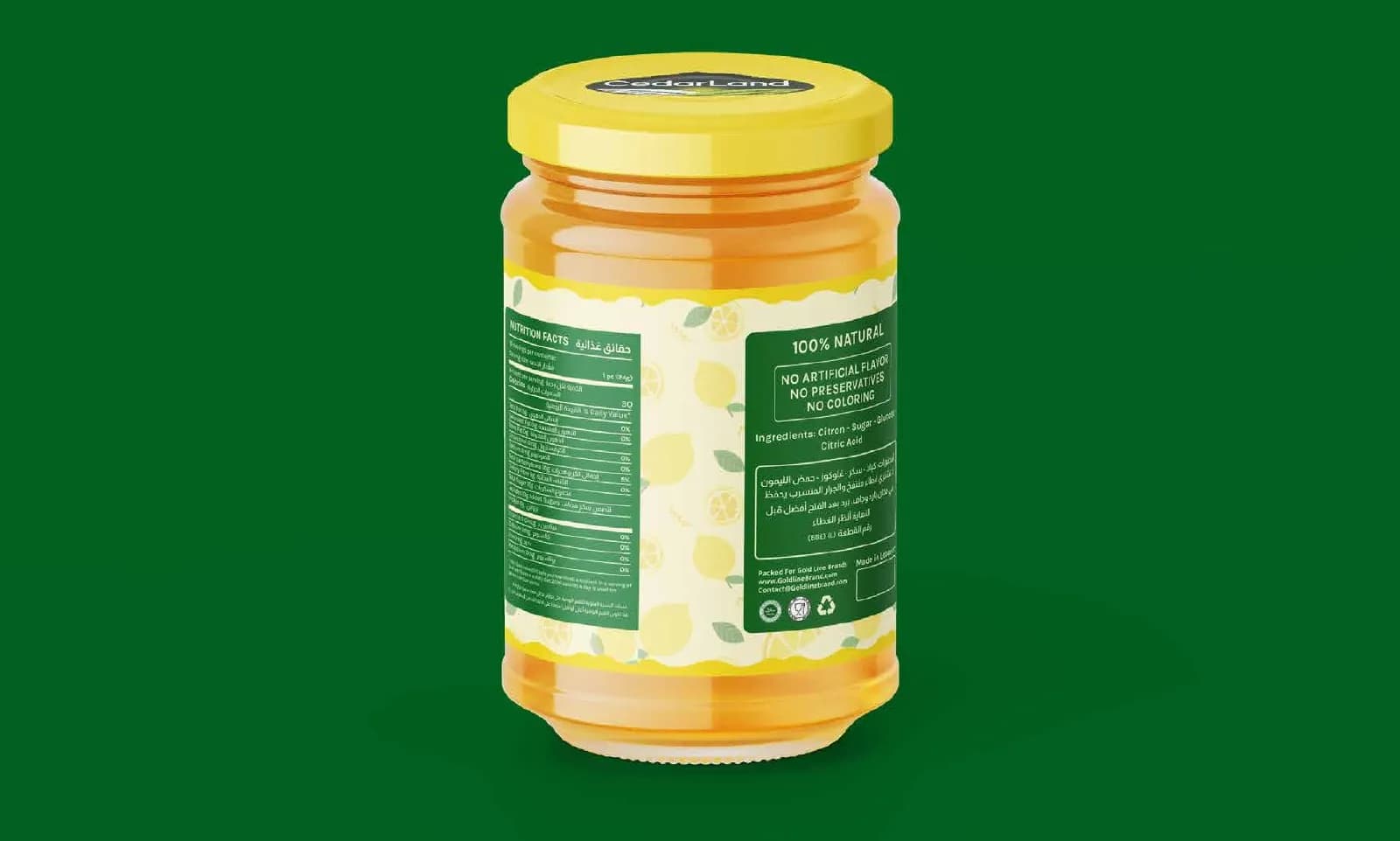
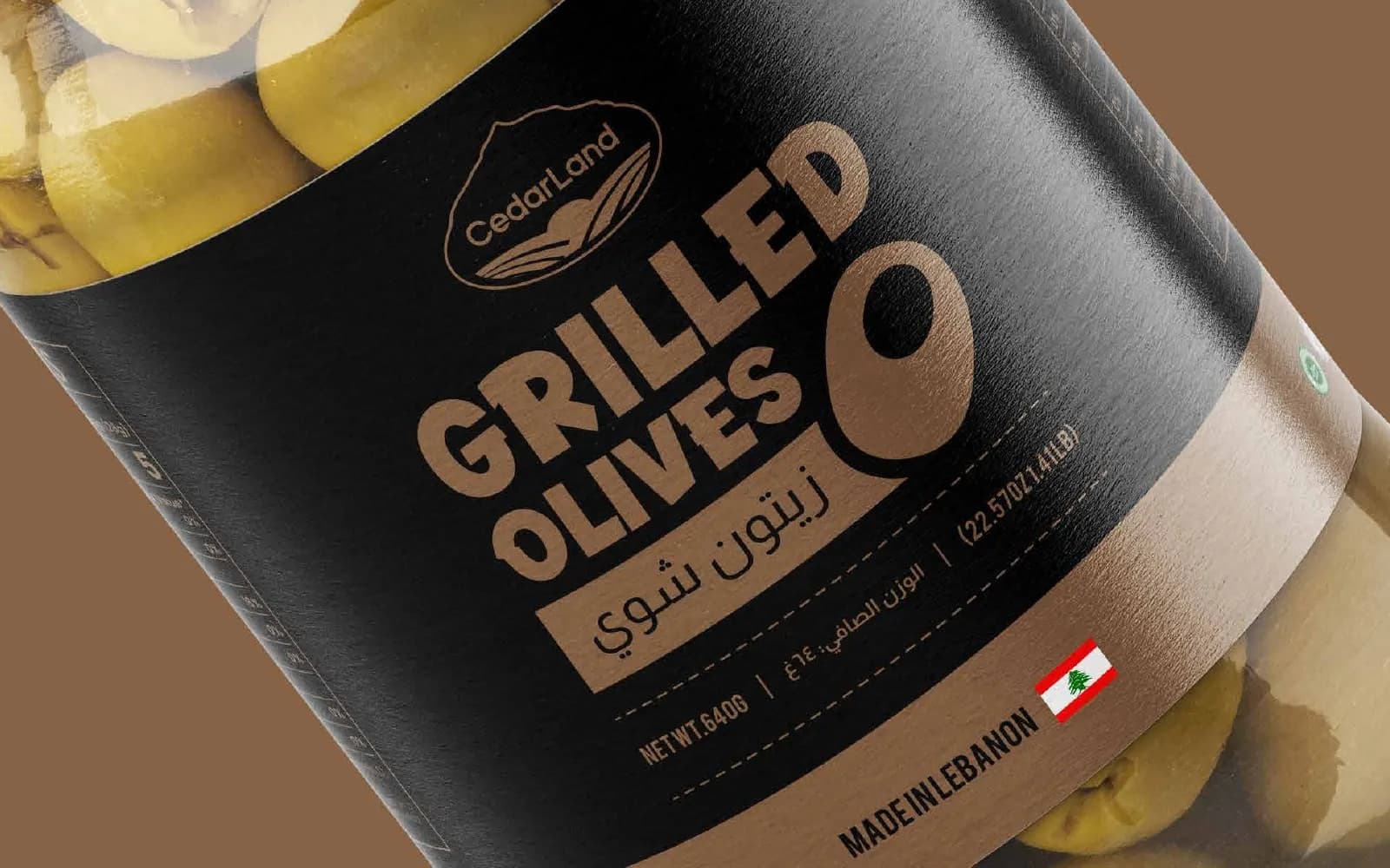
The yellow option leads with a big illustrated lemon. The green one is softer and more botanical. Both keep the CedarLand crest front and center and set the nutrition and ingredient details cleanly for print.
What I delivered
- Two label design directions
- Bilingual (Arabic / English) layout
- Nutrition and ingredient panels
- Print-ready flat label artwork
- Jar mockups and range presentation
Where it landed
Two finished labels shown on the jar, ready for the client to choose one and send it to print.
[RESULT: add a result you can share, like a launch date, a sales or engagement lift, or a client quote]
Need the same for your brand? See what’s included in packaging & label design and how pricing works.
The full project7 images
Next project
CedarLand Halawa Line
Packaging · Food & Beverage