Branding basics8 min read
What is brand identity? (And why it’s more than a logo)
The parts an identity is made of, how they work together on two real projects, and what a founder needs at each stage. No jargon.
Javeria Hareem
Logo & Brand Designer, founder of Jayy Studio
 Branding basics
In this article
Most founders who ask me for a logo are asking for something bigger. They just don’t have a word for it yet.
You can feel the gap. The logo is fine, but the website, the deck and the Instagram grid look like three different companies. A new post takes an hour because someone has to decide the colours again. You hired a freelancer and got something close to your brand, but not quite.
The word for the thing you’re missing is brand identity. So: what is brand identity, what is it made of, why does a logo on its own stop working on day two, and what do you need at each stage? Two real projects below, so none of this stays abstract.
So what is brand identity, in plain words
Three words get used as if they mean the same thing. They don’t, and the difference matters when you are paying for one of them.
Your brand is what people think of you: the reputation, the feeling, the thing they say when your name comes up and you aren’t in the room. You don’t fully own it. Branding is the work of trying to shape that: the decisions, the positioning, the design, the way you behave. Brand identity is the visible part of branding, the system of things people can actually see and recognise.
So when a founder tells me they need “branding”, we spend the first conversation working out whether they mean the thinking, the visuals, or both. Usually both, and usually they already have more of the thinking than they realise. What they are missing is the identity: the thinking turned into something you can put on a sign.
The parts an identity is made of
An identity is a set of parts that have been designed to agree with each other. Pull one out and the rest still hold; change one on a whim and the rest start to look wrong. These are the parts.
The logo, in all its versions
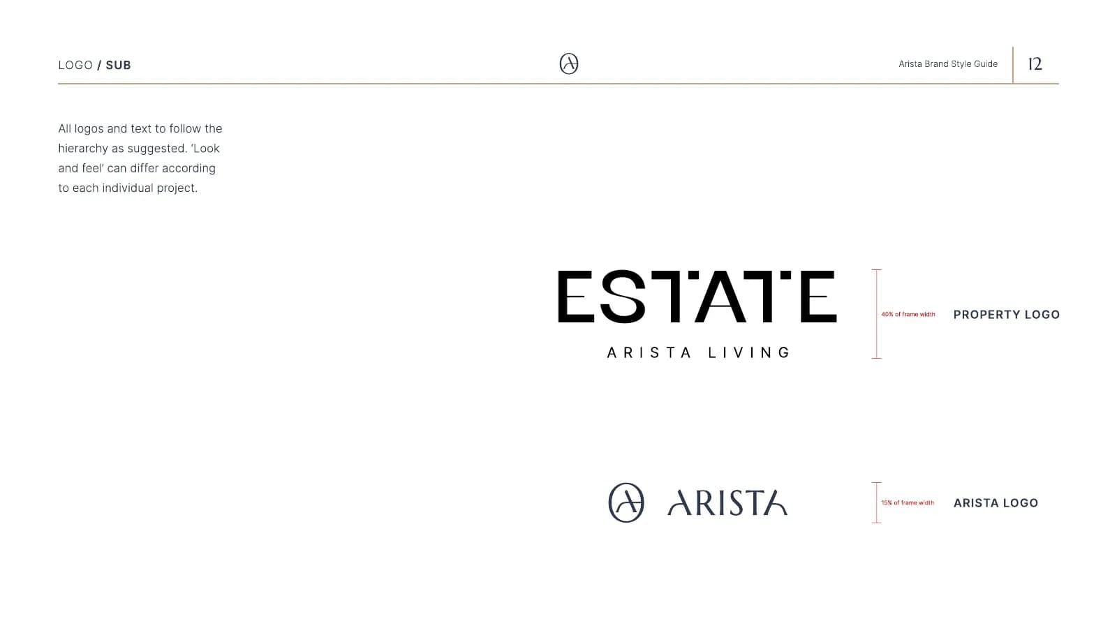
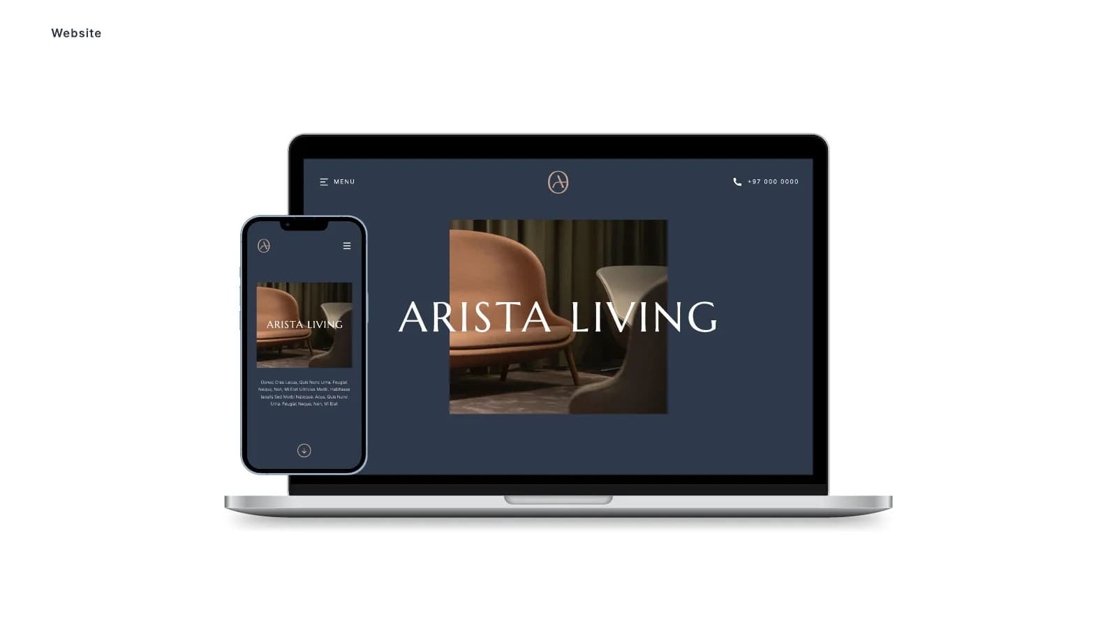
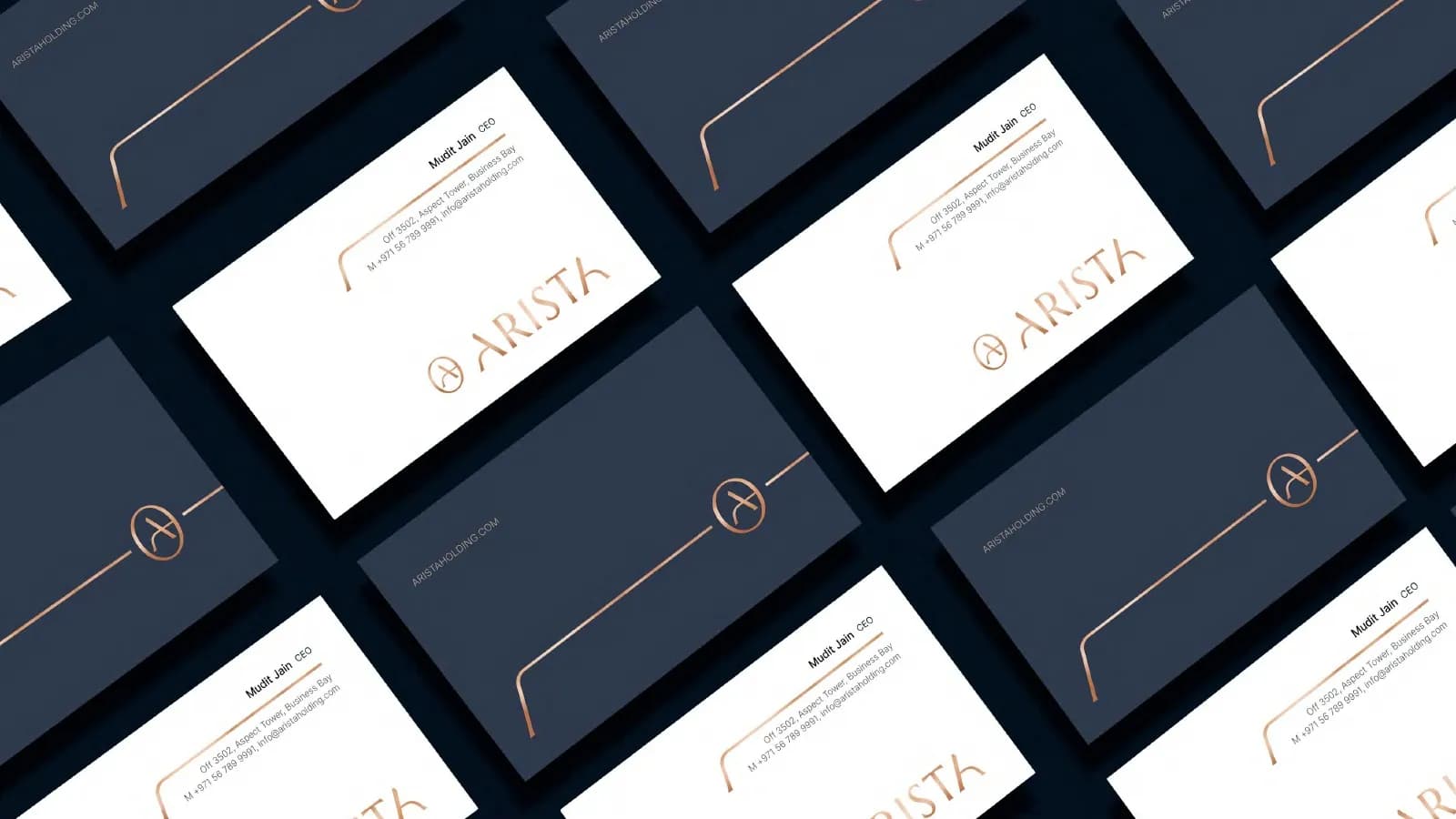
Not one logo. A primary lock-up, a stacked version, a symbol or monogram for small spaces, and each of those in full colour, one colour and reversed for dark backgrounds. Arista has a circular A monogram, a wide wordmark and an Estate sub-brand for its developments, each with rules for when it is used.
Colour
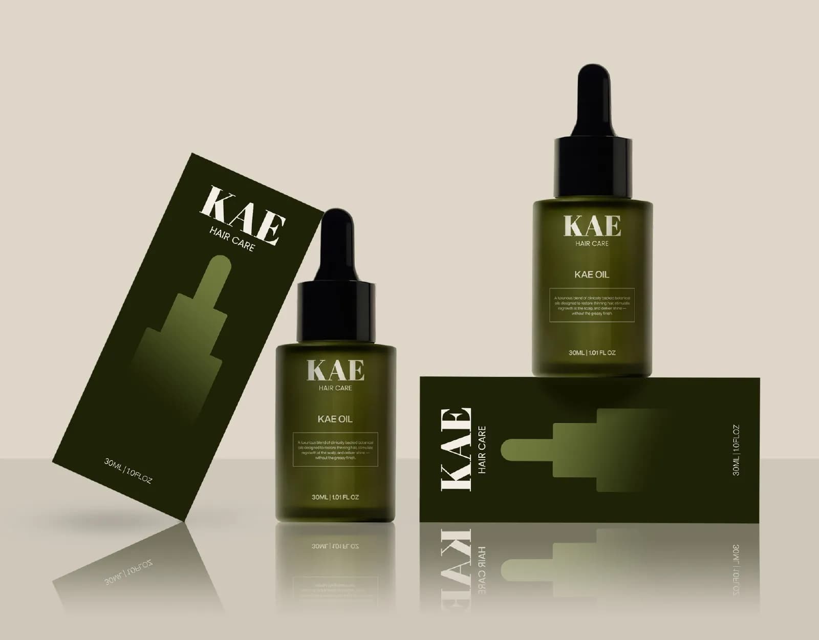
A small palette with exact values for screen (HEX, RGB) and print (CMYK, Pantone), and a rule about how much of each to use. Arista runs on deep navy and warm sand. KAE runs on a deep olive with stone neutrals. Neither needs a seventh colour, and both would be weakened by one.
Typography
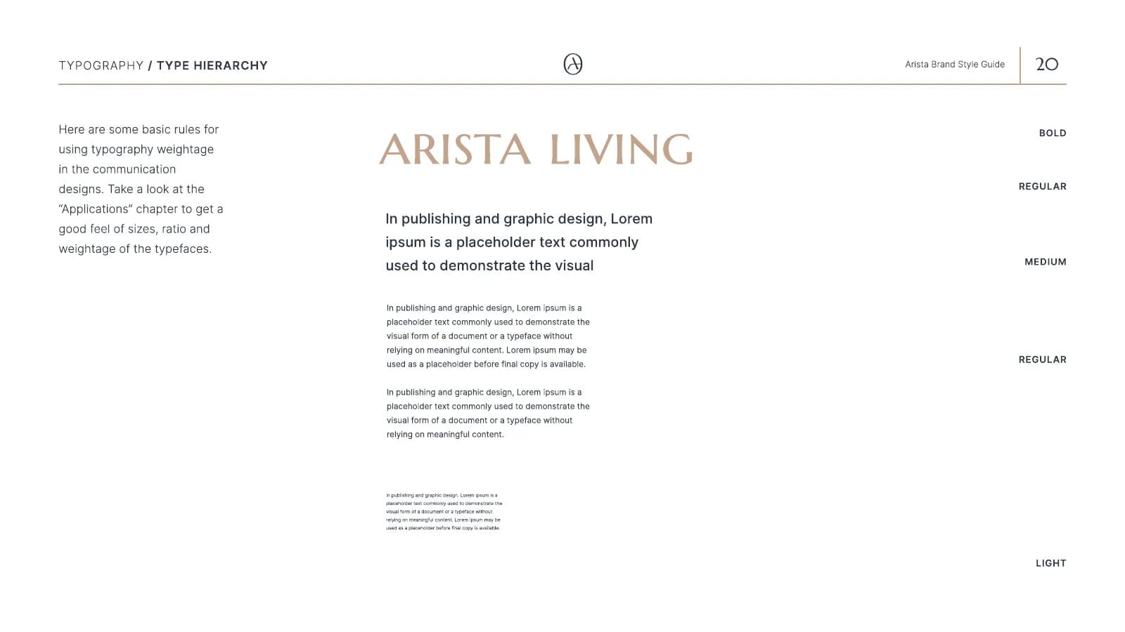
One typeface for headlines and one for reading, with the sizes and weights for each job decided once. Marcellus and Inter for Arista; Abril Fatface and Helvetica Now for KAE. The pairing is a choice about tone: Marcellus has the proportions of a Roman inscription, which is why Arista feels calm and expensive before you read a word.
Imagery
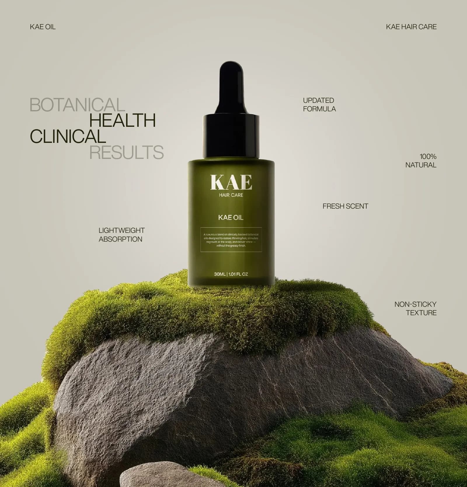
The kind of photography and illustration the brand uses, and the kind it never uses. For KAE that meant moss, stone and dark glossy hair rather than smiling models in a white studio. For Arista, soft light and natural materials. Imagery gets chosen in a hurry more than any other part, which is why it needs a rule.
Voice
How the brand sounds in a caption, a proposal and a complaint reply. Visual identity is what most people mean by the term, but a brand that looks premium and writes like a discount site has a split personality, and customers notice.
Layout
The grid, the margins and the way elements are arranged on a page, a post or a slide. It is the part nobody notices consciously and everybody feels.
Applications
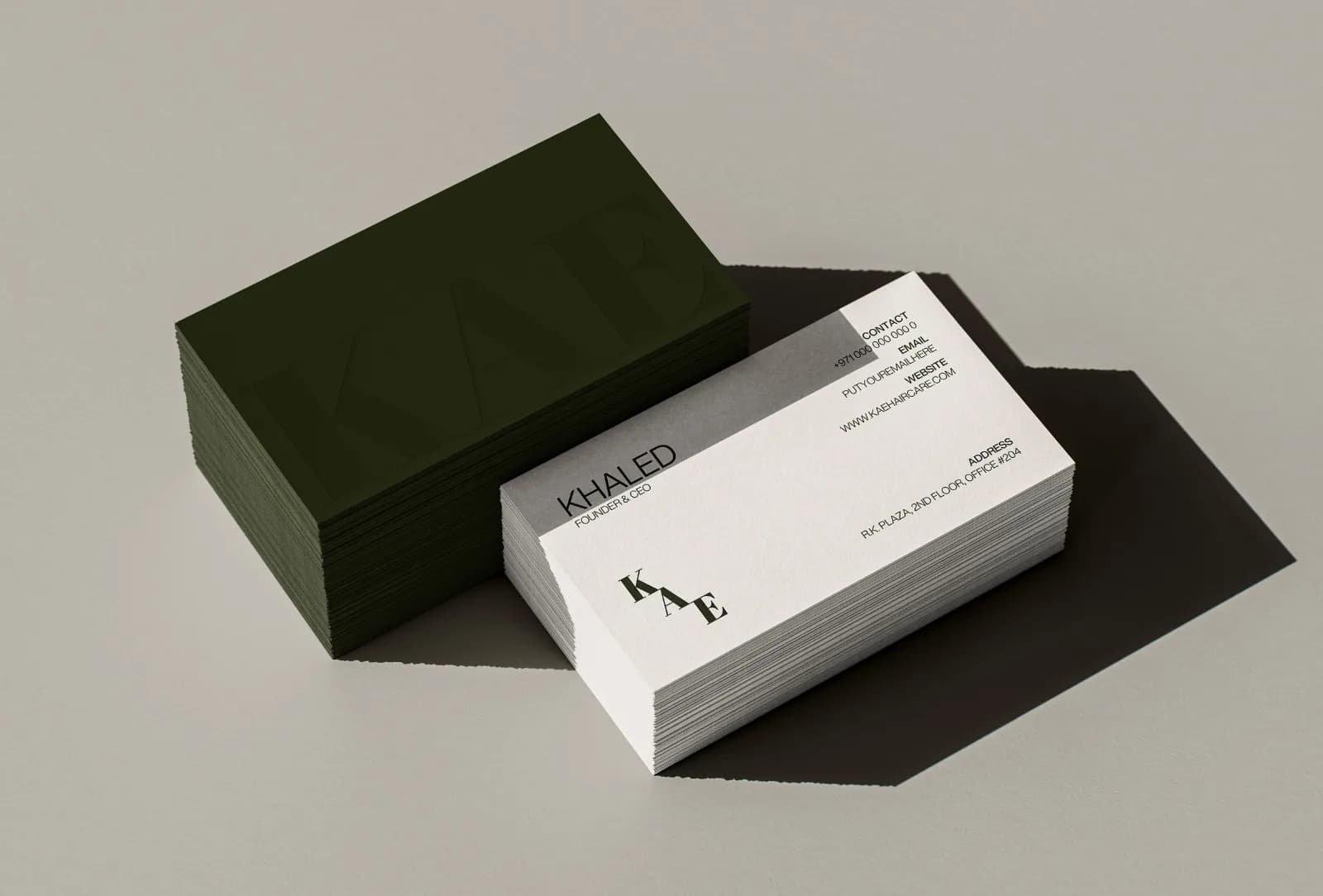
The actual things: business cards, packaging, signage, social templates, the website, a vehicle, a hoodie. This is where the identity is tested. A system that only exists on a white artboard isn’t a system yet.
Why a logo on its own fails on day two
On day one you have a logo and you put it on the website. It looks good. On day two you need a LinkedIn banner, and now you have to choose a colour for the background, a font for the headline and a photo. None of those decisions were made, so you make them by feel. On day three someone else makes a post and makes them differently.
That is the failure: not the logo, but the two hundred decisions around it that nobody made once. A logo gives you recognition. It cannot give you consistency, because consistency is about everything the logo sits on. The logo vs branding post goes into the three specific places a logo-only brand breaks.
How the parts work together on a real project
Take Arista. The brief was that people buy luxury property on feeling long before they look at floor plans, so the brand had to stay calm and high-end in print, online and on site. Every part answers that one sentence. The monogram is a circle, which is calm. Navy and sand are the colours of a hotel lobby, not a billboard. Marcellus is slow and classical; Inter stays out of the way. The photography is soft light and real materials. Business cards, folders, bags, brochures, the website, vehicle livery and the event backdrop all follow the same 45-page guide, so an agent, a supplier and the in-house team produce the same brand without checking with each other.
KAE is the same idea with a different brief. Hair oil brands look either clinical and cold or homemade, and KAE had to sit between the two. So the wordmark in Abril Fatface has the weight of an old apothecary label, the olive palette and moss-and-stone photography soften it, and the bottle stays dark with minimal type so the product reads as a treatment rather than a cosmetic. The 17-page guide and the print-ready packaging came out of the same decisions.
Notice that neither project started with a logo. Both started with a sentence about what the customer needs to feel, and the logo was one of several answers to it.
What you actually need at each stage
You don’t need all of the above on the day you register the company, and I’ll tell you so if you ask for it too early.
Launching: a logo with its versions, two or three colours with codes, a type pairing, and a one- or two-page rule sheet. That is a small identity, and it is enough for a website, a deck and social media to agree with each other. Projects at this stage sit at the lower end of what I charge.
Growing: once other people make things for you, you need the full system. Imagery direction, layout rules, templates for the things you make most, packaging if you sell a product, and a proper guideline book so the next designer or hire can’t drift. The brand identity package post lists what sits in each level, and if you are not sure whether your current brand has a problem, 9 signs your brand looks amateur is a quick way to check.
Already have a logo you like? That is often the right starting point. I can build the colour, type, layout and applications around a mark a client already has, and point out anything in it that will cause trouble in print or at small sizes.
Where to go from here
If the word you were missing was brand identity, the next thing to read is why a logo isn’t a brand, which covers the trade-offs more bluntly. If you already know you need the system and want to know what it includes, the brand identity service page lists it.
And if you would rather just describe your business and have me tell you what you need, send me a few lines. An honest answer costs nothing, and sometimes the answer is that a logo is all you need right now.
Questions founders ask me
No. The identity is the system itself: the logo, colours, type, imagery and applications. The style guide or guideline book is the document that records the rules for using it. You can have an identity without a guide, but it tends to drift.