Rebranding10 min read
9 signs your brand looks amateur, and how to fix each one
People decide whether to trust you in a few seconds, and most of what tips them is small and fixable. Here are the nine things I check first, and what each one costs you.
Javeria Hareem
Logo & Brand Designer, founder of Jayy Studio
In this article
- What’s going on when a brand looks unprofessional
- 1. Your logo is a slightly different colour on every platform
- 2. The logo only works at one size
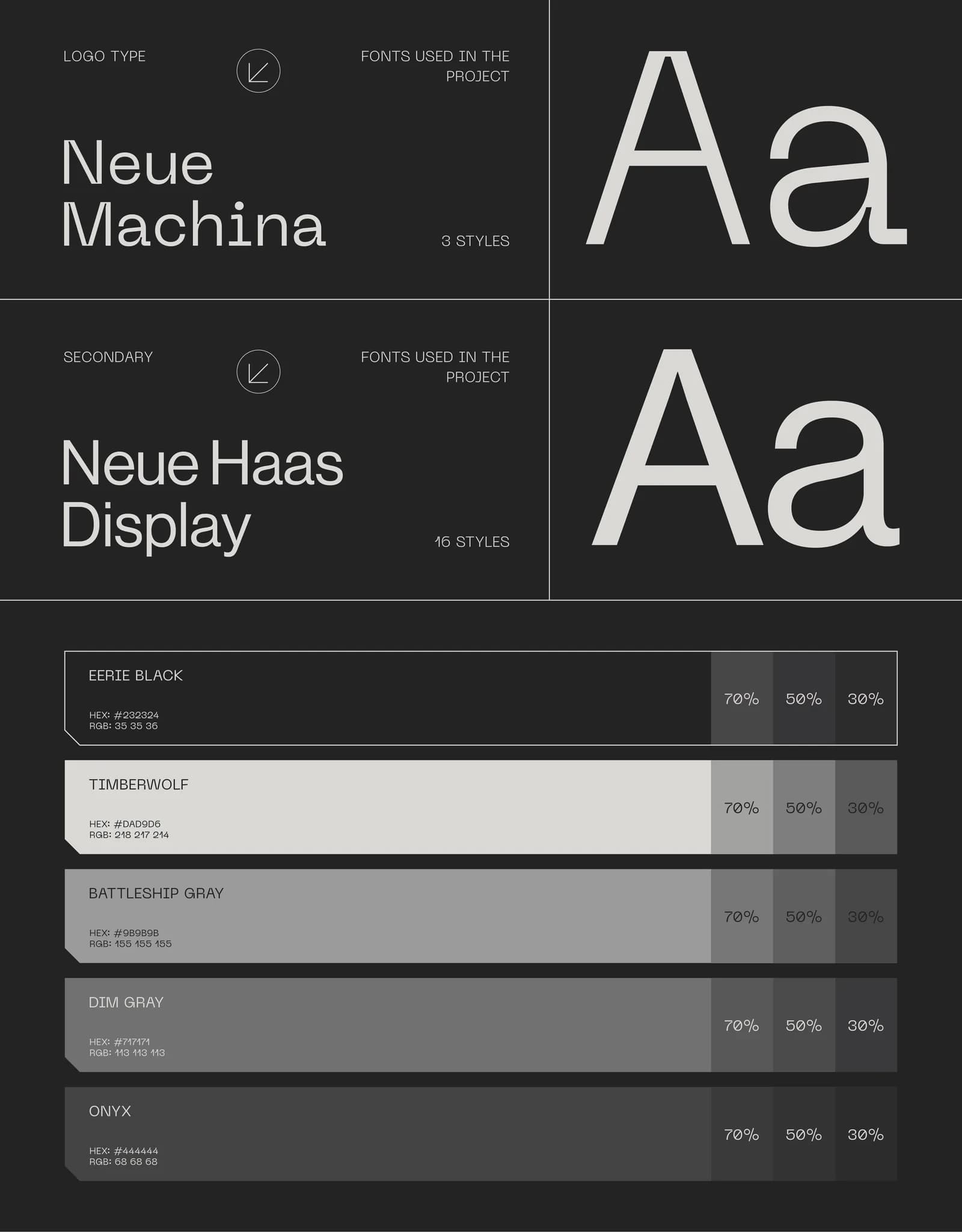
- 3. Four fonts, and none of them chosen on purpose
- 4. Stock icons and clip art inside the mark
- 5. It looks like everyone else in your category
- 6. There is no one-colour or reversed version
- 7. Your website, deck and Instagram look like three companies
- 8. The logo files are blurry, stretched or boxed in white
- 9. Nobody has written the rules down
- Which of these are quick fixes, honestly
- What to do next
- Questions founders ask me
Nobody tells you your brand looks unprofessional. They just don’t reply to the proposal, or they pick the other quote, or they scroll past.
Founders usually sense it before they can name it. The website feels a bit off. The deck looks homemade next to a competitor’s. You’ve started apologising for the logo before anyone has said anything about it.
After seven years and a thousand-plus projects I can usually spot the cause in a minute, and it’s rarely one big thing. It’s a handful of small ones. Here are the nine I check first, in your own files, with what each costs you and how it gets fixed.
What’s going on when a brand looks unprofessional
Almost nobody has a brand that is bad in one dramatic way. What they have is a logo that was fine in 2021, a colour that got eyedropped from a screenshot, a font a freelancer picked because it was installed, and a deck a new hire built from an old one. Each decision was reasonable. Together they read as “nobody is in charge here”.
Customers don’t analyse any of this. They register a feeling, and the feeling is risk. If you can’t keep your own logo the same colour, how carefully will you handle their project? It’s unfair, and it’s also how people decide.
So, the nine signs. Go through them with your website, your last proposal and your Instagram open. If you’d rather have a second pair of eyes, send it in for Rate my logo, my monthly logo review.
1. Your logo is a slightly different colour on every platform
How to spot it: screenshot your logo from the website, your email signature and your latest social post and put them side by side. If the blues or greens don’t match, this is you. It usually happens because the colour was never written down, so each person picked it by eye.
Why it costs you: a colour that drifts tells people the brand isn’t looked after. It also makes print unpredictable, because a screen value pasted into a print job comes out muddy.
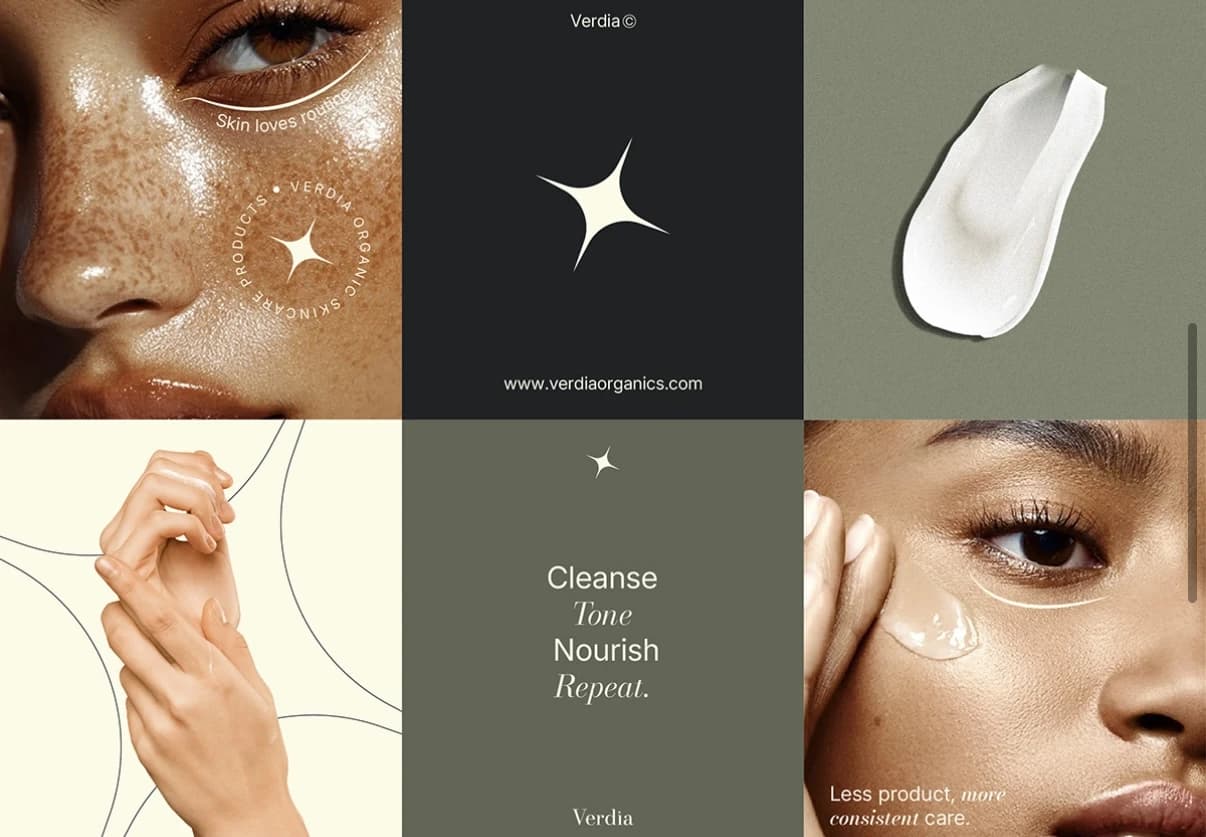
The fix: one palette with HEX for screens, RGB for digital files and CMYK for print, written in a document everyone can find. I set this for every identity, and it is the cheapest sign on this list to put right. The Cerevion palette has seven colours with all three value sets recorded, which is why four products on a shelf still read as one brand.
2. The logo only works at one size
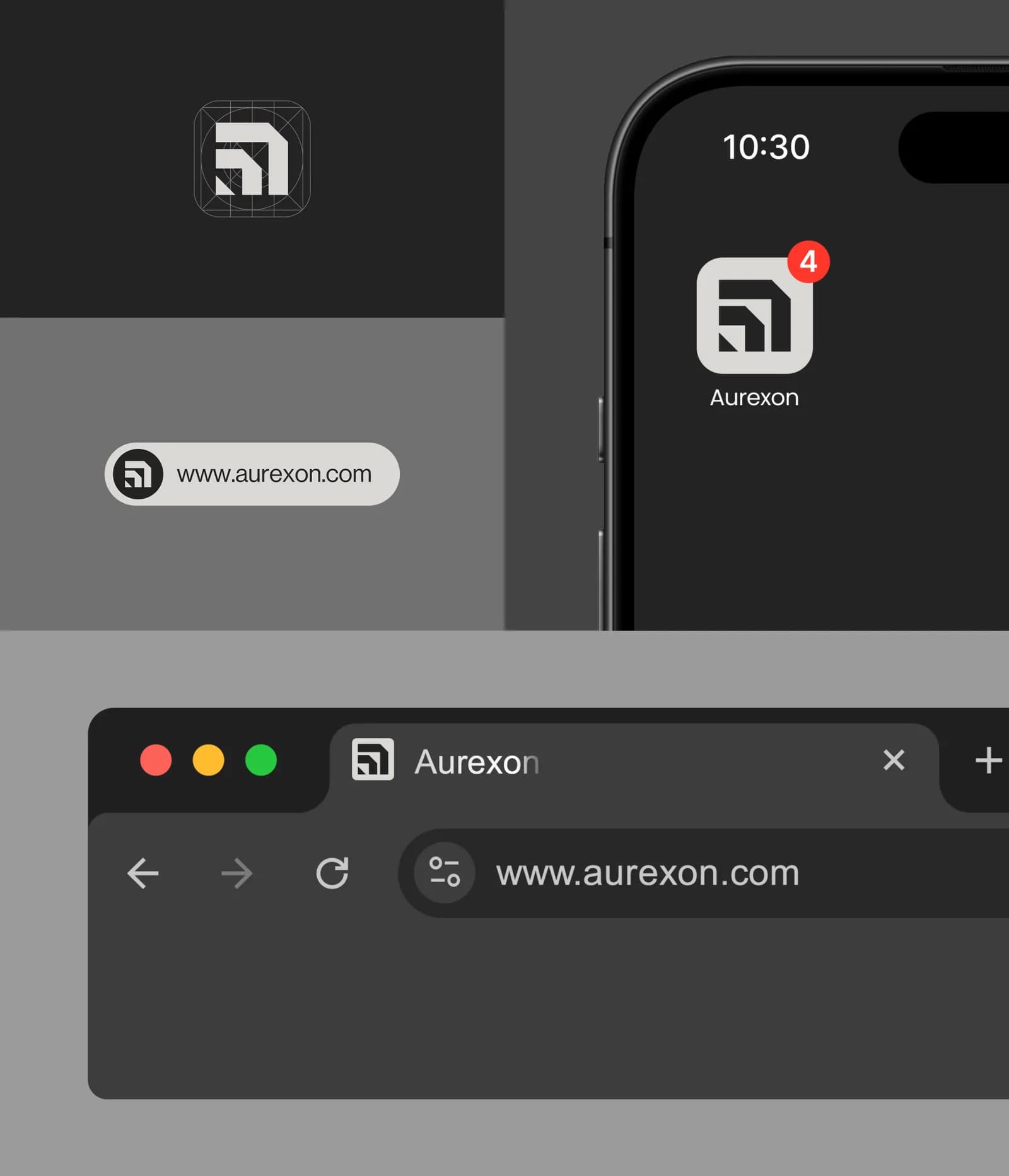
How to spot it: shrink your logo to 16 pixels, the size of a browser tab icon. Then blow it up to the size of a shop sign. If it turns to mush at one end or looks thin and empty at the other, it was designed for a single use, usually a website header.
Why it costs you: every new place you put the brand becomes a compromise. The app icon is a cropped version someone made in a hurry. The embroidered shirt has a logo the embroiderer simplified without asking.
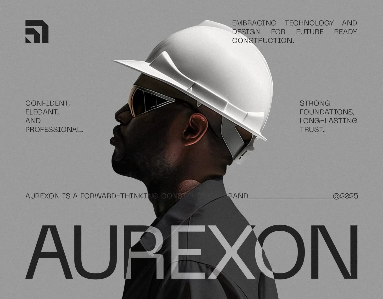
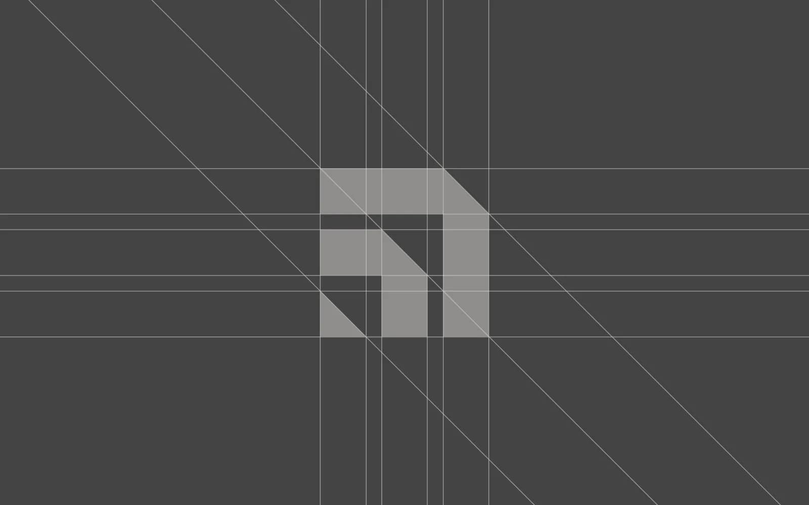
The fix: this one is the mark itself, so it means redrawing. A mark built on a grid, with a symbol that works alone and a wordmark that works alone, survives every size. The Aurexon symbol was drawn on a strict grid for exactly that reason: it goes from a cast-metal sign on a facade to a smartwatch face without changing shape.
3. Four fonts, and none of them chosen on purpose
How to spot it: count the typefaces on your website, your deck and your Instagram. If you get past two and can’t say why each one is there, that’s the sign. Common version: the website uses whatever the theme came with, the deck uses Calibri, the posts use whatever Canva suggested that day.
Why it costs you: type is the most-read part of your brand, far more than the logo. When it changes from surface to surface, the brand has no voice, just a series of defaults.
The fix: pick one headline face and one reading face, write down the weights and sizes for each job, and name the fallbacks for tools that can’t load your fonts. How to choose brand fonts walks through the pairings I’ve used and why.
4. Stock icons and clip art inside the mark
How to spot it: a generic lightbulb, a leaf, a swoosh, a globe, a house with a roof line. If you could search the shape on a stock site and find it in ten seconds, it’s this.
Why it costs you: two reasons. You may not own it, which matters the day you try to trademark the name. And it makes you interchangeable: there are thousands of “leaf plus sans serif” wellness brands, and customers can’t tell them apart because there is nothing to tell apart.
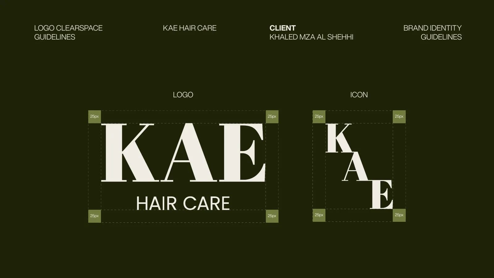
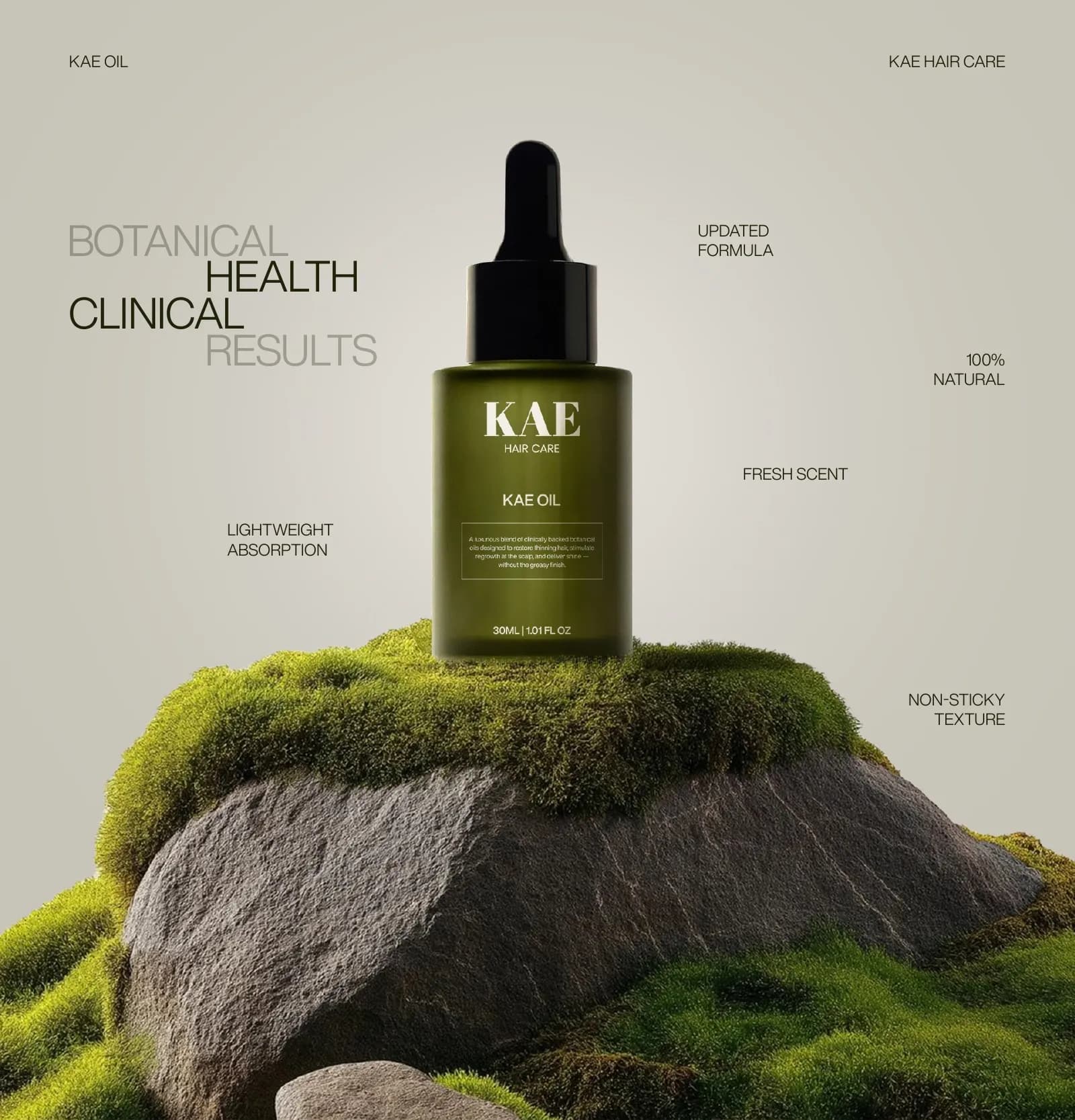
The fix: a mark drawn for you. It doesn’t have to be complicated. The KAE logotype is three letters in Abril Fatface, set with care, and it is more ownable than any botanical illustration would have been. Before you redraw anything, read who owns your logo and check what you actually have the rights to.
5. It looks like everyone else in your category
How to spot it: search your category on Google Images or Instagram and put your logo among the results. If it disappears, it’s following the category defaults. Construction firms with hard hats and orange. Beauty brands in blush pink. Tech startups in gradient blue.
Why it costs you: being safe is being invisible. Customers choosing between three similar-looking suppliers choose on price, because nothing else is distinguishable.
The fix: a positioning decision before a design decision. Aurexon went monochrome in a category that runs on orange and blue, and the restraint is the whole point: it reads as an engineering company, not a local contractor. You don’t have to be loud to be distinct. You have to be different in a way that fits what you actually are.
6. There is no one-colour or reversed version
How to spot it: try to put your logo on a dark background, or on a photo, or send it to an embroiderer. If the only file is a full-colour version on white, you’ll either get a white box or a gradient that embroidery can’t reproduce.
Why it costs you: every surface that can’t take full colour gets an improvised version. Over a year, that’s a lot of improvised versions.
The fix: a complete set. Full colour, one-colour black, one-colour white (reversed), and a standalone icon, each as vector and PNG with transparent backgrounds. Plus two rules: minimum size and clear space. It’s the standard handoff for any logo project I do and it takes the guesswork out of every future print job. The file formats post explains which file goes where.
7. Your website, deck and Instagram look like three companies
How to spot it: open all three at once. Same logo, maybe. Same anything else? Usually not. The website is from the agency that built it, the deck is from the founder’s last job, the posts are from whoever ran social last.
Why it costs you: this is the sign that most damages trust with bigger clients, because they see all three in the same week. A procurement team that gets a polished proposal from a scrappy-looking website wonders which is the real you.
The fix: a system, which is what a brand identity actually is. Colour, type, layout rules and templates for the surfaces you use most. It is the single biggest jump from “has a logo” to “has a brand”, and most of my identity projects are this fix. If the logo is fine, you don’t need a new one to do it: rebrand or refresh explains the difference.
8. The logo files are blurry, stretched or boxed in white
How to spot it: zoom in on your logo on the website. If the edges are fuzzy, it’s a small raster image being displayed too large. If it looks slightly squashed on the Facebook banner, someone stretched it to fit. If there is a white rectangle around it on a coloured background, it was saved as a JPG.
Why it costs you: of the nine, this is the one customers consciously notice. A pixelated logo reads as “cheap” faster than any other mistake, and it undermines everything next to it.
The fix: get the vector file (AI, EPS or SVG) and use it everywhere it can be used. Export PNGs at the right size for each platform, with transparent backgrounds. If you don’t have a vector, the logo needs to be redrawn as one; I do this often for clients who only ever received a JPG.
9. Nobody has written the rules down
How to spot it: ask whoever made your last design piece how they chose the colours and fonts. If the answer is “I looked at the website”, there are no rules. There is only imitation, and imitation drifts.
Why it costs you: every freelancer, printer and new hire makes dozens of small decisions, and each guess is a little different from the last. This is the cause behind signs 1, 3 and 7. It’s also why fixing the others without fixing this one doesn’t hold.
The fix: a guidelines document. Not necessarily a 45-page book; a focused 12 to 20 pages is enough for most small businesses. KAE’s runs to 17 pages, PuppyDock’s to 12. The seven things it must include is the checklist I work from. If you’re not sure whether you need a style guide or a full book, brand guidelines vs style guide sorts out the difference.
Which of these are quick fixes, honestly
Signs 1, 6, 8 and 9 are system fixes: write the palette down, export a proper logo set, get the vector, make a short guide. If your logo is sound, I can do all four in a few days as a refresh. For what the bigger version looks like, see five rebrands before and after.
Signs 3 and 7 are a bit bigger, because they involve choosing type and building templates, but they still don’t need a new logo.
Signs 2, 4 and 5 are about the mark itself. If you recognised your brand in those three, you are looking at a redesign, and it’s better to know that now than after you’ve paid for templates built around a logo that has to change. What a logo costs covers the ranges so there are no surprises.
What to do next
Count your signs. If it’s mostly the system ones, send me what you have, including every logo file you can find, and I’ll quote a refresh. If the mark itself is in trouble, book a call and we’ll talk through whether it’s a redraw or a rebrand before you spend anything. Either way, the goal is the same: a brand nobody has to apologise for.
Questions founders ask me
No. Some marketplace logos are perfectly sound. The problems tend to be the files (no vector, no one-colour version) and ownership (templates reused across buyers). Check those two things first; the design itself may be fine.