Logo design10 min read
Logo file formats explained: AI, EPS, SVG, PNG, PDF
Someone has asked for your logo “in vector” and you’ve sent the PNG from your website. Here’s what every logo file is for, and which one to send to whom.
Javeria Hareem
Logo & Brand Designer, founder of Jayy Studio
In this article
Somebody has just asked you for your logo “in vector”, you’ve sent them the PNG from your website, and now they’re asking again.
This happens to founders every week. A printer wants an EPS. A developer wants an SVG. The embroidery shop says the file you sent “won’t work” and doesn’t explain why. Meanwhile your VA is pasting a JPG with a white box around it onto a dark Instagram post, and nobody is quite sure which of the eleven files in the shared drive is the right one.
So here is the plain-words version of logo file formats: what each one is, who needs it, and the handful of versions you should have before anyone asks.
Vector or raster: the only distinction that matters
Every logo file is one of two things. A vector file stores your logo as geometry: points, curves and fills, described mathematically. Make it the size of a stamp or the size of a building and it is redrawn perfectly each time, because there are no pixels to run out of. A raster file stores your logo as a grid of coloured squares. It looks fine at the size it was made and slightly worse at every size above that.
That is the whole lesson, honestly. Almost every logo file problem I get asked about comes from a raster file being used where a vector was needed. The 200-pixel PNG someone pulled off the website, blown up for a trade-show banner, is the classic. From two metres away it looks like it was drawn in chalk.
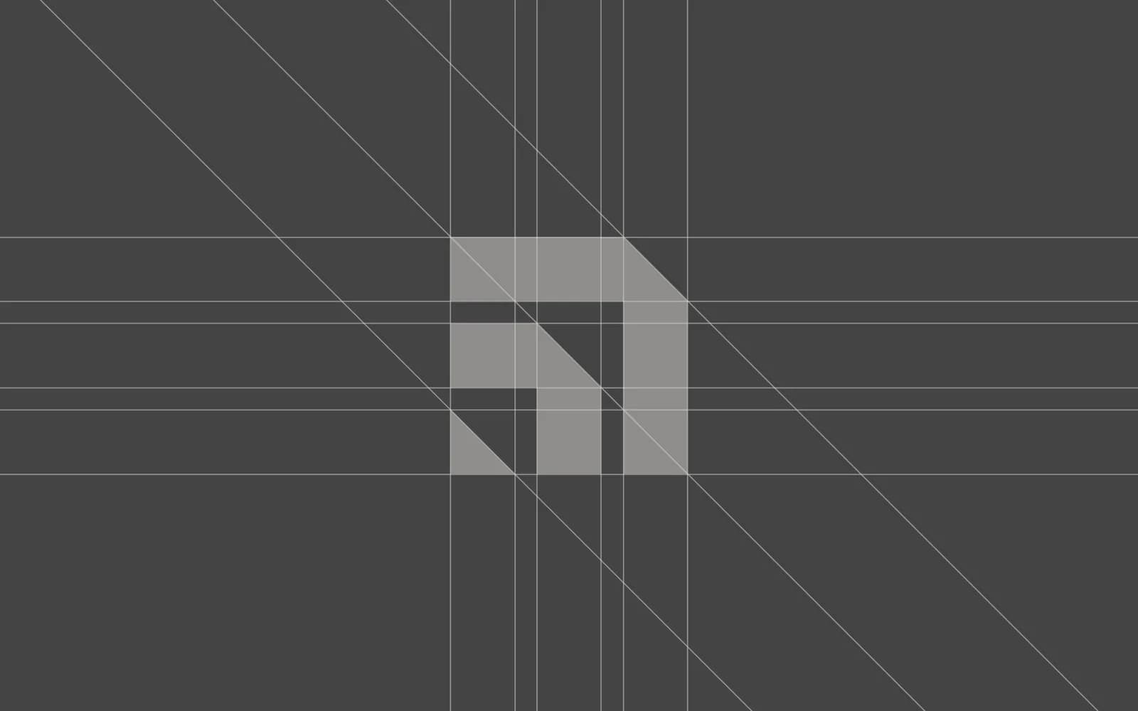
The six logo file formats, one at a time
AI
The Adobe Illustrator source file. This is the master: every shape is still editable, the layers are still named, and any designer with Illustrator can open it and make changes. It is also the file most of your suppliers cannot open, so it rarely leaves the folder. Keep it safe, back it up, and never let it be the only copy of anything.
EPS
The older, universal vector format. Print shops, sign makers and embroidery digitisers have been asking for EPS files for twenty years and many still do. It opens in almost every professional tool and keeps the vectors intact. If a supplier says “send me a vector” and nothing else, EPS is usually what they mean.
SVG
The vector format of the web. An SVG is a text file your browser draws on the fly, so it stays sharp on every screen, including the ones with very high pixel density, and it weighs almost nothing. Your developer wants this. So does anyone building a presentation template or an app icon. It is also the format I’d hand to someone using Figma or Canva, because both import it cleanly.
The one people underestimate. A PDF exported from Illustrator keeps the vector data, which makes it a vector file with a friendly face: it opens on any phone or laptop, previews properly in email, and a printer can place it directly into their layout. Just be aware that a PDF made from a JPG is still a JPG inside. Ask your designer for a “vector PDF” and they’ll know what you mean.
PNG
The everyday raster file. The thing that makes a PNG useful is transparency: the logo can sit on any background with no white box around it. Export it large (2,000 pixels wide is a sensible minimum, plus smaller sizes for social) and use it in documents, presentations, email signatures and social posts. Never for print at a size bigger than a business card, and never as the file you send a printer.
JPG
Also raster, no transparency, and compressed in a way that leaves faint smudges around sharp edges. It is fine for a photo. For a logo it is the last resort: a JPG is what you send when a form only accepts JPGs, and that is about it. If the only logo file you own is a JPG, that is the clearest sign you are missing the rest of the set.
Two more you’ll bump into. WebP is a compressed format websites use to load faster; your developer makes it, you don’t supply it. ICO is the tiny favicon for browser tabs, built from your SVG by whoever makes the website.
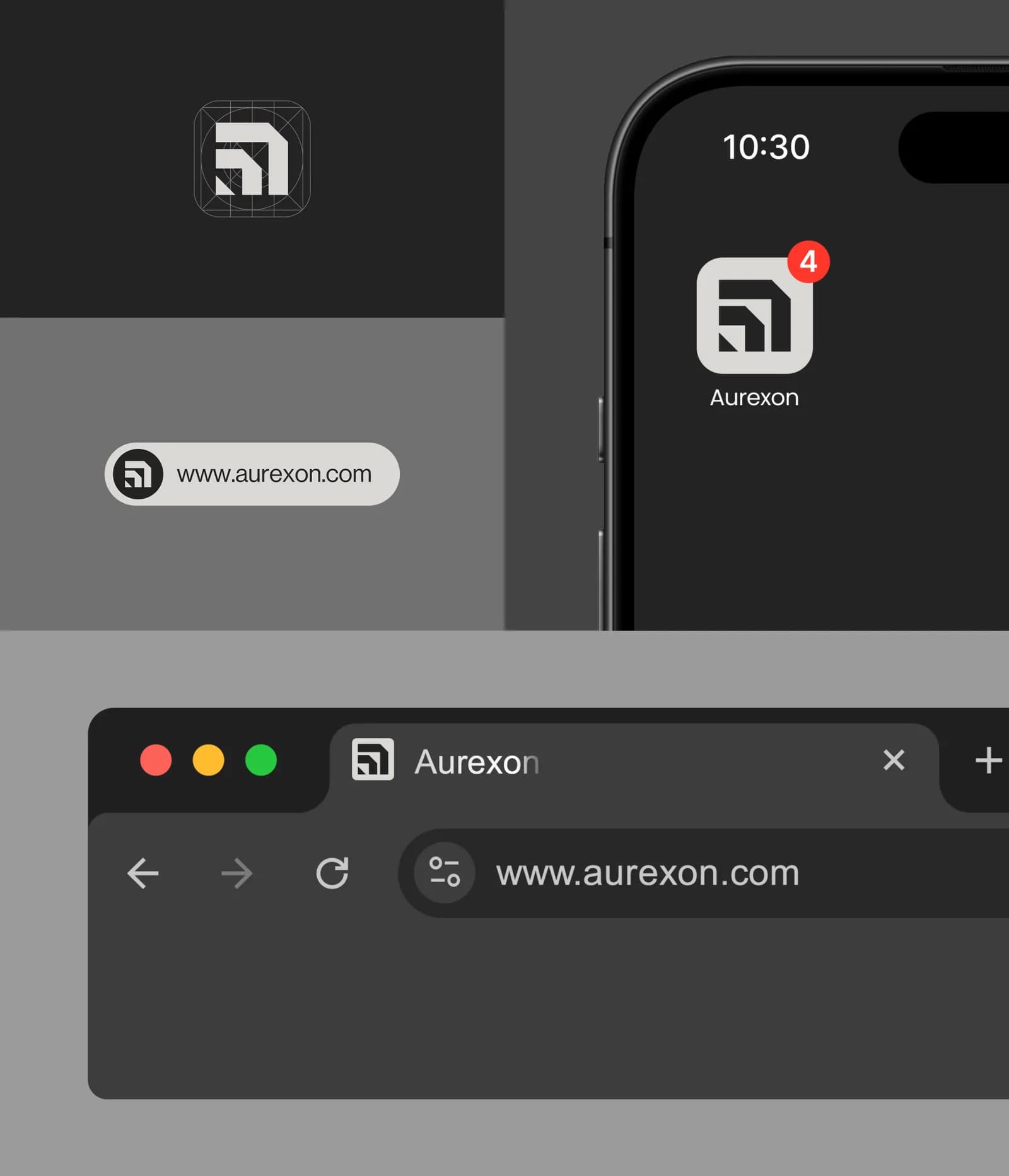
Which file to send to whom
Here is the table I wish I could pin to every client’s shared drive. When someone asks for your logo, find them on the left and send what is on the right. If they ask for something different, they probably know what they are doing; send that too.
| Who is asking | Send them | Why |
|---|---|---|
| Printer (cards, flyers, brochures) | EPS or vector PDF, CMYK | They place it at any size and the colours match their inks |
| Sign maker or vinyl cutter | EPS or SVG, one-colour version | Cutting machines follow vector paths; they cannot cut a JPG |
| Embroidery shop | EPS, one-colour, plus a PNG preview | They digitise from the vectors and check the look against the preview |
| Web developer | SVG, plus PNG fallbacks | Sharp on every screen, tiny file size |
| Social media manager or VA | Transparent PNGs in several sizes | Drops onto any background without a white box |
| Someone making a slide deck | Transparent PNG or SVG | PowerPoint, Keynote and Google Slides all accept both |
| Merch or packaging supplier | EPS or vector PDF, with Pantone references | Their presses and inks are specified from the vector |
| Another designer | The AI file | They need the editable master |
The versions you should have, not just the formats
Formats are only half of it. The other half is versions. A logo that only exists in full colour on a white background is going to fail the first time it meets a dark shirt, a one-colour print run or a square profile picture. Restaurants hit this first, on stamps, cups and napkins, which is why restaurant branding starts with a one-colour mark.
The set I deliver on every logo project is the same: the full-colour logo, a one-colour black version, a one-colour white version (the “reversed” logo, for dark backgrounds), and the symbol or icon on its own for the places where the full lockup won’t fit. If the logo has a horizontal and a stacked arrangement, both of those, too. Each of those exists in every format above, and the raster versions all have transparent backgrounds. For founders on a tight runway, startup logo design covers what to buy first.
That sounds like a lot of files, and it is: a few dozen, organised and clearly named. The alternative is a founder trying to recolour a JPG in Canva the night before a print deadline, which I have watched happen more than once.
The mistakes I see every week
The white box. A JPG, or a PNG exported without transparency, placed on a coloured background. You have seen this on a thousand small-business Instagram posts. It is the single most common sign that a brand doesn’t have its files in order.
The blurry banner. A screen-sized PNG sent to a large-format printer, who prints what they were given. The founder sees it at the exhibition and says “but it looked fine on my laptop”.
The fake vector. Someone has opened a JPG in Illustrator, hit “image trace” and saved it as an EPS. It is technically a vector file and it looks like a melted version of your logo. If a “vector” appeared from nowhere, this is probably what it is.
The font swap. A vector file saved with live text instead of outlined text. On your designer’s computer it looks right. On the printer’s computer, which doesn’t have the font, the type quietly swaps to something else. Final logo files should always have the lettering converted to outlines, which is one of the things a brand guidelines document should spell out.
And the quiet one: no files at all. The designer sent one PNG, the project ended, and the source lives on a hard drive you will never see again. That is partly a file problem and partly an ownership problem, which I’ve written about separately in who owns your logo.
What a proper handoff folder looks like
When a logo project ends, this is what should land in your inbox. If it doesn’t, ask for it; any designer who drew the logo properly can export this in an afternoon. Bigger projects add a written guide on top; brand guidelines vs style guide vs brand book explains which one you need.
- A folder per version: primary logo, secondary lockup, symbol, with full-colour, black and white inside each
- Vector files for every version: AI, EPS, SVG and vector PDF, text outlined, in both CMYK and RGB where the colours differ
- Transparent PNGs at a few sizes, including one large enough for a poster and one sized for social profiles
- A JPG on white for the forms that insist on it
- The colour values written down: HEX, RGB, CMYK and, if you have them, Pantone
- The font names and where the licences came from
- A short readme or a page in the guidelines that says which file goes where
If you don’t have these files
First, ask. Most designers keep their source files and will export a proper set if you explain what you need; some charge a small fee for the time, which is fair. If the designer has disappeared, or the logo only ever existed as a PNG, it can be redrawn as a clean vector. A small job if the mark is simple, a bigger one if it was traced from a photo.
And if you are about to commission a logo, put the file list above into the brief before you pay a deposit. It is a two-minute conversation at the start and a two-week headache at the end. What goes into a proper brand identity package is a longer answer, but the files are the floor, not the ceiling. If you’d like me to look at what you’ve got, send me a message and I’ll tell you honestly whether you need a redraw or just an export.
Questions founders ask me
You can run an automatic trace in Illustrator or a free online tool, and for a very simple shape it may be acceptable. For anything with curves, fine lines or lettering the result is usually lumpy and needs redrawing by hand. A proper redraw from a designer takes a few hours and gives you clean paths you can use for years.