Cost and hiring8 min read
What’s included in a brand identity package?
Three designers, three quotes, three different ideas of what a “package” is. Here is what should be in the box at each level, and the items that usually go missing.
Javeria Hareem
Logo & Brand Designer, founder of Jayy Studio
 Cost and hiring
In this article
Ask three designers for a brand identity package and you will get three quotes that have almost nothing in common.
One is a logo and three colours on a PDF. One runs to forty line items and includes a vehicle wrap for a vehicle you do not own. The third sits somewhere in between and does not say where. All three are called the same thing, and all three are priced as if you already know what is inside.
This is the list I wish every founder had before comparing quotes: what a brand identity package should contain at each level, what each item is for, and what the cheap ones quietly leave out.
The three levels of a brand identity package
Most quotes fit one of three shapes, whatever they are called on the invoice.
Level one: the logo on its own
A primary logo, usually a secondary lock-up (stacked or horizontal), an icon or monogram for small spaces, each in full colour, one colour and reversed out of dark. Vector source files and the exports. Clear-space and minimum-size rules. This is the right level for a new business that needs to look credible on a website and a social profile and has nothing in print yet. Whether a logo alone is enough is its own question: logo vs branding.
Level two: the logo plus the system
Everything in level one, plus a colour palette with exact values for screen and print, a typography pairing with a type scale (what size a headline is, what size body copy is), and a short set of rules: which logo version goes where, which colours sit together, what never to do. Often a few pages of basic guidelines. This is the level where the brand starts to survive other people touching it.
Level three: the full identity
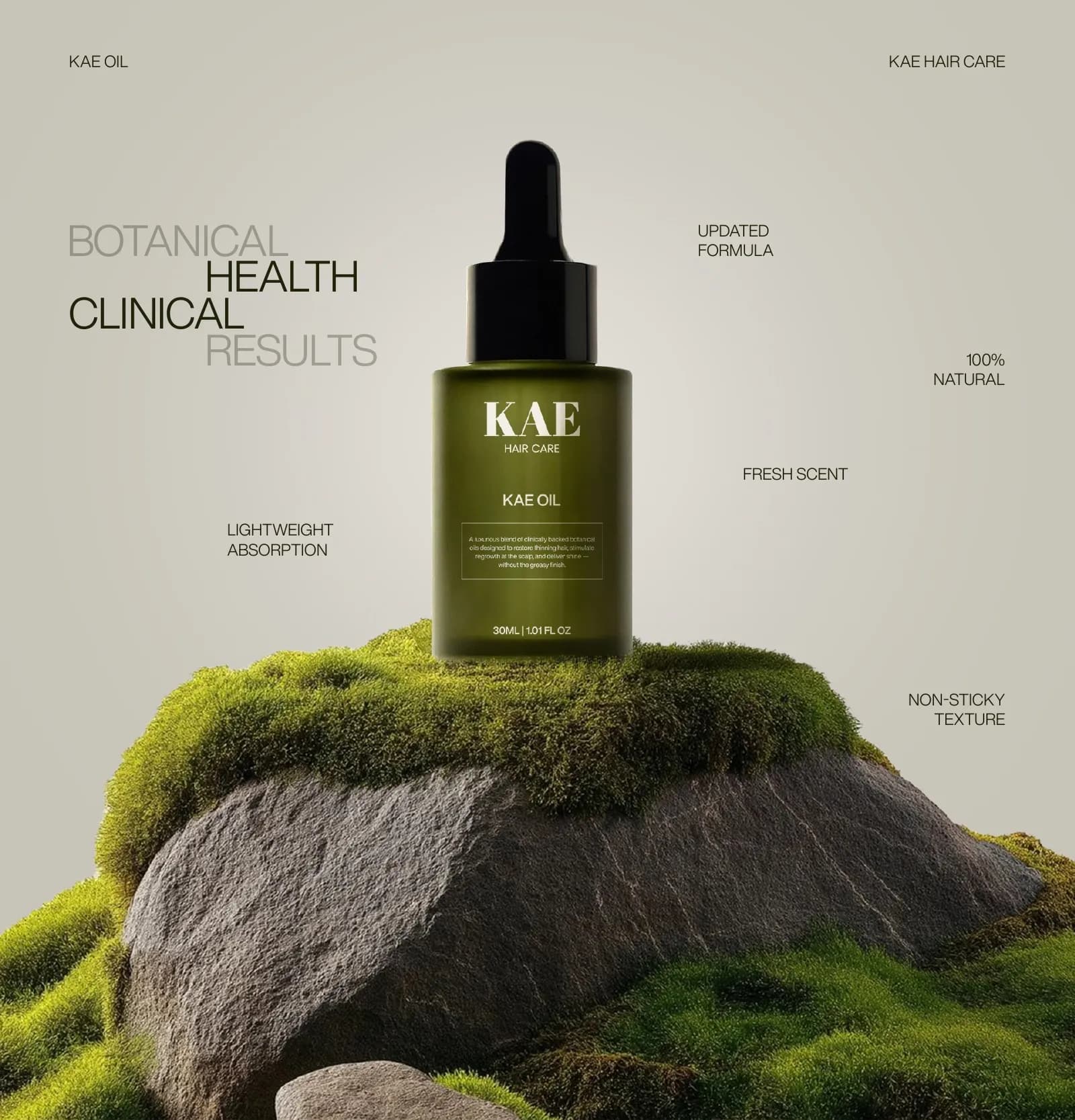
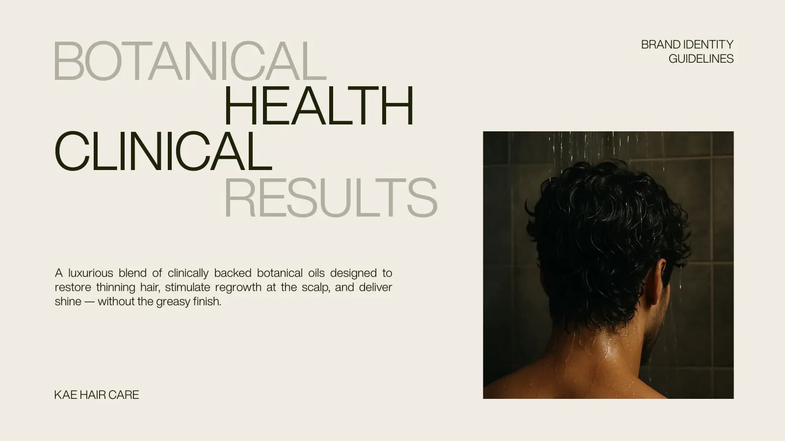
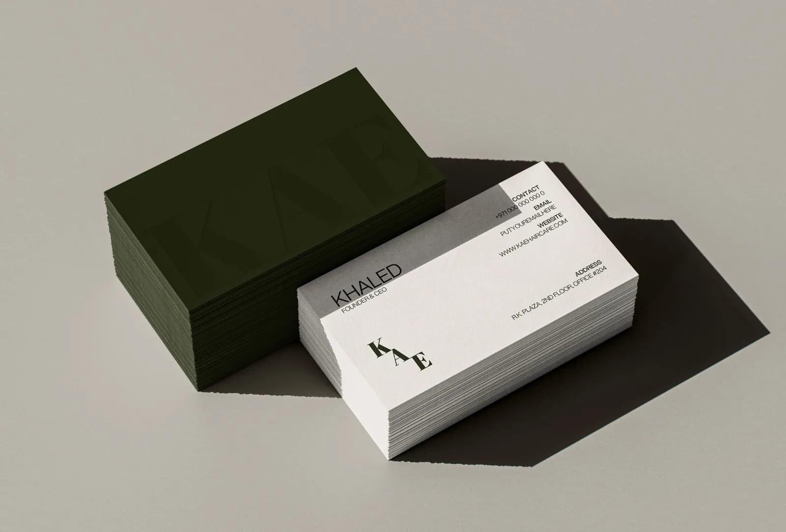
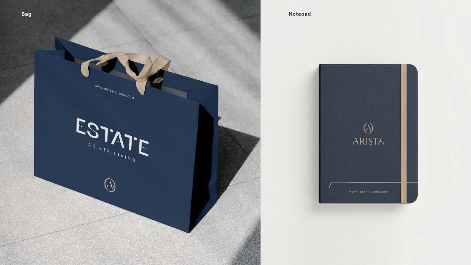
Everything above, plus the applications the business actually uses. Business cards, letterhead and envelopes. Social media templates. Packaging or label artwork if there is a product. Sometimes a pattern, an icon set, signage or a vehicle. And a proper guidelines document, somewhere between twelve and forty-five pages depending on how much there is to govern. KAE Hair Care is a level-three project: wordmark, monogram, palette, bottle, carton, cards, bags, boxes and a 17-page guide.
What each piece is actually for
Line items make more sense once you know the problem each one prevents. If the term itself is fuzzy, what is brand identity starts from the beginning.
The one-colour version exists because printers, embroiderers and engravers often cannot reproduce your gradient or your second colour. The reversed version exists because your logo will eventually sit on a dark photograph or a black shirt. The icon exists because a horizontal wordmark does not fit a circle, and every social platform uses a circle.
Colour values in three systems exist because the same green is written three different ways: HEX for the web, RGB for screens and CMYK for ink, and a printer guessing from a screenshot will get it wrong. A type scale exists so the person making next month’s deck does not have to decide what a subheading looks like. The guidelines exist because, sooner or later, someone who has never met you will make something with your brand, and they will guess unless there is a page to check.
I went through the seven sections a guidelines document needs in a separate post. Not every package needs all seven. Every package needs the first three. What to call that document, and how long it should be, is a separate question: brand guidelines vs style guide.
What cheap packages leave out
The cheapest packages are cheap because they stop at the drawing. Here is what usually goes missing, in the order I tend to see it.
- One-colour and reversed versions. You get the full-colour logo and nothing else, and find out when the embroiderer calls.
- Clear space and minimum size. Without them, the logo gets crammed against page edges and shrunk until it smears.
- CMYK values. The package gives you a HEX code and stops, and the printed card comes back a different green.
- Source files. You receive PNGs. The AI or SVG stays with the designer, and so does your ability to change anything.
- A guide of any kind. The rules live in the designer’s head, which is no use to your next freelancer.
- Font licences. The quote names a typeface but not if the licence covers your website and print, or what that costs.
- Real applications. A mockup on a coffee cup is a picture, not a print-ready file. Ask which items are delivered as artwork.
How to read a quote
Lay the quotes next to each other and look for six things.
First, the logo versions, by name. Second, the file formats, and specifically whether vector source is included. Third, colour values in HEX, RGB and CMYK, not just swatches. Fourth, how many concepts and how many revision rounds, and what happens after the rounds run out. Fifth, ownership: a sentence that says the final files are yours once paid. Sixth, what the word “guidelines” means in that quote: two pages or twenty, a PDF or a link to a Canva board.
Then ask the question most people skip: who is doing the work? At a studio or agency the answer may be someone you never meet. With me it is me, from the first question to the last file.
What is in my packages
I offer three levels, and they map onto the three above. The entry level is a logo done properly: several concept directions, a primary logo, a secondary lock-up and a standalone icon, in full colour, one colour and reversed, as AI, EPS, SVG, PDF, PNG and JPG, with clear-space and minimum-size rules. Three to five days.
The middle level adds the system: more concepts, unlimited revisions until it is right, a colour palette with usage rules, a type scale for print and screen, and basic guidelines. Around five days.
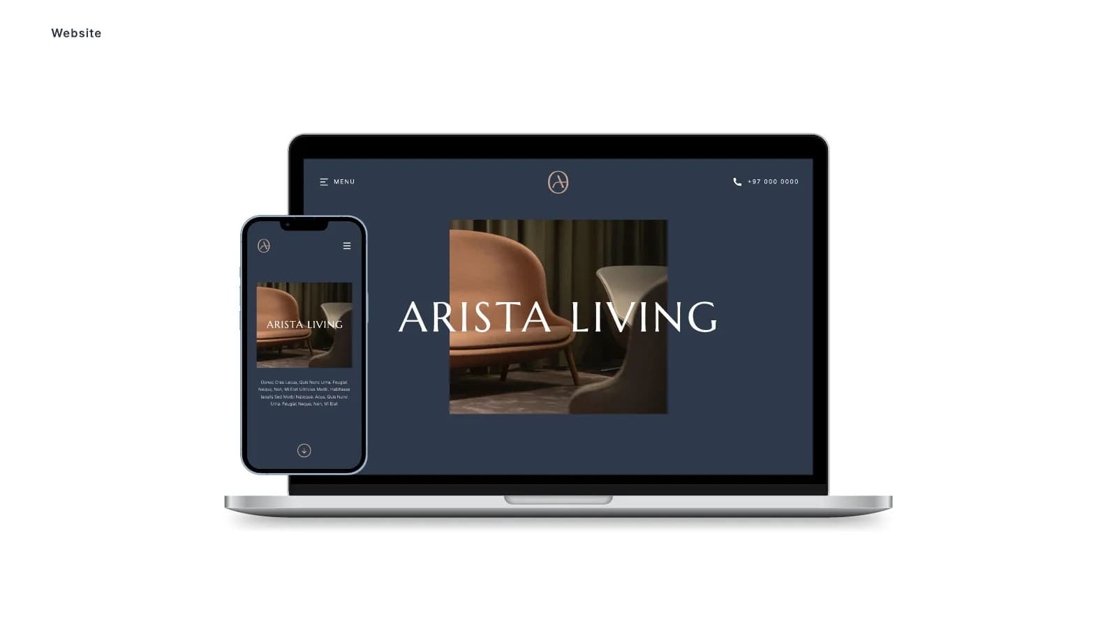
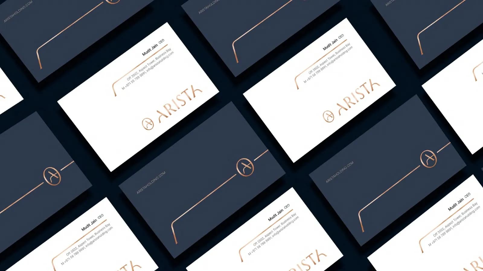
The top level is the full identity: everything above plus business card, letterhead and envelope, a social media template set, a brand pattern or icon set, and a full guidelines PDF. Seven to ten days. Packaging is scoped on its own, because it depends on your dieline and how many variants you have. The full breakdown, with starting prices, is on the pricing page, and every project gets a fixed quote with the scope written down before anything starts.
Which level you actually need
Launching alone, with a website and Instagram as your only touchpoints: level one, done well, is enough. You can add the system later without redoing the logo, provided the logo was built properly in the first place. Logo design for startups goes through that stage in detail.
A team, or regular print: level two at least. The moment two people make brand material, the rules matter more than the mark.
A product, a shop, packaging, or outside suppliers like printers and agencies: level three. Every one of those people will need the same files and the same answers, and a guide is cheaper than correcting each of them. If you are not sure, count how many people will touch the brand in the next year. One: level one. A few: level two. Many, or strangers: level three.
Pick the level, then ask for the list
Decide which shape you need before you compare prices, because a level-one quote will always look cheaper than a level-three quote, and it is not the same product. Then ask each designer for the itemised list, in writing. If you want mine for your project, tell me what you are building and I will send it with a fixed price, usually the same day. How a project runs is written up if you want to know what happens after that, and what a logo costs covers the price brackets.
Questions founders ask me
No. A logo package stops at the mark and its versions. A brand identity package adds the colour, type and rules around it, and at the higher levels the applications: stationery, templates, packaging and a guidelines document. Many designers use the terms loosely, so ask for the itemised list.