Branding basics8 min read
Why a logo isn’t a brand
I have designed over a thousand logos, so I’m allowed to say it: the logo is the smallest part. Here is where a logo-only brand breaks, and what to buy instead.
Javeria Hareem
Logo & Brand Designer, founder of Jayy Studio
In this article
- Logo vs branding: what each one actually does
- What a logo cannot do, however good it is
- Where it breaks: the second touchpoint
- Where it breaks: the second designer
- Where it breaks: the second year
- What to buy instead, at each budget
- When a logo really is all you need right now
- If you’re not sure which you need
- Questions founders ask me
I have designed more than a thousand logos. I mention it so the next sentence lands properly: the logo is the smallest part of your brand.
You might be about to pay for one. Or you have one you like and something still feels off: the website, the deck and the Instagram grid don’t look like they belong to the same company, and you can’t say why, because the logo on all three is the same.
That is the logo vs branding problem, and it is the most common one I see. Here is what a logo can do, what it can’t, the three places a logo-only brand breaks, and what to buy instead at each budget. Including the honest case for buying just a logo.
Logo vs branding: what each one actually does
A logo does one job well: recognition. It is the shape people learn to spot on a shelf, in a feed, on a van. A good one is simple enough to recognise at a glance, built to keep its shape at any size, and different enough from the category’s defaults that it isn’t confused with a competitor. That is a real and useful job. It is also where the job ends.
Branding does the jobs a logo can’t. It positions you (premium or affordable, clinical or warm, local or global) through colour, type, imagery and words. It builds trust through consistency, because people trust what looks the same every time they meet it. And it makes the business reproducible: anyone can make the next thing and have it look like you.

What a logo cannot do, however good it is
It cannot tell anyone if you are expensive. It cannot make a bad photo look premium. It cannot choose the font for your proposal or the colour of your next Instagram post. It cannot stop a freelancer inventing a new shade of your green. It cannot make the website and the packaging feel like one company. None of those are failures of the logo. They are things the logo was never for.
I say this as someone who sold logos by the piece, cheaply, early on, before I understood what I was actually sitting on. The marks were fine. The problems those businesses had were never in the mark. I wrote more about that in Fiverr logo vs custom brand identity.
Where it breaks: the second touchpoint
The first touchpoint is easy. You put the logo on a website and it looks good. The second one is where a logo-only brand starts to wobble. You need a social post, a slide, a label, a sign, and suddenly there are decisions to make that the logo doesn’t answer: what colour is the background, what font is the headline, what kind of photo, how much white space.
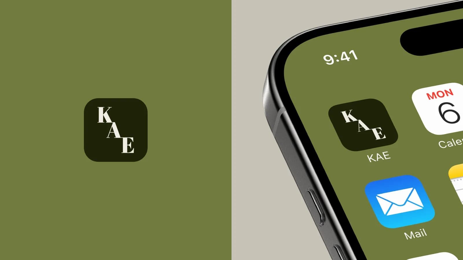
Make those decisions by feel and the second touchpoint looks slightly different from the first. By the tenth, the brand looks like a group project. KAE avoided that because the carton, the bottle, the app icon and the business card were designed together, from one set of rules, before any of them existed.
Where it breaks: the second designer
At some point someone other than the person who made the logo will make something for your brand. A new freelancer, a VA, an agency, a developer, a printer. They will work from whatever you can send them, and if all you can send is a logo file, they will invent the rest. Not out of carelessness. There is simply nothing to check against.
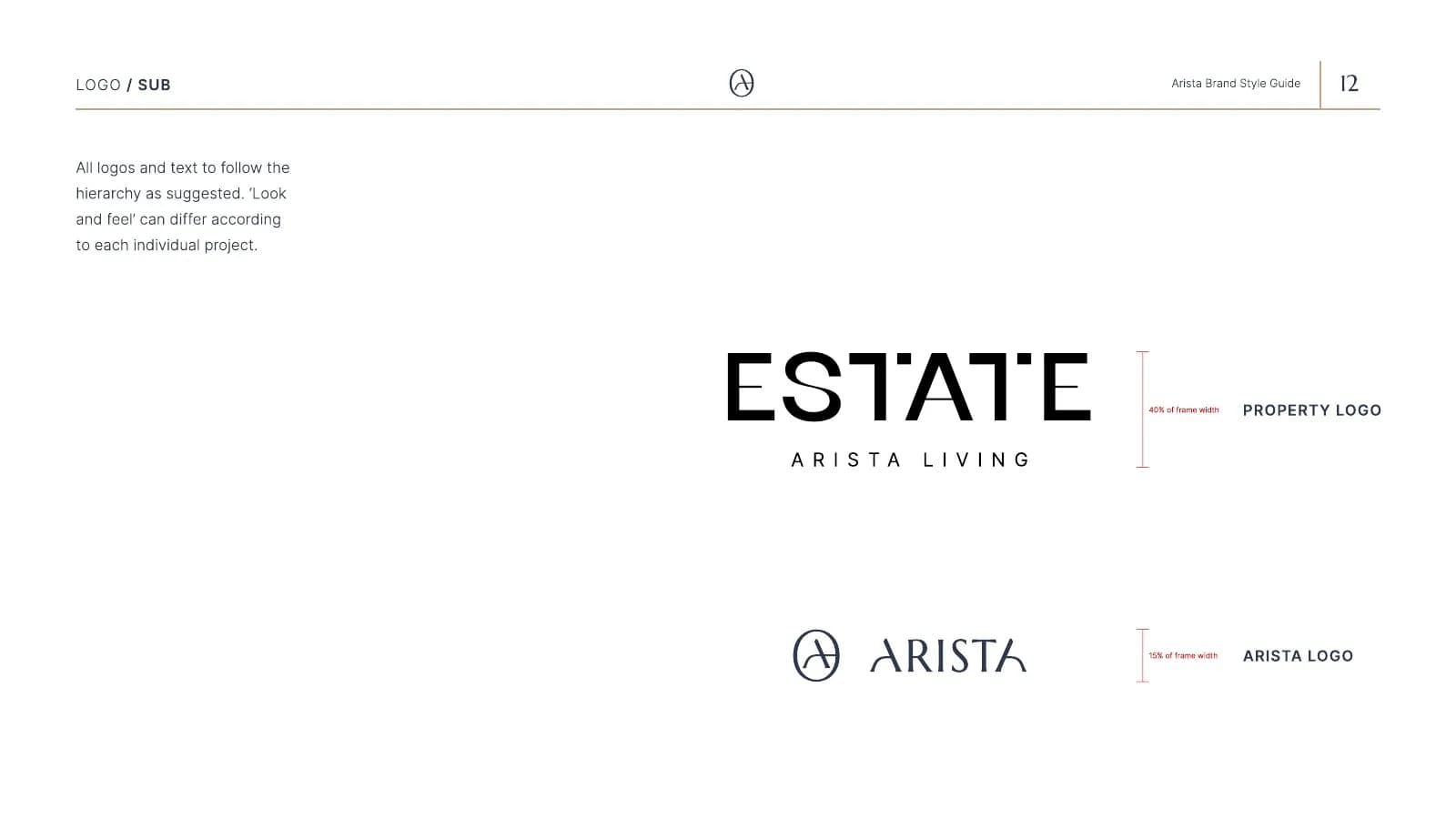
This is the most expensive break, because it compounds. Every new person drifts a little further from the last, and nobody can point to the moment it went wrong. The fix is boring and cheap compared to the problem: colour values, type, a few rules, written down. The 7 things every guidelines document needs covers exactly what to write.
Where it breaks: the second year
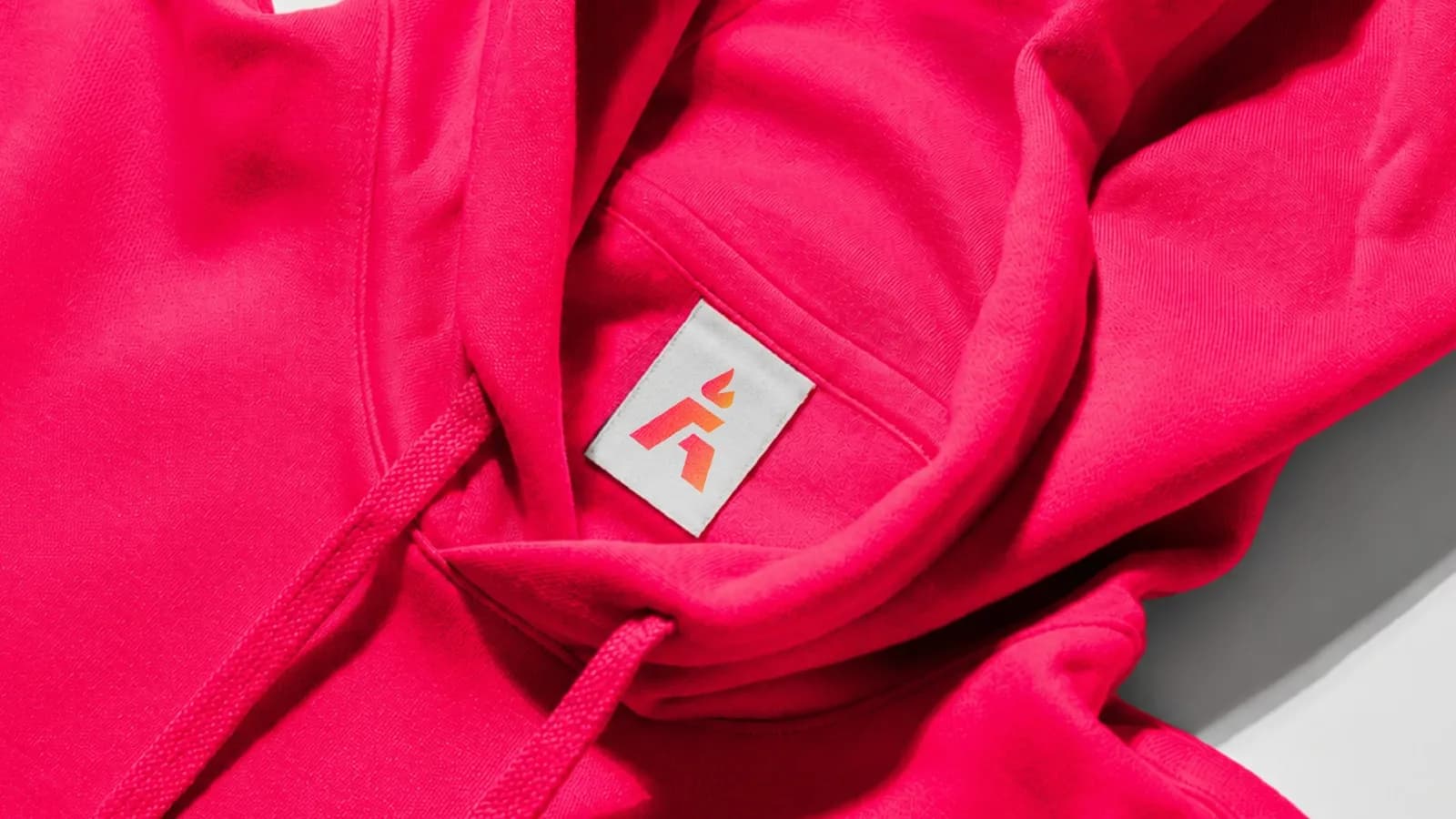
A logo bought in a hurry is bought for the business you have, not the one you are building. In year two you add a product line, open a second location, hire a sales team, or start pitching bigger clients. The logo that was fine on a website now has to go on a hoodie tag, a watch face, a trade-show wall and an investor deck, and it has never been tested on any of them.
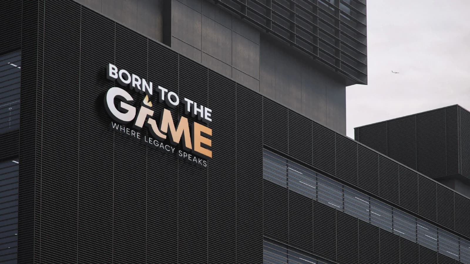
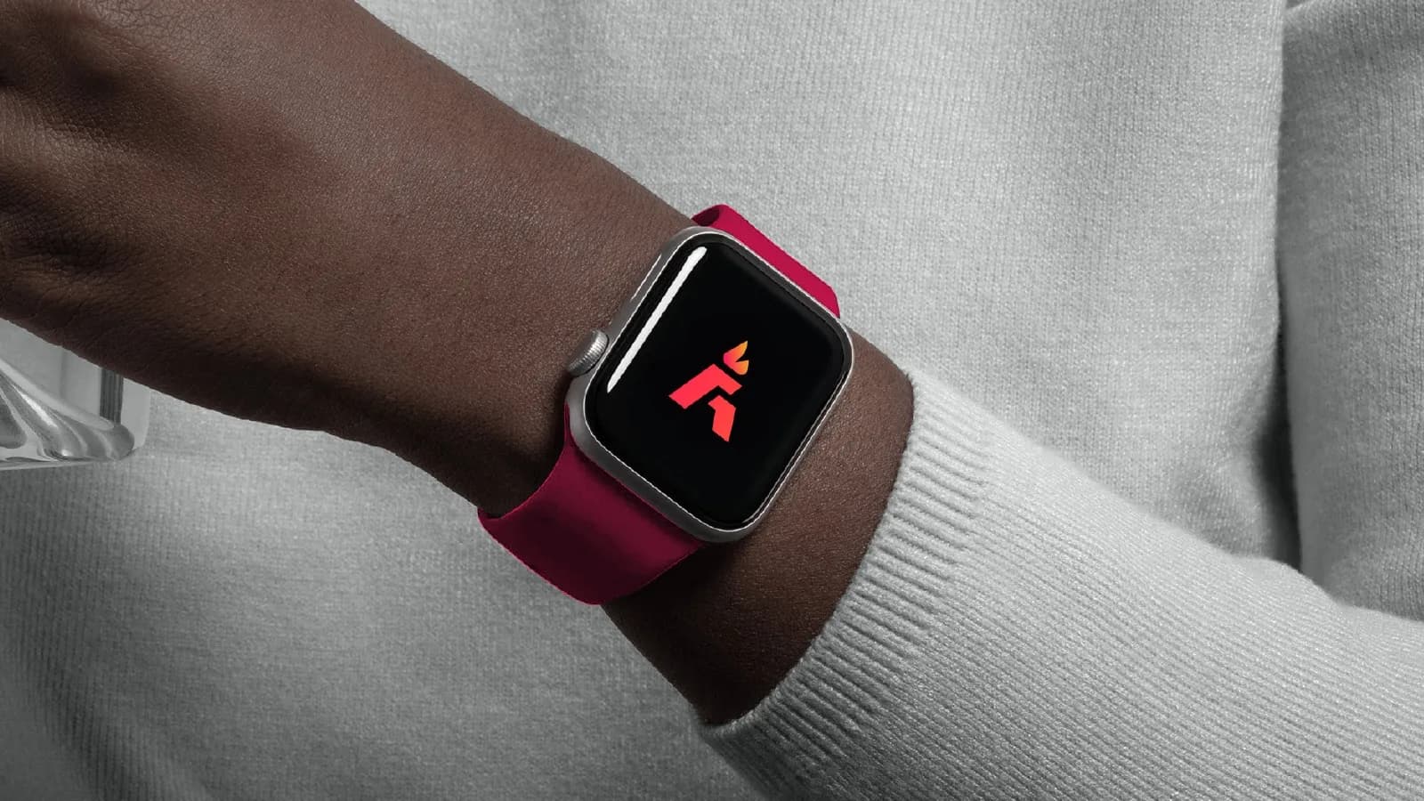
Born To The Game is a sports brand, which means its mark lives in some of the noisiest places there are: feeds, kit, stadium screens. It was built from the start to be the same thing on a watch face as on a hoodie, with lock-up and clear-space rules so partners could reproduce it. That is what a second year looks like when it was planned for.
What to buy instead, at each budget
Branding isn’t a single purchase and it doesn’t have to be a big one. These are the three levels I work at, and roughly where each sits.
A logo, done properly
If a logo is what you can afford, buy a proper one: a primary mark, a stacked version and a symbol, each in full colour, one colour and reversed, as vector files, with a single page of clear-space and minimum-size rules. That page is the difference between a logo and a logo file. This sits at the low end of what I charge, and it is a real foundation rather than a placeholder.
A logo with a small system
The logo above, plus a palette with codes for screen and print, a headline and a reading typeface with sizes, and a short guide. This is what most launching businesses actually need, and it is what stops the second touchpoint and the second designer from drifting. It is the middle of my range.
The full identity
Everything above, plus imagery direction, layout rules, the applications you use most (stationery, social templates, packaging, signage) and a proper guideline book. This is for businesses where other people already make things for the brand. It is the top of my range. Across the three levels, most of my projects fall between about $99 and $1,500, with a fixed quote before we start. The brand identity package post lists what each level includes, and the logo design cost post puts the numbers in context.
When a logo really is all you need right now
Sometimes it is. You are testing an idea and don’t know whether it will exist in six months. You are a one-person business whose entire brand is a website and an email signature. You have a strong, consistent sense of taste and you make everything yourself. In those cases a well-made logo with its versions and a one-page rule sheet is enough, and I will tell you that rather than sell you a system you won’t use. Not sure if yours does that job? Send it in for Rate my logo and I’ll give you an honest score.
The thing to avoid is the middle: a cheap logo with no versions, no rules and no vector files, bought as if it were a brand. That is the one that costs the most, because it has to be replaced the moment the business grows.
If you’re not sure which you need
Start with what is brand identity if the terms are still fuzzy. If they aren’t, tell me about your business in a few lines: what you sell, who buys it, where the brand lives today. I’ll reply with an honest view of whether you need a logo, a small system or the full thing, and what each would cost. If you don’t need me yet, I’ll say that too.
Questions founders ask me
Yes. A logo package is a real product, not a consolation prize, and it includes every version and the rules for using it. If I think you need more, I’ll say so once and then design the logo you asked for.