
Logo design7 min read
Rate my logo: send me yours and I’ll tell you what’s working
A monthly series where founders send me their logo and I say, in public and with permission, what’s working and what isn’t. Starting with my own mark.
Javeria Hareem
Logo & Brand Designer, founder of Jayy Studio
In this article
Every week someone sends me a logo with the same question underneath it: be honest, is it bad?
I always answer, and I’ve noticed the answer helps more people than the one who asked. So I’m making it a regular thing and calling it Rate my logo. Once a month I’ll pick a few logos founders have sent in and review them here and on LinkedIn, in public, with permission.
Below: the rules, what I look at, and, because it would be unfair to start with anyone else, an honest rating of my own studio’s mark.
Why I’m doing this
Partly because the private answers were getting long. Partly because a founder with a logo they are unsure about usually has no one to ask who isn’t trying to sell them a new one. A friend will say it’s nice. A designer on a marketplace will say it needs replacing. Neither is a review.
And partly because I think it makes me better. Explaining, in plain words, why a mark works or doesn’t is the same muscle I use on client work, and doing it in public keeps me honest about my own.
How Rate my logo works
- Send the logo. WhatsApp is quickest; a LinkedIn message works too. A PNG on a plain background is fine, an SVG or PDF is better because I can test it at small sizes.
- Add one line about the business: what you sell and who buys it. A logo for a law firm and a logo for a skate shop are judged against different things.
- Tell me whether I can name the business. If not, I’ll describe it generally (“a hair care brand”) and show the mark as it is, because a review of a blurred logo helps no one.
- Each month I pick a few, usually ones that teach something other founders will recognise in their own mark, and publish the reviews here and on LinkedIn.
- You get a score out of 10, the reasons, and the one change I would make first. That’s it. No upsell inside the review.
What I actually look at
Scores can feel arbitrary, so here is the list I run through. It is the same one I use before any client sees a concept.
Does it read at 16 pixels
I put it in a browser tab and on a phone home screen. If the letters merge or the symbol turns into a smudge, that is the first note, because that is where most people will meet it.
Is there a one-colour version
Flatten it to black. Then to white on black. Gradients, shadows and glows disappear in embroidery, on a stamp and on a receipt printer. If the logo falls apart without its colours, it was leaning on them.
Does it look like everyone else in the category
Every category has a default: the swoosh, the leaf, the lightbulb, the roof line, the hard hat. If your mark could be swapped with a competitor’s and nobody would notice, that is the most expensive problem on this list, and the most common.
Is the type any good
Most logos are mostly type. I look at the spacing between letters, the weight, whether the font has been stretched, and whether one letter is quietly letting the rest down. I also check whether the font is properly licensed, because a free font with bad kerning is where a lot of “something looks off” comes from.
How does it sit on real things
A sign, a bottle, a business card, a shirt, a social avatar. A logo is a shape that has to behave on surfaces, and I score it on how it behaves, not on how it looks alone on a white square.
The rules
Kind, and specific. I will tell you what isn’t working, in words you can act on, and I won’t perform harshness for an audience. No scoring theatre either: the number comes with its reasons, and a 6 with a clear fix is worth more than a vague 9.
I won’t review a logo without the owner’s permission, even if someone else sends it in. I won’t redesign it in the review; if you want it fixed, that is a logo project and we can talk about it separately. And I won’t review marks I designed for clients, because that would be marking my own homework. The one exception is below.
Going first: the Jayy Studio mark, rated honestly
It would be rich to start with someone else’s logo, so here is mine, judged by the same list.
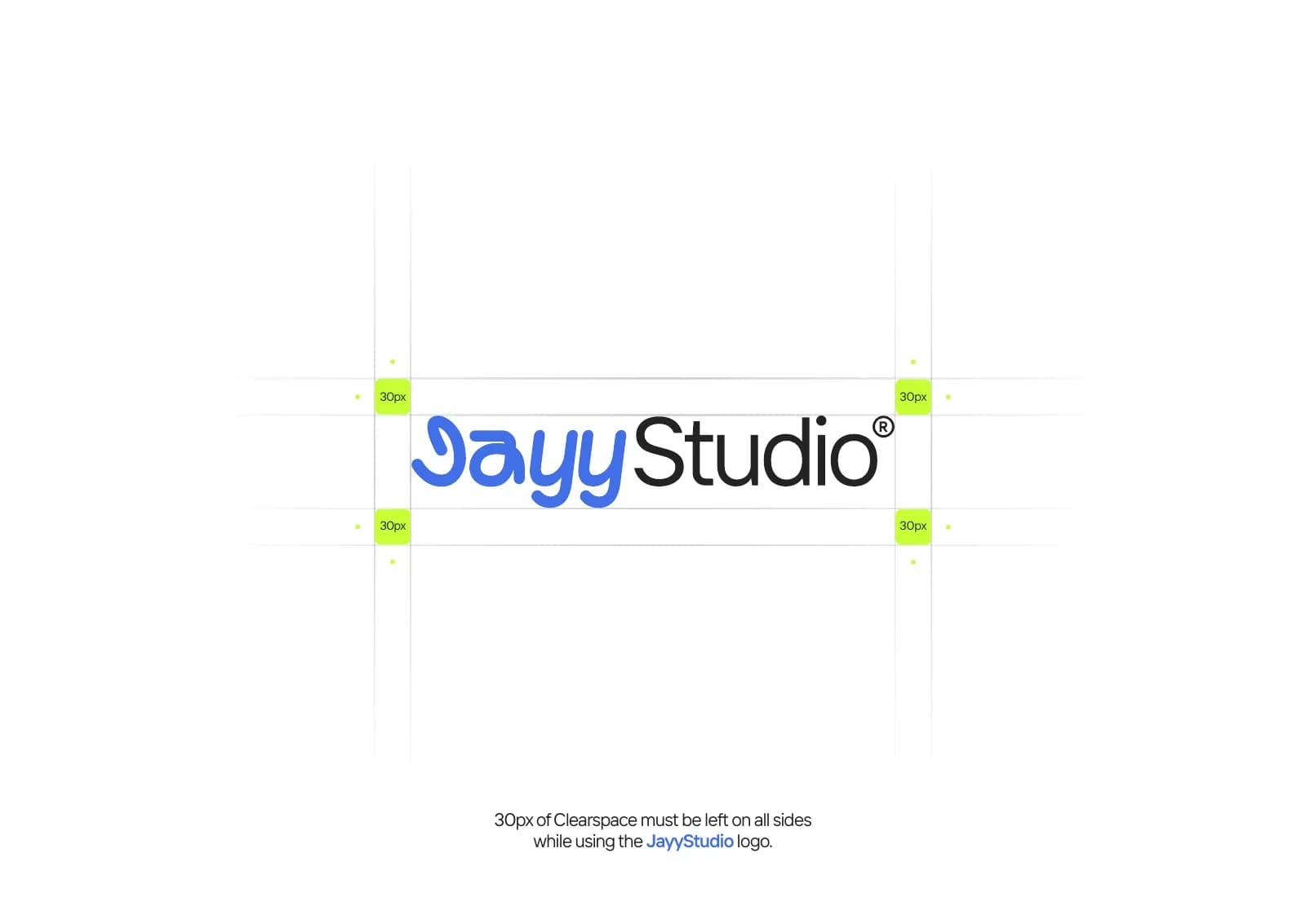
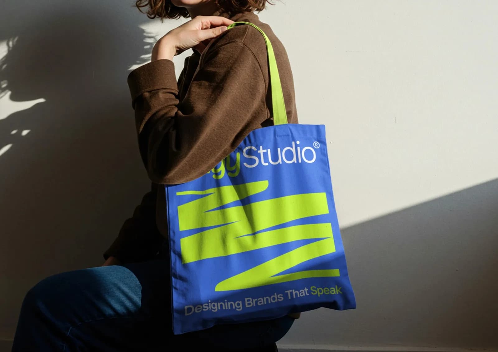
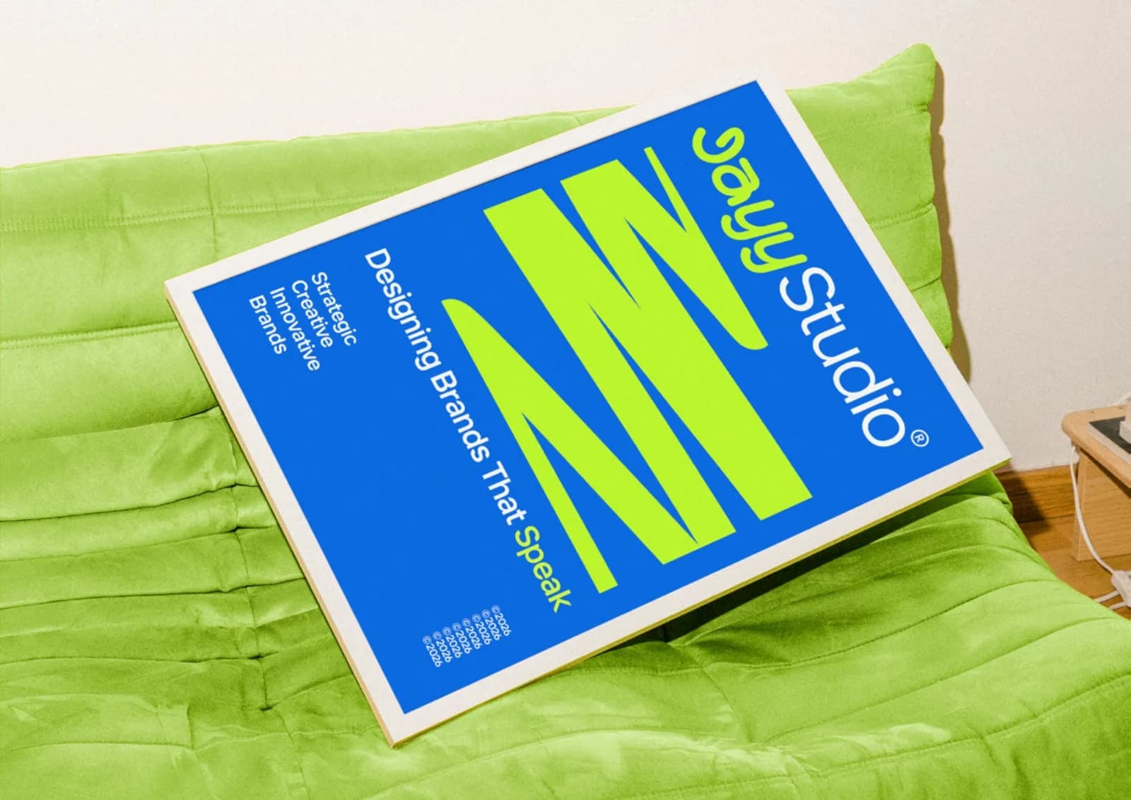
What works. The two-part lock-up gives the mark a personality and a straight man: the custom “Jayy”, built from the typeface Aminute and then redrawn letter by letter, does the talking, and “Studio” in TT Interphases Pro keeps it grown up. Blue and lime is not a pairing many studios use, so it is recognisable at a glance in a feed. It holds up on a sign, a tote, a shirt and a business card, and the 17-page guideline book means I follow my own rules on the four approved backgrounds.
What I’d change. The J. It is the least conventional letterform in the word and the first thing a new reader has to decode, and at small sizes the hook can read as a different letter before the rest of the word catches up. The two y descenders also crowd each other below about 20 pixels. That is why the short form is “Jayy” on its own rather than a single-letter mark, and it is the thing I would fix next: a proper one-letter symbol for the favicon and the app icon, so four letters don’t have to squeeze into sixteen pixels.
Score: 8 out of 10. Distinctive, consistent, well documented, and a little too reliant on the wordmark at the smallest sizes. If a client sent me this, the first note would be “build the monogram”.
Send yours, or follow along
If you want your logo reviewed, message me on WhatsApp or on LinkedIn with the file and one line about the business. If you’d rather just watch, follow me on LinkedIn; the monthly round-up goes there first, and the longer version lives on this blog.
And if a review makes you realise the problem is bigger than the logo, the 9 signs your brand looks amateur post is where I’d go next, or tell me about your project and I’ll give you an honest view of what would help.
Questions founders ask me
Only if you say I can. Otherwise I describe the category and leave the name out. Either way, you see the review before it goes up.