Working with me7 min read
The brand design process at Jayy Studio, step by step
Most people have never hired a designer before, and the thing they’re nervous about is not knowing what happens next. Here is exactly what happens next.
Javeria Hareem
Logo & Brand Designer, founder of Jayy Studio
In this article
Most people who get in touch have never hired a designer before, and the thing they’re nervous about isn’t the price. It’s not knowing what happens next.
So here is the whole brand design process, day by day, as it actually runs on a project with me. What I send you, what I need back, how feedback works, how revisions and disagreements go, what the handoff folder looks like, and when money changes hands. Read this and there won’t be any surprises.
Before day one: the quote and the deposit
It starts with a message: the contact form, WhatsApp, or a 30-minute call if you’d rather talk. I ask a few questions about the business and what you need, then send a fixed quote with the scope and the timeline written down. Nothing vague. If it says “logo, three concepts, all file formats, basic usage rules, five days”, that is exactly what arrives. Clients nearby sometimes ask whether we need to meet; what I do as a brand designer in Lahore answers that.
A 50% deposit books your slot in the schedule. The balance is due before the final files are handed over. Most of my projects fall between about $99 and $1,500 depending on scope, and I’ll say so early if what you’re asking for doesn’t fit the budget you have, so we can trim it rather than cheapen it.
The brand design process, day by day
Step 01: Discovery (day one)
You get a short questionnaire. It asks about the business in one line, who buys from you, who you keep losing to and why you think that is, what you want people to believe about you the first time they see the brand, where the brand will actually live (shop sign, app icon, pouch, LinkedIn), what already exists, and what you can’t stand. Then we talk it through, on a call or over WhatsApp. Nothing is drawn yet. If you want to see what good answers look like, this post walks through a brief.
What I need from you on day one: the questionnaire back, any existing logo files, and the names of everyone who has a say in the decision. That last one matters more than people think. A project with one decision maker runs in days; a project with five runs in weeks.
Step 02: Direction (day two)
I send back a direction document: references, two or three palette options, type candidates, and a few sentences on why each fits what you told me. This is not design yet. It is the conversation that stops a big reveal from missing the point. You pick a lane, or tell me which parts of two lanes you want, and we agree it in writing before anything gets polished.
Step 03: Design (days three to five, longer for a full identity)
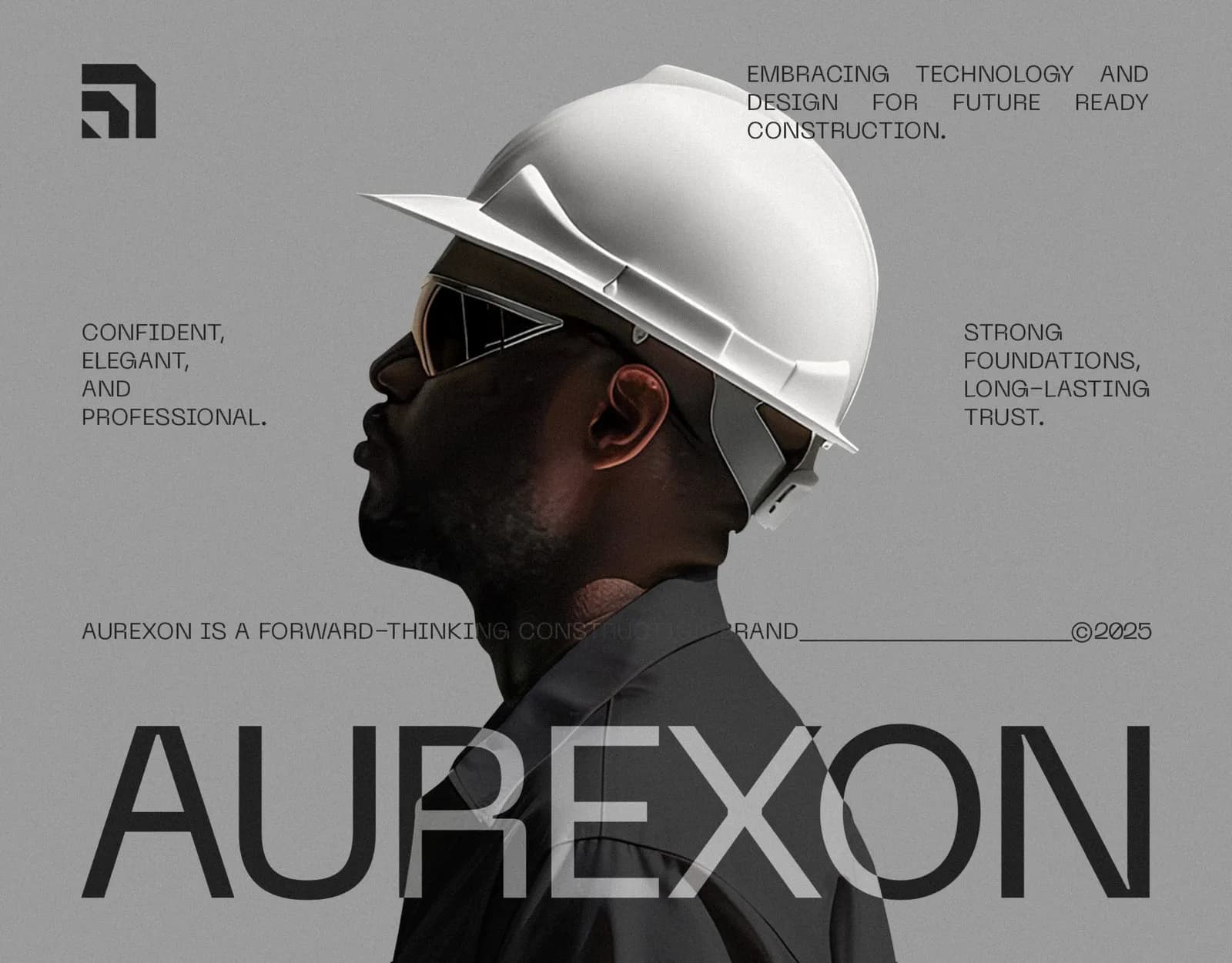
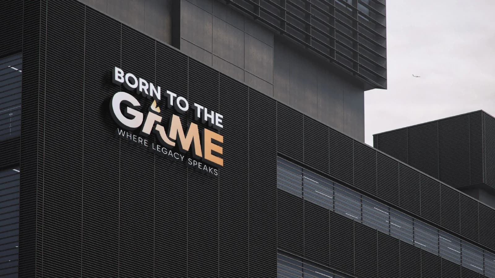
Now I design. You see concepts on a bottle, a sign, a phone screen or a shirt, never floating on a white square, because a mark that looks great on white and dies on a hoodie isn’t finished. For Born To The Game that meant seeing the mark on a tote bag before the client chose a direction. For Aurexon it meant the symbol on a steel facade and on a hard hat, on the same page.
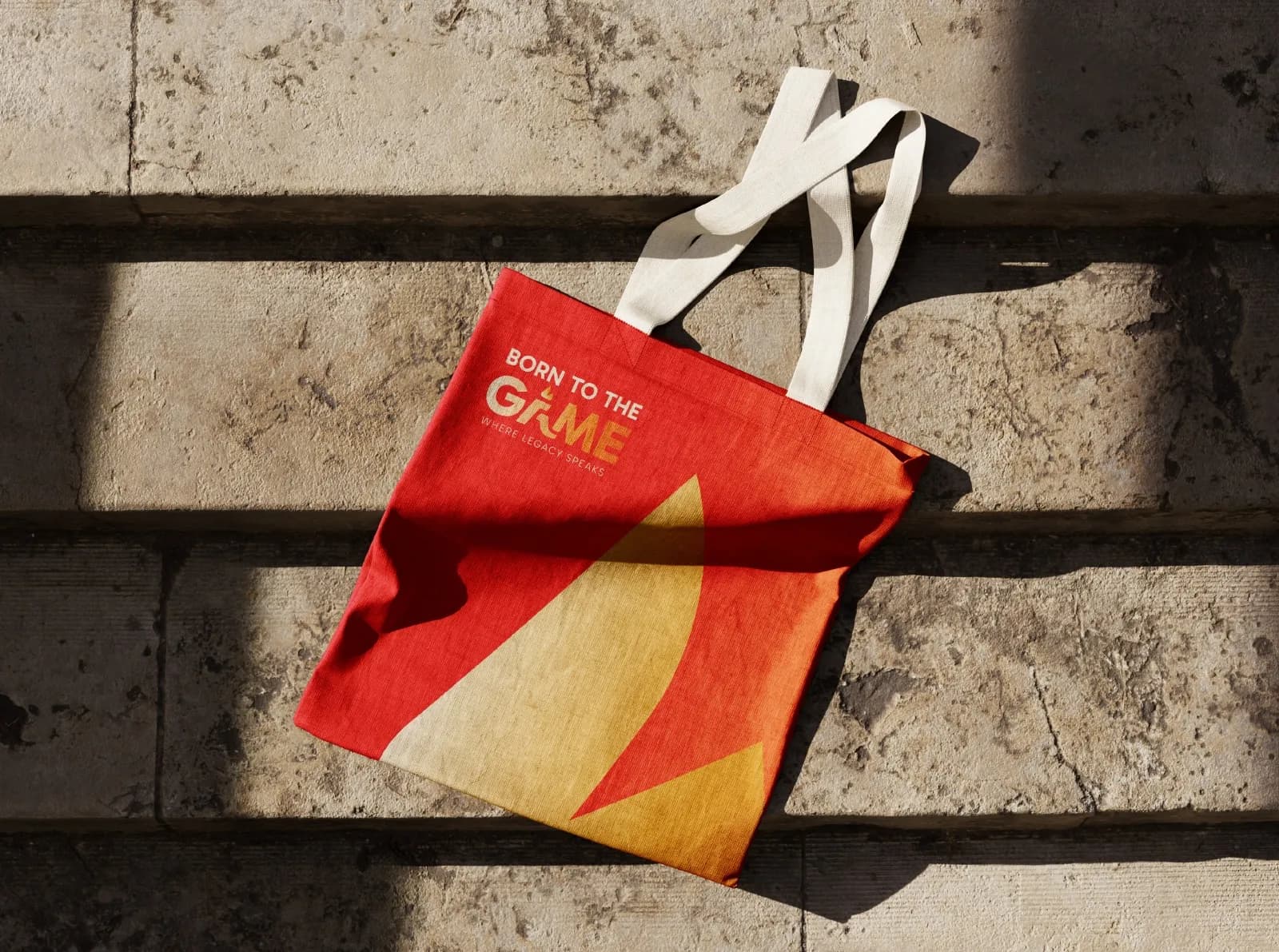
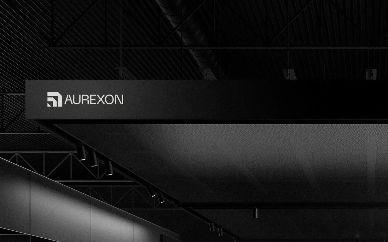
On the entry logo package you get two concepts; on the bigger packages, five or more. Each one comes with a short note on where it came from and where it will struggle, because every mark has a weakness and I’d rather you hear it from me than from your printer.
Step 04: Refine (the next few days)
You send feedback. One consolidated round from everyone who has a say, not a trickle of messages across the week. I’ll ask for it that way, and it is the single thing that keeps a project on its date. Then I tighten the direction you chose: proportions, colour balance, the secondary mark, the small-size version.
Revisions are part of the job, not an extra. Three rounds on the entry package, unlimited on the bigger ones, until you’re happy. If the first concepts miss entirely, I go back and try a new direction rather than nudging one you don’t like. And if a change you ask for would weaken the work, I’ll say so and explain why, then do what you decide. It’s your brand.

Step 05: Handoff (the last day)
Once the balance is paid, the files arrive in one organised folder. It looks like this:
- 01 Logo: the full lockup, the symbol alone and any secondary mark, each in full colour, one colour and reversed, as AI, EPS, SVG, PDF, PNG and JPG.
- 02 Colour and type: the palette with HEX, RGB and CMYK values, and the typefaces with their roles and where to get them.
- 03 Applications: the stationery, social templates or packaging artwork in the scope, print-ready where relevant and built to the dieline.
- 04 Guidelines: usage rules, clear space, minimum sizes and don’ts as a PDF. A short sheet on a logo project; a full book on an identity.
Every file is named so a printer or developer can find what they need without asking you, which means without asking me. You own all of it outright once the project is paid in full. No licences, no royalties.
What happens after
I’m still here. A printer asks a question, a developer needs a different export, you want to add a bag or a sign six months on: message me. Small things I just answer. Bigger additions get a quick quote and a slot, and they match the rest because the system is written down.
What makes a project go well
From my side: a written scope, a date you can plan around, concepts in context, honest notes on each one, and replies within a few hours. From yours: the questionnaire answered properly, one decision maker or one consolidated voice, feedback that says what isn’t working rather than what to change (“it feels too corporate” is more useful than “make the blue lighter”), and files for anything that already exists. Founders describe the result better than I can, so I’ve collected what they tell me after a rebrand.
That’s it. No account manager, no handoff between a strategist and a junior. You deal with the person doing the work from the first message to the last file. If you’re weighing that against a bigger shop, this post compares freelancers and agencies without taking sides.
Ready when you are
If you’ve read this far, you know more about how I work than most clients do before they start. Tell me about your project, or book a call if you’d rather talk it through first. For how long each kind of project takes, the timeline post breaks it down, and the Aurexon write-up shows what the finished thing looks like.
Questions founders ask me
Only honest answers. The questionnaire does the structuring. If you have an existing logo, a website or a competitor you admire, have the links handy. Everything else we work out together.