Case studies7 min read
Aurexon branding case study: a construction logo built to last
A construction company that wanted to be hired like an engineering firm. The grid, the two typefaces, the five greys, and where the brand lives now.
Javeria Hareem
Logo & Brand Designer, founder of Jayy Studio
 Case studies
In this article
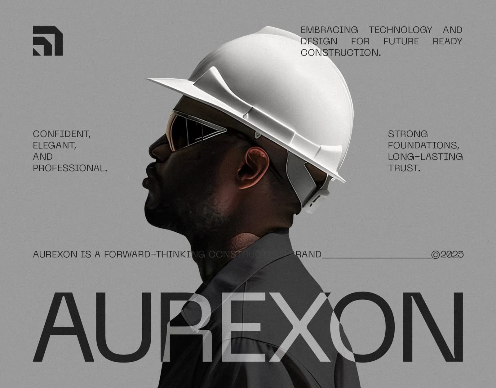
Aurexon came to me with a problem most construction companies have and few of them say out loud: they looked like a contractor, and they wanted to be hired like an engineering firm.
This is the full story of the Aurexon branding, from the first conversation to the 21-page guideline book. What the brief asked for, the decisions I made about the mark, the type and the colour, and where the identity lives now, from a steel facade to a smartwatch face. If you run a construction or real estate business and you’re wondering what a proper identity actually involves, this is what one looks like.
The brief, in their words
Aurexon builds residential, commercial and large-scale infrastructure projects. Strong, reliable, forward-looking: that is how they describe themselves, and that is how they wanted to be seen by the people who matter to them, which is mostly large developers deciding who gets the next contract.
The problem was the category. Open any directory of construction companies and you’ll see the same thing: a hard hat, a roof line, a swoosh, blue and orange, a bold italic name. It all reads as “local contractor”. None of it reads as “the firm you trust with a forty-storey tower”. Aurexon didn’t need to shout. They needed to look like they’d already been taken seriously.
What the Aurexon branding had to do
Before anything was drawn we agreed on three jobs for the identity. It had to look like engineering, which means precision, geometry and restraint. It had to work at the scale construction actually operates at: cast in metal on a facade, printed on a work jacket, stuck on a hard hat, and shrunk down to an app icon on a phone. And it had to be easy for other people to use correctly, because a construction brand is applied by sign makers, printers, uniform suppliers and site managers far more often than by a designer.
That last point shaped more decisions than anything else. If a mark only works when I’m the one placing it, it isn’t finished.
The mark: a shape you could build
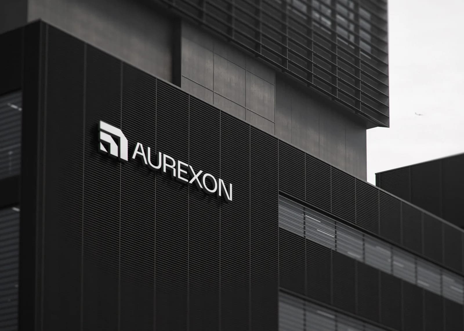
The symbol comes from architectural geometry. Two L-shaped forms, one nested inside the other, cut at 45 degrees so they read as a corner, a cornerstone, or a structure rising, depending on how long you look at it. Every angle sits on a grid. Every gap between the shapes matches a stroke width.
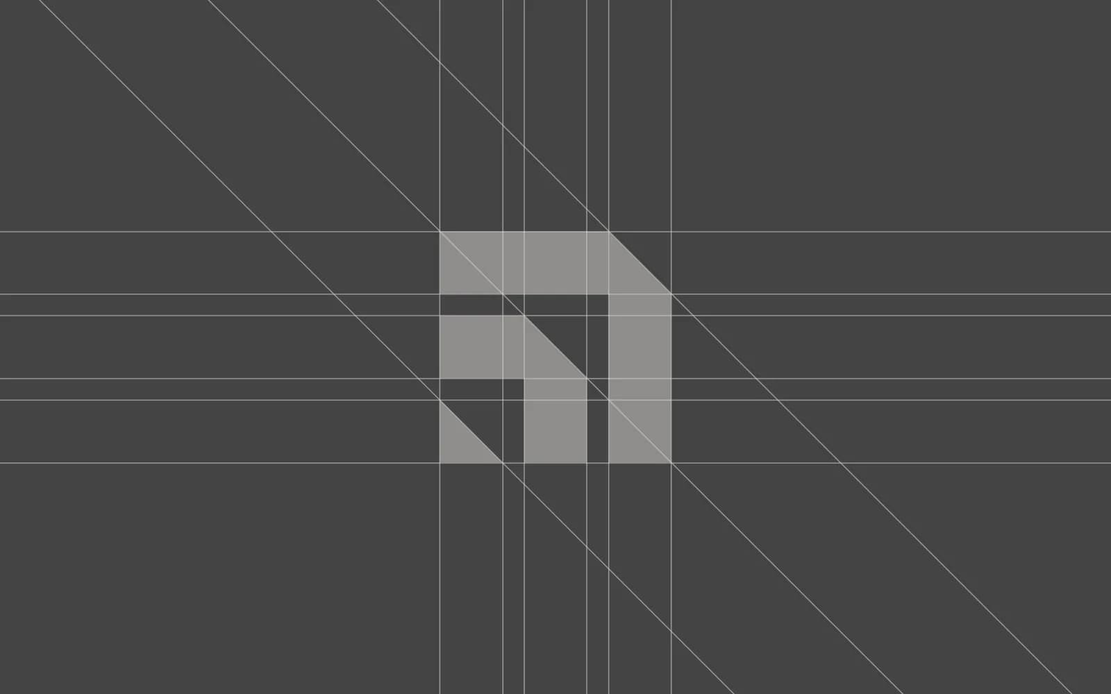
Why does that matter? Because a sign fabricator cutting the logo out of steel needs something they can reproduce exactly, and an app icon at 32 pixels needs shapes that don’t turn to mush. A grid-built mark does both. There are no thin strokes to fill in, no curves to fight at small sizes, no gradient to flatten for embroidery.
Two typefaces, five greys
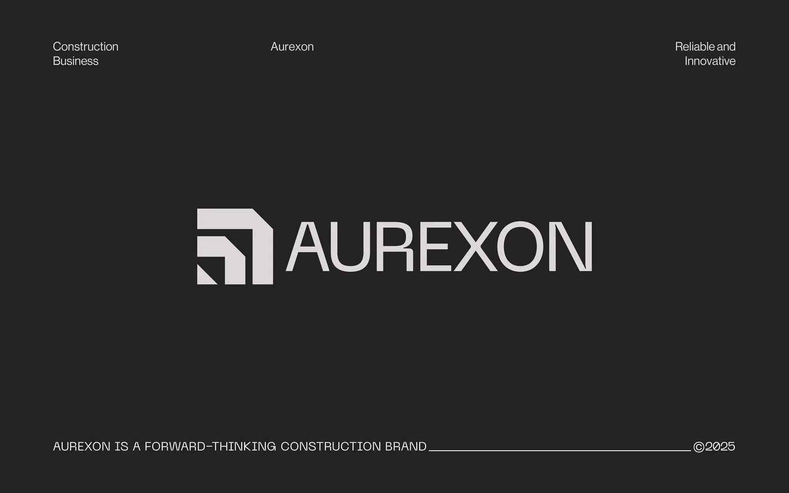
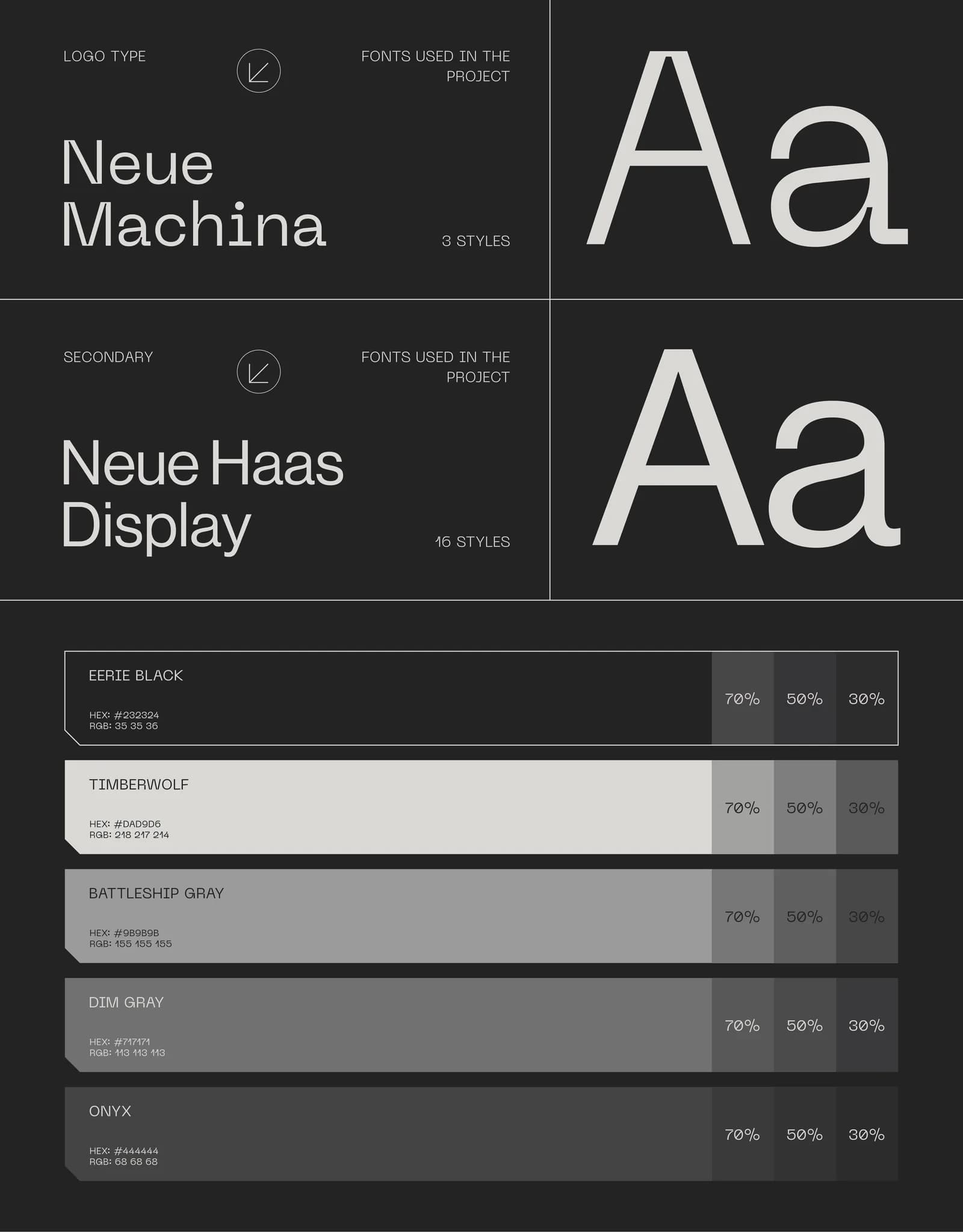
The wordmark is set in Neue Machina, a face with squared-off, engineered shapes that suit a company that pours concrete. Everything else, from body text on the website to the fine print on a business card, runs in Neue Haas Display. One typeface carries the name, one does the reading. That is all a brand like this needs.
Colour was the bigger argument. Clients usually expect a “brand colour”, and construction clients in particular reach for safety orange or trust blue. I pushed for the opposite: no colour at all. The palette is five greys, from Eerie Black (#232324) through Onyx, Dim Gray and Battleship Gray to Timberwolf, each with 70, 50 and 30 percent tints.
Monochrome does three things for Aurexon. It separates them from everyone in the directory. It prints cheaply and consistently on everything from packing tape to a billboard. And it makes photography the only warm element, so every picture of a real person on a real site carries more weight. When your work is buildings, you don’t need a colour to say so.
Where the brand lives
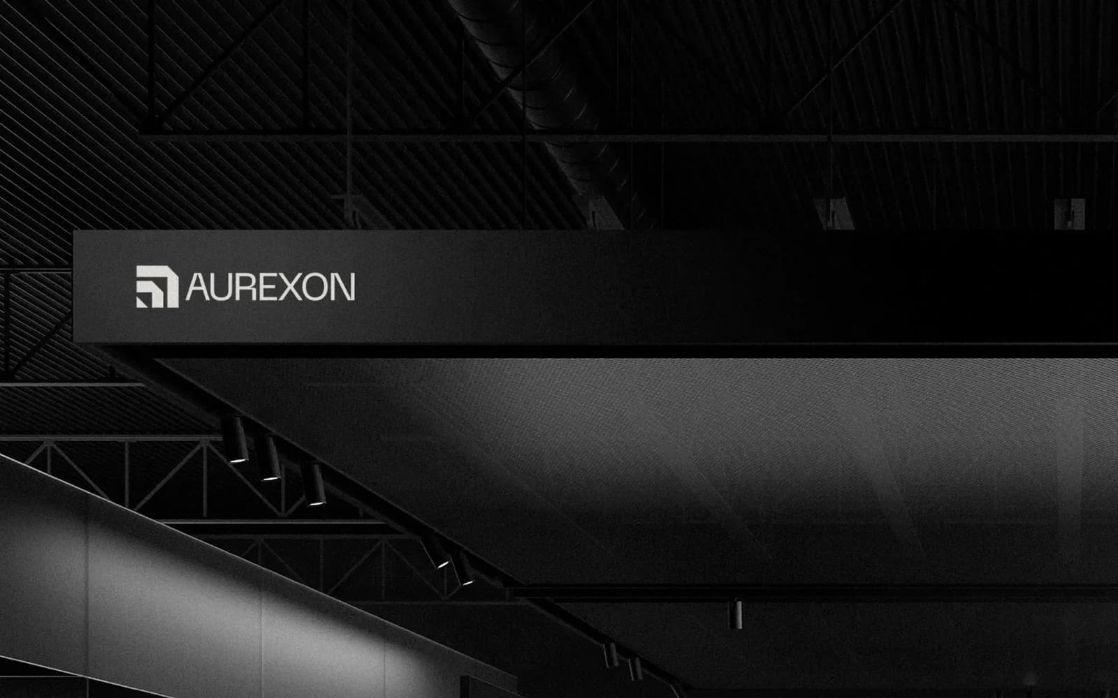
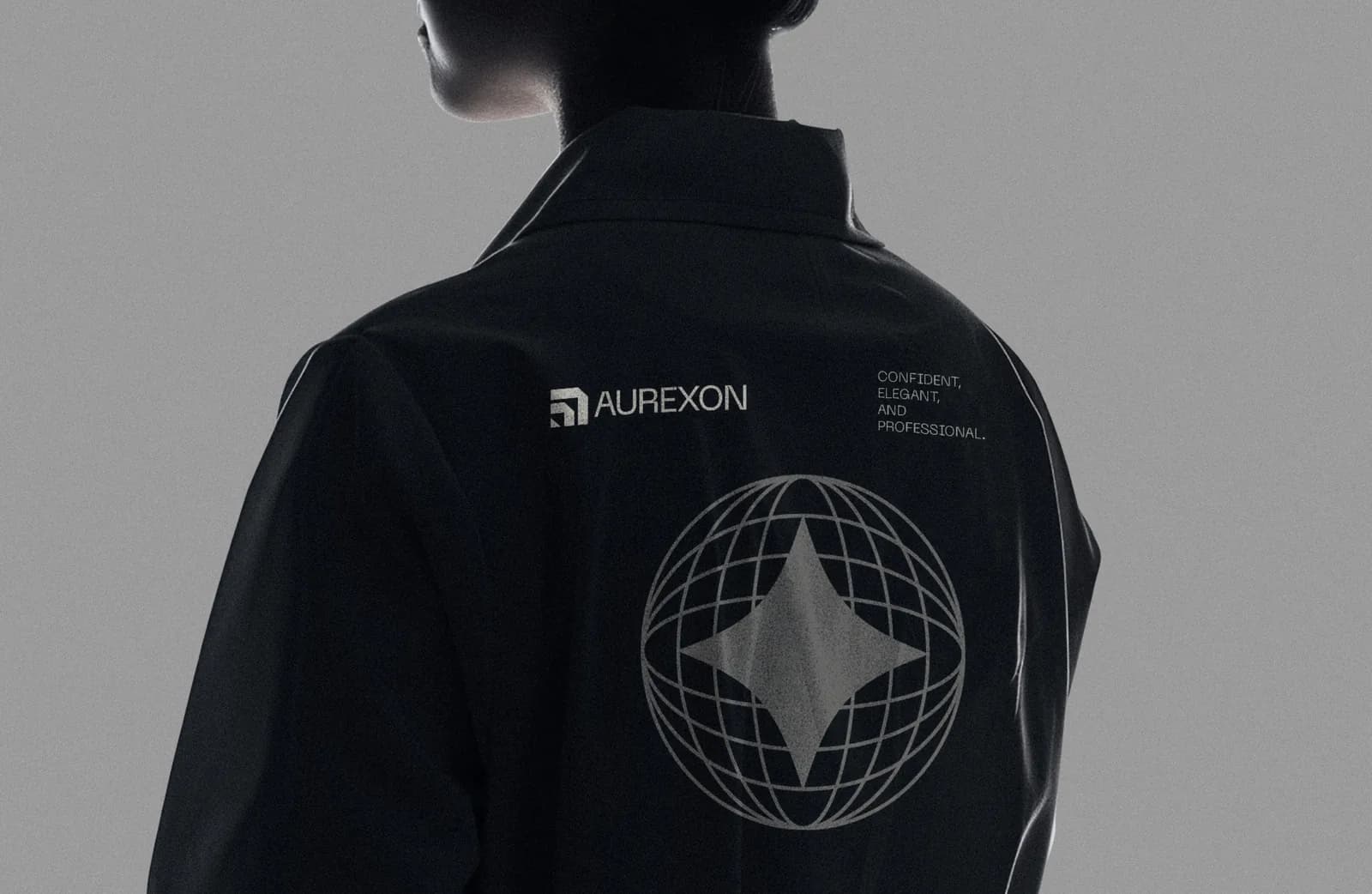
An identity for a construction company is mostly worn, touched and walked past. So the applications were chosen from how Aurexon actually operates, not from a mockup bundle.
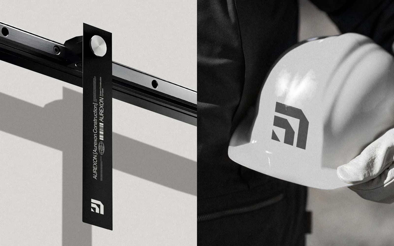
![White packing tape printed with AUREXON [Aurexon Construction], Modern Construction Company, a globe icon and a barcode, wrapped around a white box.](/_next/image?url=%2Fwork%2Faurexon-construction%2F09.webp&w=1600&q=75)
![A person in a black hoodie wearing a black lanyard printed with AUREXON [Aurexon Construction], holding a dark ID badge with the name Alice Morgan and the AUREXON wordmark.](/_next/image?url=%2Fwork%2Faurexon-construction%2F12.webp&w=1600&q=75)
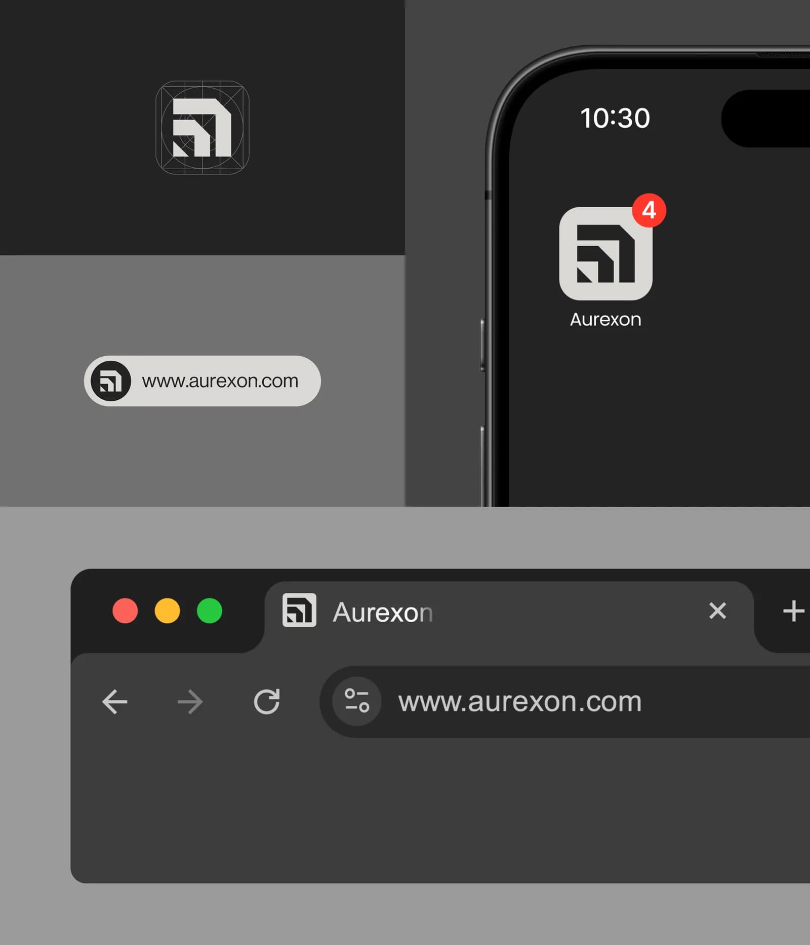
Then there are the small screens, which is where a lot of construction brands quietly fall apart. The symbol becomes the app icon, the favicon and the smartwatch face without any redrawing, because the grid already did that work.
The 21-page book
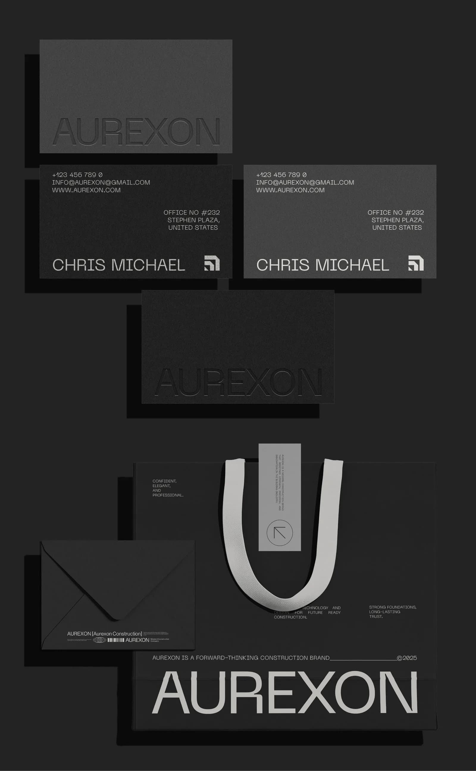
The last deliverable is the one that keeps everything above from drifting. The Aurexon guideline book runs to 21 pages: logo versions and clear space, the construction grid, minimum sizes, the five colours with their codes and tints, both typefaces with their roles, photography direction, and every application shown in context so a supplier can match it.
It isn’t written for designers. It’s written for the sign company, the uniform supplier, the printer doing the next run of business cards and the developer’s marketing team dropping the logo into a tender document. If any of them have a question, the answer is in the book, which means it isn’t a WhatsApp message to me at 9pm. If you want to know what belongs in a document like this, I’ve written up the seven things every brand guidelines document must include.
What Aurexon can do now without me
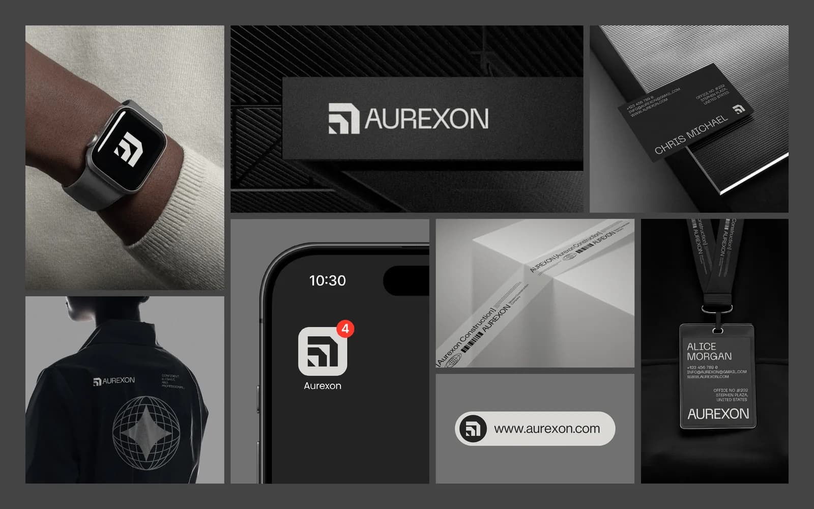
That is the real measure of a brand project. Aurexon can brief a sign maker in a new city and get the same result. They can order jackets, tape, hard hats and cards from different suppliers and have them arrive matching. A new hire can build a tender deck that looks like it came from the same company as the website. None of that needs me on the phone.
If your construction or real estate company still looks like the directory, the first step is a short conversation. Tell me about your business, or read how a project like this runs from day one to handoff. You can also see how the same thinking produced a very different result for a luxury property brand in the Arista case study, and what I’d brief for a construction company in general.
Questions founders ask me
A full brand identity with me usually runs 7 to 10 days from the discovery questionnaire to handoff. The guideline book and the application mockups were part of the scope, so Aurexon received the logo, the system and the book together rather than in stages.