Industry guides8 min read
Branding for construction and real estate companies
Open a directory of builders and you’ll see the same logo forty times. Here is what developers and buyers actually judge, where a construction brand really lives, and how real estate is a different conversation.
Javeria Hareem
Logo & Brand Designer, founder of Jayy Studio
 Industry guides
In this article
Open a directory of construction firms and you’ll see the same logo forty times: a roofline, a hard hat, a crane, a swoosh, blue and orange.
There is nothing wrong with any of those on their own. The problem is what they say, which is “we are a construction company” and nothing after that. A developer choosing between five bids already knows you’re a construction company. The question they are actually asking is whether you will still be standing, on budget, in three years. Most construction company branding doesn’t even try to answer it.
I’ve built identities for a construction firm and a luxury real estate brand, among the fifty-odd industries I’ve worked in, and the two taught me different things. This is what I’d tell a founder in either business before they commissioned a logo.
Why construction company branding all looks the same
Category defaults are safe. A builder who puts a roof shape in the logo will never be accused of being unclear, and the first designer they asked probably had three roof-shape templates ready. Blue says “trustworthy” in every colour psychology listicle, orange matches the hi-vis, and so the whole industry converged on the same two colours without anyone deciding to.
The cost of that is only visible side by side. When your capability deck lands on a developer’s desk next to four others, and all five have a swoosh, the one thing your brand was supposed to do, which is make you the obvious choice, is cancelled out. You become the fifth builder, chosen on price.
What developers and buyers actually judge
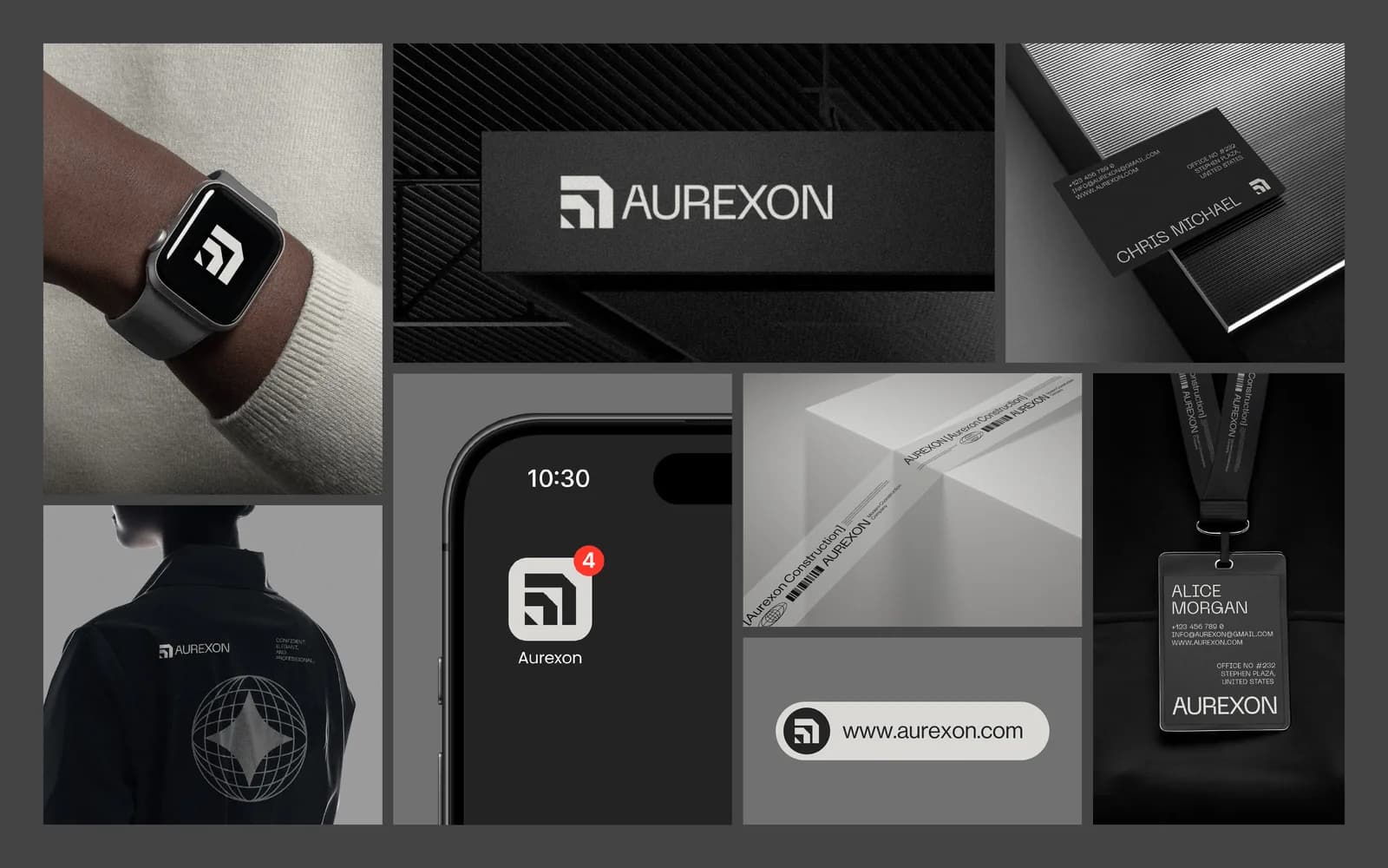
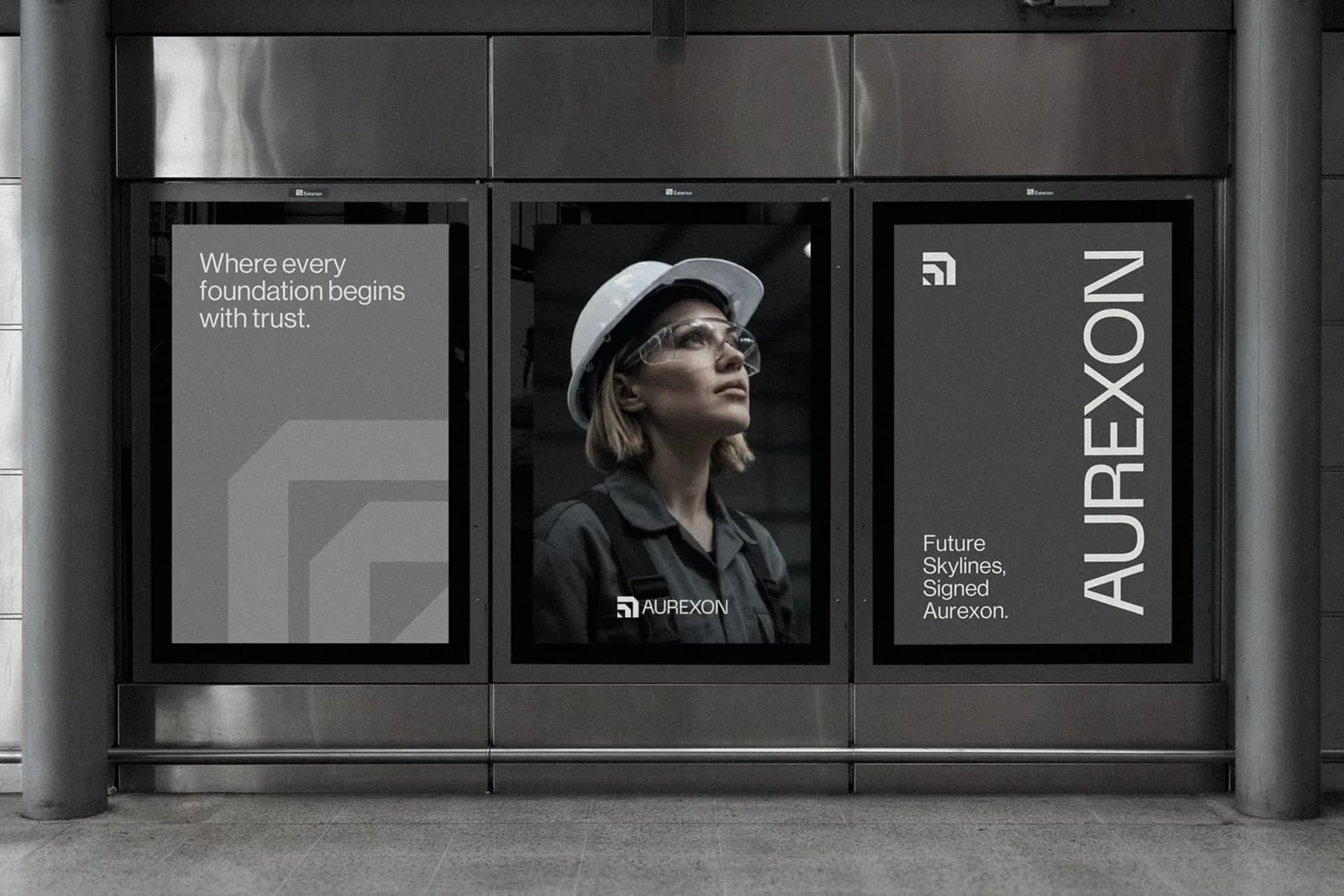
When Aurexon came to me, the brief was blunt: they wanted to read as a modern engineering company that big developers take seriously, not as a local contractor. Underneath that are the three things every serious client in this industry is weighing, whether or not they say so.
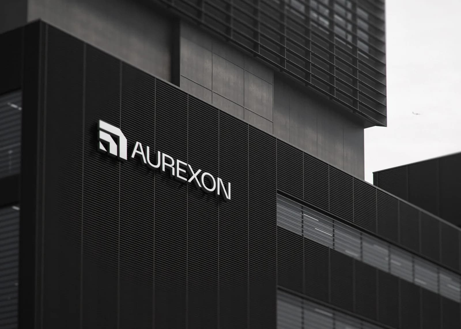
Reliability. Will you be here to honour the warranty. A brand signals this through restraint: a mark that doesn’t chase a trend, a palette that will look the same in a decade, type that was chosen for being unremarkable in the best sense. Precision. Will the details be right. A logo built on a strict grid, with consistent angles and spacing, says this before anyone reads a word, which is why the Aurexon symbol comes from architectural geometry rather than a drawing of a building. Scale. Can you handle the big job. That is a question of how the brand behaves on a facade, a fleet and a hoarding, not on a business card.
Where a construction brand actually lives
Before I design anything for a builder, I list the surfaces. It is a very different list from a consumer brand, and it changes the design more than the mood board does.
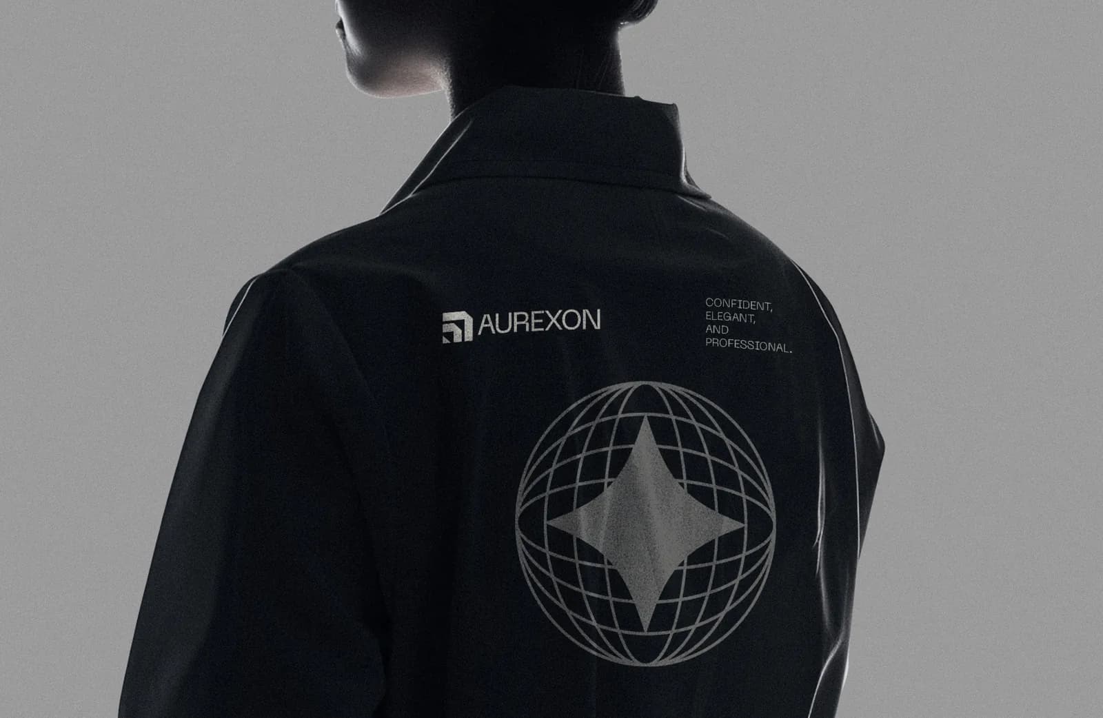
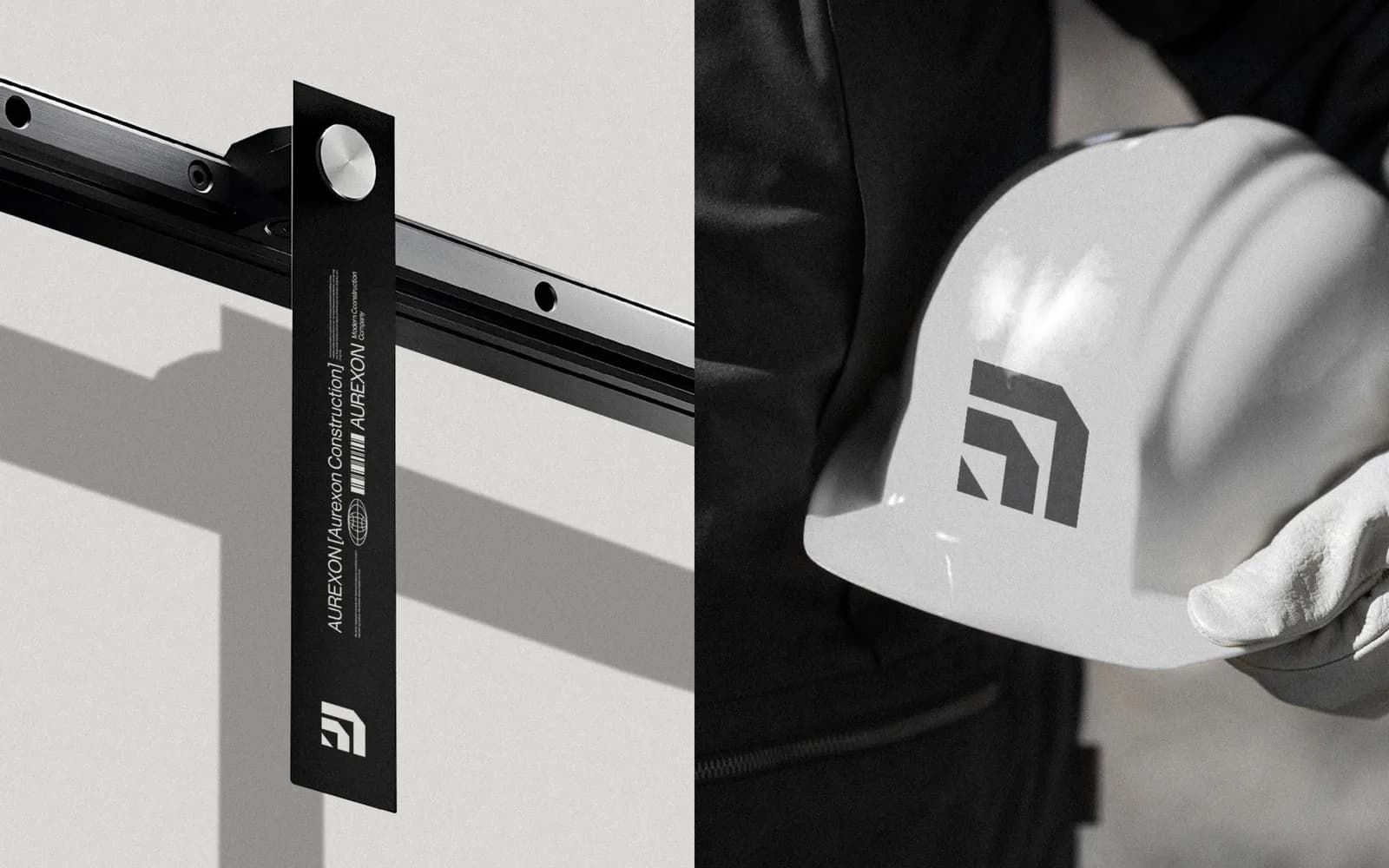
Site hoarding, which is the largest advert you will ever run and which is seen by every passer-by for the length of the project. Vehicles, which are moving signage. Workwear, hi-vis vests and hard hats, which are the brand on every person on site. Facade and site signage. Bid documents and capability decks, where the decision is actually made. LinkedIn, where developers look you up before the meeting. And the small, telling things: packing tape on a delivery, an ID badge on a lanyard, the hanging tag on a steel rail. Instagram is near the bottom of the list, which surprises people.
Rules that come from the site, not the screen
Everything on that list is hard on a logo. Signage is cut from metal or vinyl in a single colour. Embroidery can’t do gradients or thin lines. Reflective tape has one colour and it is silver. A hi-vis vest is already the loudest colour on the site. So the first rule is that the mark has to work as a flat, single-colour shape, with no gradient, no thin stroke and no tiny detail that disappears when it is 20 millimetres wide on a helmet. The full-colour version is a bonus, not the baseline.
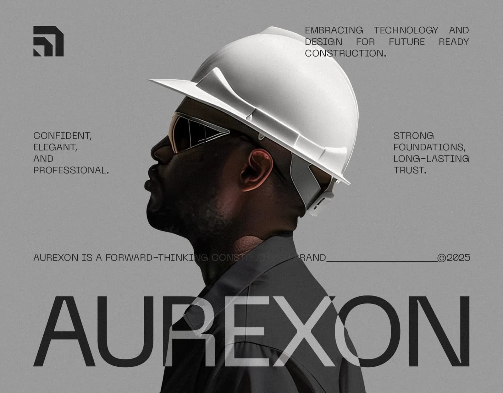
The second rule is that monochrome is a strength in this industry, not a limitation. Aurexon runs on five greys with tints and nothing else, and the warmth comes from photography of real people and real sites. On a facade, on a billboard and in a deck, that restraint reads as engineering. The blue-and-orange competitors look like they are selling tools.
The third is distance. Type that looks elegant in a logo file has to be read from a moving car or across a site. Wide, open letterforms with generous spacing do that; condensed display faces and script do not. Aurexon’s logotype is Neue Machina, backed by Neue Haas Display for everything else, chosen for how they behave at ten metres rather than at ten points.
Real estate is a different conversation
A construction brand has to convince a professional. A real estate brand, especially at the top end, has to convince a person who is buying a feeling long before they look at a floor plan. The job flips: calm instead of strong, warmth instead of restraint, and a brand that behaves beautifully in a brochure, a viewing and a quiet website rather than on a hoarding.
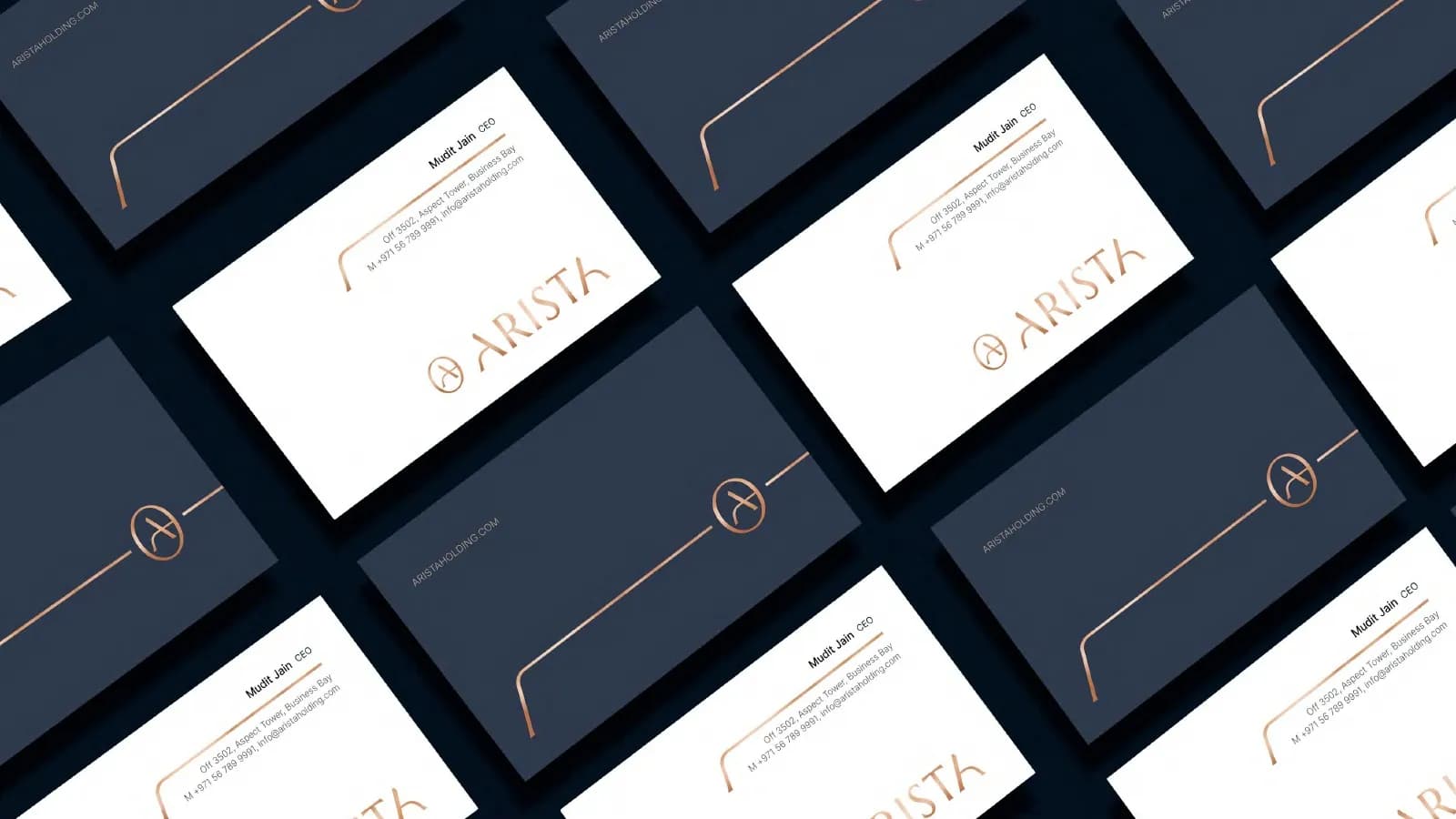
For Arista Living, that meant a circular A monogram and a wide, airy wordmark set in Marcellus, deep navy and warm sand throughout, and photography limited to soft light and natural materials. There is an Estate sub-brand for developments, so individual projects can have their own presence without drifting from the parent. The 45-page style guide is long because agents, suppliers and a whole range of print, from folders to shopping bags to event backdrops, all needed to look like one brand across one more handover than a construction firm usually has.
The two share one principle, though. Both were designed for the surfaces where the decision happens.
What to brief, and what it costs
When you brief a designer for a construction or property brand, give them the surface list above, in order of how much it matters to you. Tell them which competitors you keep losing bids to and what those competitors look like. Say who signs off, because the person who approves the logo is often not the person who ordered it. And say whether there is an existing mark on fifty vehicles, because that decides whether this is a refresh or a rebrand.
On cost, a logo alone sits at the low end of my range and is usually enough for a small contractor who needs to stop looking homemade. A full identity, with signage, vehicle and workwear specifications and a guideline book that printers and sign makers can follow without ringing you, sits at the top; that is what Aurexon’s 21 pages are. The honest ranges across freelancers, studios and agencies are in how much a logo costs. Either way you get a fixed quote, a delivery date on day one, and the files in every format a sign maker will ask for.
Where to start
If you want to see the whole process on a real project, the Aurexon case study walks from the brief to the 21-page guidelines, and before and after: 5 rebrands shows how it sits next to brands in other industries.
And if you’d rather talk about your own business, send me a few lines: what you build, who you’re losing to, and where the brand needs to live. I’ll reply within a few hours with what I’d do and what it would cost. If the answer is that your current logo is fine and you just need a vehicle template, I’ll tell you that too.
Questions founders ask me
Fewer than you think. Blue and orange are so common in the industry that they stop meaning anything. A restrained palette, even a monochrome one with photography for warmth, reads as engineering and precision, and it reproduces perfectly on signage, vinyl and embroidery, where multi-colour logos fail.