Rebranding7 min read
Rebrand before and after: 5 brands and what actually changed
Not two logos side by side. For five projects: the problem each brand walked in with, the one decision that did the most work, and what the business can do today.
Javeria Hareem
Logo & Brand Designer, founder of Jayy Studio
 Rebranding
In this article
- What a rebrand before and after really shows
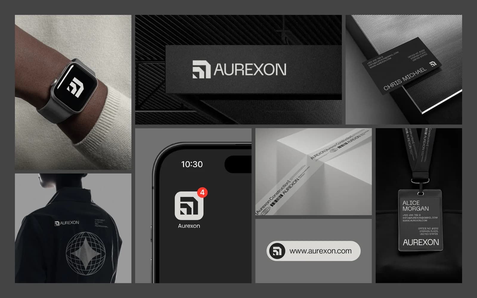
- 1. Aurexon Construction: from local contractor to engineering firm
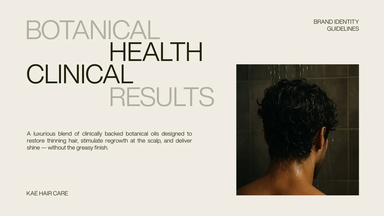
- 2. KAE Hair Care: between the lab and the kitchen
- 3. Cerevion: serious science without the sterility
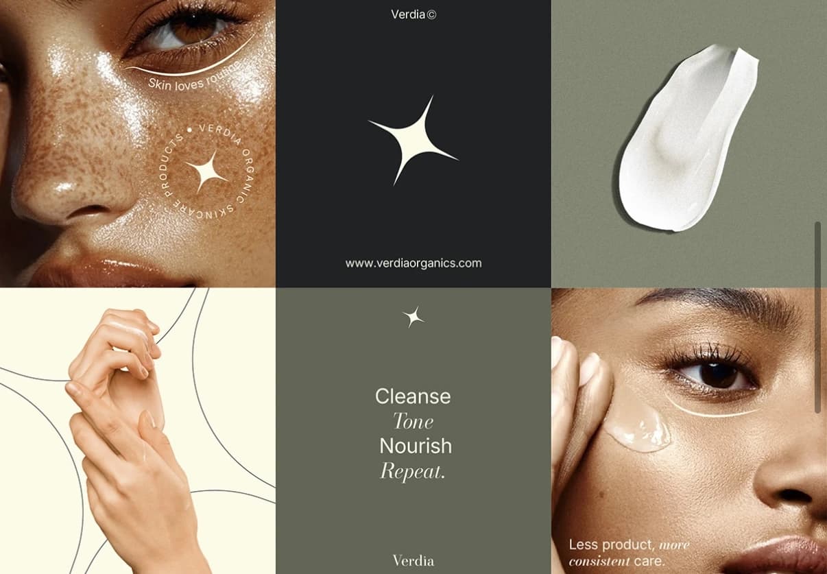
- 4. Verdia: premium and botanical at once
- 5. Arista Living: feeling before floor plans
- What the five have in common
- Questions founders ask me
Every rebrand before and after post you’ve seen shows two logos side by side and lets you guess what happened in between. That is the least useful part.
I’m going to do it differently. The site shows finished work, not old logos, so for each of these five projects I’ll tell you where the brand started, meaning the brief and the problem the founder walked in with, the one decision that changed the most, what the brand looks like now, and what the business can do today that it couldn’t before. No sales figures, because I don’t publish those. Just the practical difference.
What a rebrand before and after really shows
A logo swap is a small part of what changes. The bigger shifts are in what a business can now produce consistently: a tender deck, a carton, a retail bag, an Instagram post made by a new hire. So for each project below I’ve written the before as the brief, and the after as the system. That is the honest version, and it is the one that will help you work out which of these your own situation is closest to.
1. Aurexon Construction: from local contractor to engineering firm
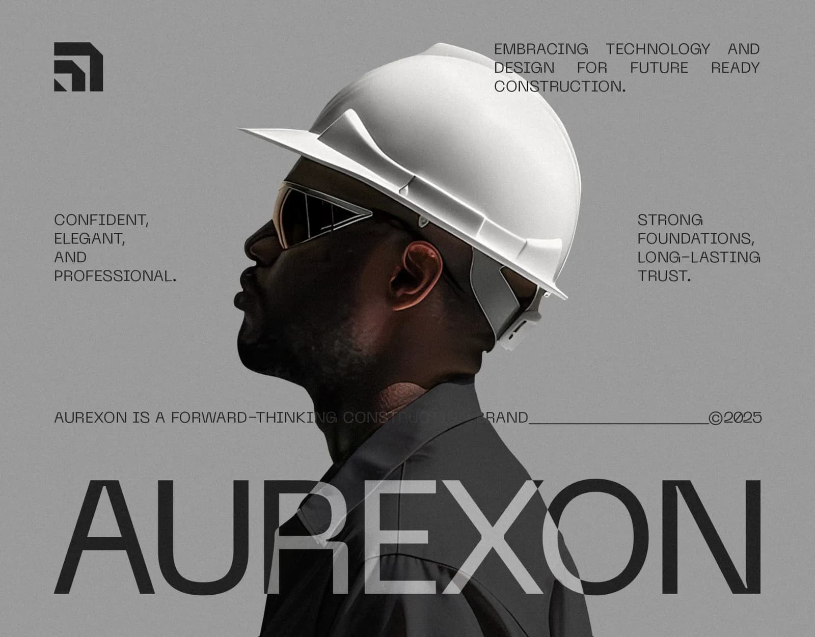
Before: a construction company that described itself as strong, reliable and forward-looking, in a category where every brand looks like a clip-art hard hat. The people they needed to convince were large developers, and nothing about the typical construction look says “trust us with the tower”. It’s a pattern across the sector, and construction company branding goes into why.
The decision that changed the most: no colour. Five greys, from Eerie Black to Timberwolf, with photography as the only warmth. It separated Aurexon from the blue-and-orange directory in one move.
After: a symbol built on an architectural grid so it can be cut from steel and shrunk to a smartwatch face without redrawing, Neue Machina for the name, Neue Haas Display for everything else, and a 21-page guideline book. The full case study has every page; the longer write-up has the reasoning.
What they can do now: brief a sign maker, a uniform supplier and a printer in three different cities and get matching results.
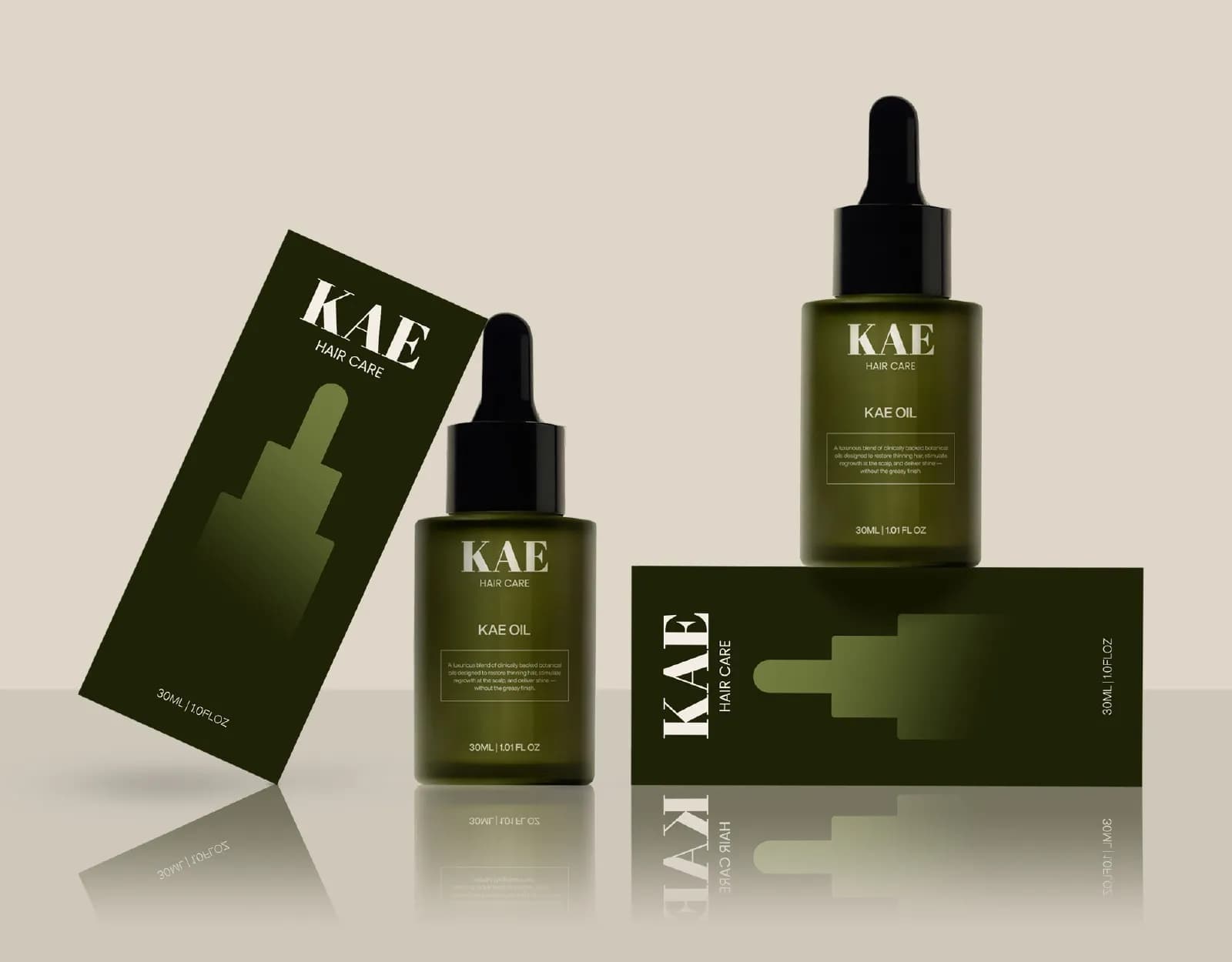
2. KAE Hair Care: between the lab and the kitchen
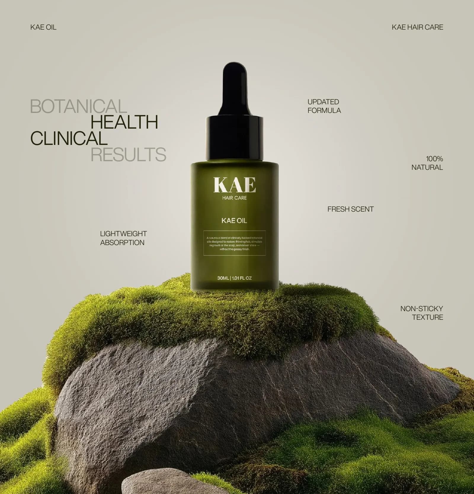
Before: a botanical hair oil in a category where bottles look either cold and clinical or homemade. The founder wanted the product taken seriously as a treatment, and neither look delivers that.
The decision: the apothecary reference. Abril Fatface for the wordmark gave it the weight of an old label, and a dark olive bottle with minimal type made it read as a treatment, not a cosmetic.
After: a logotype and a stepped monogram, an olive-and-stone palette with HEX, RGB and CMYK written down, moss-and-stone photography, print-ready bottle and carton artwork, stationery, retail bags, and a 17-page identity guide. See the case study or the write-up.
What they can do now: send one folder to the carton printer and another to the web developer and know the green will match.
3. Cerevion: serious science without the sterility
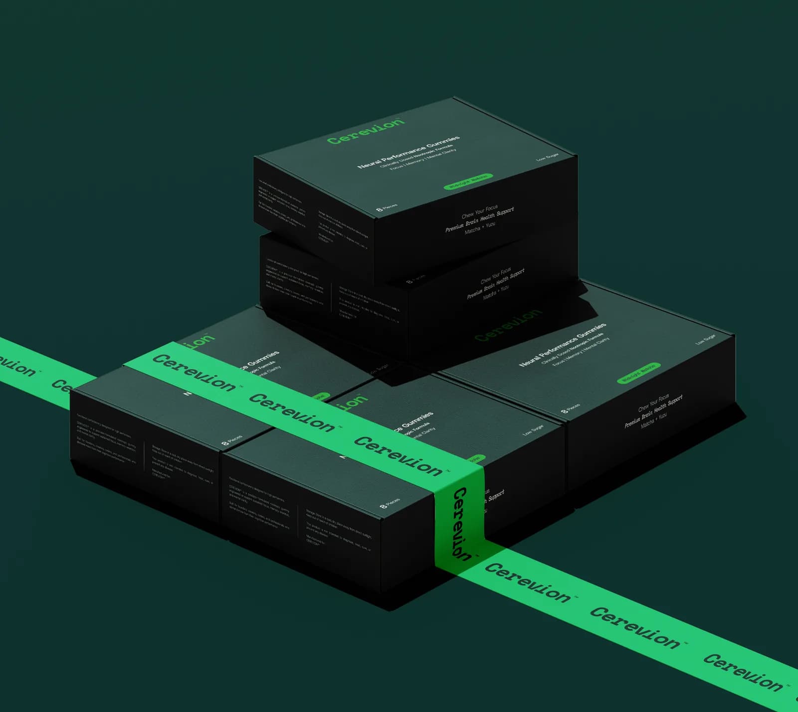
Before: a nootropic supplement that had to hold its own on a pharmacy shelf and still feel modern online. Nootropics have a credibility problem: too much wellness styling and it reads as a fad; too much lab styling and it reads as medicine.
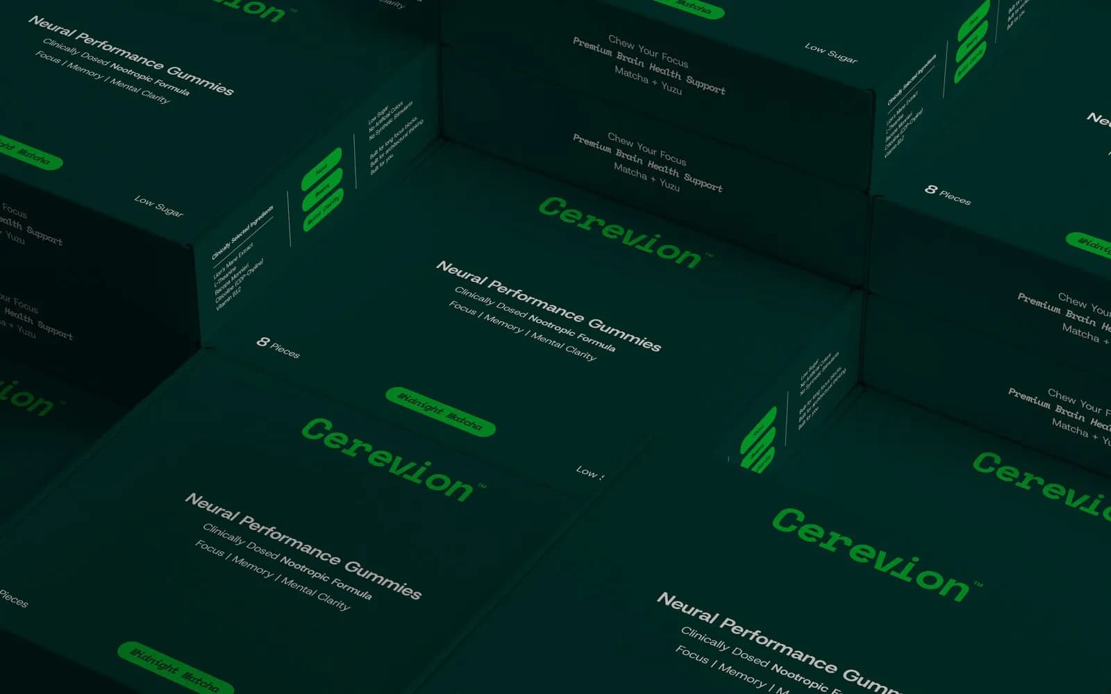
The decision: one layout, one accent. Every SKU shares the same carton structure and changes a single accent colour, so the range reads as a family as it grows. The dosage information is set in Host Grotesk and Space Mono like data, not like marketing.
After: bright signal green against near-black, a seven-colour palette with every value written down, and a 16-page packaging and identity system with artwork ready for carton and tub. The case study shows the whole range.
What they can do now: add a new flavour or format by changing one colour, without re-briefing a designer.
4. Verdia: premium and botanical at once
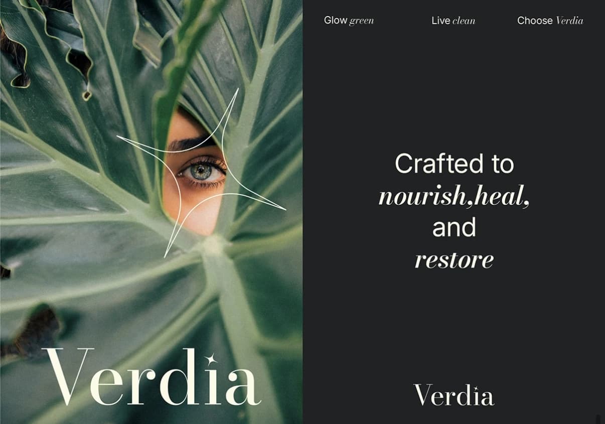
Before: organic skincare that needed to be credible enough for a pharmacy shelf and warm enough for a bathroom counter. The category splits into crunchy-homemade and clinical-cold, and Verdia didn’t fit either.
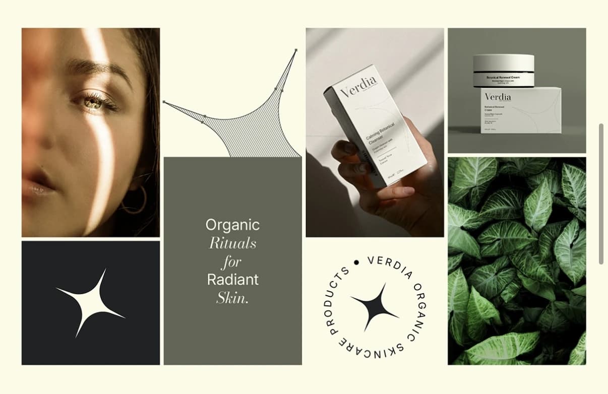
The decision: a Bodoni-based wordmark paired with a four-point spark mark. The serif gives the authority of an apothecary label; the spark stands in for the small moment of glow the products promise, and gives the brand a second mark for small spaces. There’s more on that category in beauty brand identity.
After: cream, near-black and muted sage rotating across packaging, campaign and social, editorial photography of skin, leaves and hands, and a full guideline set across cleanser, serum and mist. The case study has the range.
What they can do now: extend the range and the campaign imagery from the same three colours and two marks, and have it all read as one brand from a shelf away.
5. Arista Living: feeling before floor plans
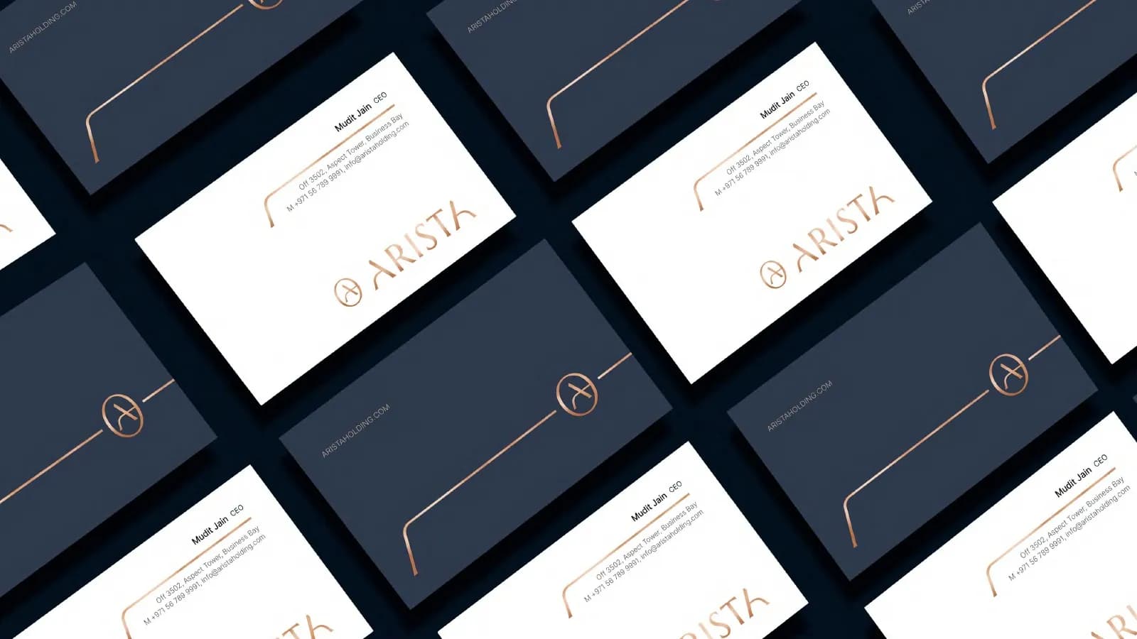
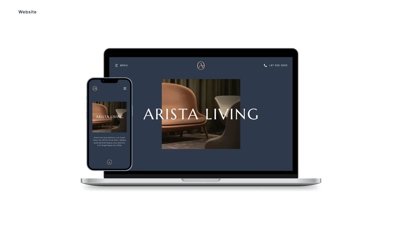
Before: a luxury real estate brand in a market where people decide on feeling long before they see a floor plan. The brand had to stay calm and high-end in print, online and on site, and it needed an Estate sub-brand for developments.
The decision: restraint. A circular A monogram, a wide airy wordmark in Marcellus, Inter for reading, deep navy and warm sand, and photography limited to soft light and natural materials.
After: a 45-page style guide covering the monogram, the sub-brand, lock-ups and misuse, colour, type, imagery, stationery, shopping bags, brochures, website and social templates, vehicle livery, flags and event backdrops. All of it is in the Arista case study.
What they can do now: hand the guide to agents, suppliers and an events company, and have the first viewing look like the handover.
What the five have in common
Four things, and none of them is “a new logo”.
- The before was a positioning problem, not a drawing problem. Each brand looked like its category, and the category look was working against them.
- One decision did most of the work: no colour for Aurexon, the apothecary serif for KAE and Verdia, one layout and one accent for Cerevion, restraint for Arista. Everything else followed from it.
- The mark was designed for its surfaces first: a steel facade, a frosted bottle, a carton, a copper-foil card. That is why none of them needed redrawing later.
- Every project ended with a written system: colour values, type roles, usage rules, and a guide of between 16 and 45 pages, so the brand holds without me in the room.
If you want to understand the difference between a full rebrand and a lighter refresh before deciding what you need, that post is here. And if you’d rather talk it through, book a 30-minute call and bring your current logo. I’ll tell you which of these five your situation is closest to, and whether you need a rebrand at all.
Questions founders ask me
Two reasons. The site shows finished work, and most clients would rather their old identity wasn’t published next to the new one. The useful comparison is the problem they came in with against what they can do now, which is what this post covers.