Industry guides9 min read
Beauty brand identity: branding a hair care or skincare startup
Hair care and skincare brands fall into one of two traps: cold and clinical, or homemade. Here is how to land in between, with two real launches as the worked example.
Javeria Hareem
Logo & Brand Designer, founder of Jayy Studio
 Industry guides
In this article
- The two traps
- What a beauty brand identity has to do that other brands don’t
- The packaging is the brand
- Type: why beauty keeps coming back to serifs
- Colour: not pink
- Photography: the setting the product lives in
- Plan the range before the first bottle
- What a launch range actually needs
- If you are at the start of this
- Questions founders ask me
In beauty, the bottle is the billboard. Nobody will ever look at your logo as closely as they look at the thing in their hand in the bathroom.
That changes what a beauty brand identity has to do. A construction company can get away with a logo and a van. A hair oil or a serum has to be beautiful at arm’s length, legible at thumbnail size, legal on the back panel and consistent across a range that will grow. All at once, and on the first day.
I have designed identities and packaging for hair care, skincare and supplements, and the same two mistakes come up every time. This post is about avoiding them, and about what to build instead, using two launches I can show you: KAE Hair Care and Verdia.
The two traps
Most beauty startups land in one of two places without meaning to.
The first is cold and clinical. White box, thin grey sans-serif, a lot of percentages, a product that looks like it belongs in a hospital. It promises results and feels like nothing. Nobody wants it on the bathroom shelf where guests can see it.
The second is homemade. A script font, a watercolour leaf, a kraft label, a bottle that looks like it was filled at a market stall. It feels warm and it promises nothing. Nobody trusts it with their face.
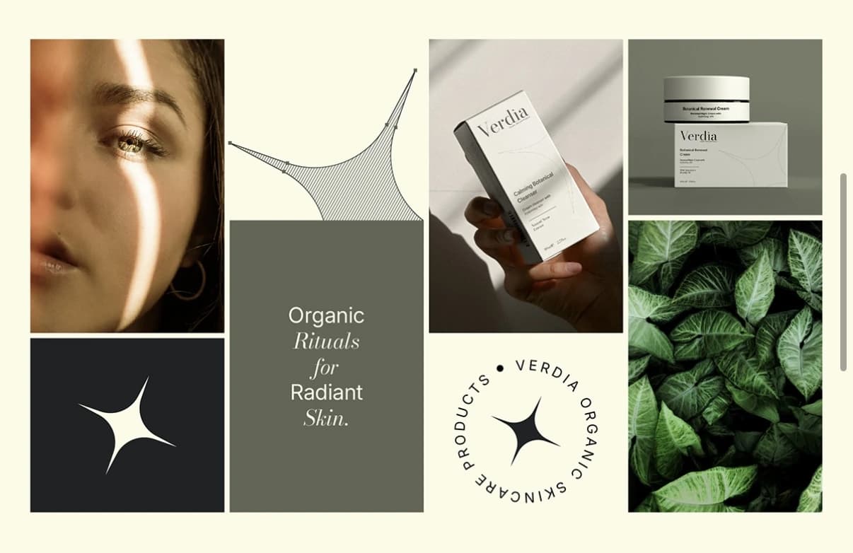
The brief for both KAE and Verdia was the same sentence in different words: sit in between. Gentle enough to feel kind, clinical enough to feel like it works. That is where most of the beauty market actually wants to buy from, and it is a narrower target than it sounds.
What a beauty brand identity has to do that other brands don’t
Pass the shelf test
Stand a metre from your product. Can you read the name? Can you tell what it is? Does it look like it costs what it costs? A dark bottle with a small, confident wordmark reads as a treatment. A busy label with six claims reads as a bargain bin. Decide which you are and design for the distance.
Pass the feed test
Now shrink it to the size of a marketplace thumbnail or an Instagram grid square. Most of the detail disappears. What is left is a shape, a colour and maybe one word. If that silhouette does not belong to you, you are invisible online, however good the bottle looks in the hand.
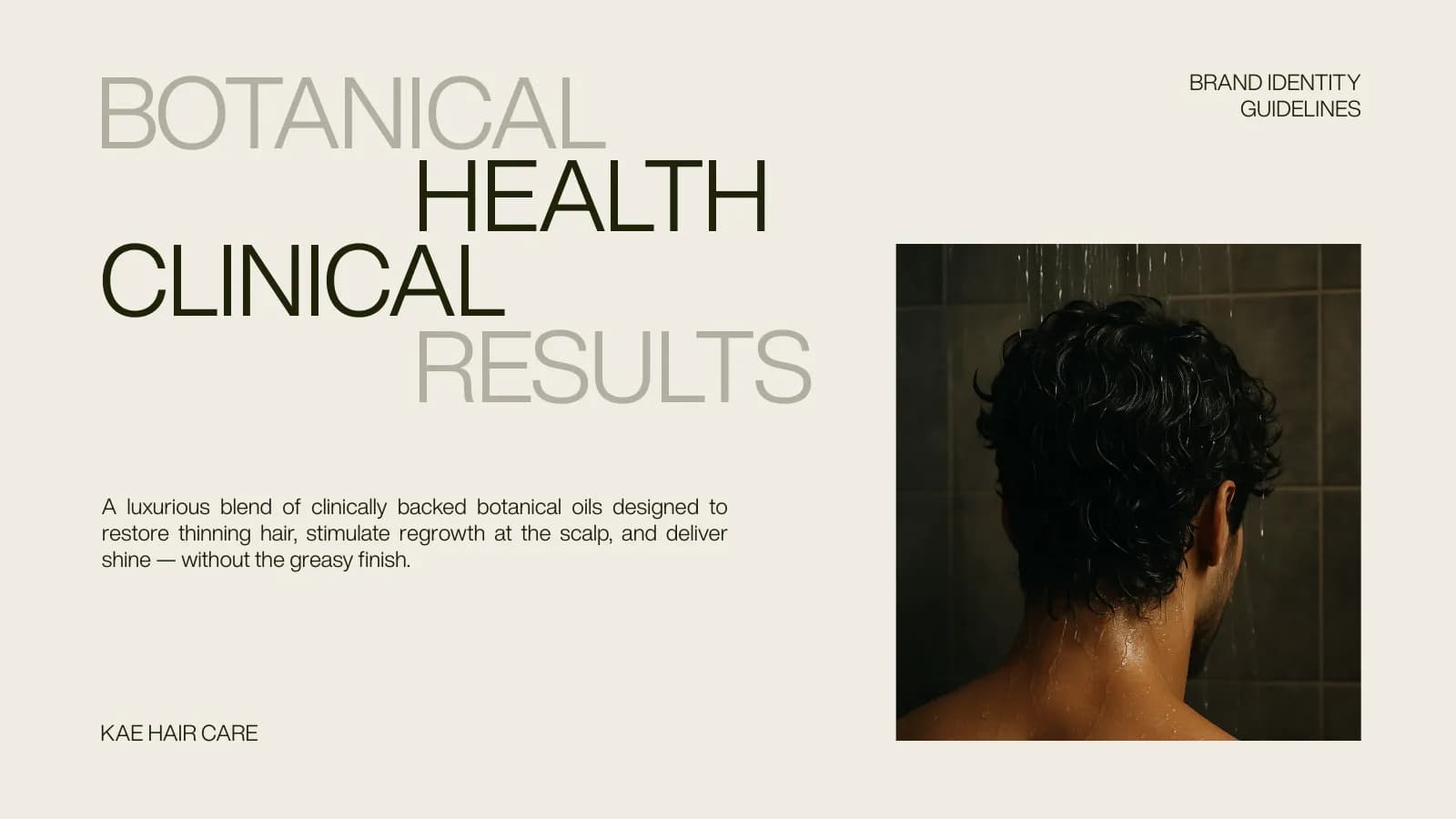
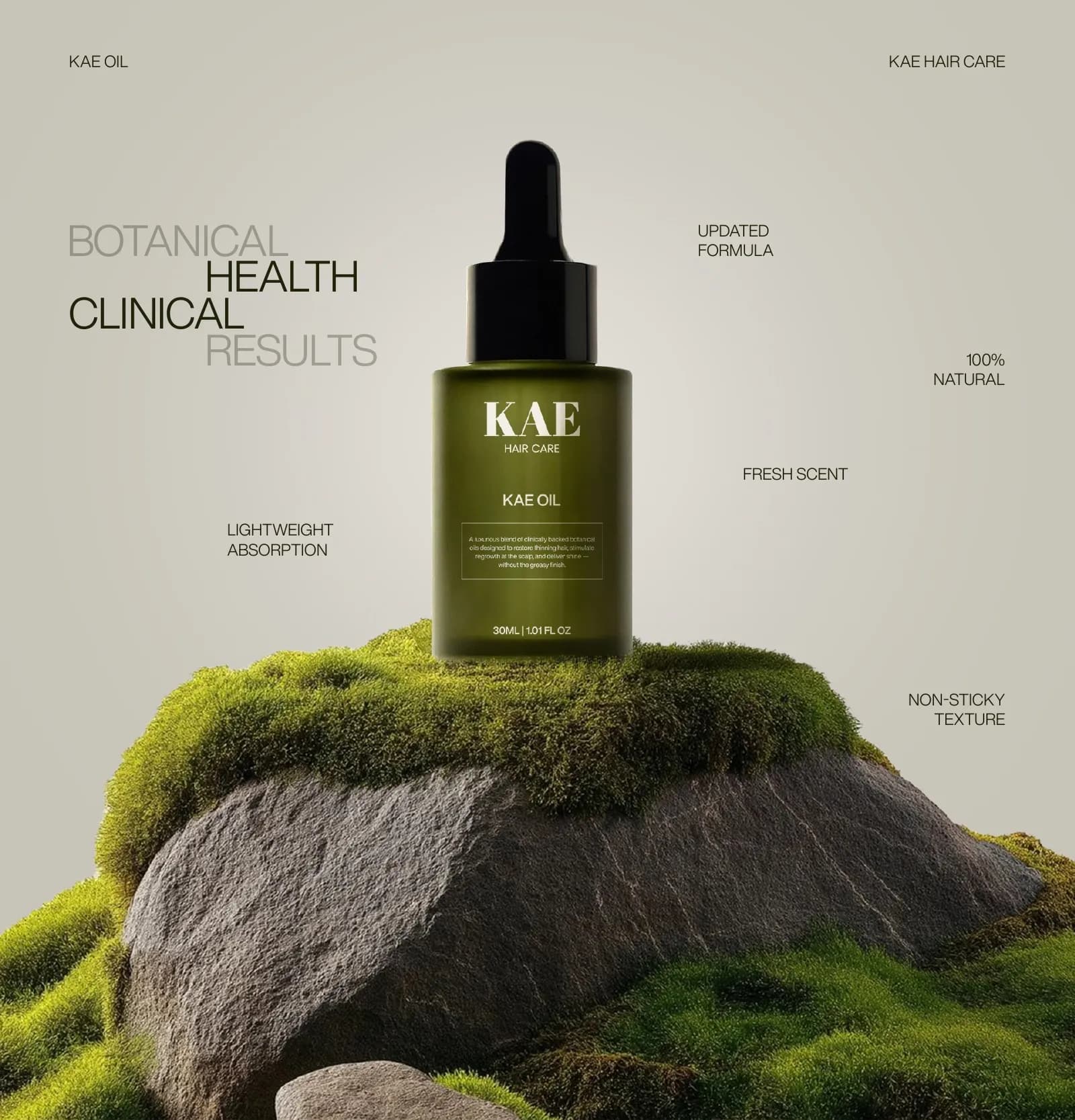
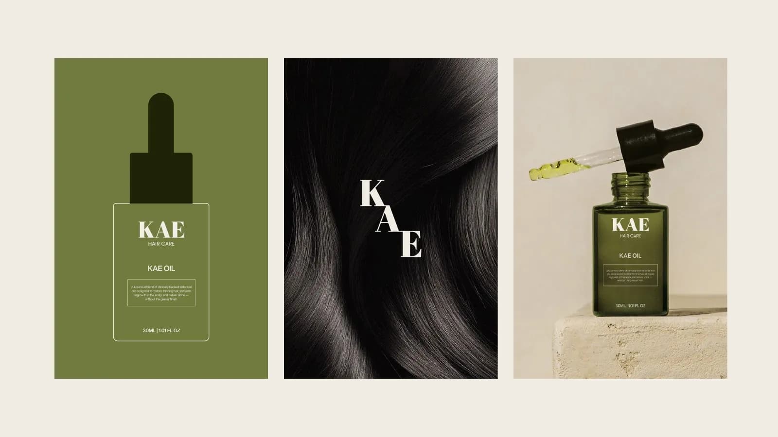
KAE passes both tests the same way: an olive bottle that is a different colour from every other hair oil, and three letters big enough to read from across a room. The full story is in the KAE hair care packaging case study.
The packaging is the brand
In most industries I design the identity and then apply it to things. In beauty I design the identity on the bottle, because the bottle is where the brand will be judged.
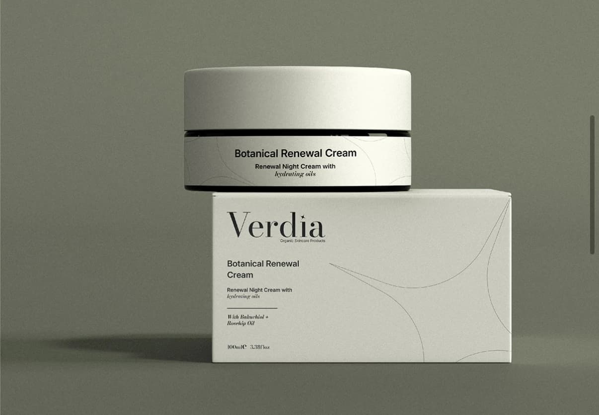
That means the colour palette is chosen against the actual material. Olive looked right for KAE on dark frosted glass; it would have looked muddy on a white tube. Verdia’s cream, near-black and sage were chosen so a jar, a carton and a tube all read as one family on a bathroom shelf. The wordmark is sized for the front panel first and the website second. The photography is planned so the product has a setting to sit in, which in beauty is half the sell.
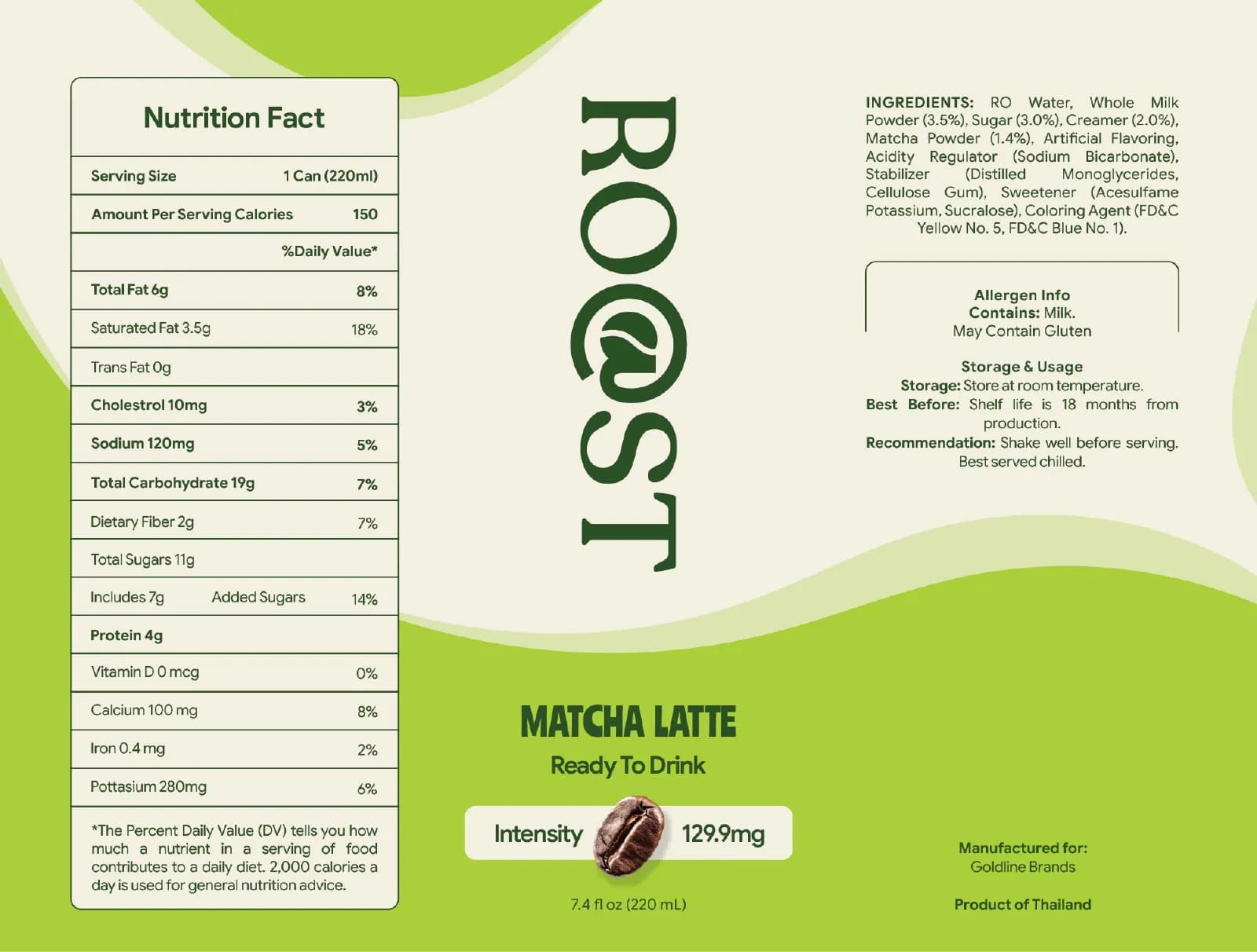
The back panel is a legal document
The front sells. The back has to be right. Depending on where you sell, that means an ingredient list in the standard INCI order, the net contents, a batch code, the period-after-opening symbol, the country of origin, a responsible address and any warnings your regulator asks for. In the EU the rules sit under the cosmetics regulation, and other markets have their own. Get the list from your manufacturer or a regulatory consultant early, because it eats space, and a label designed without it will not fit it later.
This is the part a logo-only designer does not do, and it is the part that gets a product pulled from a shelf. It is in the packaging checklist for a reason.
Type: why beauty keeps coming back to serifs
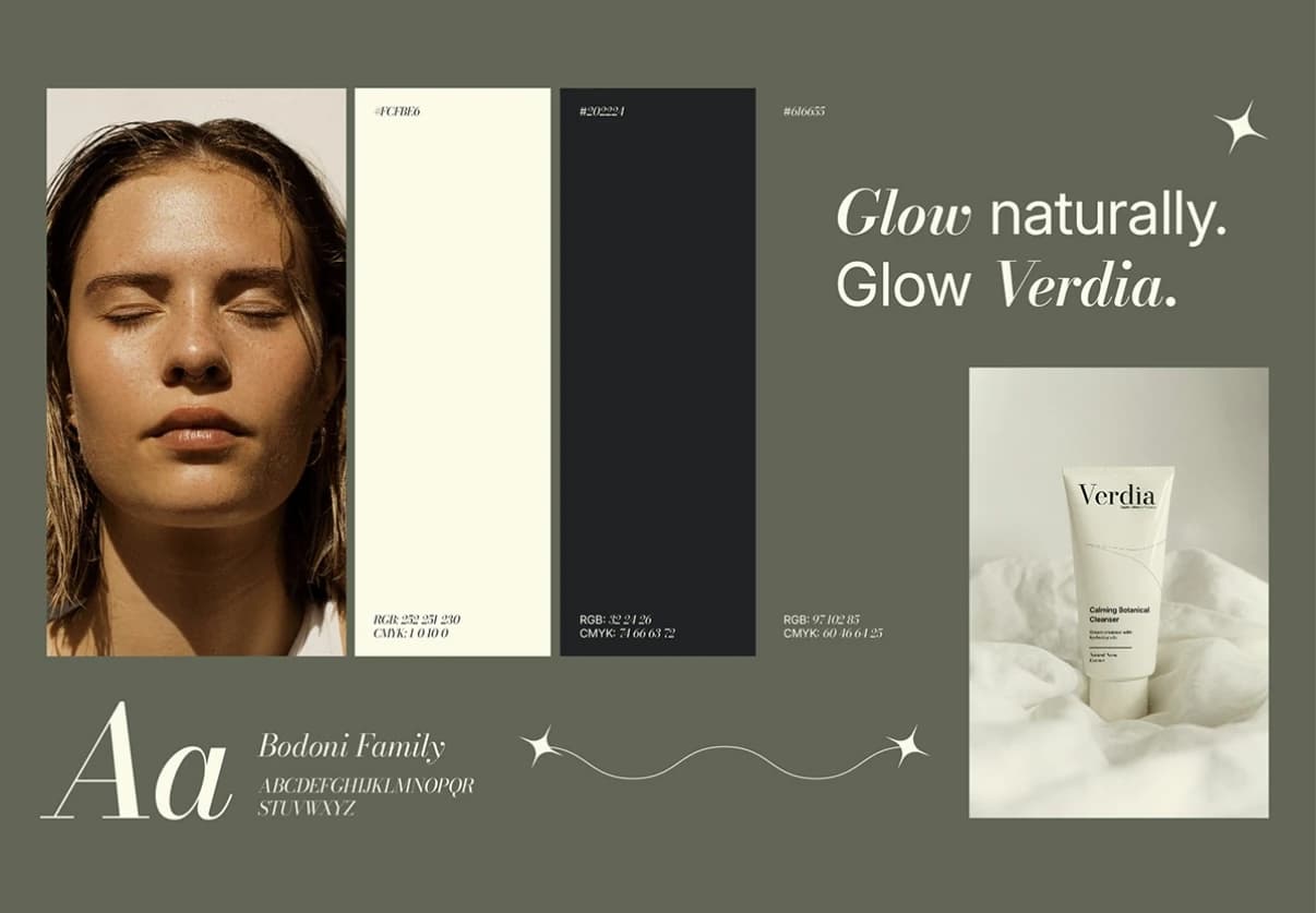
KAE is set in Abril Fatface. Verdia is a Bodoni. Both are high-contrast serifs, where the thick strokes are very thick and the thin strokes are very thin, and I keep reaching for them in beauty because of what they borrow. An old apothecary label. A fashion magazine masthead. A pharmacy sign from a century ago. Those references say “this was made carefully by people who know what they are doing” without a single claim on the box.
The sans-serif does the quiet work next to it: the ingredient list, the product descriptor, the small print. Helvetica Now for KAE. A plain modern sans for Verdia. One face with character, one with none, and both of them in weights that survive at the size of a lipstick label.
Colour: not pink
The default beauty palette is pink, rose gold and white, and it has been for long enough that it now means “generic”. You do not have to avoid it, but you should know that it is the category uniform, and that wearing the uniform makes you harder to find.
For KAE the answer was deep olive against stone. For Verdia it was cream, near-black and a muted sage. Both palettes keep enough softness that the product still feels kind, and both are far enough from pink that they own their shelf space. I have written more about how to choose colour without the pseudoscience, but the beauty version is short: look at what everyone else is wearing, then do not wear that.
Photography: the setting the product lives in
Beauty is sold on feeling, and feeling comes from photography more than from logos. Decide the setting early. KAE lives among moss and stone, cool light, dark hair: botanical, slightly damp, a little clinical. Verdia lives on skin, leaves and hands in warm editorial light: close, honest, no filters.
Write that down in the guidelines, with examples of what fits and what does not, because the social media manager you hire in month four will otherwise pick a stock photo of a woman laughing at a salad.
Plan the range before the first bottle
Almost no beauty brand stays one product. The serum gets a cleanser, the cleanser gets a mist, the mist gets a travel size. If the first bottle was designed as a one-off, every addition is a new design problem and the shelf slowly stops looking like one brand.
So I design the system first, even when there is only one product. Where does the product name go, and at what size? What changes between products: a colour, a word, a stripe? What never changes: the wordmark position, the typeface, the back panel layout? Verdia launched across a cleanser, a serum and a mist, and the answer there was that the colour and the line illustration shift while everything else holds still. That is a template, and a template is what lets you add product four without calling a designer.
What a launch range actually needs
For a first launch with one to three products, the list is shorter than most founders fear: a wordmark and a small secondary mark for lids and social, a colour palette with print and screen values, two typefaces with a licence, front and back panel artwork for each product built to the manufacturer’s dieline, a carton if there is one, a short photography direction, and a guide of ten to twenty pages so the next person can follow it. KAE’s guide runs to 17 pages and covers everything the launch range needed.
On cost, a wordmark plus bottle and carton artwork for one hero product sits in the middle of the range I usually work in, and a full launch range with guidelines sits at the top of it. The cost post has honest numbers for the whole market, and every project with me gets a fixed quote before anything is drawn.
If you are at the start of this
Send me what you have, even if it is a product name and a bottle you bought on Alibaba. I will tell you which of the two traps you are closest to, what the back panel will need, and what the smallest sensible launch system looks like for your range. Tell me about the product, or if you want to see the whole thing on a finished brand first, the KAE case study walks through it bottle by bottle.
Questions founders ask me
Packaging. In beauty the bottle is where the brand is judged, so a logo designed without the bottle in mind usually has to be redone. Design the identity on the packaging from day one.