Industry guides10 min read
Packaging design checklist: what to check before you print
A packaging mistake is the only design mistake you pay for twice. Here is the list I run through before any label or carton goes to the printer, and why each line is on it.
Javeria Hareem
Logo & Brand Designer, founder of Jayy Studio
 Industry guides
In this article
A packaging mistake is the only design mistake you pay for twice: once to print it, and again to print it properly.
A typo on your website gets fixed tonight. A typo on five thousand cartons sits in a warehouse. The same goes for a barcode that won’t scan, a green that came off the press looking grey, or an allergen line a retailer rejects on arrival. None of these are design problems in the creative sense. They are checklist problems, and almost all of them are avoidable before the file leaves your hands.
This is the packaging design checklist I run before any label, carton, pouch or can goes to a printer. Some of it I learned the proper way, from printers. Some of it I learned the expensive way. Both kinds are on the list.
Start with the printer, not the design
The most useful thing you can do for your packaging happens before anyone opens Illustrator: choose the printer and ask them for a dieline. A dieline is the flat template of your box, label or pouch, with the cut lines, fold lines and glue areas marked, and it is specific to their machines. A dieline downloaded from a template site will be close. Close is how you end up with a logo folded over an edge.
While you’re talking to them, ask about materials and finishes they can actually run, minimum order quantities, and lead times. A matte laminate with a spot-gloss logo looks wonderful and adds a week and a cost line. Better to know that now than after the design is signed off. Takeaway boxes, cups and bags follow the same rules; restaurant branding covers the food-service side.
The packaging design checklist
Tick these off in this browser as you go; your ticks are saved. Below the list I’ve expanded the items that cause the most trouble.
Save this checklist
Before your packaging goes to print
Fifteen checks, in roughly the order they come up. Your ticks are saved in this browser so you can come back to it.
0/15
15 still to go.
The items that go wrong most often
Bleed, safe zones and the things that get trimmed
Printing is not precise to the millimetre. Sheets shift a little as they are cut, so any colour or image meant to reach the edge has to run past it, usually by 3 mm, which is the bleed. Anything important stays a few millimetres inside the cut line, which is the safe zone. The classic failure is a border: a thin line around a label looks neat on screen and uneven on every jar, because 1 mm of drift on a 2 mm border shows. I design borders out whenever I can.
Colour: why the screen lies
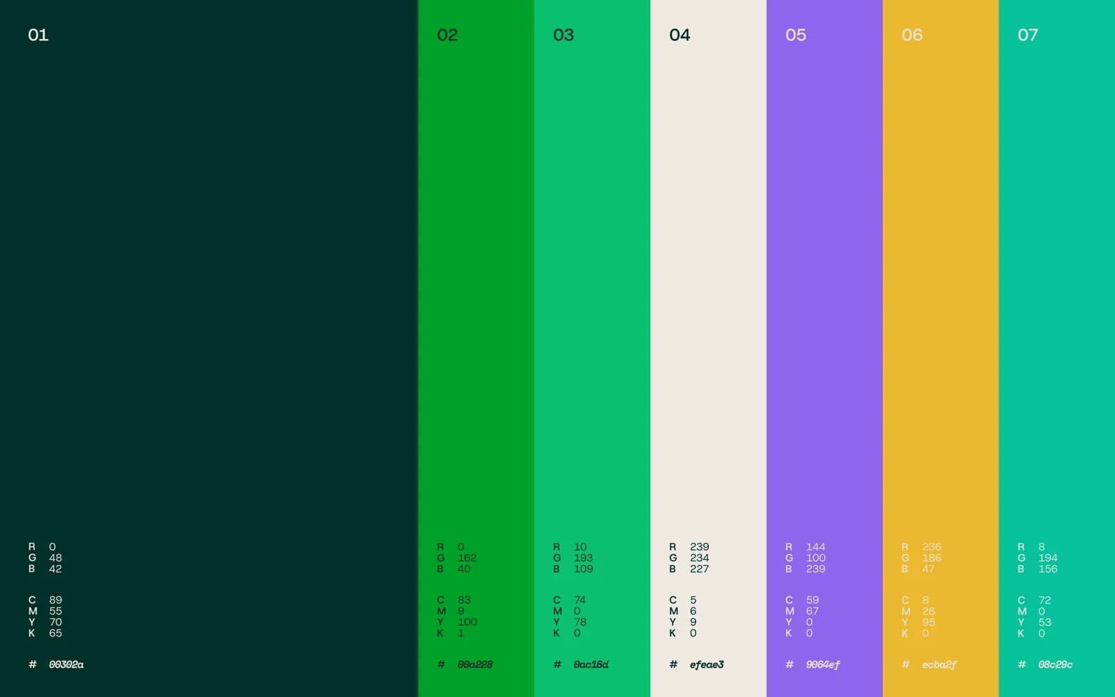
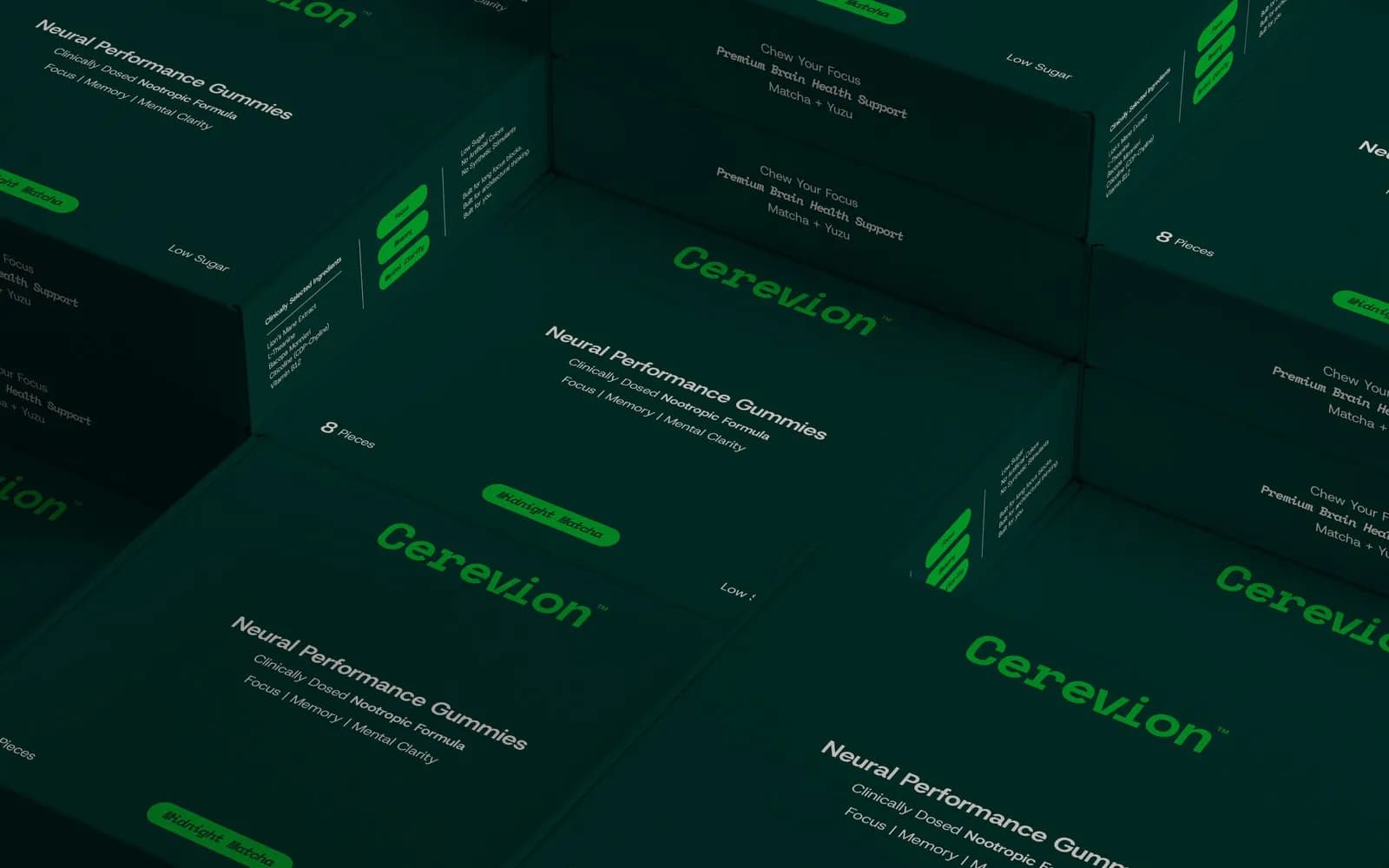
Your screen makes colour with light; a press makes it with ink. The bright green you chose in RGB may not exist in CMYK at all, and the printer will substitute the nearest thing without telling you. So every colour in the file is converted to CMYK before it leaves, and the one or two colours the brand depends on get a Pantone reference as well, so any printer anywhere can match them. For Cerevion, the whole palette is written out in RGB, CMYK and HEX on one page, because the same green has to match on a carton, a tub and a website.
Barcodes, panels and the legal text
A barcode needs three things: enough size, enough contrast and enough quiet zone, the blank margin either side of the bars. Shrink it to make room for a nicer layout and the scanner at the till will refuse it. Print it in a brand colour on a dark background, same result. Dark bars, light background, printer’s minimum size, and leave the margin alone.
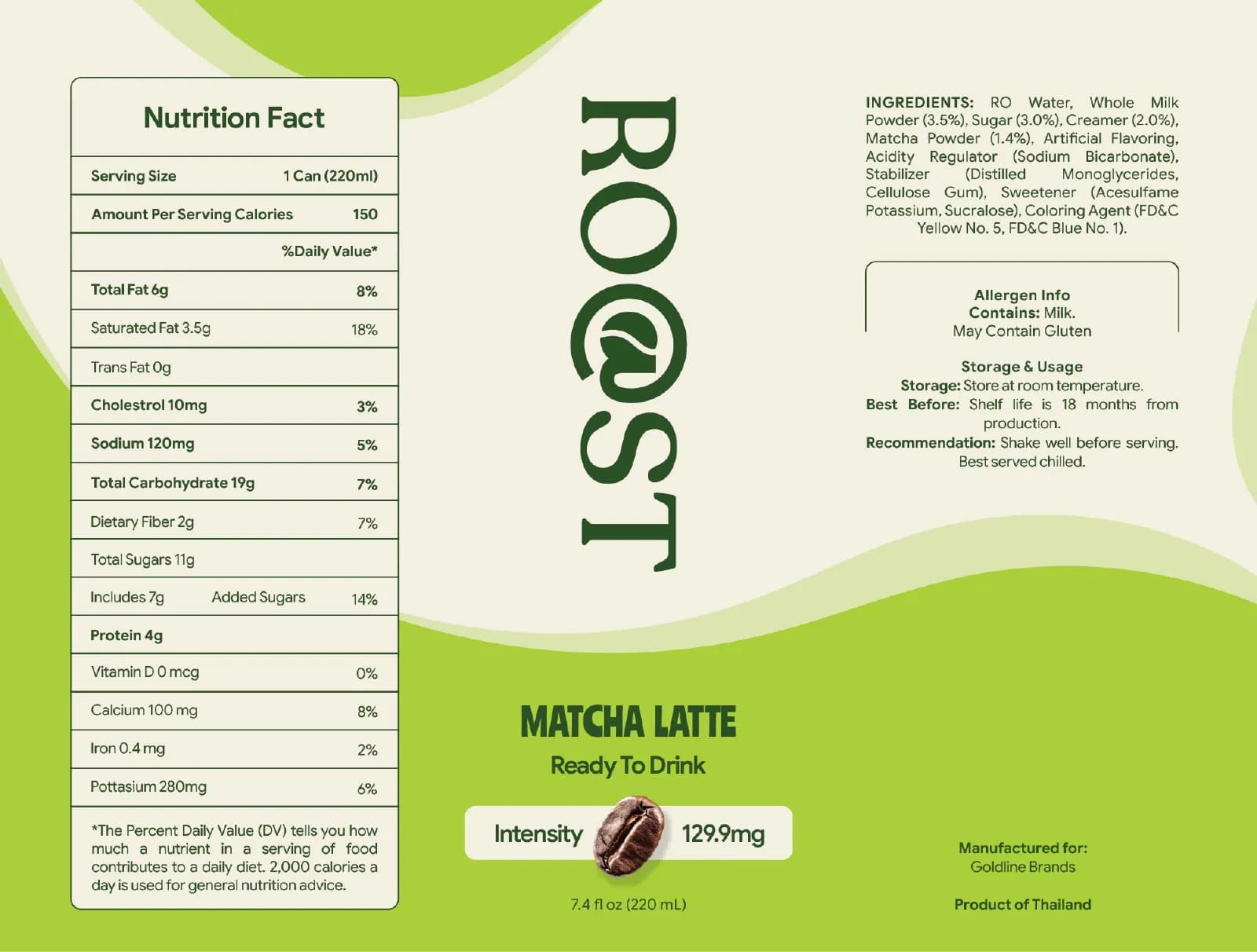
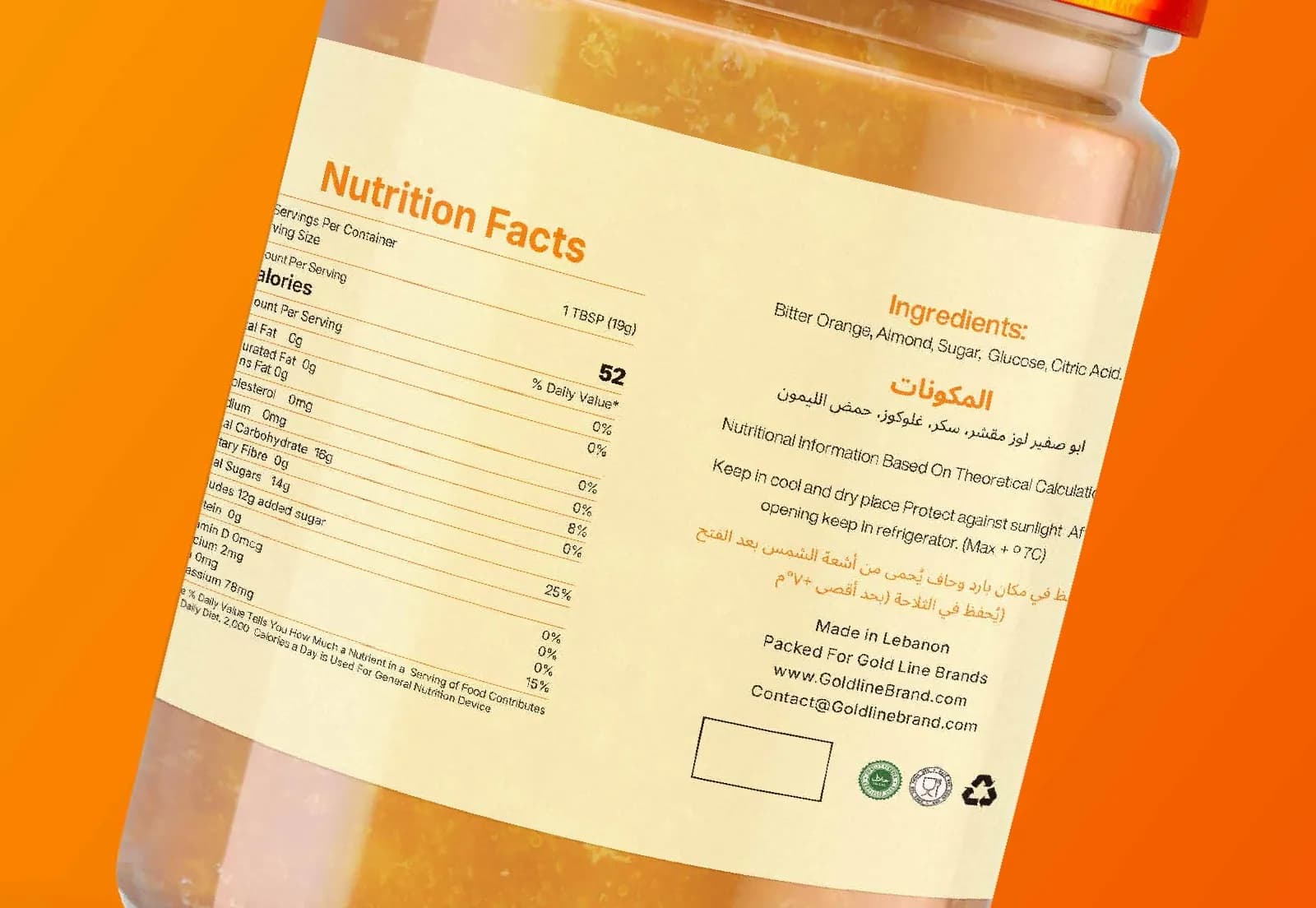
The nutrition and ingredient panels are the part founders most want to rush and the part a retailer checks first. Every market has its own format: the order of nutrients, the units, the serving-size wording, how allergens are emphasised, which warnings are mandatory. A US nutrition facts box and a UK back-of-pack table are not interchangeable. I lay these out to the spec for the destination country and ask the client to have the content confirmed by whoever handles compliance, because a designer can make a panel legible but cannot make it legal.
Bilingual layouts
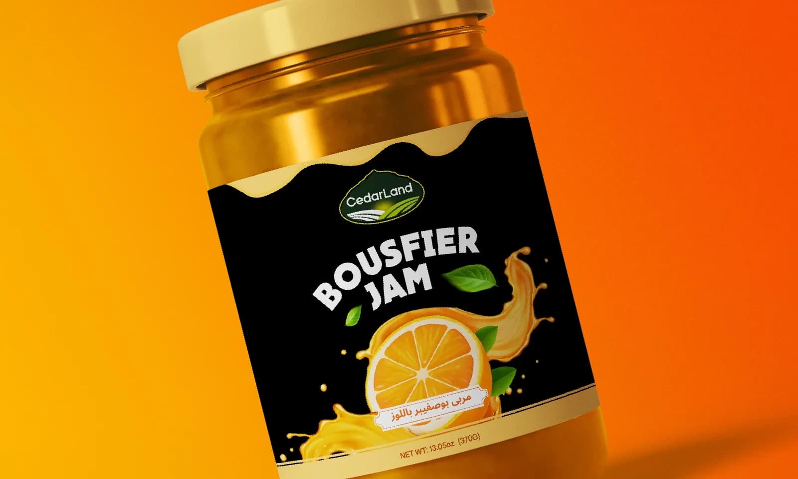
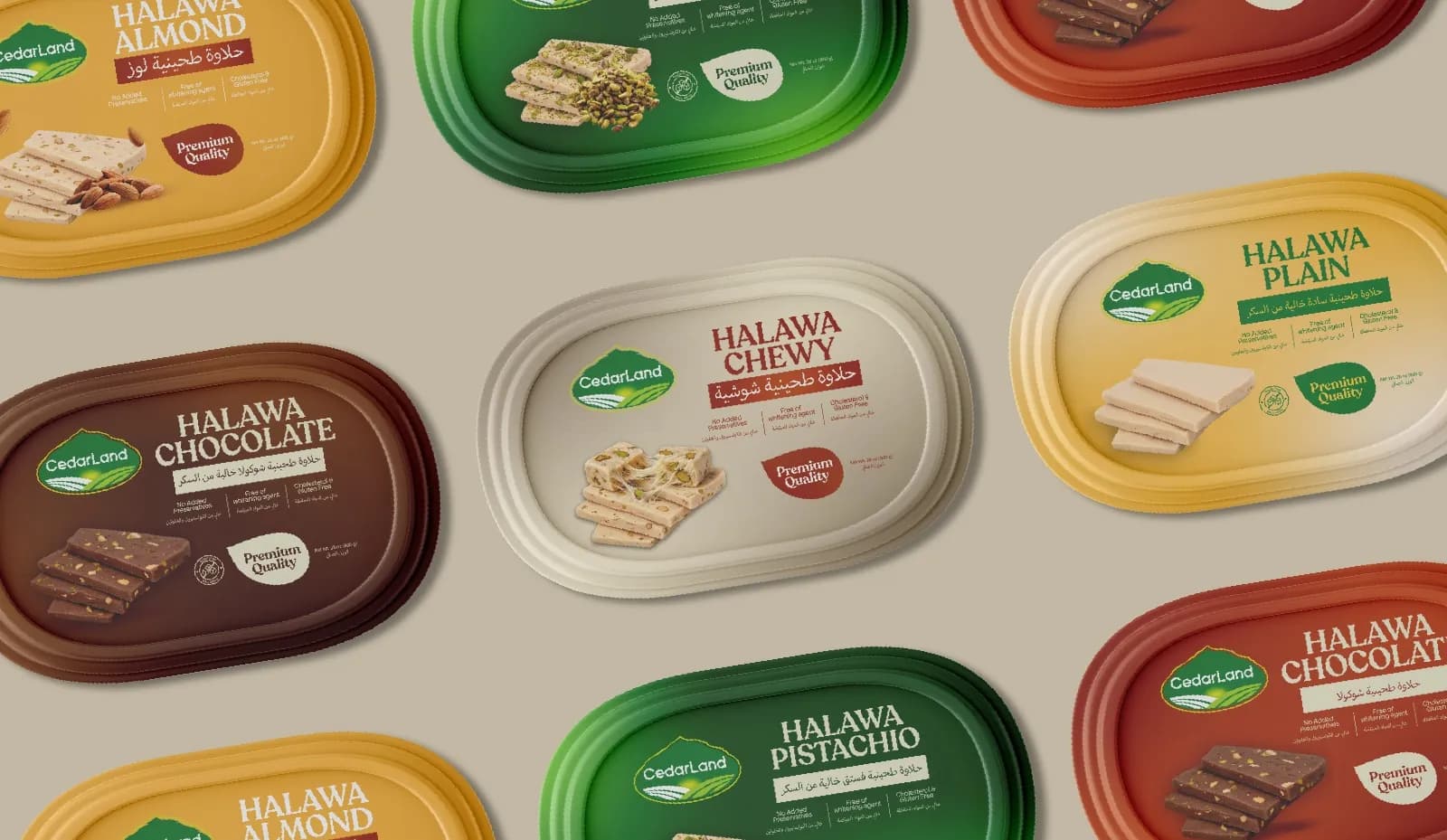
The CedarLand labels I’ve designed run in Arabic and English, and bilingual packaging has its own traps. Arabic reads right to left, so the layout has to give both languages equal weight without one looking like a translation footnote. Text expands and contracts between languages, so a panel that fits in English can overflow in the other. And the designer usually cannot read one of the two, which is why the checklist says a native reader proofs the final artwork. Not the client’s cousin over WhatsApp at midnight. Someone sitting down with the PDF.
Fonts, images and the files you send
Fonts get outlined, so no live text is left to swap to a default on the printer’s computer. Images are checked at printed size: a photo that fills a phone screen is often far too small for a carton face and will print soft. Finishes, meaning foil, embossing and spot varnish, go on their own layers so the printer can see exactly where the gloss goes and quote for it. Then the whole thing is exported as a print PDF with crop marks and bleed, the dieline on a non-printing layer, and named so that nobody sends “label_final_v3_FINAL2” to the wrong press.
Three tests before you sign off
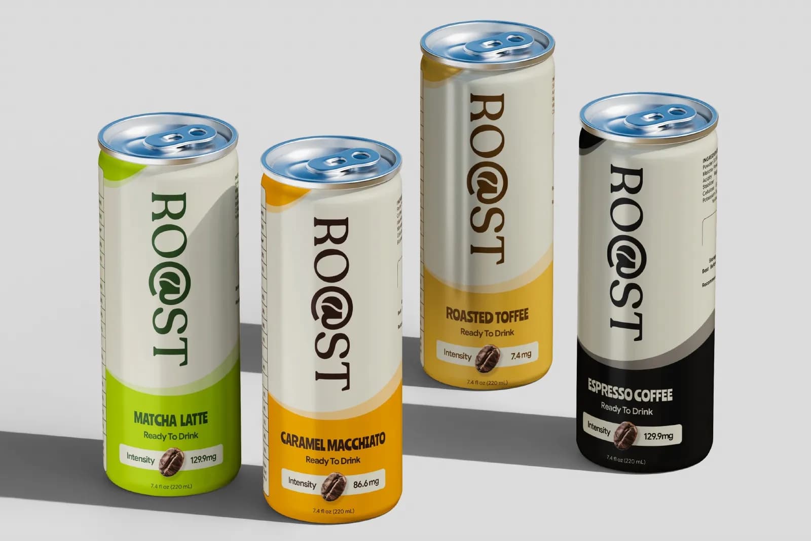
The shelf test. Print the front at actual size, stick it on a shelf or a cupboard door, and walk two metres away. Can you tell what the product is and which brand it is from there? Shoppers decide at that distance. Six flavours of CedarLand halawa share one layout, and from two metres away you read the colour first, the flavour second, and the CedarLand mark holds them together as a family. That is the test passing.
The thumbnail test. Shrink the front panel to a small square on your phone, the size it will be in a marketplace grid or a delivery app. If the product name disappears or the design turns to mush, the hierarchy needs work. Plenty of products are now chosen from a thumbnail before anyone sees them on a shelf.
The physical proof. A printed sample on the real material, not a PDF on a screen and not a laser print on office paper. This is where you find out the matte stock dulls your orange, the foil is slightly off-register, or the fold lands through the middle of a word. A proof costs a little and a reprint costs a lot. I have never regretted asking for one.
What it costs and how long it takes
On my side, a single product usually takes about a week from brief to print-ready files, and each extra variant adds a day or two, because variants are mostly careful repetition. Then add the printer’s proofing and production time, which is often one to three weeks depending on the finish and the quantity. If you need product on shelves by a date, work backwards from it and give the design a month of runway. The KAE hair care packaging case study shows a full launch range done that way.
On cost, packaging sits in the middle of my range: more than a logo on its own, because of the technical work above, and less than a full identity with guidelines. You get a fixed quote once I know the number of SKUs, the format and whether the brand identity already exists. The honest comparison with other options is in how much a logo costs; packaging follows the same logic, with the printer’s own costs on top.
If you’re about to send artwork
Run the list. If more than two items are unticked, hold the file for a day; the printer will not mind and the warehouse will thank you. If you want someone who does this for a living to look over it, or you are starting a packaging project from nothing, tell me about the product and I’ll tell you what the artwork needs. You can read what a packaging project includes, and the KAE Hair Care case study shows the whole process on one launch range, from bottle to carton to the print files.
Questions founders ask me
You can sketch and explore without one, but you cannot produce print-ready artwork without it. The dieline fixes the exact dimensions, fold positions and glue areas for your printer’s equipment. Ask the printer for it before the design starts; most will send one quickly.