Industry guides9 min read
Restaurant branding essentials (for cafes and cloud kitchens too)
A restaurant brand lives on a paper bag, a menu and a sign at 9pm, not on a white square. What each surface needs, and the lessons from donut, coffee and jam packaging.
Javeria Hareem
Logo & Brand Designer, founder of Jayy Studio
 Industry guides
In this article
- Restaurant branding is touched more than it’s looked at
- The menu is your most-read brand document
- The logo has to work on a paper bag and a sticker
- The sign at night
- Takeaway packaging and the box on a stranger’s doorstep
- Photography that looks like the food tastes
- Cafe, restaurant or cloud kitchen: where to spend
- Printing realities nobody mentions in the pitch
- What to brief
- Questions founders ask me
A restaurant brand is held more often than it is looked at.
Think about where your customers actually meet it. A menu in their hands. A paper bag swinging from a wrist. A cup on a desk at 11am. A sign they glance up at in the dark. A box that arrives at a door with a rider who is already leaving. Almost none of these are a logo on a white square, which is what most restaurant branding gets designed as.
I have designed packaging and identities for food brands from a donut shop to jam and ready-to-drink coffee, and the lesson is the same every time: design for the surfaces first. This is what each one needs, and what to ask a designer for so you actually get it.
Restaurant branding is touched more than it’s looked at
When I ask a cafe owner for their brand, I usually get a logo file and a colour. When I ask for their brand as the customer sees it, I get a list: the A-board outside, the menu card, the till receipt, the takeaway cup, the sticker that holds the bag closed, the napkin, the staff T-shirt, the Instagram grid, the Google listing photo.
The second list is the brand. The logo is just the thing that has to survive on all of it. That changes the job. A mark that only looks good at 400 pixels wide on a website is no use on a sticker the size of a coin, and a palette of six colours is no use on a bag that will be printed in one.
The menu is your most-read brand document
More people will read your menu than will ever visit your website. They read it hungry, in a hurry, often in bad light, and they decide how much to spend while they are holding it. It deserves a designer’s attention more than the logo does, and it almost never gets it.
A good menu is set in the brand typeface at a size that works in candlelight, with the dishes you make money on placed where eyes land first, and prices set so they do not line up in a column that invites comparison. It is printed on a stock that survives a spill. And it is a template, so when the spring menu comes in, the kitchen can change the dishes without breaking the layout.
For a cafe, the menu is probably a board behind the counter and a QR code. Same rules. If it is a board, test it from the back of the queue.
The logo has to work on a paper bag and a sticker
This is the constraint that shapes restaurant logos more than any other, and it is why I design them in one colour first. A bag is printed in one ink. A sticker is often a stamp on kraft. A napkin has about as much detail as a potato print. A thermal receipt printer renders your logo in black dots at a resolution that would embarrass a fax machine.
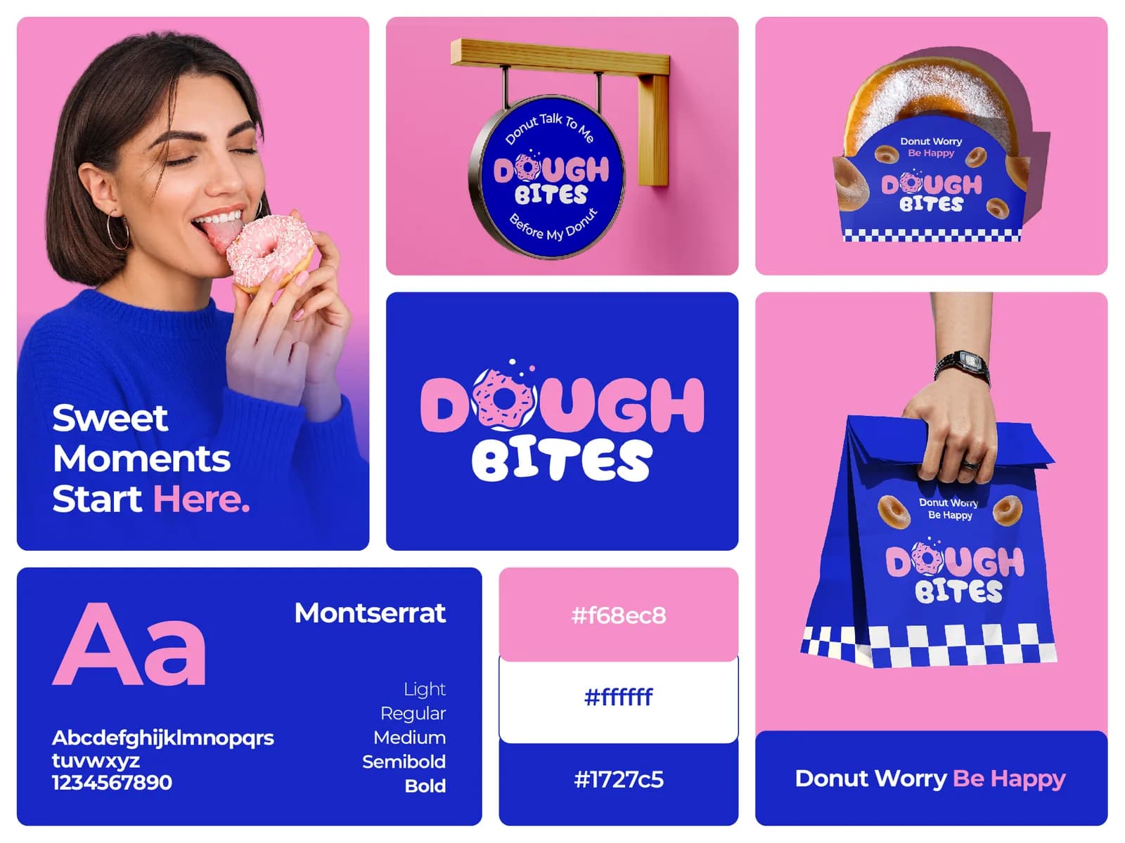
So the mark needs a solid, simple one-colour version with no thin lines, no gradients and no tiny text, before anyone adds the full-colour version for the website. Dough Bites works because the wordmark is chunky enough to survive a stamp, and because two colours, pink and cobalt, cover every surface without needing a third.
Ask your designer for the one-colour version up front, and ask to see it on a bag mock-up before you sign off. If they can only show it on a white square, that is a sign to be careful.
The sign at night
Most restaurant signs are approved in daylight on a laptop and seen in the dark from a moving car. Those are different signs.
Thin letters disappear against a lit background. Dark colours vanish once the sun goes. A reversed version of the logo, light on dark, is the one you will need for an illuminated box and the one most brands do not have. Test the sign as a photo taken at 9pm from across the street. The round hanging sign for Dough Bites is a simple two-colour disc for exactly this reason: it reads as a shape before it reads as words.
Takeaway packaging and the box on a stranger’s doorstep
If you deliver, the box is the restaurant. The customer sees a bag on a doorstep, a box on a table, and whatever is printed on it. If it is a plain brown box with a receipt stapled to it, that is your brand for that order.
The cheapest wins here are a branded sticker that seals the bag, a stamp for plain kraft boxes, and one printed insert card. The bigger win is designing the packaging as a range: the cup, the bag, the box and the sauce pot all sharing one layout and one position for the logo, so a table full of your packaging looks like one restaurant and not a pile of containers.
Cloud kitchens live or die on this, because the box and the app thumbnail are the entire brand. If that is you, spend the design budget on the packaging and the photography, and skip the sign altogether.
Photography that looks like the food tastes
Most restaurant photography is taken with a phone under a kitchen strip light. You do not need a studio. You need daylight from one window, a plain surface, the food shot from the angle you would eat it at, and someone willing to take forty frames and keep two.
Then decide the style once and write it down: warm or cool, close or wide, busy table or plain backdrop. A grid of photos that all share one style looks like a restaurant with a point of view. A grid that mixes a flat-lay, a dim selfie and a stock image of coffee beans looks like three places.
Cafe, restaurant or cloud kitchen: where to spend
The surfaces are the same, but the order matters, and the budget usually only covers the top three.
A cafe is the sign, the cup and Instagram. People walk past, then they carry you around town, then they tag you. A sit-down restaurant is the sign, the menu and the room: the brand lives in the printed matter on the table and on the wall. A cloud kitchen is the app listing, the box and the photography, in that order, because the first two decide the order and the third decides the review.
Spend in that order and you will look like a bigger operation than you are. Spend evenly across everything and you will look average everywhere.
Printing realities nobody mentions in the pitch
Restaurant printing is cheap, fast and unforgiving. One-colour stamps need bold shapes. Napkins and cups often have a minimum order in the thousands, so the logo on them has to last a few years without looking dated. Thermal receipts take a black logo at low resolution, and nothing else.
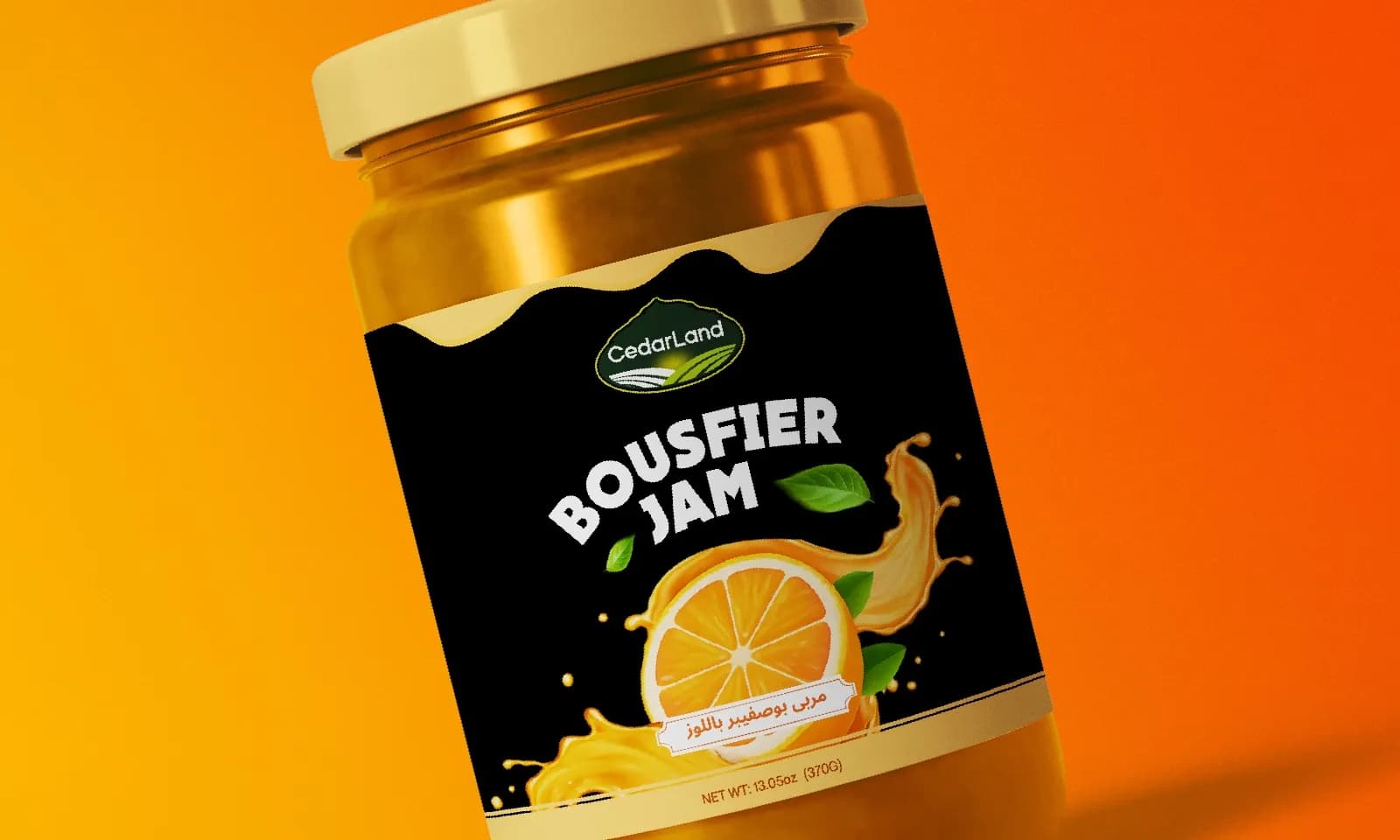
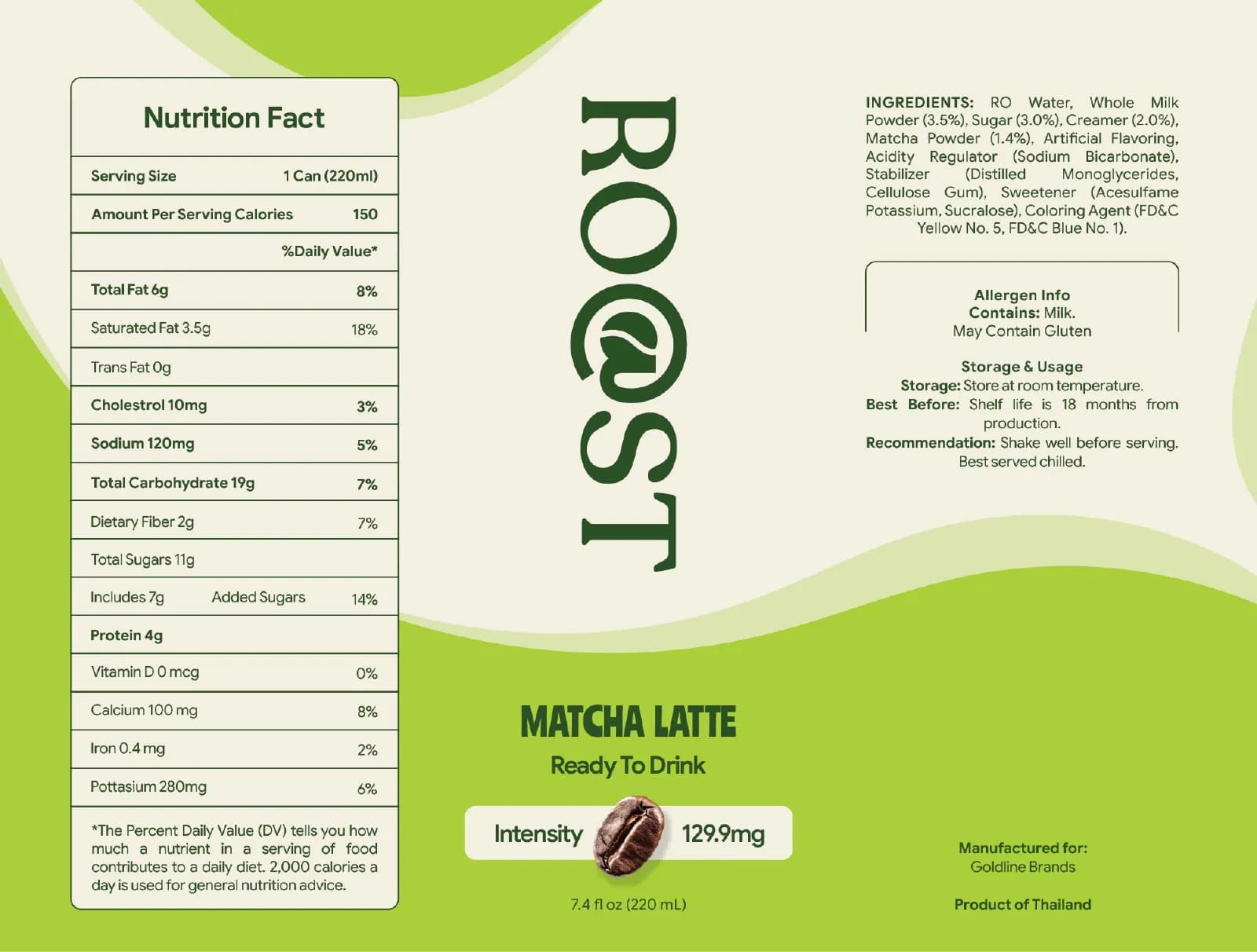
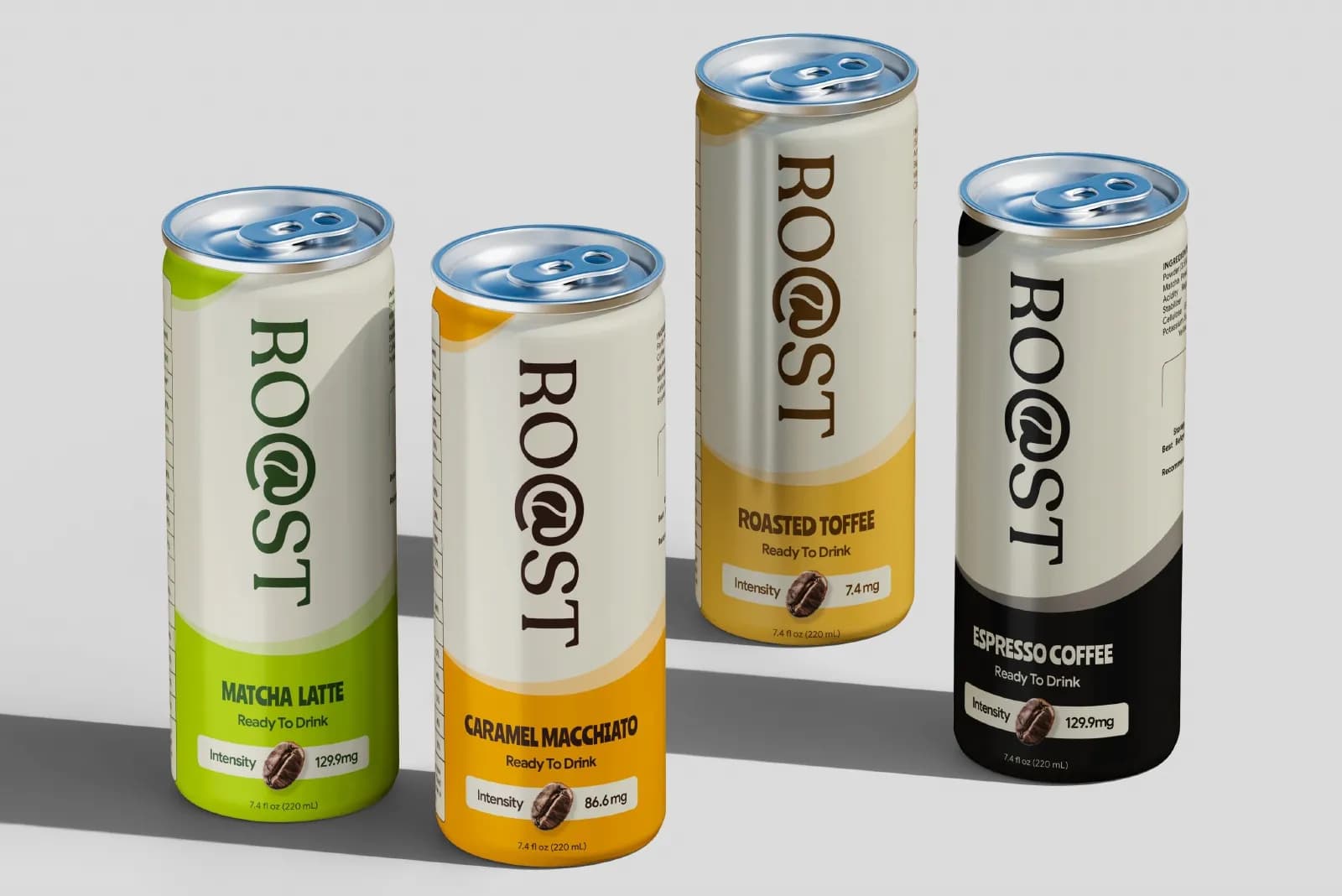
Food packaging adds another layer. Anything with a label needs the legal panel: ingredients, allergens, net weight, storage, sometimes in two languages. The CedarLand jam labels are bilingual, Arabic and English, with a full nutrition panel set to print spec, and the Roast coffee cans carry a complete nutrition facts box, an allergen note and storage instructions on the flat artwork. That text is not decoration. If it is wrong or missing, the product does not go on sale.
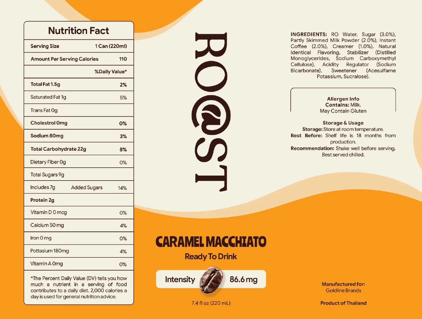
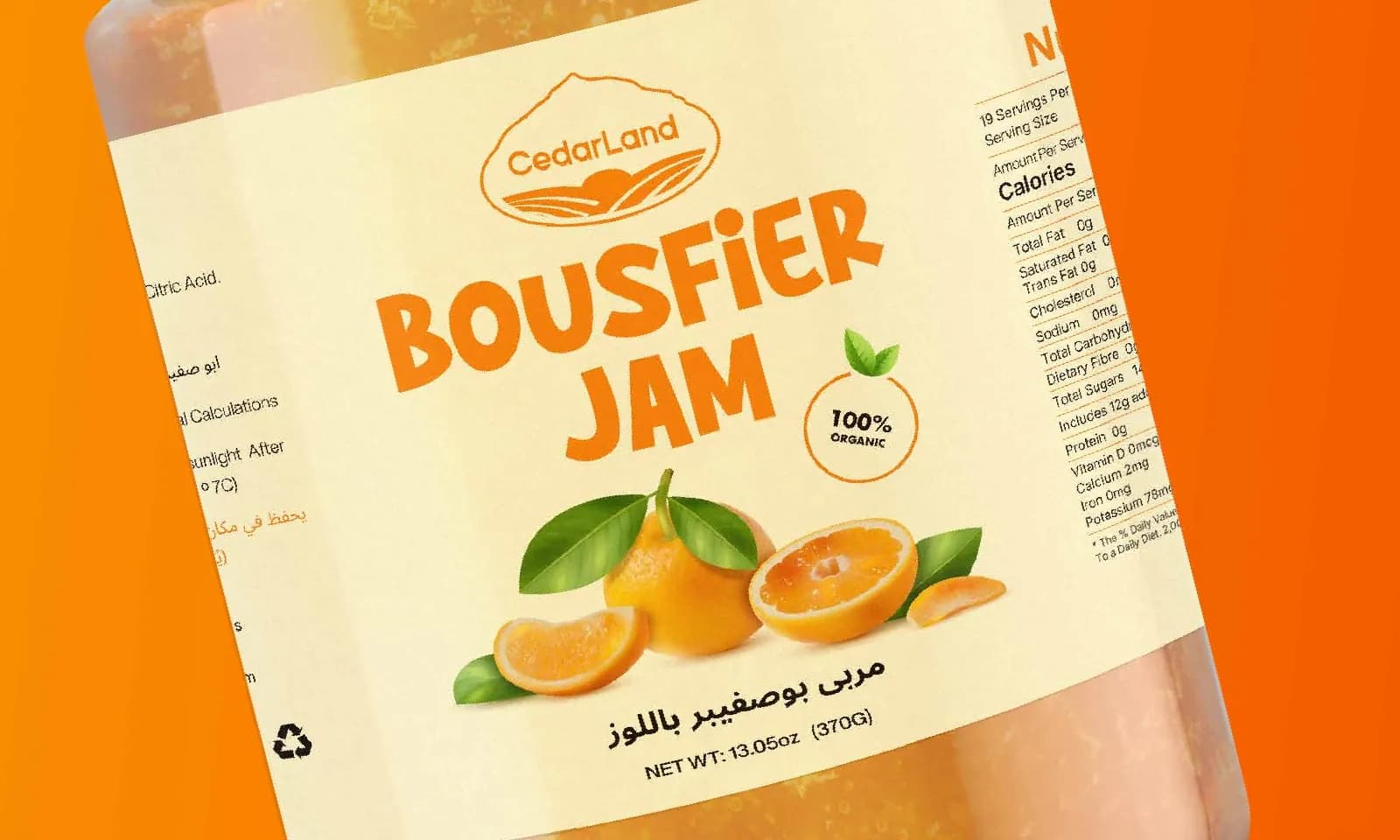
The lessons from that packaging work carry straight into restaurants: fix the layout, change one thing per product, and treat the small print as part of the design from the first draft. If you sell a sauce or a bag of beans alongside the food, the packaging checklist will stop you printing something you have to throw away.
What to brief
When you talk to a designer, do not open with the logo. Open with the list: the surfaces you have, the ones you will have in a year, what gets printed in one colour, what gets delivered in a box, how often the menu changes, and the three competitors on your street. Then ask for the one-colour mark, the reversed version for the sign, the menu template and the packaging range, in that order. The cost post will tell you what each of those should run to.
If you want someone to do that with you, tell me about the place. Send a photo of the shopfront and whatever you are handing to customers today, and I will give you an honest list of what needs doing, what can wait, and what you can fix yourself with a stamp and a roll of stickers.
Questions founders ask me
No. You need a mark that works in one colour, a reversed version for the sign, a menu template and a cup. That is a small, focused project. The full identity can come when you open the second site.