Case studies7 min read
Case study: KAE hair care packaging design and identity
A hair oil that had to sit between the lab and the kitchen. The serif, the olive, the dark bottle, and the guide that holds it all together.
Javeria Hareem
Logo & Brand Designer, founder of Jayy Studio
 Case studies
In this article
- The brief: a treatment, not a cosmetic
- What hair care packaging design usually gets wrong
- The wordmark: Abril Fatface and a stepped monogram
- Colour: deep olive, and stone to rest on
- The bottle and the carton
- Photography and the wider system
- The 17-page guide and the handoff
- What to take from this for your own launch
- Questions founders ask me
KAE sells a hair oil, and a hair oil has to solve a branding problem before it solves a scalp problem: on the shelf, almost every bottle looks either like a lab sample or like something a friend made in their kitchen.
This is the KAE Hair Care project from brief to print-ready artwork. The position we chose between those two extremes, the serif wordmark, the olive bottle and carton, the photography, the stationery, and the 17-page identity guide that keeps it consistent. If you’re launching a beauty or hair product, the hair care packaging design decisions here will transfer directly to your own.
The brief: a treatment, not a cosmetic
KAE Oil is a blend of botanical oils aimed at thinning hair and regrowth at the scalp. The founder wanted it taken seriously by people who have already tried things that didn’t work. That rules out the soft, pastel, self-care look straight away: it reads as a nice-to-have. It also rules out the white-and-blue clinical look, which promises results but feels cold, and oddly less trustworthy when the product is plant-based.
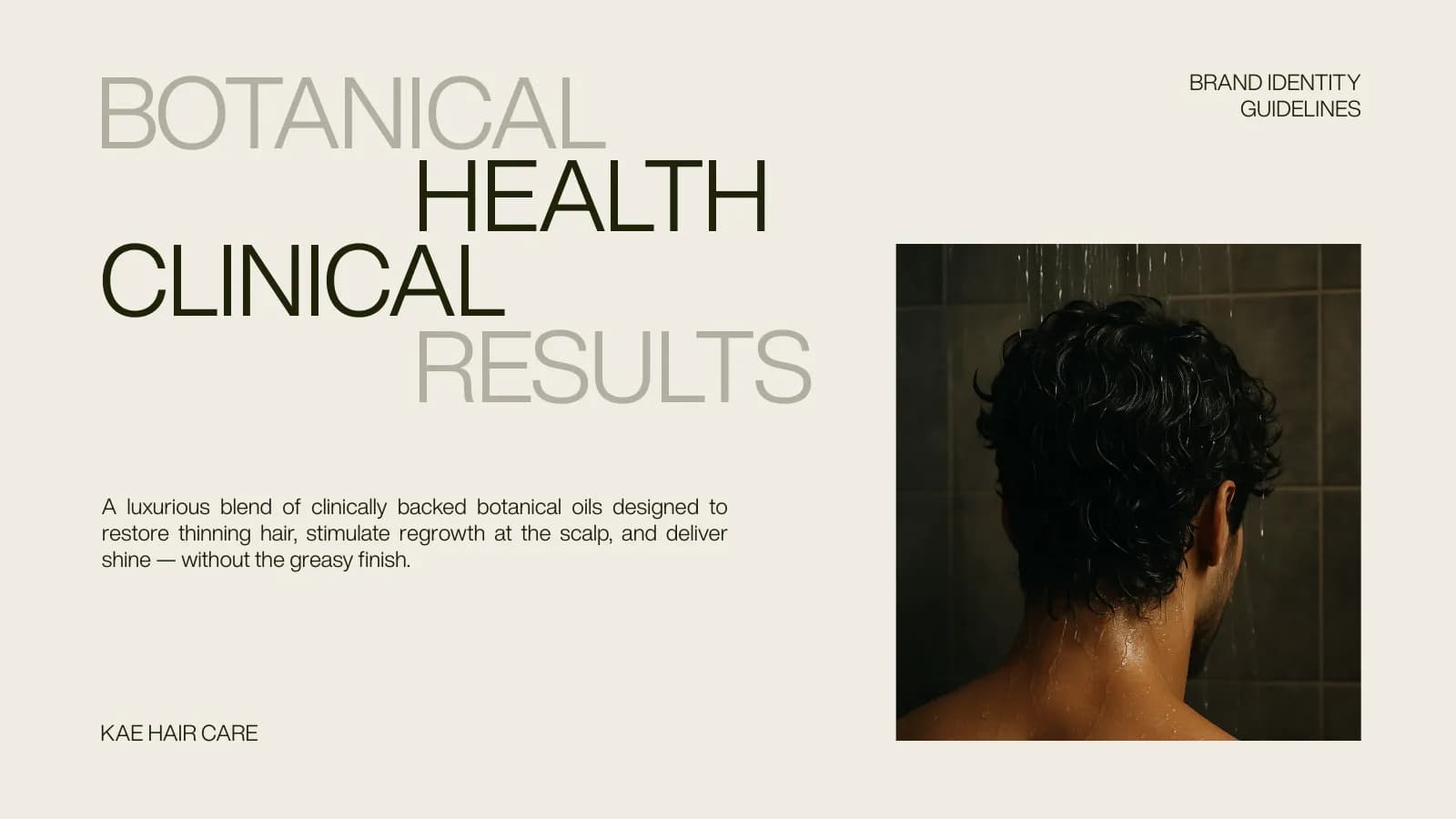
So the brief became a position: botanical health, clinical results. Kind on one side, serious on the other, never tipping fully into either.
What hair care packaging design usually gets wrong
Two things, mostly. The first is colour: the category defaults to white, pink or a bright “natural” green, so a shelf of hair oils blurs into one. The second is type: either a rounded, friendly sans that undersells the product, or a sterile grotesque that makes it look like a prescription. Neither gives a small brand any presence on a shelf or in a thumbnail on a marketplace listing.
The fix for KAE was to borrow from somewhere older than the beauty aisle. Apothecary labels had weight and authority because the type did the work, not the decoration. That was the reference.
The wordmark: Abril Fatface and a stepped monogram
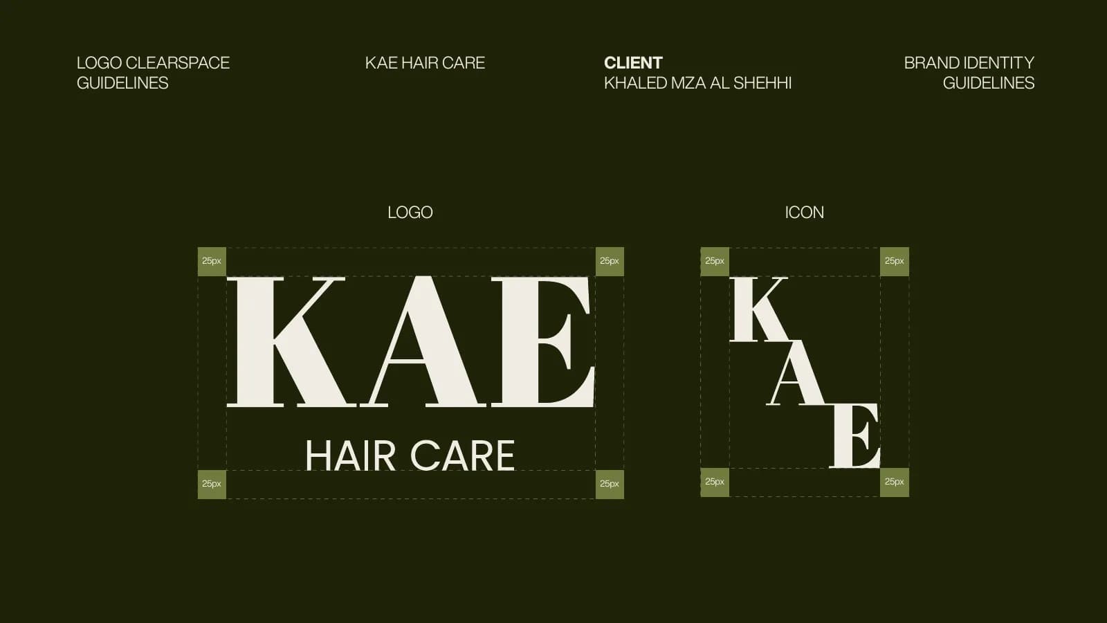
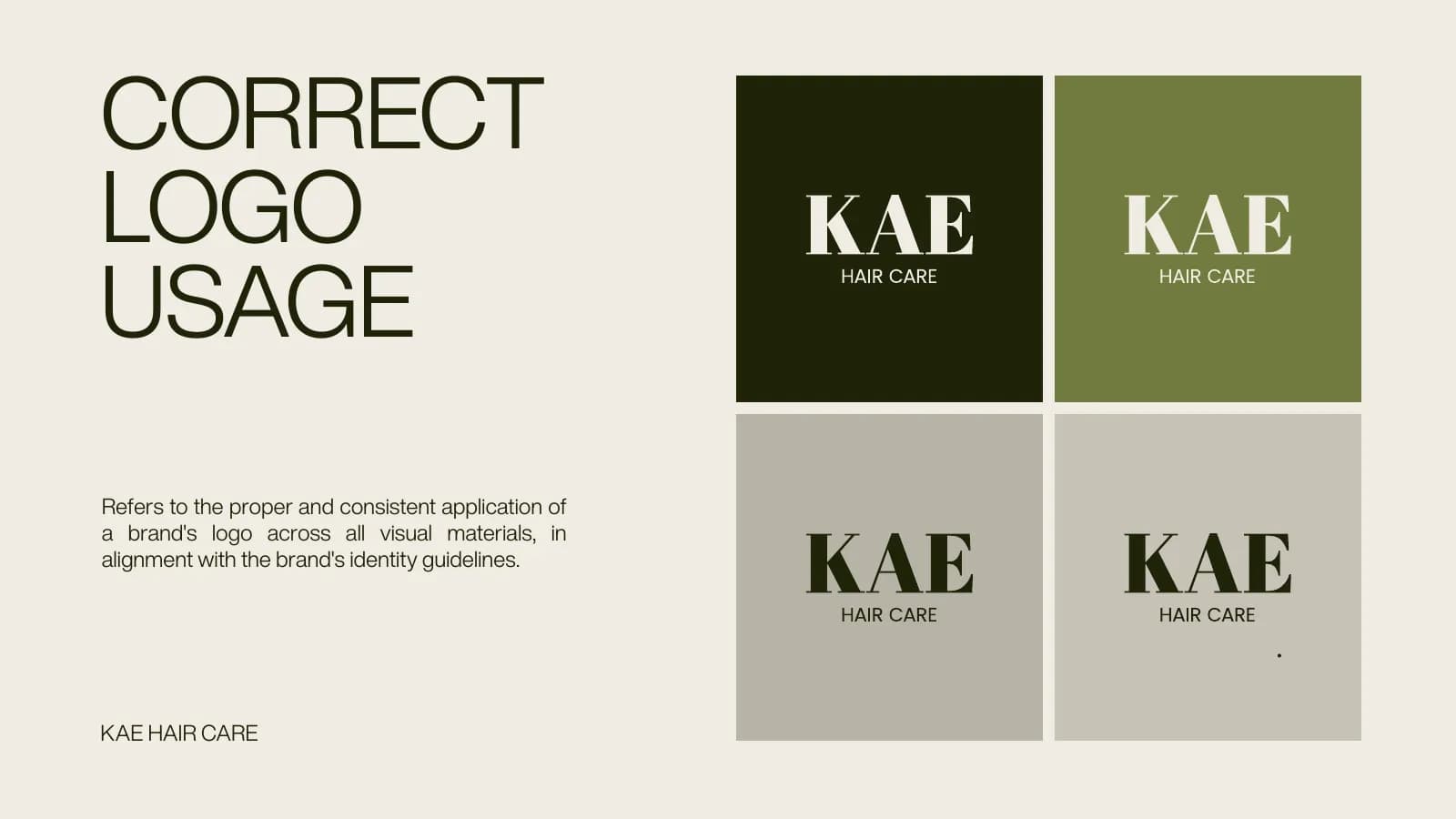
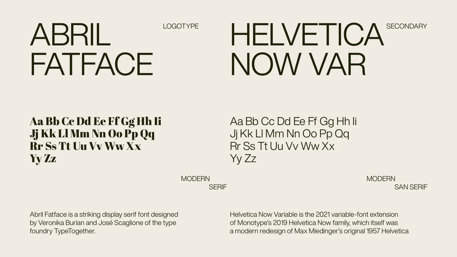
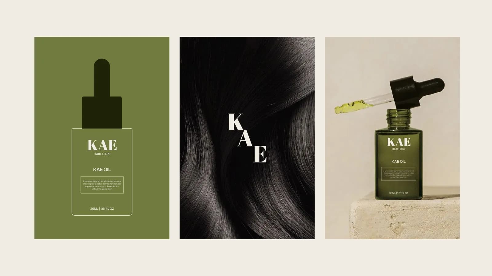
The logotype is KAE in Abril Fatface, a high-contrast display serif with thick verticals and hairline serifs. At label size those thick strokes hold their shape on frosted glass; at app-icon size the three letters still read. HAIR CARE sits beneath in a plain sans so the name does the talking.
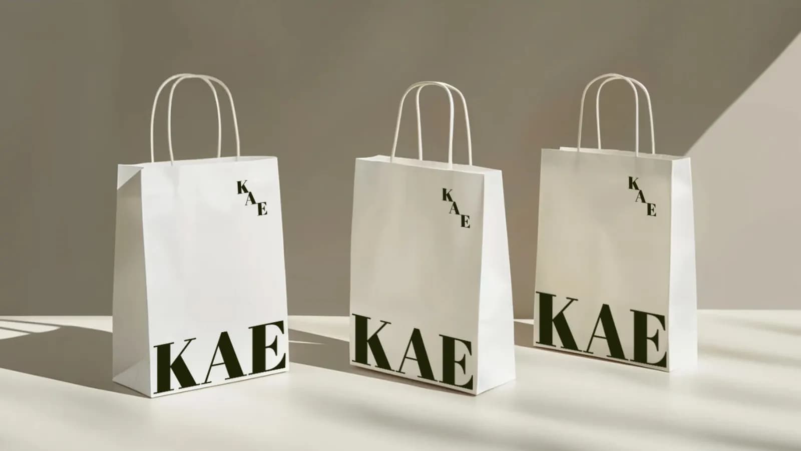
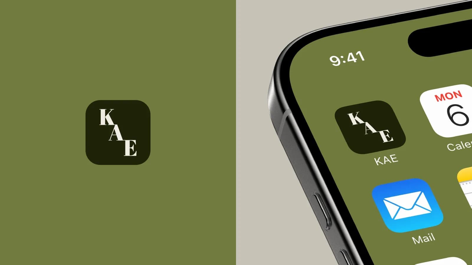
The icon is the same three letters stepped diagonally, K above A above E. It gives the brand a second mark for small spaces: the corner of a business card, the top of a retail bag, a phone screen. The guide sets a clear-space rule of 25 pixels around both marks so nobody crowds them.
Colour: deep olive, and stone to rest on
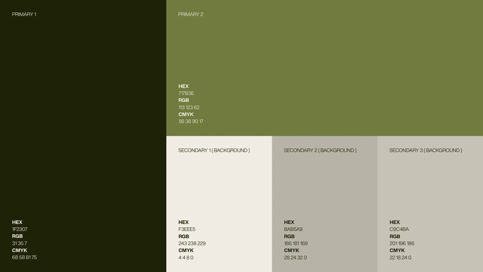
Two primaries and three backgrounds. Primary 1 is a near-black olive (#1F2307); Primary 2 is the mid olive (#717B3E) you see on the bottle. The three secondaries are stone and bone tones used behind everything. Every colour has HEX, RGB and CMYK written in the guide, because the carton printer and the web developer need different numbers for the same green.
Olive was a deliberate step away from the category’s bright greens. It is the colour of the oil itself, it photographs well against moss and stone, and on a bathroom shelf it looks like something that belongs there for a while. How I think about colour in general is in colour psychology in branding.
The bottle and the carton
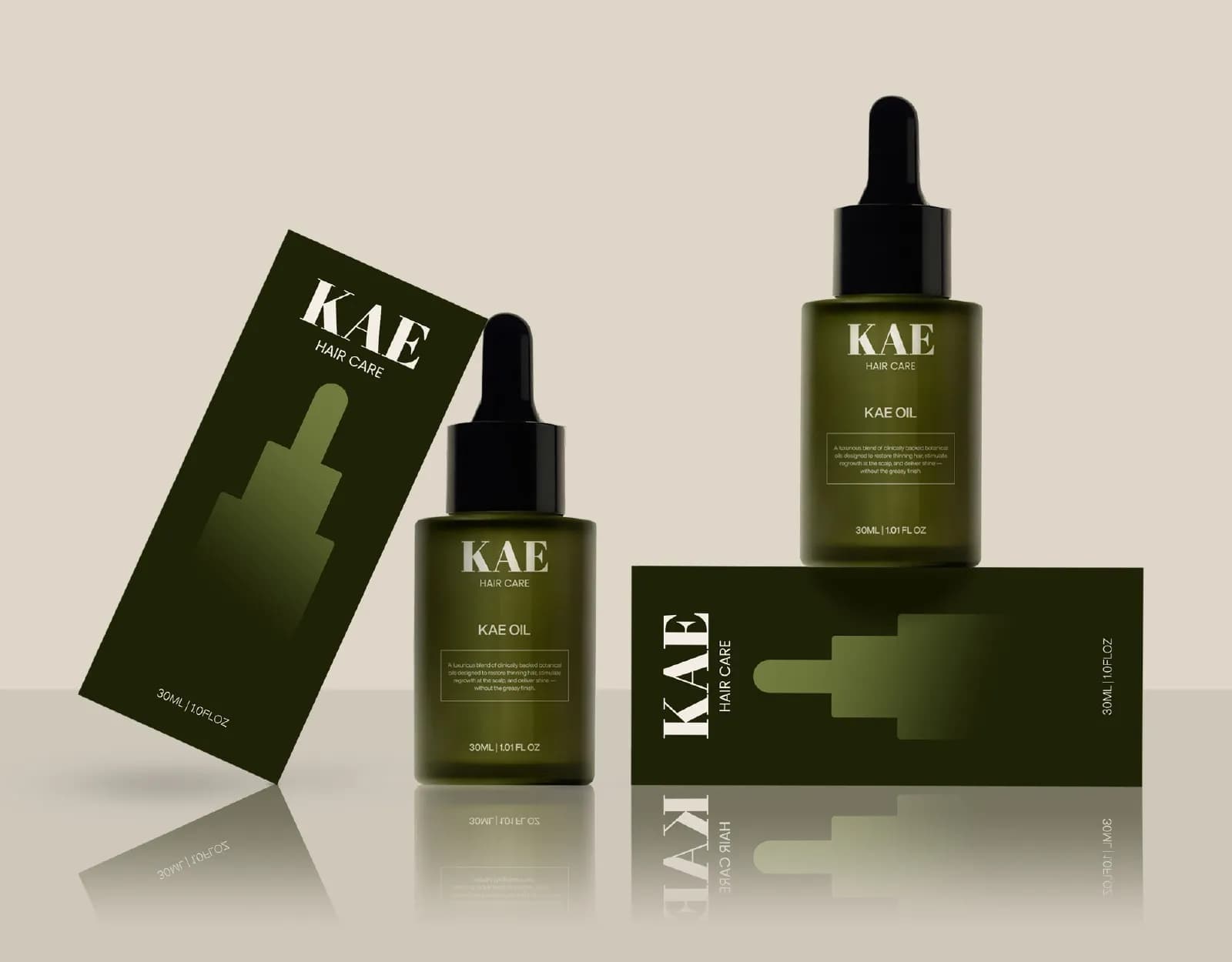
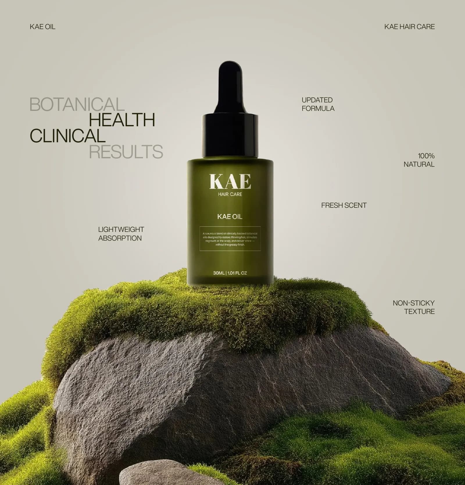
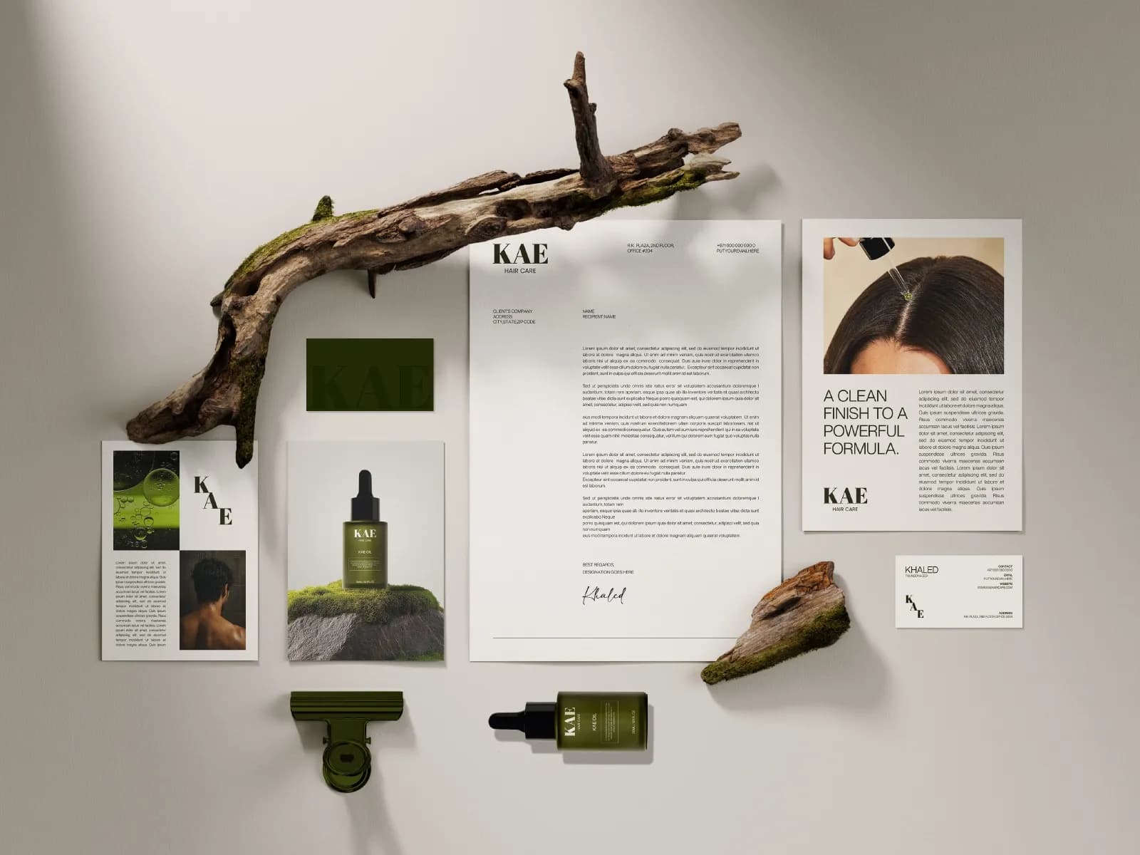
The bottle is a 30ml frosted dropper in dark olive glass with a black cap. The label is minimal: the wordmark, KAE OIL, a short description inside a thin keyline box, and the volume. No claims shouting, no leaf illustrations. The dark glass is what makes it read as a treatment rather than a cosmetic, and the restraint in the type backs that up.
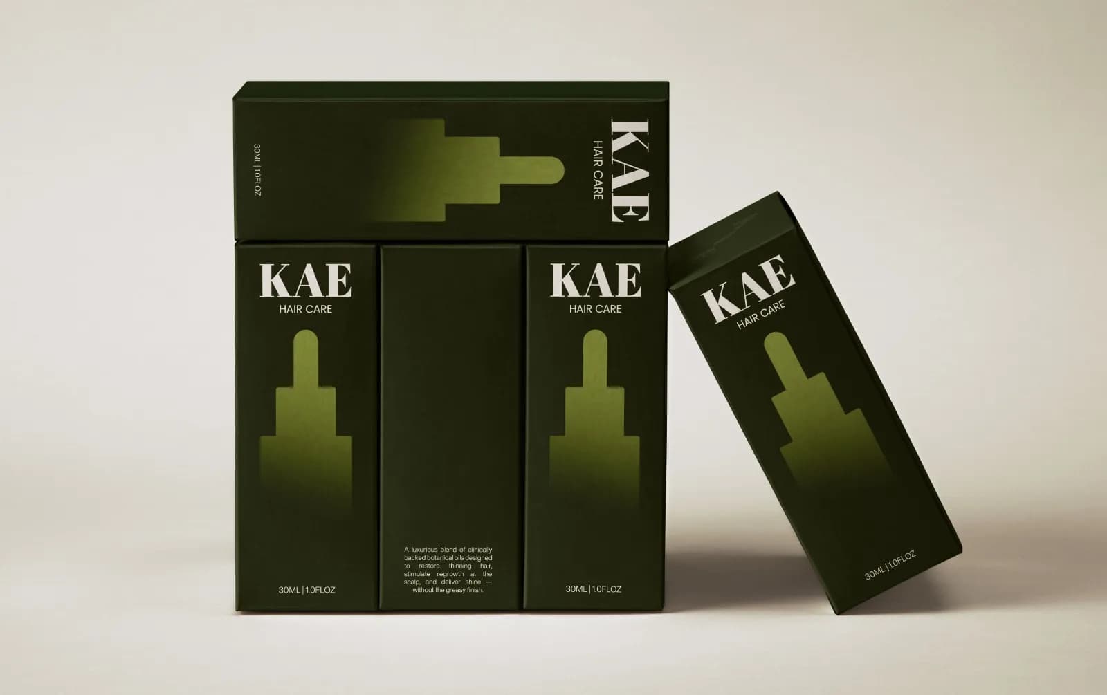
The carton carries the same lockup and a soft gradient silhouette of the dropper bottle on the front panel, so the shape of the product is visible before the box is opened. The side panels hold the description and the volume. All of it was built to the printer’s dieline with bleed and safe zones, so the artwork went to production without a redraw.
Photography and the wider system
The imagery rule is simple: moss, stone, water, real hair, real scalp. No white studio sweeps, no pastel props. It keeps the brand grounded and makes the olive feel natural rather than chosen from a swatch book.
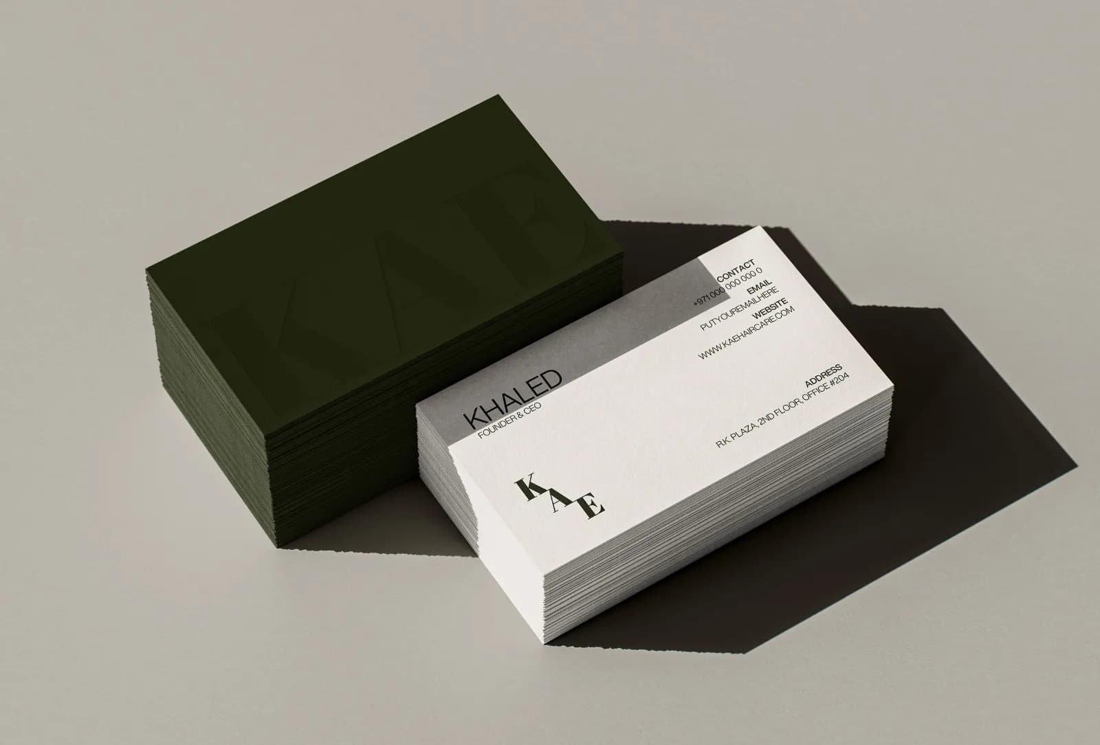
From there the identity rolls out onto the pieces a launch actually needs: business cards in dark olive with a blind-embossed wordmark, letterhead, retail bags with the stepped icon up top and the wordmark along the base, a billboard layout, and the app icon.
The 17-page guide and the handoff
KAE received a 17-page identity guide covering the logo and icon with clear space, the colour values, both typefaces, correct and incorrect usage, imagery direction and the applications. Alongside it: vector source files (AI, EPS, SVG) and PNG, JPG and PDF exports for every logo version, and print-ready bottle and carton artwork built to the dieline. That is the whole launch range, ready for the printer. I’ve written about what belongs in a guide like this and the checks I run before anything goes to print.
What to take from this for your own launch
Decide the position before the colour. KAE’s whole identity follows from four words, and the olive, the serif and the dark glass are just those words made visible. Pick a type reference outside your category; the apothecary label did more for KAE than any beauty brand would have. And get the carton built to the dieline from the start, because a label that looks lovely on screen and misprints on board is the most expensive mistake in packaging.
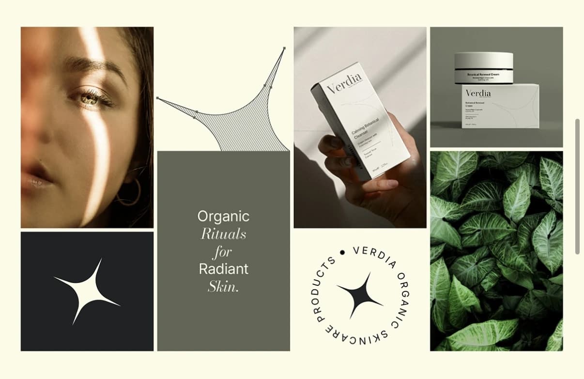
If you’re building a beauty, hair or skincare brand, tell me about the product and I’ll give you a straight read on what it needs. The Verdia skincare case study shows the same approach on a wider range, and the beauty branding guide covers these decisions in more depth.
Questions founders ask me
A full brand identity runs 7 to 10 days with me, and packaging about a week depending on how many variants there are. KAE combined both, so the identity, the bottle and carton artwork and the 17-page guide were delivered together.