
Branding basics9 min read
Colour psychology in branding: what actually matters
Blue does not mean trust and green does not mean nature. Here is what colour really does for a brand, with the palettes from real projects to prove it.
Javeria Hareem
Logo & Brand Designer, founder of Jayy Studio
 Branding basics
In this article
- What colour psychology branding guides get wrong
- Contrast first, then everything else
- Category conventions, and when to break them
- The same colour on every surface
- How many colours you actually need
- Context the chart does not know about
- How I choose a palette in practice
- If your brand colour is giving you trouble
- Questions founders ask me
Somewhere on the internet there is a chart that says blue means trust, red means passion and green means nature, and I would like it taken down.
I have designed more than a thousand logos and identities, and I have never once watched a customer feel calmer because a label was blue. What I have seen, many times, is a name that was unreadable on the shelf, or a green on the website that was a different green from the one on the box.
So this is the colour psychology branding post with the psychology mostly taken out. What is left is the part that decides whether your brand looks like one business or three, and whether anyone can read it from two metres away.
What colour psychology branding guides get wrong
The charts are not wrong because colours have no effect. They are wrong because the effect is small and the context is everything. Red on a fire extinguisher means one thing. Red on a jam jar means bitter orange. Red on a Chinese New Year envelope means luck. Nobody feels passion in the supermarket.
The other problem is that every brand reads the same chart. If blue meant trust and every bank chose blue, then blue would stop meaning trust and start meaning bank. Which is roughly what happened. Colour meaning is relative to what sits next to you, and the chart does not know who your neighbours are. The same is true of colour fashions, which I pick apart in branding trends for 2027.
So when a founder tells me they want blue because it feels trustworthy, I ask a different question: what colour are the three businesses you keep losing to? That answer is worth more than any chart.
Contrast first, then everything else
Before a colour can mean anything, people have to be able to read what is written in it. A surprising number of brands fail at this stage. Pale gold on white. Mid grey on light grey. A thin script in coral over a photo of a beach.
I check contrast the boring way. Body text needs a contrast ratio of at least 4.5 to 1 against its background, which is the level the WCAG guidelines set for normal text, and a free tool like the WebAIM checker gives you the number in seconds. If your brand colour cannot pass as text, it is a fill colour, not a text colour. That is not a flaw. Most good accents are fill colours.
Cerevion is a useful example. The signal green is loud, and on its own it would be a mess as body text. So it never is. It sits against a near-black green, as a wordmark and a small flavour tag, and the dosage information is set in cream. The loud colour gets a small job and does it well.
Category conventions, and when to break them
Every category has a default palette. Supplements lean white and clinical. Hair oils go gold and brown. Construction firms are blue and orange with a roof-line swoosh. Luxury property is navy, or black, or a very expensive-looking grey.
The default exists because it works. It tells a shopper what shelf they are standing in front of. So the question is never “should I follow the convention”, it is “how much of it do I keep”. Keep enough that people know what you sell. Break enough that they can tell you apart. Food is the clearest example, and restaurant and cafe branding goes into it.
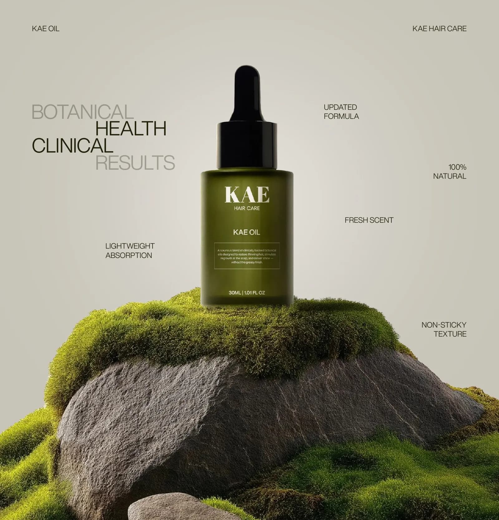
For KAE Hair Care we kept the dark bottle, which is what a treatment looks like, and swapped the gold-and-brown palette that every other hair oil uses for a deep olive. The product still reads as hair care. It just does not read as the same hair care. The wider category is in branding a beauty or hair care startup.
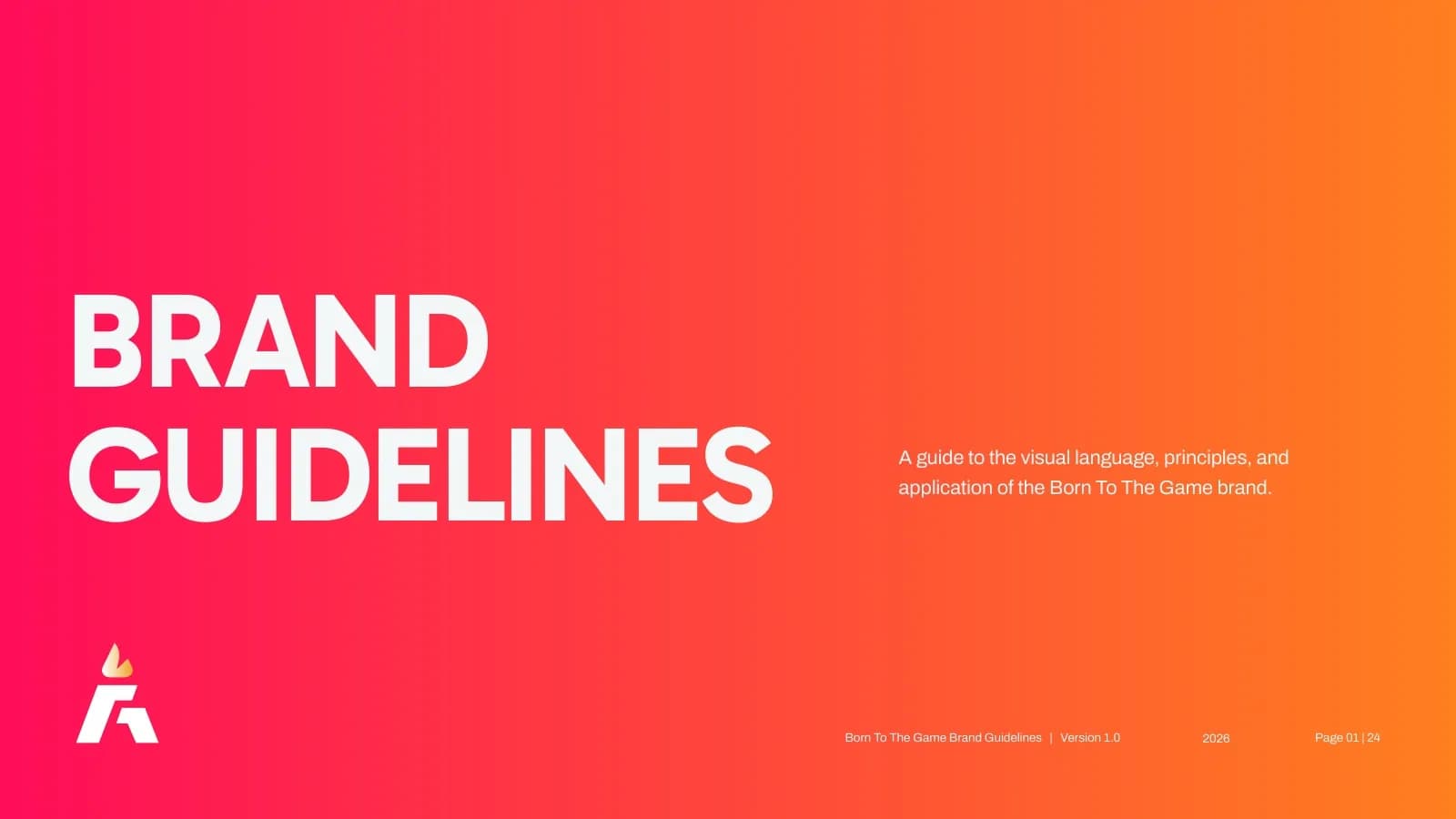
Born To The Game went the other way. Sports brands already shout, so to be heard it shouts in a colour few others in its space use: a hot pink that runs into orange. On black and white it is impossible to mistake for anyone else, and the discipline is in using one gradient rather than five.
The same colour on every surface
This is the part that costs real money when it goes wrong, and it has nothing to do with psychology.
A colour lives in at least three places: on a screen (RGB and HEX), on a digital printer (CMYK), and sometimes on a press or a piece of packaging where it is matched to a Pantone reference. These are different systems and they do not agree with each other automatically. A green that glows on a phone will go muddy on a carton unless someone has chosen its CMYK version on purpose and checked it on a proof.
Which is why a brand palette is not a mood board. It is a list of numbers. For Cerevion the guide carries seven colours with the RGB, CMYK and HEX values written next to each one, so the printer, the web developer and the person making Instagram posts all land on the same green without a conversation.
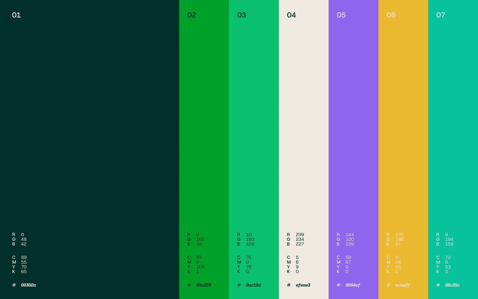
If your current brand has a colour but no values, that is the first thing to fix, and it costs almost nothing. Pick the exact value you have been using most, write down all three versions, and stop sampling it from whatever file was closest.
How many colours you actually need
Fewer than you think. One lead colour that is yours. One accent that can do a different job. Two or three neutrals for backgrounds and text. That is a full palette for most businesses, and it is enough to make a website, a bag, a deck and a feed feel like the same company. Colour is one part of a wider system, which I explain in what is brand identity.
The exception is a range. When you have six flavours or four strengths, colour becomes the thing that tells them apart from across the aisle, and then you need a system rather than a palette. The rule I use: the layout never moves, the colour does.
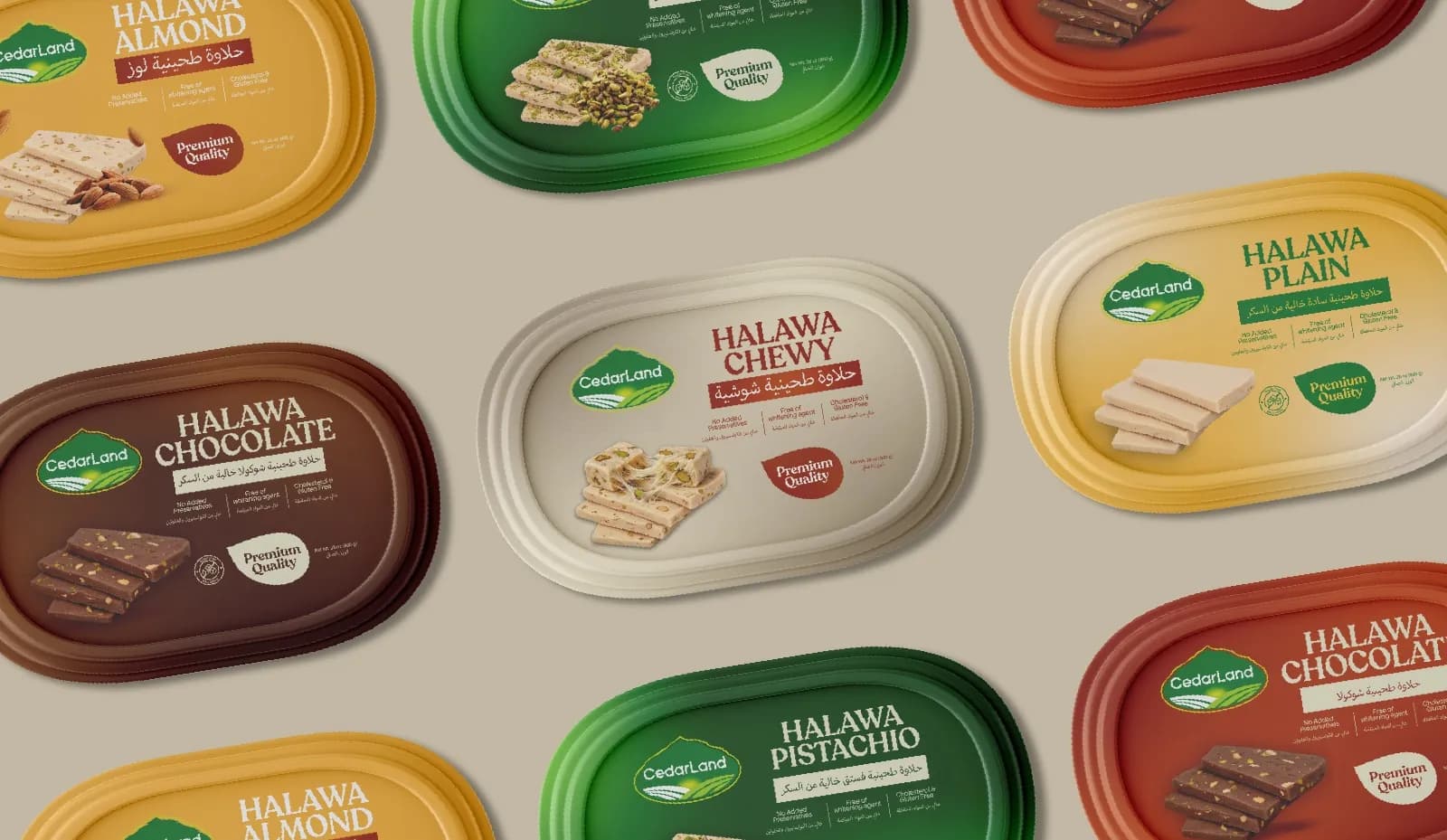
The CedarLand halawa line is the clearest version of this. One tub layout, one badge in the same corner every time, and the product photographed in the same spot on every lid. Almond is mustard, pistachio is green, chocolate is brown. Nobody has to read the lid to know which one they picked up last week.
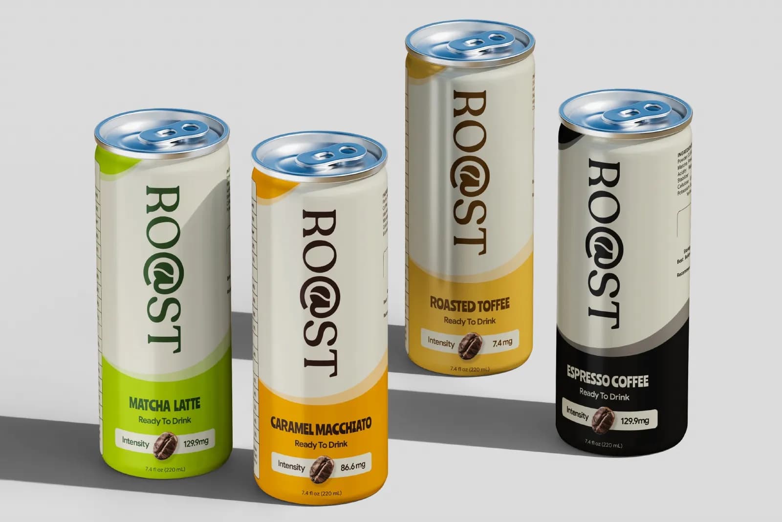
The Roast cans do the same thing. The wordmark sits in exactly the same place on every can and the colour band at the base changes with the flavour. A shopper learns the system in one glance and then stops needing to read.
Context the chart does not know about
Colour meaning does shift between places, and this is the one part of the psychology conversation worth having. White is a wedding colour in one market and a mourning colour in another. Green carries religious weight in Pakistan and across much of the Muslim world. Red is lucky in China and a warning across most of Europe.
None of this means you cannot use those colours. It means you should know what they carry where you sell, and not be surprised. If you are launching in three markets, ask someone from each of them to look at the packaging before it prints. That is cheaper than any focus group.
How I choose a palette in practice
I start with the shelf or the feed, not with a chart. I put the client next to the businesses they lose to and look at what everyone is wearing. Then I look at the surfaces: is this going on a dark glass bottle, a white carton, a van, a phone screen in sunlight? The surfaces rule out more colours than the mood does.
From there I pick one lead colour and test it as a fill and as text, on light and on dark. If it only works one way, I note that and give it that job. I add an accent that contrasts with the lead rather than matching it, and neutrals that come from the same family (a warm cream with a warm lead, a cool grey with a cool one). Then I write down every value, print a proof, and look at it under a normal lightbulb rather than a studio monitor.
Only after all that do I think about what the colour says. By then it usually says the right thing anyway, because it was chosen for the place it will live.
If your brand colour is giving you trouble
Most colour problems I see are not the wrong colour. They are the right colour used five different ways. Before you rebrand, check the values, check the contrast, and check that the website and the packaging were made from the same file. That fixes more than people expect.
If it does not, the palette is usually one piece of a bigger consistency problem, and it is easier to sort out as part of a proper brand identity system than on its own. Tell me what you are working with and I will give you an honest read on whether it is a tweak or a project. If you want to see how colour decisions play out on real packaging first, the work is the place to look, and the fonts post covers the other half of the decision.
Questions founders ask me
Less than the charts suggest and more than zero. What affects sales is whether people can read your name, recognise you the second time and tell you apart from the competitor next to you. Colour helps with all three when it is chosen for contrast and used consistently.