Branding basics8 min read
Branding trends 2027: what’s coming, and what to ignore
Eight shifts I keep seeing in the briefs crossing my desk, who each one suits, and the three things that will not change no matter what the trend posts say.
Javeria Hareem
Logo & Brand Designer, founder of Jayy Studio
In this article
Every trend post I have ever read was written to be shared, not to be used, so let me try to write one you can actually use.
I see a lot of briefs. Founders send me what they like, what their competitors did, and what they saw on a feed last week, and over a year those references drift in a direction you can feel before you can name it. What follows is the direction I feel going into 2027.
For each of the branding trends 2027 is bringing, I will say what it is, who it suits, and whether you should ignore it. Most of you should ignore most of them. That is not cynicism. A brand that follows every trend looks like a brand with no opinion.
Branding trends 2027: the short list
Eight things, in rough order of how often they come up.
1. The backlash to AI sameness
For two years a lot of businesses have generated a logo from a prompt and shipped it, and the results all look like cousins: a gradient blob, a geometric letter, a swoosh with soft corners. People can now spot it. So the briefs coming in have started asking for the opposite: a hand-drawn mark, custom lettering with a visible decision in it, a texture that could not have been made in four seconds.
Who it suits: food, drink, hospitality, craft, anyone selling something made by a person. Who should ignore it: a law firm, a logistics company, a B2B software tool. Those brands still want to look designed, just not hand-made. And a warning for everyone: faking the hand-drawn look with a filter is worse than the blob. People can spot that too.
2. Logos that have to move
The first place most people now meet a brand is an app splash screen, a reel sticker or a two-second intro on a video. A mark that only exists as a flat shape has nothing to do in those places. So it is worth designing with the question “what does it do for two seconds” from the start: a line that draws, a letter that assembles, a badge that stamps down.
Who it suits: apps, media, sports, events, any brand that lives on screens. Who can ignore it: if your brand lives on a van and a letterhead, a motion version is a nice extra and nothing more.
3. Variable fonts
A variable font is one file that holds every weight from thin to black, and anything in between. On a website that means faster loading and smoother headlines. In a brand it means the same typeface can whisper on a label and shout on a billboard without switching to a different face.
This is a tool more than a look, which is why it is a good trend: you can adopt it without anyone noticing. Who should ignore it: nobody, really, but you do not need to think about it until you are choosing fonts, and I have a post on that.
4. The unblanding of direct-to-consumer brands
Somewhere around 2018 every direct-to-consumer brand decided to look the same: a beige background, a lowercase geometric sans, a pastel product shot, a name with a missing vowel. It got called blanding, and it is ending. The brands launching now want a point of view you can see from across the room.
Who it suits: anyone who launched in that era and now cannot be told apart from six competitors. This is usually a refresh rather than a rebrand, because the name and the product are fine; it is the costume that aged. Who should ignore it: if you never blanded, you have nothing to unbland.
5. Big type, fewer colours on packaging
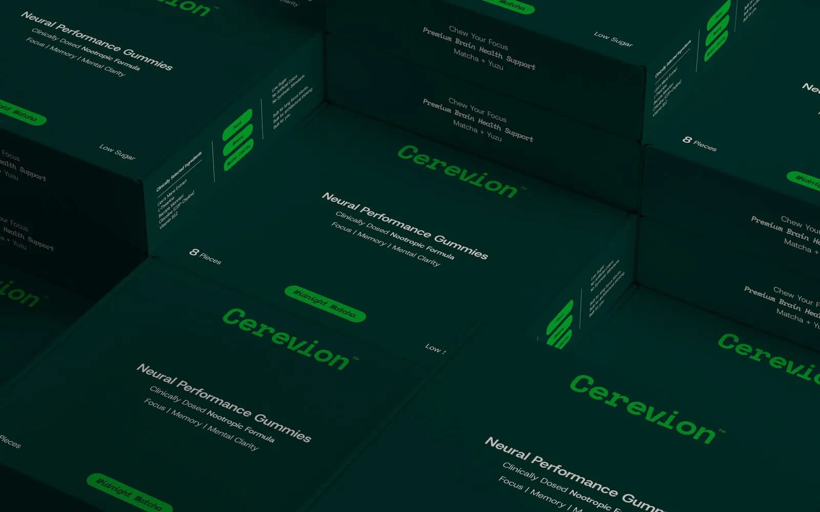
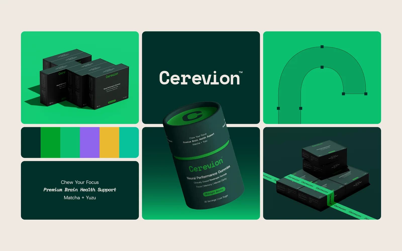
Shelves are crowded and marketplace grids are tiny, so the packaging that wins is the packaging you can read at thumbnail size. That means fewer colours, one big word and a lot of empty space. The Cerevion range is built this way: a near-black carton, one bright green, the product name as the largest thing on the box.
Who it suits: supplements, drinks, skincare, anything sold online next to forty competitors. Who should ignore it: a heritage brand whose busy label is the point. Some labels are supposed to look like they have been around since 1920, and simplifying them would throw that away.
6. The serif revival in beauty and wellness
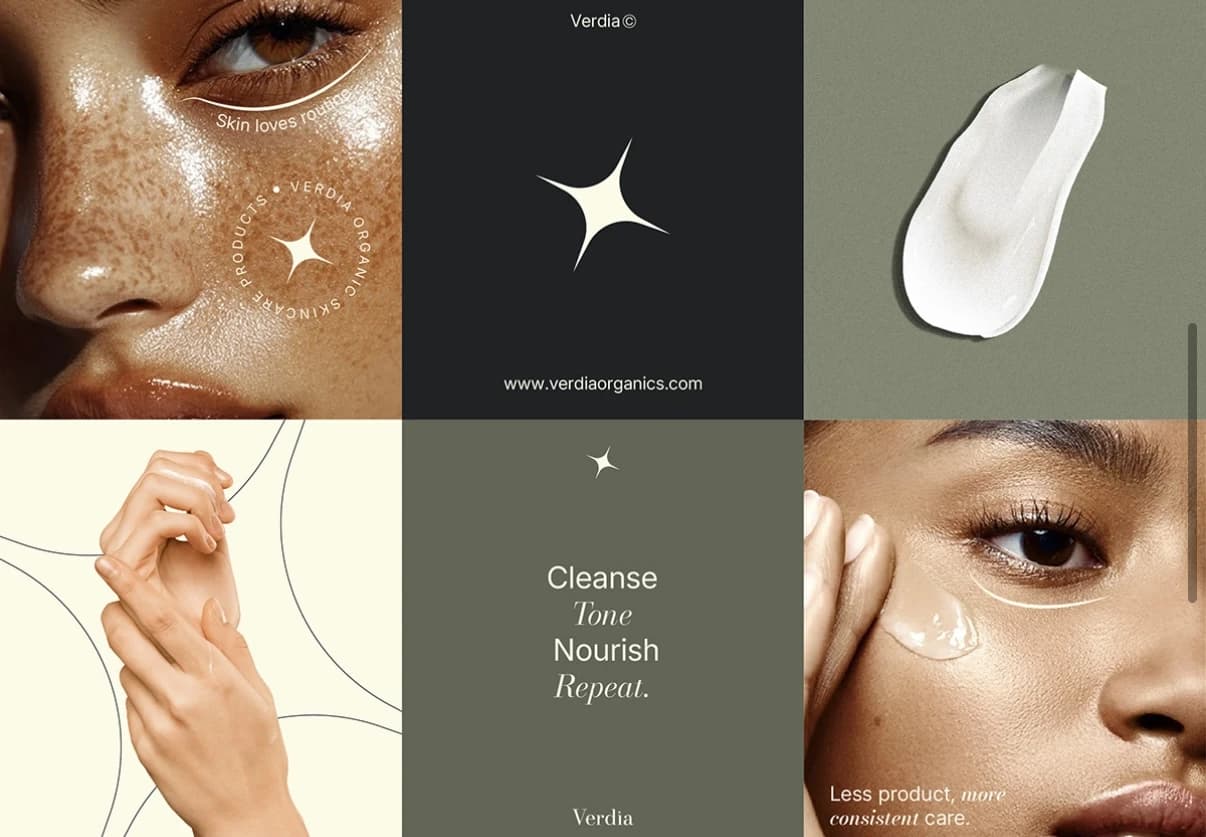
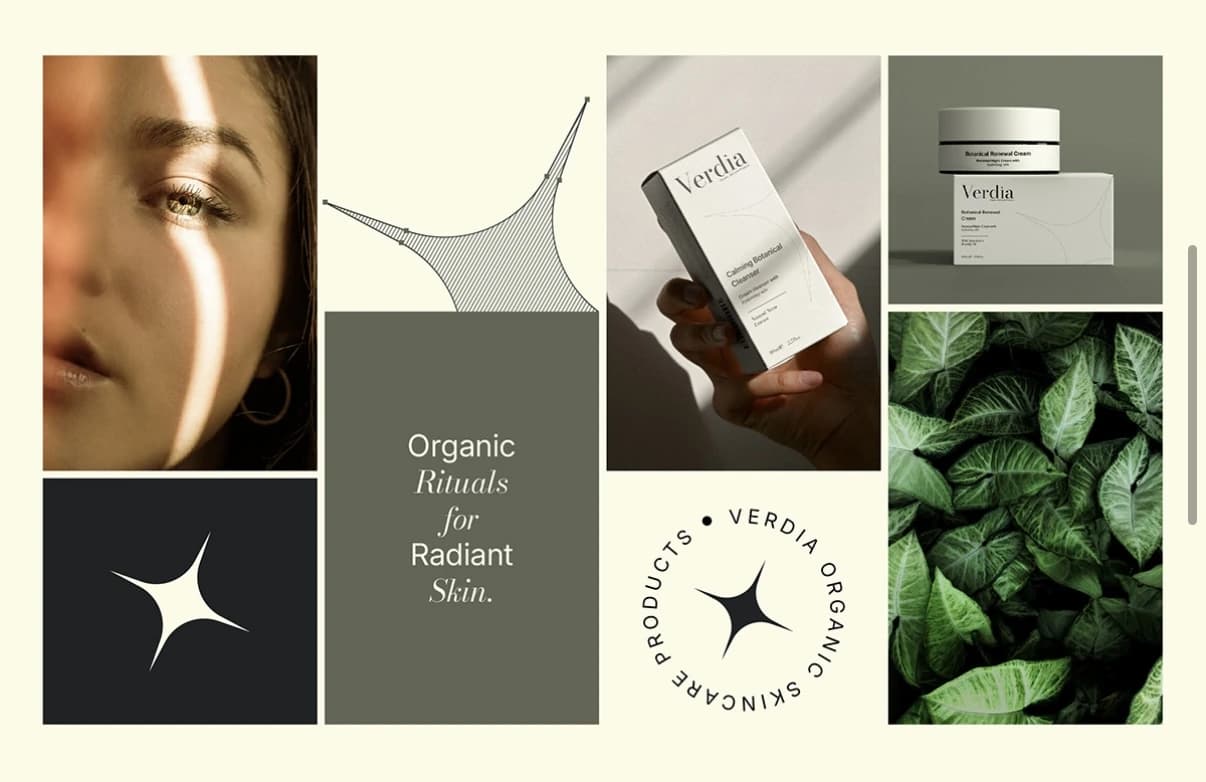
Beauty spent a decade in thin sans-serifs. Now it is coming back to serifs, and specifically to high-contrast ones that feel like an old pharmacy label or a fashion masthead. I used Abril Fatface for KAE Hair Care and a Bodoni for Verdia for exactly this reason: a serif with real contrast makes a product feel like a treatment rather than a toy.
Who it suits: skincare, hair care, supplements, anything that wants to feel considered. The risk: this is already becoming the new sameness. If every serum on the shelf has a Bodoni wordmark on a cream box, yours will need something else to carry it, which is where the next trend comes in.
7. Sticker-like badges and secondary marks
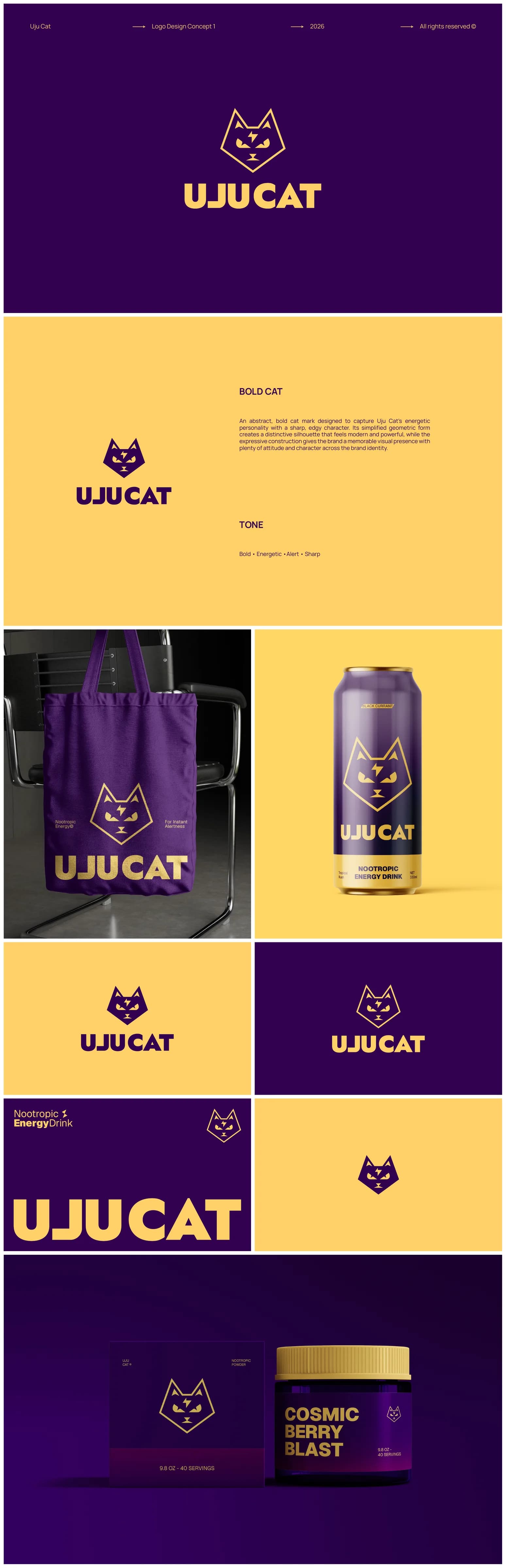
A single logo is no longer enough. Brands now carry a small family of marks: a round badge for a product seal, an icon that works alone on a sticker, a wordmark for the sign, a monogram for the app. Verdia has its four-point spark, which goes on a jar lid, inside a circular badge, and alone on a black square, and each one still says Verdia.
Who it suits: anyone with a social presence, packaging or merchandise, which is almost everyone. Who should ignore it: if your brand is one person and one business card, one mark is fine for now.
8. Phone screen first
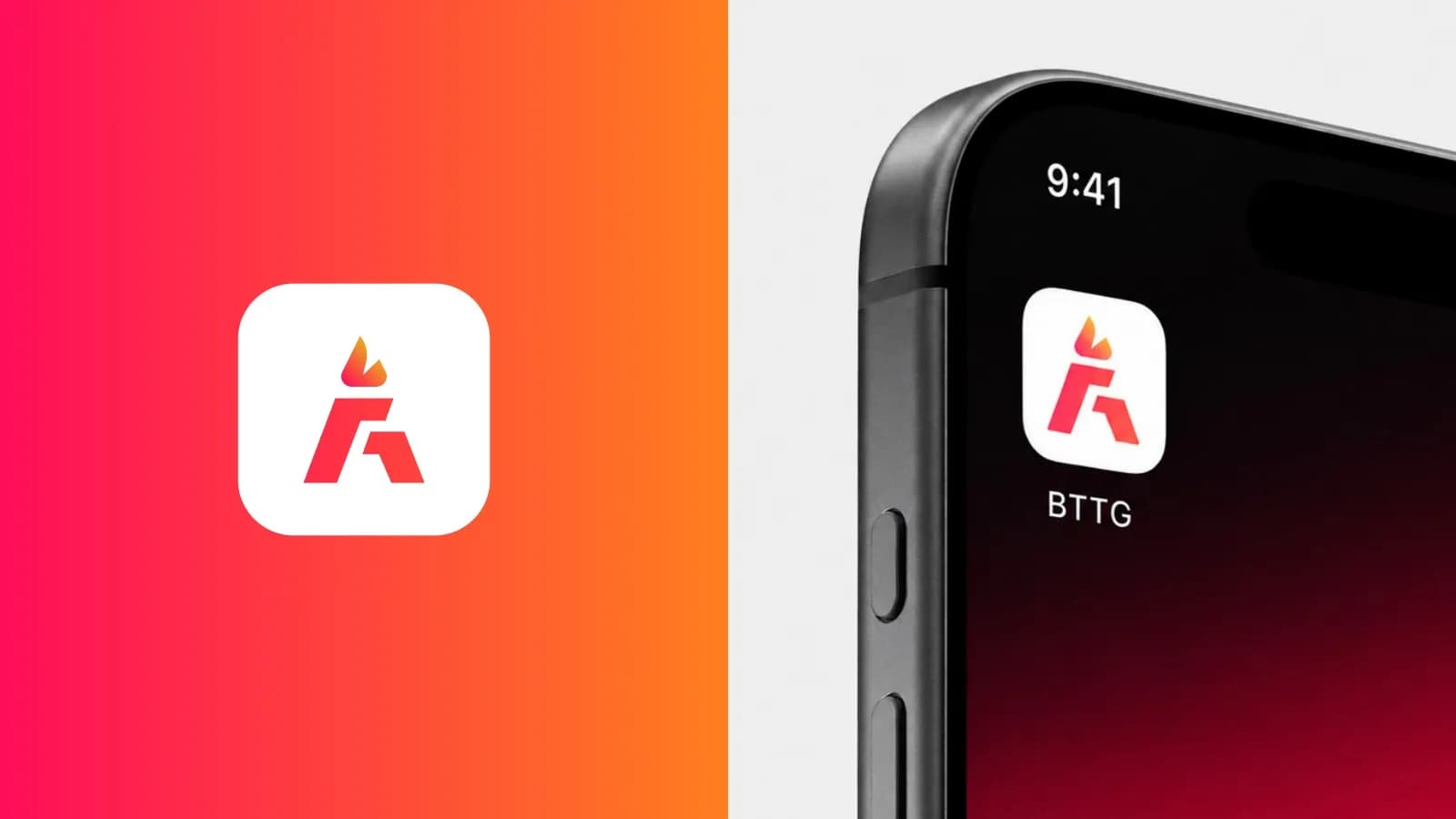
The sign used to be the first test of a logo. Now it is a circle the size of a fingernail on a phone. Identities are being designed from the smallest version outward: does the mark survive as a profile picture, an app icon, a favicon, a square crop in a feed? If yes, the big versions take care of themselves.
Who it suits: everyone. This one is not optional. Who should ignore it: nobody, and if your current logo fails the fingernail test, that is one of the nine signs a brand is quietly looking amateur.
Which of these to ignore
A quick way to decide. Write down the three places your customers meet your brand most often. For a cafe it is the sign, the cup and Instagram. For a software company it is the website, the deck and LinkedIn. For a supplement it is a marketplace thumbnail, the carton and an unboxing video.
Now look at the list above. Any trend that lives on one of your three surfaces is worth a conversation. Any trend that does not is a distraction, however good it looks on someone else. Most businesses will find two trends that matter and six they can watch from a distance.
The things that will not change
Trends are the weather. These are the climate.
Legibility. If people cannot read your name at the size they will actually see it, nothing else about the brand gets a chance. I often see logos that are beautiful at a metre wide and illegible at a centimetre.
Consistency. The same colour, the same typeface, the same logo on every surface, every time. A trend applied consistently looks like a decision. A classic applied inconsistently looks like a mess. If this is where your brand struggles, the fix is a guidelines document, not a trend.
Ownership. Vector files, a one-colour version, the fonts and the licences in your own name. None of this is fashionable and all of it is what lets you adopt or drop a trend in an afternoon instead of starting from scratch. If you are unsure what you own, ask your designer, and if you are weighing up what a redo would cost, the cost post has honest numbers.
If you want an opinion on your own brand
I will give you one for free. Send me your logo, the packaging or the website, and a sentence about who buys from you, and I will tell you where it sits against all of this and whether anything needs doing. Sometimes the answer is “nothing until next year”. Start here, or message me on WhatsApp if you would rather just send a picture.
Questions founders ask me
Almost never. A trend is a reason to refresh one or two surfaces, not to change your name and mark. Rebrand when the business has changed; refresh when the costume has aged.