Branding basics9 min read
How to choose brand fonts: a founder’s guide
Two typefaces, each with a job, a licence you can show and a fallback for Canva. That is the whole method, with the pairings I have used on real brands.
Javeria Hareem
Logo & Brand Designer, founder of Jayy Studio
In this article
Fonts are the part of a brand founders care about least and notice most.
Nobody has ever told me their business is failing because of a typeface. But I have watched plenty of founders wince at their own pitch deck, because the headline font came from a free download, the body font came from whatever the laptop had, and the two of them have never met.
This is how to choose brand fonts when you are not a designer and do not want to become one. It is a method rather than a list of favourites, and it is the same method I use on every project.
Two jobs, two typefaces
A brand needs a display face and a text face. The display face is the one with personality: it sets the logo, the headlines, the big words on the sign. The text face is the quiet one that sets the paragraph you are reading on a phone at midnight. It should be comfortable, slightly boring, and available in several weights.
Most font problems come from asking one typeface to do both jobs. A face with enough character to carry a logo is usually too much for a paragraph, and a face that is pleasant to read at 14 pixels tends to be forgettable at 140. Split the job and both get easier.
Three fonts is rarely necessary. Four is a cry for help.
How to choose brand fonts when you are not a designer
Start with where the words will live
Before you look at a single typeface, list the surfaces. A website on a phone. A sign above a door. A label the size of a thumb. An embroidered polo. A deck projected onto a wall. Each one rules out something. Thin elegant serifs die on embroidery. Wide display faces will not fit on a narrow label. A face with tight letter spacing turns to soup at twelve pixels.
Pick the reading face first
This is backwards from how most people do it, and it is the step that saves you. The reading face will be used a hundred times more than the display face, so it has to work at small sizes, in a long paragraph, in light and in bold. Set a real paragraph in it, your own words, and read it on your phone. If your eyes get tired, move on.
Then find a display face that disagrees with it
The pairing works when the two faces are clearly different: a serif with a sans, a geometric with a humanist, something with weight next to something light. Two faces that are nearly the same look like a mistake. Two faces that are plainly different look like a decision.
Test it in the ugliest place
Put the pairing into a Google Slides deck, a Canva post and an email signature. Not a beautiful mock-up, the real tools your team will use on a Tuesday. If it still looks like your brand there, you have chosen well.
The pairings I have actually used, and why
Rules are easier to trust with examples, so here are six pairings from real projects, with the reason each one fitted the client.
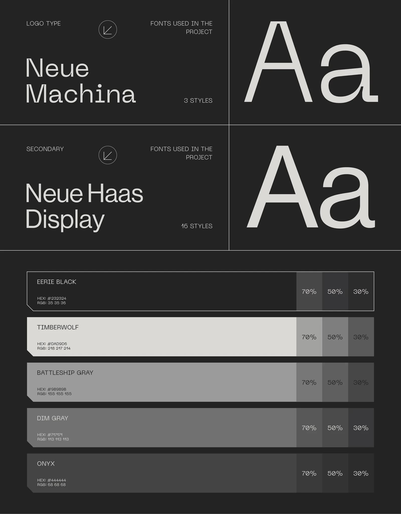
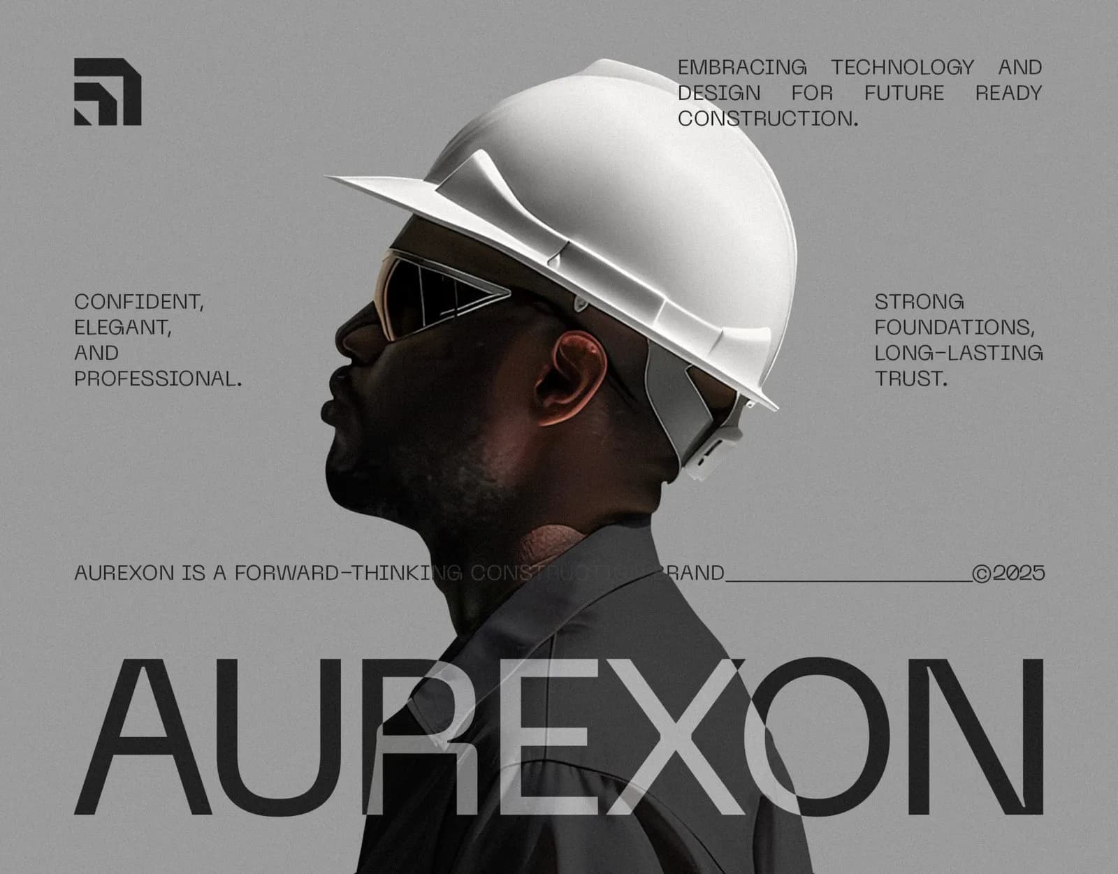
Neue Machina and Neue Haas Display for Aurexon Construction. Machina has a slightly machined, engineered feel that suits a company that pours concrete, and Haas Display is about as neutral as a sans gets, which is what you want when the words are contract clauses and safety notices.
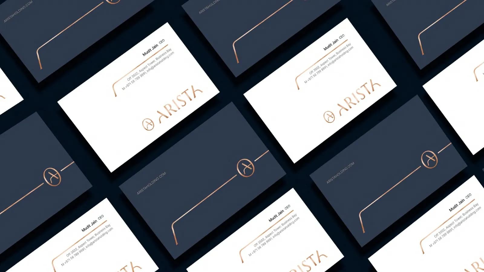
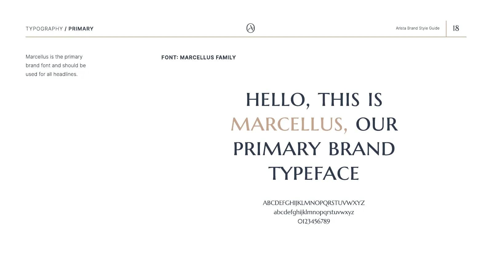
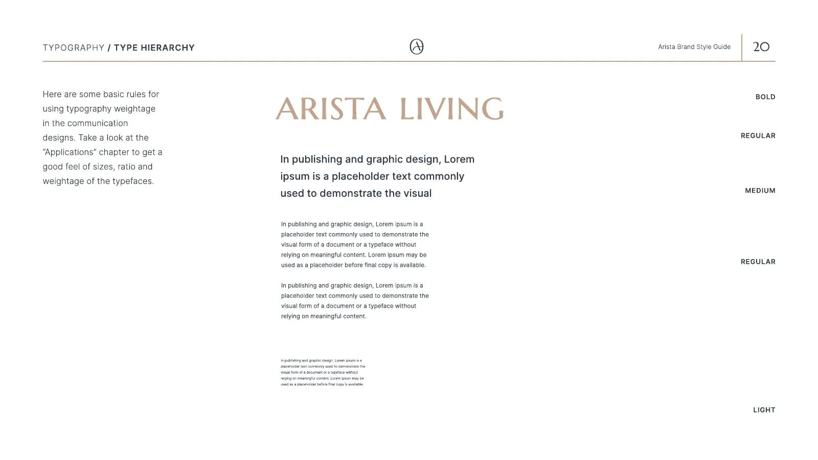
Marcellus and Inter for Arista Living. Marcellus is a classical capital with the feel of a Roman inscription, so a property name set in it looks carved rather than typed. Inter does the brochure copy and the website because it reads well small and does not compete.
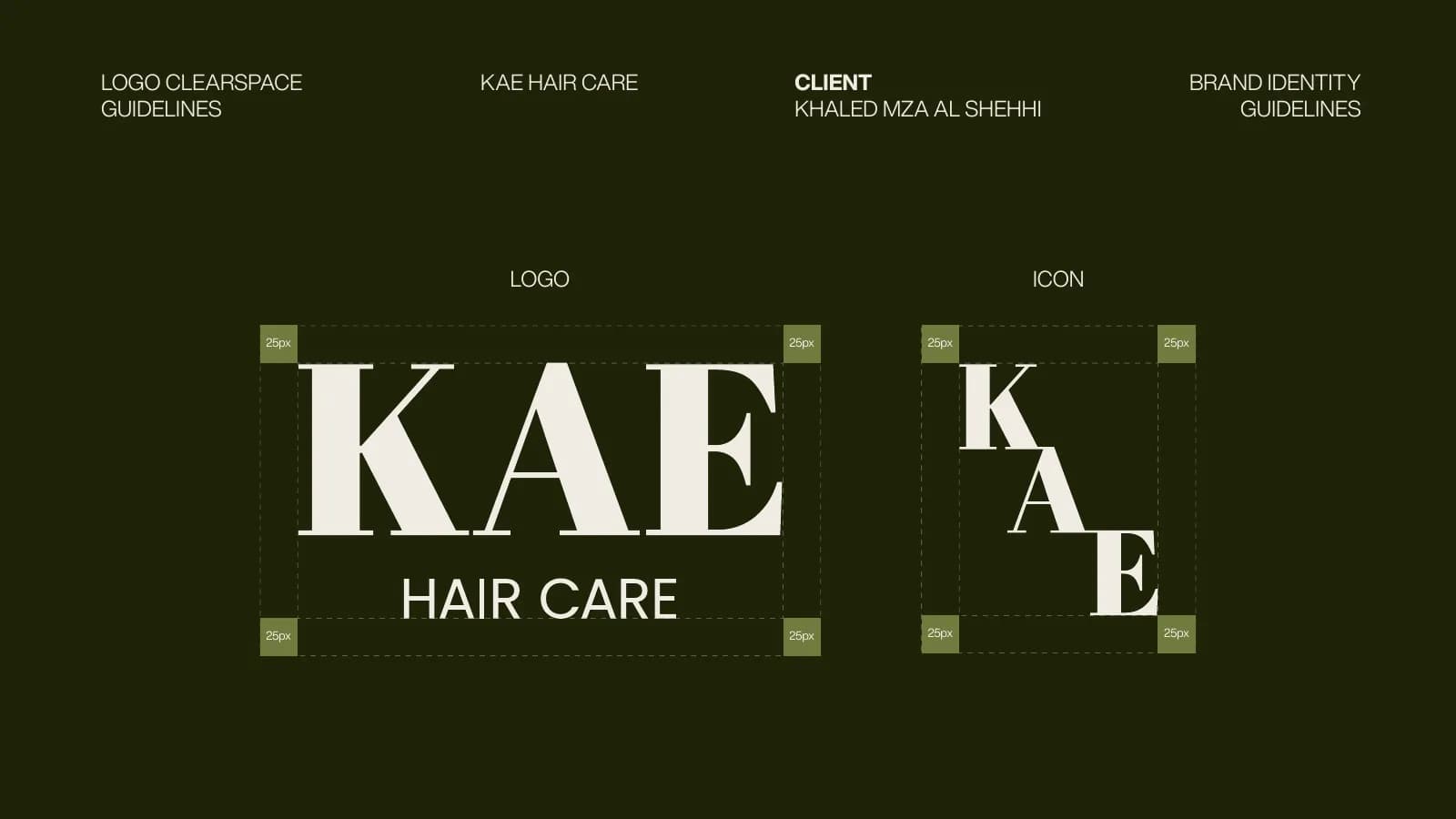
Abril Fatface and Helvetica Now for KAE Hair Care. Abril has the heavy contrast of an old apothecary label, which gives a hair oil the weight of a treatment. Helvetica Now sets the ingredient list and the small print so the bottle stays clean. Why serifs keep winning in that category is its own subject, covered in beauty brand identity.
Gabarito and Archivo for Born To The Game. Gabarito is wide, bold and loud, which is what a sports brand needs on a hoodie. Archivo is the body text because it is sturdy and reads well on a watch face.
Cal Sans and Lexend for PuppyDock. Both are rounded and friendly, which fits a pet product, and Lexend was drawn with readability in mind, which fits packaging that nervous owners read in a hurry.
Host Grotesk and Space Mono for Cerevion. The monospace sets dosage information like data, which is what a nootropic needs to look like. Host Grotesk is the modern sans that stops it feeling like a terminal window.
Notice that none of these pairings came from a “best font combinations” list. They came from the surfaces and the category. The serif in a beauty brand and the monospace in a supplement brand are doing the same job: telling you what kind of product this is before you read a word.
Licences, in plain words
A font is software. When you use one, you are using it under a licence, and the licence decides where it can go and in whose name.
Fonts on Google Fonts are free under open licences, which means you can use them on a website, in print and in an app without paying anyone. Inter, Archivo, Lexend, Marcellus, Abril Fatface and Space Mono are all there. That is not a compromise. Some of the best-made typefaces available are on that list.
Commercial faces like Neue Machina, Neue Haas Display or Helvetica Now are bought from a foundry, and the licence usually comes in parts: desktop (for designing and printing), web (for your site, often priced by page views), and app (for embedding). Buy the parts you will use. Buy them in the name of the business, not the designer, so that when you change designers the fonts come with you.
The question to ask any designer who hands you a logo: which fonts did you use, and who owns the licence? If they cannot answer, you may be using a font you have no right to, and you will find out the day you need to send the files to a printer. I cover the rest of the ownership conversation in who owns your logo.
The fallback nobody writes down
Your brand font is not installed in Google Slides. It is probably not in Canva unless someone uploaded it. It is definitely not in Outlook on your customer’s laptop. So every time one of those tools cannot find your font, it substitutes something, and the something is different each time.
The fix is one line in your guidelines: if the brand font is not available, use this one. Pick the closest common face and name it. Georgia for a serif. Arial or Helvetica for a plain sans. Then upload the real fonts to Canva once and tell the team where they are. This single line prevents more drift than almost anything else in a guidelines document, which is why it belongs in the checklist of what guidelines must include.
Mistakes I see again and again
Too many fonts, because every new designer added one. Trendy fonts that date the brand to the year it launched, usually a rounded geometric sans that a thousand startups chose at once. Free fonts with two weights and uneven spacing, which look fine at headline size and fall apart in a paragraph. And choosing by vibe alone, where a founder picks a face they like in a specimen and never sees it set in their own words. I go through which type trends are worth following in brand identity trends for 2027.
The fix for all four is the same. Decide what the typeface is for, test it there, and write the decision down.
Where to go from here
If you already have a logo and the fonts around it are a mess, this is a small job and usually part of a brand guidelines project rather than a rebrand. If you are starting from nothing, the type decision happens inside the identity work and you will never have to think about it again.
Either way, if you want a second opinion on the pairing you have, send it over. I will tell you honestly whether it is a quick fix or a reason to start again. If you want to see what the finished decision looks like on real surfaces, the case studies show every pairing above in use, and colour is the other half of the same decision, so I have written about what actually matters there too.
Questions founders ask me
Yes, and many good brands do. They are free for web, print and apps under open licences. The trade-off is that popular ones are everywhere, so pair a common reading face with a less common display face if you want to feel distinct.