Working with me8 min read
How to brief a brand designer (free template)
A good brief is not a mood board. It is ten honest answers about your business. Here is the template I send every client, and how to fill it in without overthinking it.
Javeria Hareem
Logo & Brand Designer, founder of Jayy Studio
 Working with me
In this article
Most briefs I receive are either three words (“modern, clean, premium”) or a 40-slide deck of other people’s logos. Neither tells me what I need to know.
That isn’t your fault. Nobody shows founders how to brief a designer, so you either keep it vague and hope, or you over-prepare by collecting references and end up briefing the designer to copy someone else.
The design brief template below is the one I send every new client in the first step of a project. It’s ten questions. Honest answers take about twenty minutes, and they save days of guessing on my side, which is time you’d otherwise be paying for.
What a brief is actually for
A brief exists so I’m not guessing. Everything I draw is a bet about your customers, and without a brief I’m betting blind. With one, the first concepts land closer, the revisions are about refinement rather than direction, and the project finishes on the date we agreed.
It also protects you. When the first concepts come back and one of them makes you uneasy, the brief is what we check them against. “Does this say what we wanted people to believe?” is a better question than “do I like it?”, and the brief is where the answer lives.
One more thing it does: it tells me whether I’m the right person. Sometimes a brief makes clear that what you need is a website, or photography, or a name, before a logo makes sense. I’d rather say that in week one. The other half of that check is yours: questions to ask a designer before hiring.
The design brief template
Copy these ten into an email or a document and answer them in plain sentences. Short is fine. Honest is better than polished.
- Your business in one line. What you sell, to whom, and how you’re different. If you can’t do it in one line yet, write three and we’ll find the one together.
- Your customers. Who actually pays you, described like real people: what they do, what they’re worried about, how they find you. If there are two very different groups, say which one matters more.
- The competitors you lose to. Not the ones you admire. The three names that come up when a customer picks someone else, and your honest guess at why.
- What you want people to believe about you. Finish this sentence: “When someone sees our brand for the first time, I want them to think…”. One or two beliefs, not ten.
- Where the brand will live. List the actual surfaces: website, Instagram, pitch deck, packaging, shop sign, van, workwear, app icon, trade show stand. This changes how I draw the mark.
- What exists already. Current logo, colours, fonts, photography, templates. Attach the files you have, even if they’re a JPG. Tell me how you feel about each piece.
- What must stay. A name, a colour customers know, a symbol with history. Say it now so I don’t spend a day designing it away.
- What you hate. Styles, colours, clichés in your category, things a previous designer did. This is often the most useful answer on the list.
- Budget range and deadline. A range is enough. A fixed date matters more than you’d think, because it decides what can realistically be included.
- Who decides. Name the people who need to approve the work, and who has the final say if they disagree. If the answer is “my co-founder, my spouse and my brother-in-law”, we should talk about that before the first concept.
The answers people get stuck on
Four of the ten cause most of the hesitation, so here is what I’m really asking.
Customers
I don’t need a persona document. I need to know who hands over the money and what they’re afraid of getting wrong. A nootropic supplement buyer is afraid of looking gullible. A construction client is afraid of delays and cowboys. Those fears shape the brand far more than the age range does.
The competitors you lose to
Founders want to list aspirational brands here. Resist that. The useful names are the boring ones you actually lose deals to, because the brand has to work in that comparison, on that shelf, in that tender. If you lose to someone cheaper, the brand needs to justify the gap. If you lose to someone who looks bigger, the brand needs to look established.
What you want people to believe
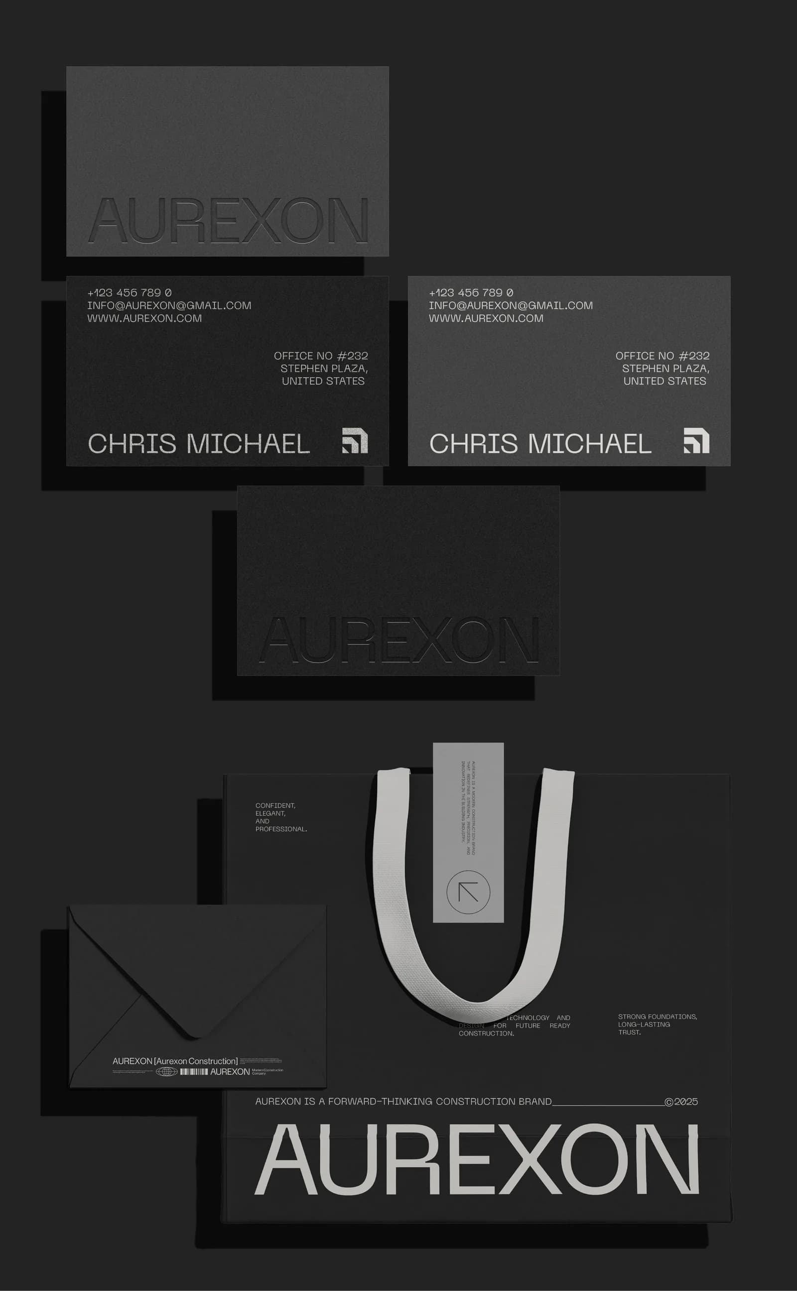
This is the sentence the whole identity gets measured against. For Aurexon it was close to “a modern engineering company, not a local contractor”. Everything, from the grid-built mark to the all-grey palette, follows from that one line. Write yours badly if you have to. I’ll help tighten it. If you’re in that sector, branding for construction companies is worth reading first.
Where the brand will live
Be literal. A logo that only ever appears on a website can be delicate. One that goes on a hi-vis vest, a van door and a 16-pixel favicon can’t. Knowing this on day one is the difference between a mark that scales and a mark that gets apologised for. The file formats post explains why the surfaces matter so much.
What to leave out
You can skip “make it pop”, “modern but timeless”, and “like Apple but for plumbing”. None of these are wrong, they’re just not information. Every client wants modern and clean. The brief is for the things only you know.
Leave out other people’s logos as instructions. A reference or two is useful if you say what you like about it (“the way the wordmark feels calm”), but a folder of thirty is a request to copy, and copying is how you end up looking like everyone else in your category.
And leave out the design itself. You don’t need to tell me it should be a blue circle. Tell me what the blue circle is supposed to make people feel, and let me find out whether a blue circle is the best way to do that.
A worked example: a supplement brand
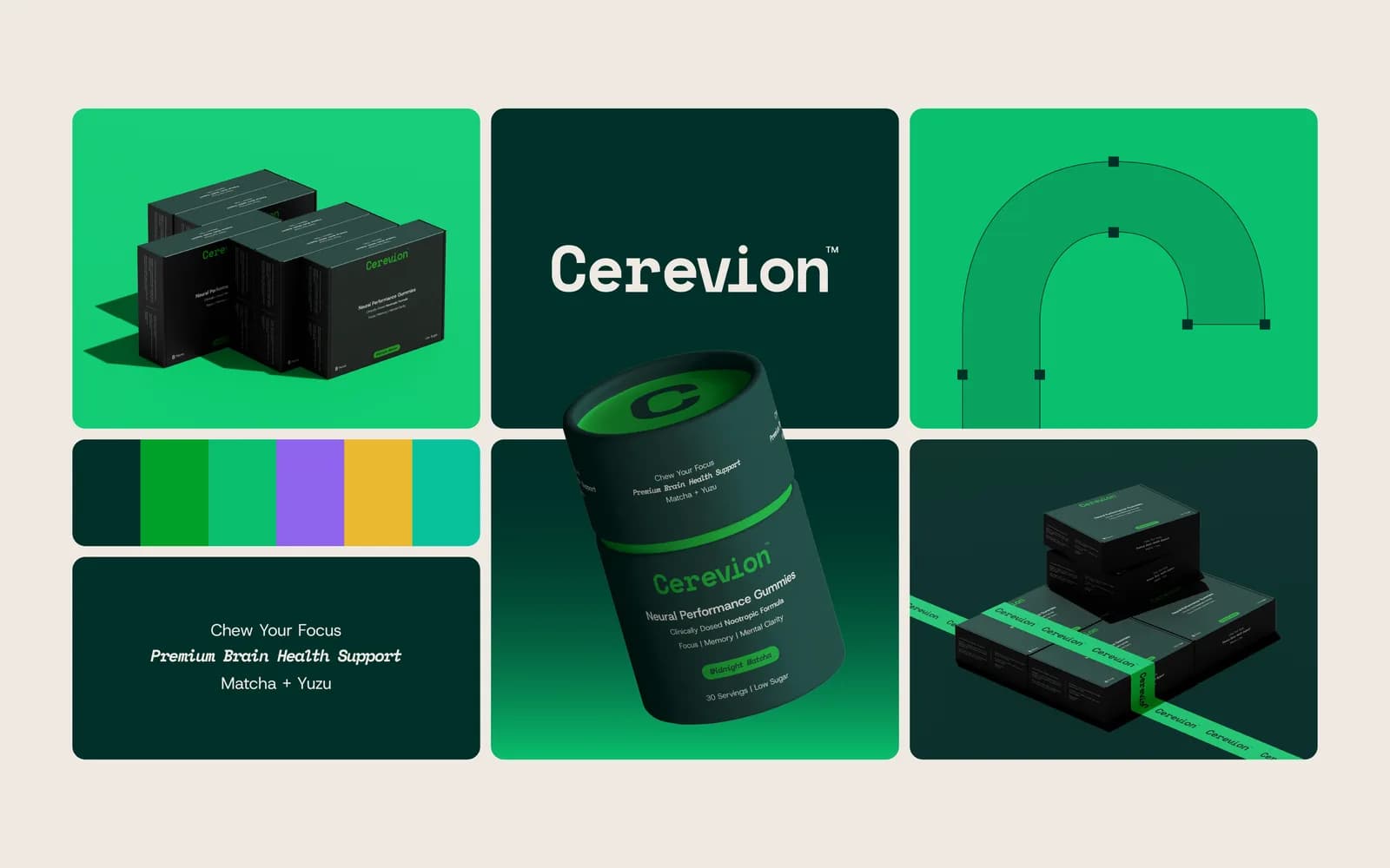
Here is an illustration of how the ten answers might read for a nootropic supplement like Cerevion. The details are made up for the example; the shape is the real thing.
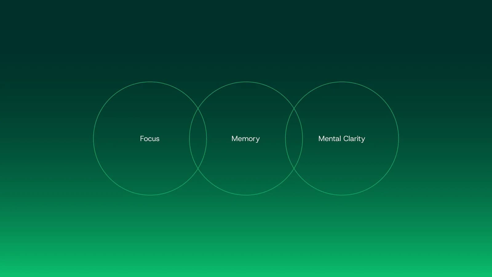
Business in one line: clinically dosed gummies for focus and memory, sold to people who already take supplements and are tired of ones that look like candy. Customers: desk jobs, buy online first and in pharmacies second, afraid of being sold a fad. Competitors they lose to: the big pastel wellness brands with better distribution. What they wanted people to believe: this is serious science that happens to taste good. Where it lives: carton, tub, marketplace thumbnail, Instagram, a pharmacy shelf. Must stay: the name. Hated: pastel gradients, cartoon brains, anything that looks like a sweet. Budget: a range covering identity plus packaging. Decides: named in the brief, with one person holding the final say.
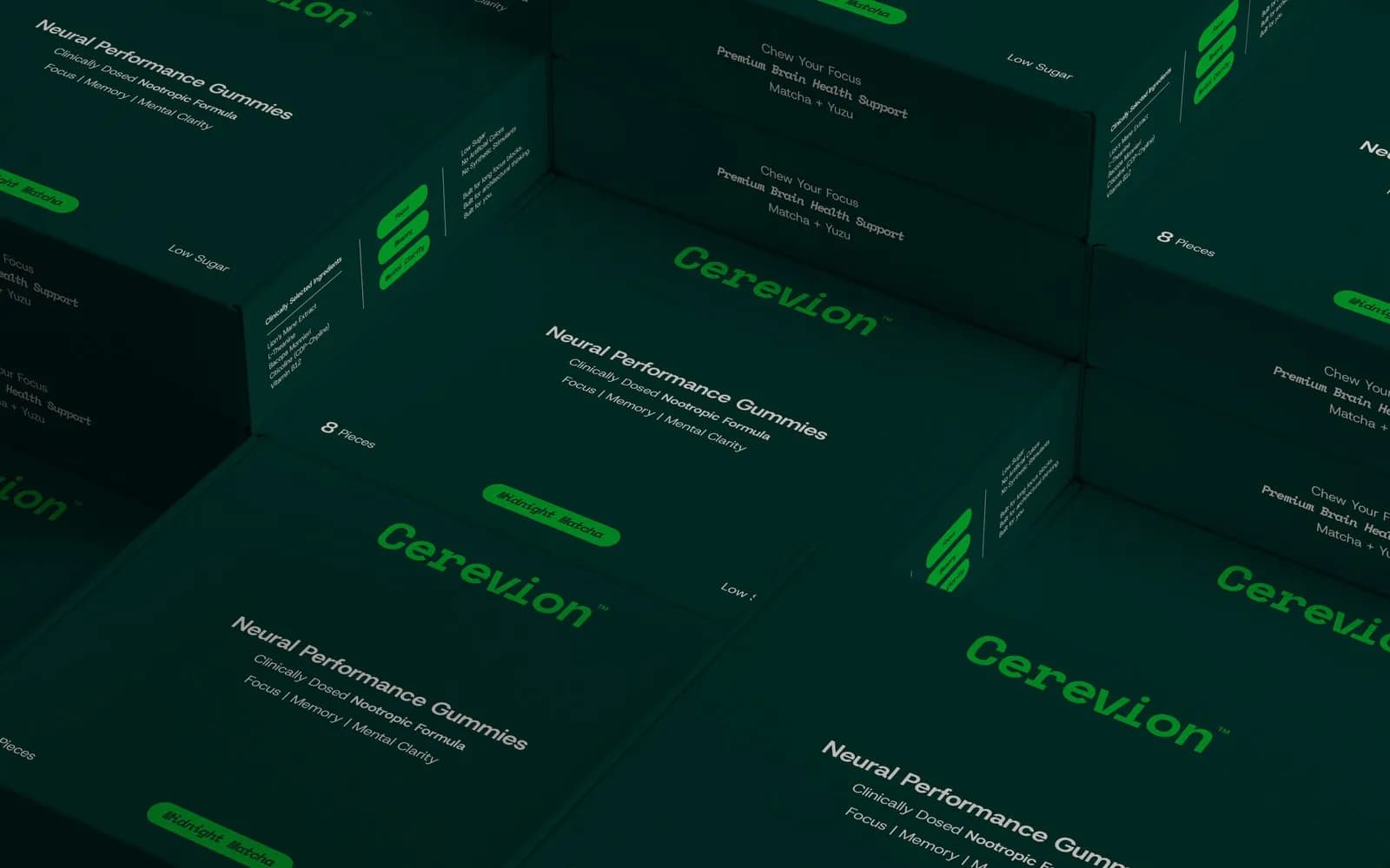
From a brief like that the decisions almost make themselves, and they match what Cerevion ended up with: signal green on near-black so it reads as data rather than dessert, Space Mono for dosage information set like a lab printout, one layout shared by every SKU with a single accent colour change, so the range stays readable as it grows. Nobody had to guess, because the brief had already said no to pastel and yes to science.
What I do with your brief in step 01
The brief is the first half of Discovery, the first of my five steps. The second half is a call where I ask the questions your answers raise: why that competitor, what happened with the last designer, which of the two customer groups pays faster. Nothing gets designed in this step. By the end of it we have a short written direction, and that’s what the first concepts are built on. The full process, step by step, is here if you want to see what happens after.
If you’re still choosing between a freelancer and an agency, the brief works for either. The difference is who reads it: with me, the person reading it is the person drawing. Freelancer vs agency goes into when that matters.
Send it over
Answer the ten questions, attach whatever files you have, and send it through the contact form or on WhatsApp. I read every brief myself and reply within a few hours with either a fixed quote or the one or two questions I still need answered. If you’d rather talk it through first, book a call and we’ll fill the brief in together.
Questions founders ask me
A page is plenty. The ten questions answered in a sentence or two each is what I work from. Longer briefs usually mean the thinking hasn’t been done yet, and the length is hiding that.