Working with me8 min read
Client stories: what founders say after their rebrand
The things founders say to me months after a rebrand, the complaints that changed how I work, and how to read any designer’s reviews, including mine.
Javeria Hareem
Logo & Brand Designer, founder of Jayy Studio
 Working with me
In this article
- The first thing they say: they stopped apologising
- One folder to the printer, and it just works
- The new hire who made a deck that looked right
- People start asking who did the brand
- What surprised them: the guidelines did the most work
- The complaints, and what I changed
- How to read brand designer reviews, including mine
- If you’d rather judge for yourself
- Questions founders ask me
There are no client quotes on this site yet. Not because there is nothing to say, but because I would rather ask each founder properly and publish what they actually said than lift a line out of a WhatsApp thread and call it a review.
So if you came here looking for brand designer reviews, I can offer you something slightly different and, I think, more useful: the things founders say to me weeks and months after a rebrand, unprompted, once the work has had time to live inside their business.
Some of it is flattering. Some of it changed how I work. All of it tells you more than five stars would.
The first thing they say: they stopped apologising
Almost every founder I work with has a tic before the project. Before they send a link they say “ignore the website, we’re fixing it”. Before a pitch they apologise for the deck. Before a trade show they apologise for the banner. It is such a habit that they don’t hear themselves doing it.
The thing I hear most, a month or two after handoff, is some version of: I sent the link without the disclaimer. It sounds small. It isn’t. A founder who stops apologising for how the business looks starts talking about what the business does, which is the conversation that actually wins the client.
One folder to the printer, and it just works
This one comes from founders who have been burned before. They had a logo as a JPG with a white box around it. The printer asked for a vector and nobody knew what that meant. The sign maker redrew the mark by eye and got the proportions wrong. The embroidery company asked for a one-colour version that didn’t exist.
After a proper handoff, that stops. The folder has the vector source files, the one-colour and reversed versions, the colour values in CMYK and Pantone, and a page that says which file goes where. Founders tell me the printer replied with “great, got everything” and nothing else, and that they hadn’t realised how rare that was.
The new hire who made a deck that looked right
A brand is tested the day someone who didn’t sit in the design meetings has to make something. Usually that’s a new marketing hire, a VA or an agency, and usually they are working from a screenshot of the homepage.
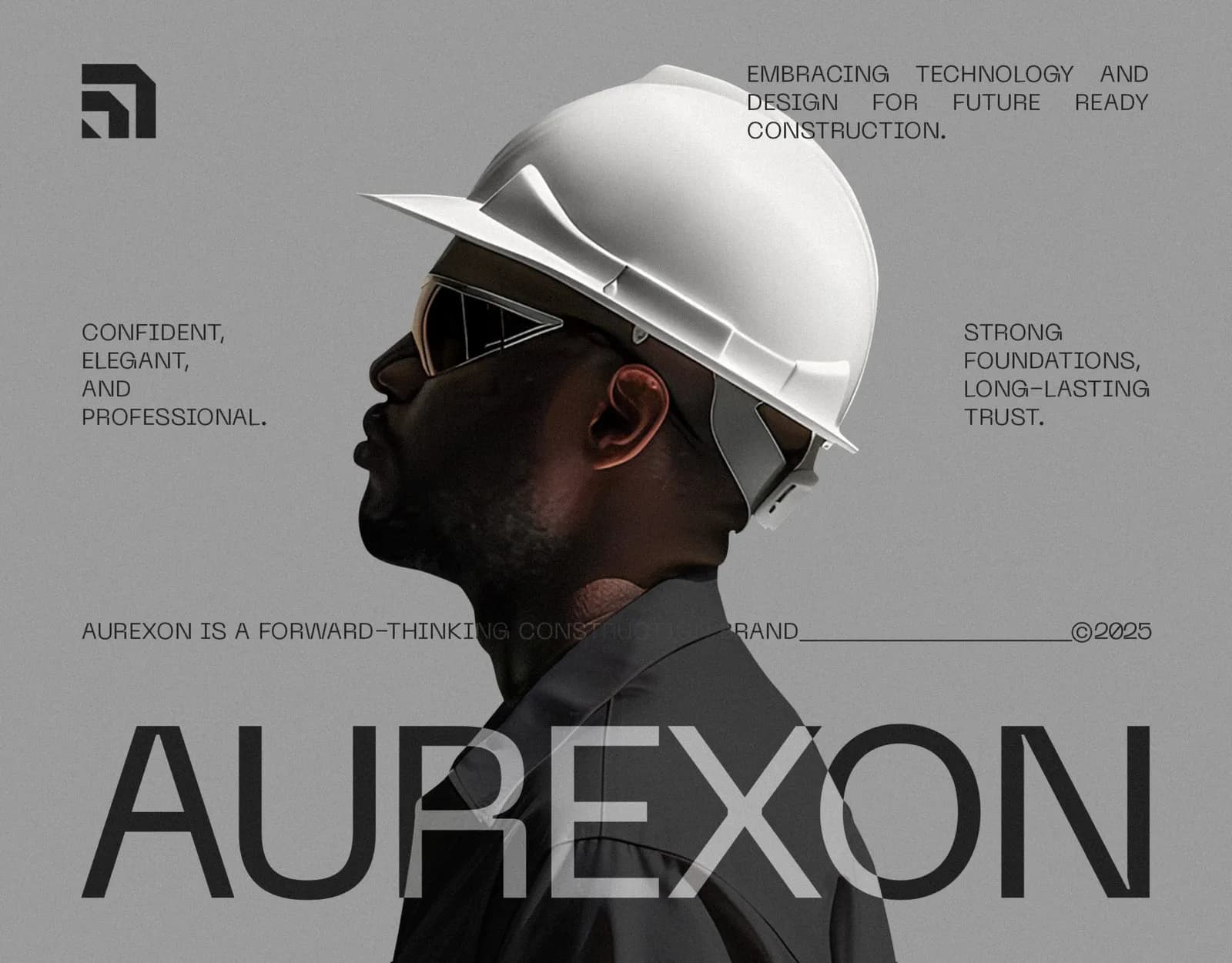
Founders with a guideline book tell me about the first time that person produced a slide, a post or a proposal and it looked right without a correction. The 21-page Aurexon book and the 45-page Arista guide exist for exactly that moment. It is the difference between a brand that lives in the founder’s head and one the company owns.
People start asking who did the brand
I hear this one with a bit of pride on both sides. A supplier asks. A customer asks. Another founder at an event asks. It is the moment the brand stops being a cost and starts being an asset the founder gets to talk about. Some of my enquiries arrive this way, which is a better endorsement than any review page.
What surprised them: the guidelines did the most work
Founders buy a logo. They tolerate the guidelines. Months later, the guidelines are the thing they mention. Not because they read them for fun, but because the questions stopped. Which blue. Which font in Google Slides when the real one isn’t installed. Can the logo go on a photo. How small is too small. Every one of those used to be a message to me or a guess by someone else; now it’s a page number.
If you are choosing between a slightly bigger logo package and a basic guide, I will almost always tell you to take the guide. The 7 things every guidelines document must include explains what goes in one.
The complaints, and what I changed
I would be lying if I said every project went smoothly. The complaints are more useful than the compliments, so here are the honest ones and what they did to my process.
Feedback was chaotic
Early on, feedback arrived as a stream of voice notes, screenshots and “actually, can we” messages over three days, often from three people who disagreed with each other. The result was revisions that undid each other. Now each round is one consolidated set of notes from one decision maker, with a date. I explain this on day one, and projects got faster and calmer.
The timeline slipped
In the first few years, I sometimes let a deadline drift rather than send a difficult message. That is on me. Now the delivery date is written down before we start, and if anything threatens it, from a late questionnaire to a printer problem, you hear about it the same day, with the new date. Founders would rather have bad news early than silence.
Too many concepts, too soon
Some founders found eight directions overwhelming, and they were right. That is why the Direction step now comes before any polished concept: references and palettes first, so we agree on where we’re going, then fewer and stronger concepts shown in context.
Which file do I use for what
A handoff folder full of correctly named files is still a folder full of files. So now every handoff includes a single page that says: this one for the printer, this one for the website, this one for embroidery, this one for Instagram. It is the kind of thing you only add after someone asks for it.
How to read brand designer reviews, including mine
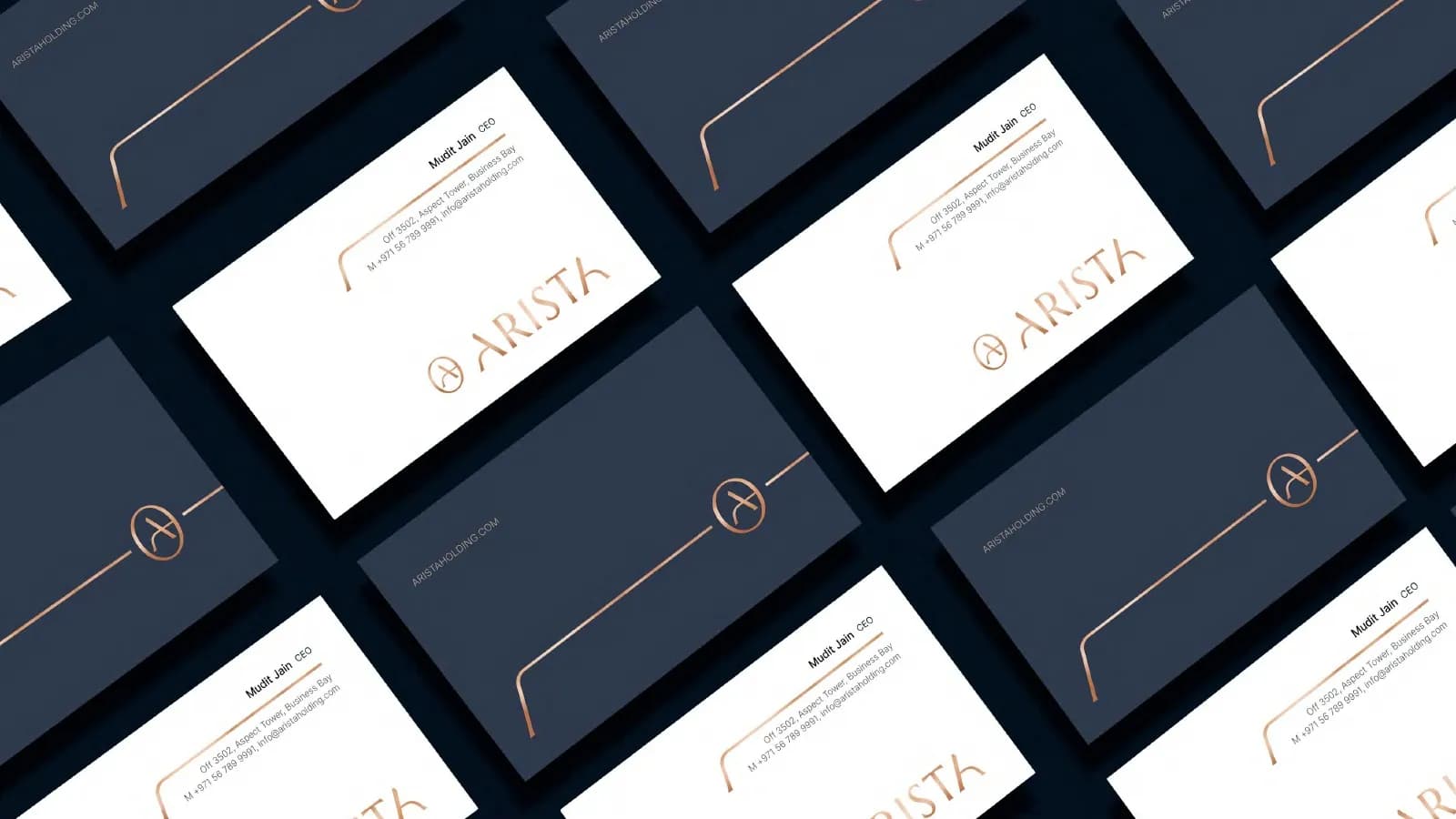
A review tells you the designer answered messages and was nice. Useful, but it says nothing about whether the logo survives embroidery, whether the colour values were written down, or whether the client owns the files. For that, read the portfolio differently.
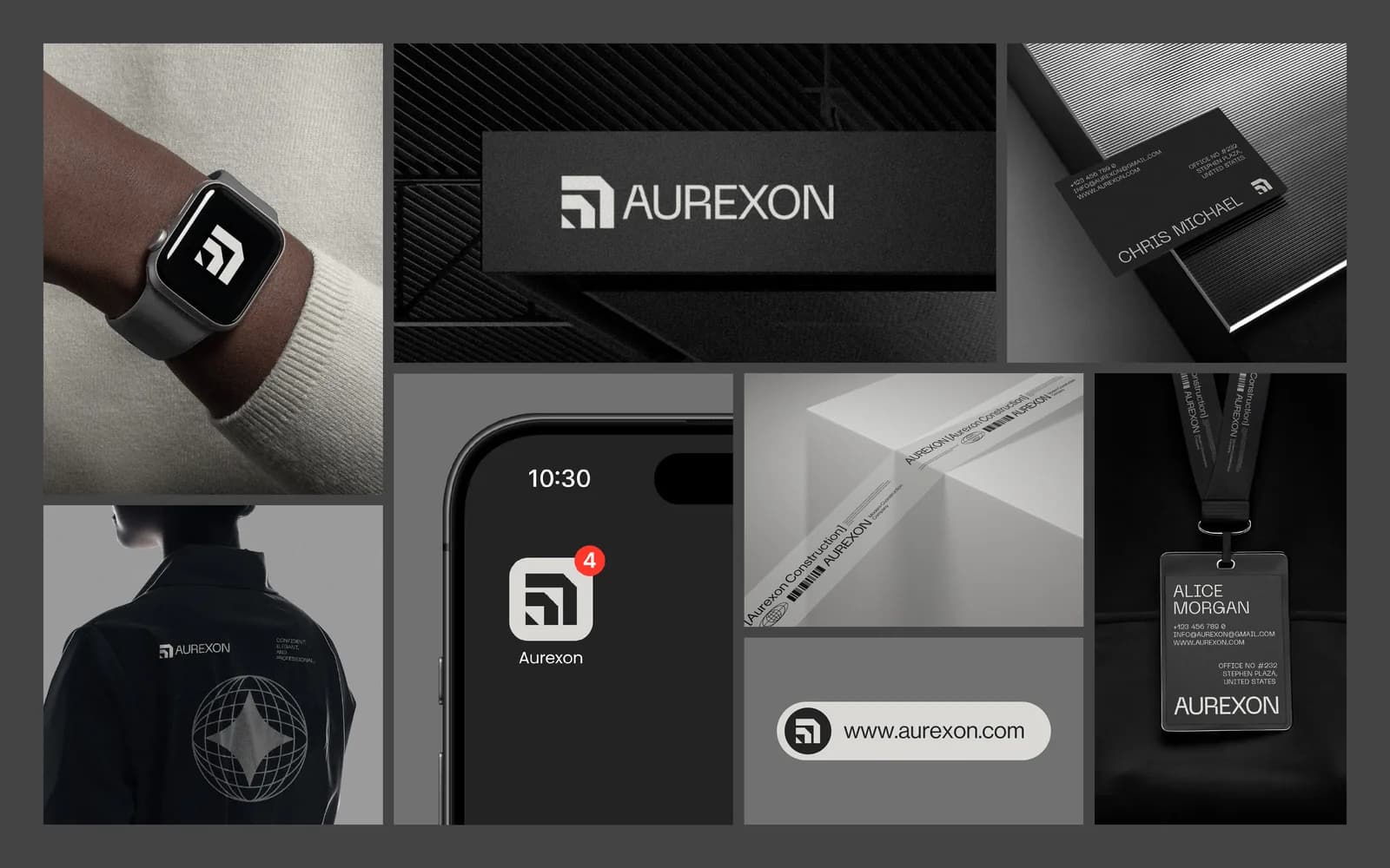
- Look for applications, not logos on white. A mark shown on a sign, a bottle, a phone and a shirt has been tested. A mark on a gradient background with a lens flare has not.
- Look for the system around the mark: colour codes, type, rules. If every project is a logo and nothing else, the designer may not do the part that saves you time later.
- Check what the handoff includes. Vector files, one-colour versions and written ownership should be listed, not assumed.
- Notice the range. Fifty projects in one style is a style, not a service. You want someone who made Aurexon look like engineering and PuppyDock look like a happy dog.
- Ask what went wrong on a project and what they changed. A designer with no answer hasn’t done enough projects, or isn’t telling you.
When real client quotes go up on this site, and they will, read them with the same eye. The useful ones will mention a printer, a hire or a deck, not just “lovely to work with”.
If you’d rather judge for yourself
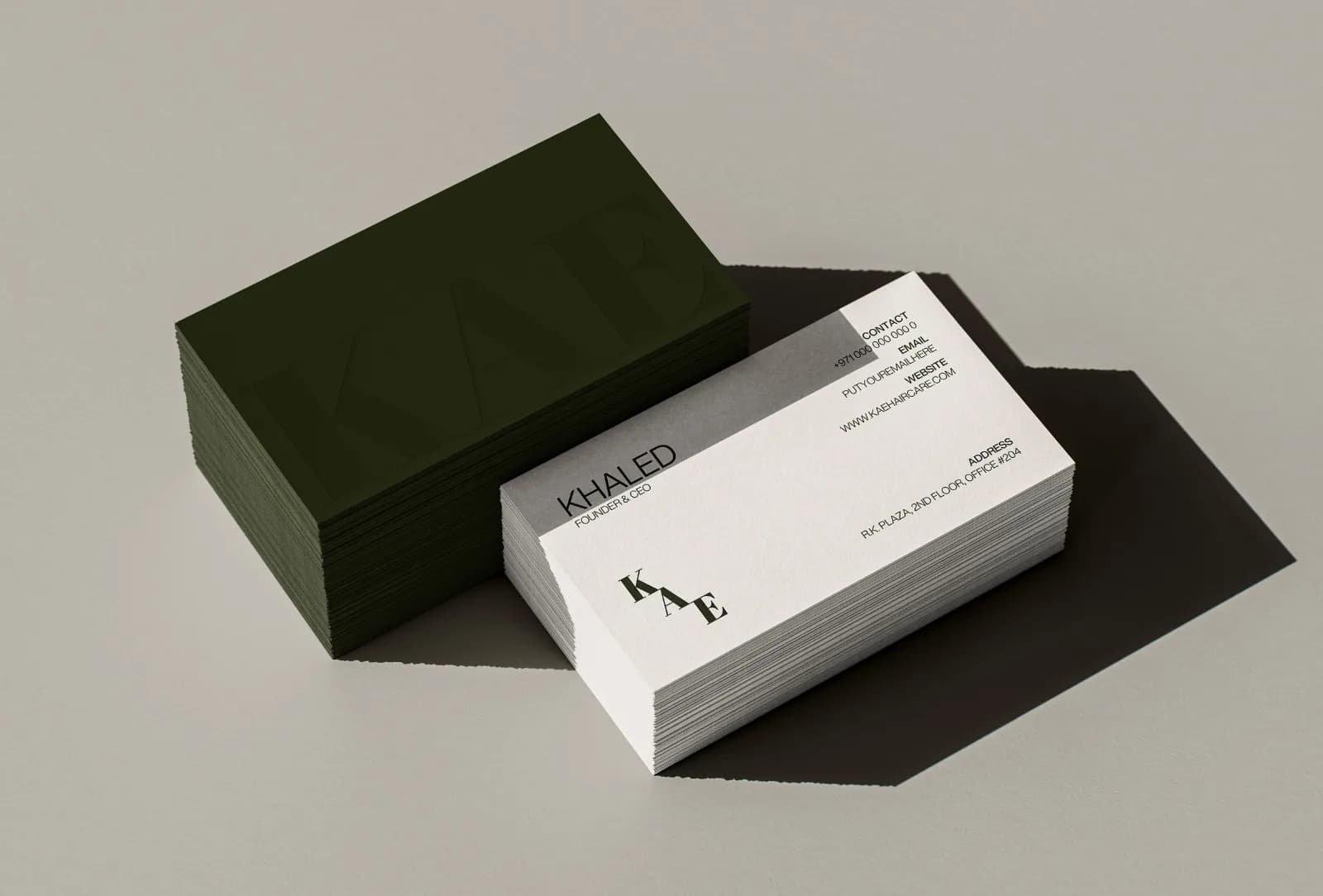
The case studies are the closest thing I have to reviews right now. Aurexon Construction, KAE Hair Care and Arista Living show the brief, the thinking and every application, so you can see how I work before you talk to me. The step-by-step process post covers what happens between the first message and the final folder.
If that looks like the way you want to work, book a 30-minute call. You’ll leave with a clear view of scope, timeline and price, and if I don’t think you need me yet, I’ll tell you that too.
Questions founders ask me
Because I want them to be real and specific, and that takes asking each founder properly rather than copying a line from a chat. They are being collected now and will go up as they come in, with each founder’s permission.