Logo design8 min read
Logo design for startups: packages and process
What a startup actually needs from a logo at each stage, what can wait, and how a logo project with me runs from a ten-minute brief to final files.
Javeria Hareem
Logo & Brand Designer, founder of Jayy Studio
In this article
Startup logo design usually happens in the wrong week: the one before the deck is due, by whoever was cheapest and fastest, and then the logo follows the company around for three years.
If that’s where you are, I understand it. You have a name, probably a domain, maybe a deck with a grey placeholder where the logo should go. There is no line in the budget called “branding” and there shouldn’t be yet. What you need is a mark that won’t embarrass you in front of an investor or a first customer, and a clear idea of what can wait.
This is how I think about it after a lot of startup logos: what each stage actually needs, the two tests every startup mark has to pass, what to skip for now, and how a logo project with me runs from brief to files.
What a startup logo has to do at each stage
A logo for a company with no customers has a different job from a logo for a company with a product in the App Store. Founders often buy the second kind when they need the first, or the first when they need the second. Both are expensive mistakes in their own way.
Pre-seed: the deck and the domain
Right now your logo lives in three places: the top-left corner of a slide, a browser tab and your email signature. It needs to be legible, confident and not weird. A well-set wordmark in a good typeface, with one colour and a tidy favicon, is enough. I’d rather you spent limited money on a mark you can still use in two years than on a mascot you’ll want to hide once the first real customer sees it. If you’re tempted by a gig, Fiverr logo vs designer is the honest comparison.
Seed: the app icon and the first hires
Once there’s a product, the logo starts meeting people without you in the room. It becomes an app icon, a profile picture, a Slack avatar for the three people you just hired. This is where a wordmark alone starts to creak. You need a symbol or a monogram that works at 16 pixels, a reversed version for dark screens, and colour and type decisions written down so the second person who makes a slide doesn’t drift.
Launch: the first customers see it
By launch the logo is on packaging, a landing page, a LinkedIn banner and probably a hoodie. Now the question is consistency. Not a 45-page book, but a short system: the logo versions, two or three colours with their codes, one headline face and one reading face, and a page of rules. The brand identity package post explains the levels; at launch most startups need the middle one. If you’re wondering why the logo alone won’t carry it, logo vs branding explains.
The app-icon test and the favicon test
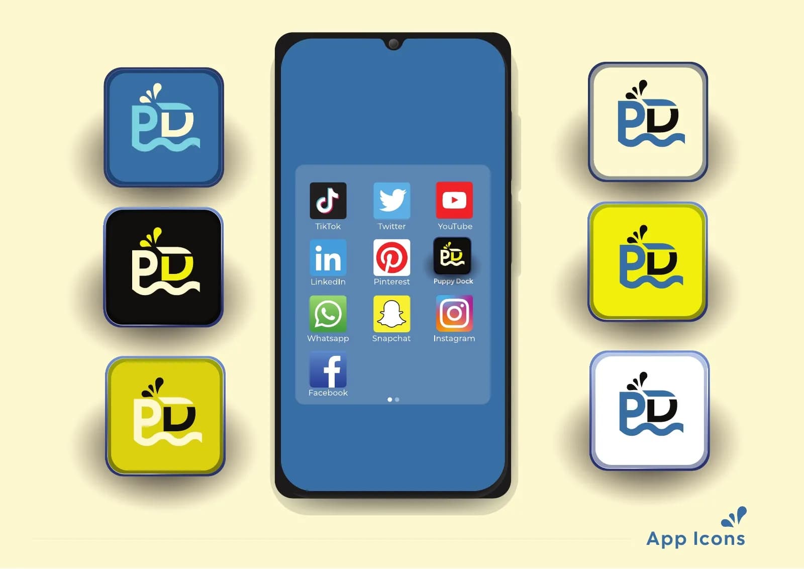
Here is the test I run on every startup mark before anyone sees it. Put it in a rounded square at 1024 pixels, then at 180, then at 16. If it still reads as the same shape at 16, it passes. If the letters merge or the detail turns to noise, it fails, and no amount of liking it at full size will fix that.
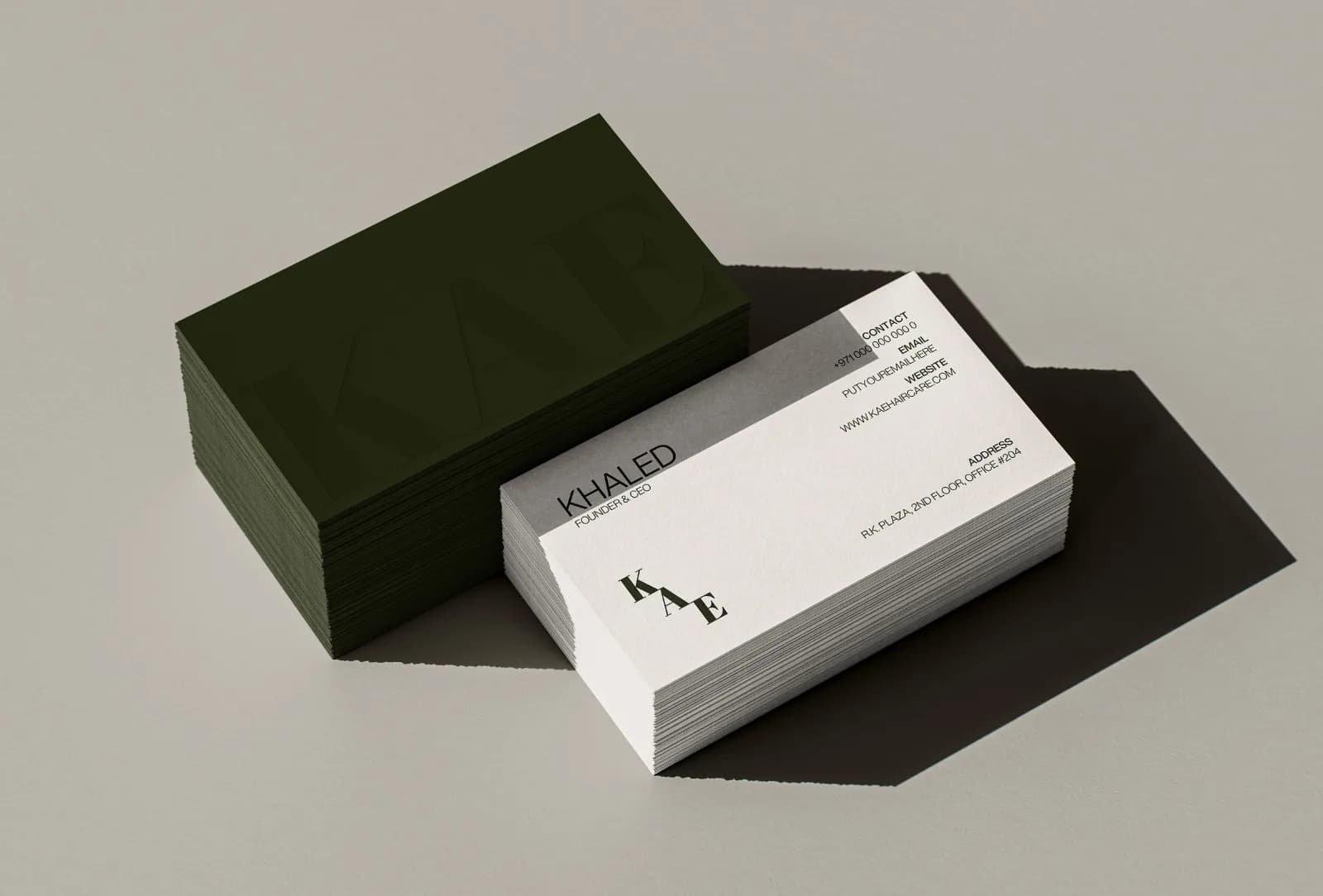
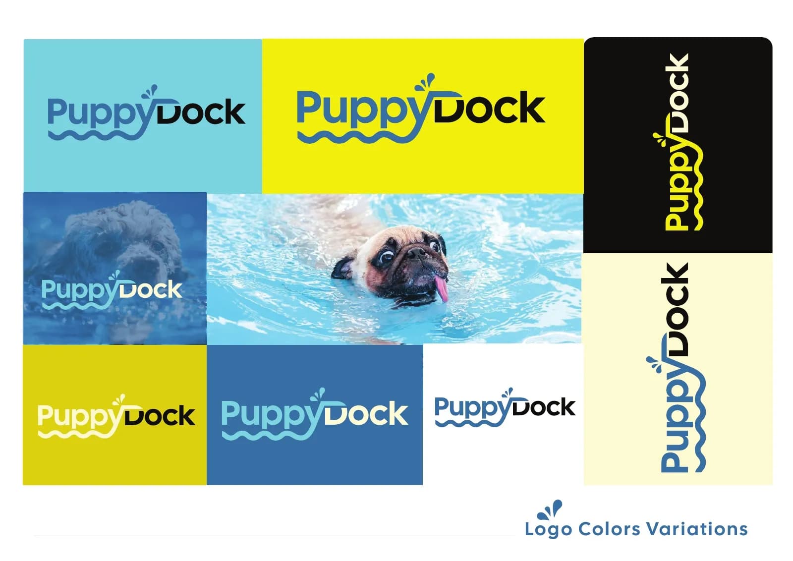
The favicon is the harsher cousin of that test. Sixteen pixels in a browser tab, often against a background you don’t control. Most wordmarks fail here, which is fine, as long as a monogram or symbol exists to take over. That is why PuppyDock has a PD short form and KAE has its monogram: the full name is for the bottle and the website, the short form is for the tab.
Run the same test in dark mode. A startup logo that only works on white is half a logo. If you want someone else to run these tests, Rate my logo is my monthly review of logos founders send in.
Check the name before you fall in love with the mark
Founders sometimes fall for a concept and then discover the name is taken by a company two countries away in the same category. Before any sketching starts, it is worth doing a quick round of checks.
- Search the name in your country’s trademark register and in the WIPO Global Brand Database.
- Search the App Store and Google Play if you’re building an app.
- Check the domain you want, the .com even if you won’t use it, and the main social handles.
- Google the name with your category word next to it and see who comes up.
None of this is legal advice and none of it replaces a trademark lawyer when you’re raising money. It is the ten minutes that stops you paying for a logo twice.
How my startup logo design projects run
The process is the same five steps I use for every logo project, compressed to fit a startup’s calendar. A logo package takes three to five days from brief to files, and you know the delivery date on day one.
- Discovery. You fill in a short questionnaire about the business, the customers and the competitors you keep losing to. Nothing gets drawn yet.
- Direction. I send references and a palette or two so we agree on where it’s heading before anything is polished. This is the step that saves the most time.
- Design. You see concepts on a phone screen, a slide and an app icon, not floating on a white square.
- Refine. We tighten the direction you picked. Revisions are part of the job. If the first concepts miss, I try a new direction instead of nudging one you don’t like.
- Handoff. Vector source files (AI, EPS, SVG), PDF, PNG and JPG, in full colour, one colour and reversed, with clear-space and minimum-size rules, all named so a developer can find what they need.
Payment is a 50% deposit to book the slot and the balance before final files. Once you’ve paid in full, the logo is yours outright: no licensing fees, no royalties, and nothing awkward if you raise and someone does due diligence on the IP.
What to skip for now
A 45-page style guide. Vehicle livery. A pattern library. A full stationery suite with letterheads nobody will print. A mascot. Motion guidelines. Most of these are right for a company with twenty people and a marketing hire, and wrong for a company with a deck and a prototype. I’ll say so when you ask for them, because I would rather you came back in a year for the next layer than paid for it now and let it go stale.
What not to skip, ever
Vector files. A one-colour and a reversed version. The clear-space and minimum-size rule on a single page. Ownership in writing. Fonts licensed to your company, not to the designer. These five things cost almost nothing extra at the start and cost a redraw, a lawyer or a rebrand later. If a cheap package leaves any of them out, that is the real price of the package.
How to brief me in ten minutes
You don’t need a brief document. Send me, in any order: what the company does in one line, who pays for it, the two or three companies you don’t want to look like, where the logo will live in the next six months, anything you already have (a name, a colour you’re attached to, a domain), and your deadline. That is enough for me to come back with a fixed quote and a start date.
Logo projects sit at the low end of what I charge, with full identities and packaging at the top, and you always get the number in writing before anything starts. Send me the ten-minute version, or book a call if you’d rather talk it through. If a logo is genuinely all you need right now, I’ll say so.
Questions founders ask me
Yes, and for most pre-seed startups that is the right order. I design the logo so a colour system, type and applications can be added around it without redrawing it. When you come back for the next layer, you are extending the work, not replacing it.